
What’s New in UIButton for iOS 15?
UIKit’s button type system gets more styles to customize and a new configuration handler
SwiftUI might’ve been the talk of the WWDC 2021 event once again, but UIKit’s story is over yet. As a matter of fact, most SwiftUI codebases today rely on UIKit in some form or other. Understandably, we’ve got plenty of interesting additions to the UIKit framework this year. Amongst them the UIButton has the most notable changes.
UIButton API has been more or less been the same since the beginning, with only a few interesting updates in the past couple of years — like iOS 14 introduced a new UIAction as a replacement for Target Actions for setting controls.
With iOS 15, UIKit’s button system has unarguably got the biggest update in a decade. We now have more styles, a completely new button configuration style, multi-line text support, and lots more.
Let’s walk through the major updates and see how to implement them.
New Configuration Styles
Until last year, UIKit’s button type system was a little constrained. An iOS developer would typically use the default system type or create custom ones on their own.
With the introduction of the new Configuration API, we’ve got a set of predefined styles to choose from:
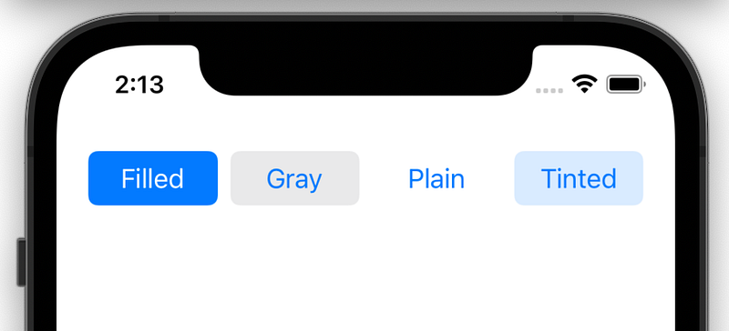
UIButton.Configuration.filled()
UIButton.Configuration.gray()
UIButton.Configuration.plain()
UIButton.Configuration.tinted()
Here’s a first look at the four configuration styles in action:
By setting the configuration instance property on the UIButton, you can assign the above styles.
let button = UIButton(type: .system)
button.configuration = UIButton.Configuration.filled()
Set Predefined Values for Shape and Size
Adding not just button styles, the new Configuration API provides a slew of other customization options ranging from title, subtitle, image, and background appearances to setting predefined shapes and sizes.
Let’s take a look at how to configure shape and size in UIButton iOS 15.
Shapes
We can set corner radius on the configuration styles directly as shown below:
var config = UIButton.Configuration.filled()
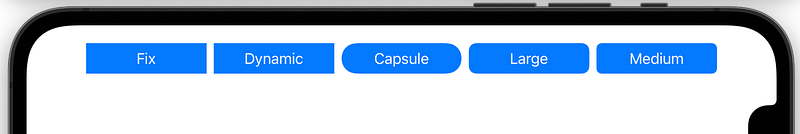
config.background.cornerRadius = 0Now we’ve also got a new UIButton.Configuration.CornerStyle to set predefined corner styles, like capsule , dynamic , fixed , small, medium, large:
config.cornerStyle = UIButton.Configuration.CornerStyle.capsuleIt’s worth noting that barring fixed and dynamic, all the other styles ignore the cornerRadius value. For instance, in the below image, we’ve set a corner radius as 0 for each button. See how capsule, large, medium override it with their predefined corner radius.
Sizes
Like corner styles, we also have a bunch of predefined sizes:
UIButton.Configuration.Size.mini
UIButton.Configuration.Size.small
UIButton.Configuration.Size.medium
UIButton.Configuration.Size.large
To set size on the UIButton, invoke the buttonSize property on the configuration instance.
config.buttonSize = .medium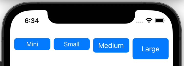
Note: iOS 15 also introduces a new behaviorStyle property for UIButton. It lets you control the appearance and behavior of button control. One can set it as mac or pad or automatic (default).
Customize Text, Image Content, and Appearance
UIButton also receives a dozen more enhancements to customize content. There’s a subtitle property that’s displayed under the title by default. We also plug in a UIImage inside UIButton using the image property on the configuration.
The following piece of code styles some button attributes to pull together a custom button:
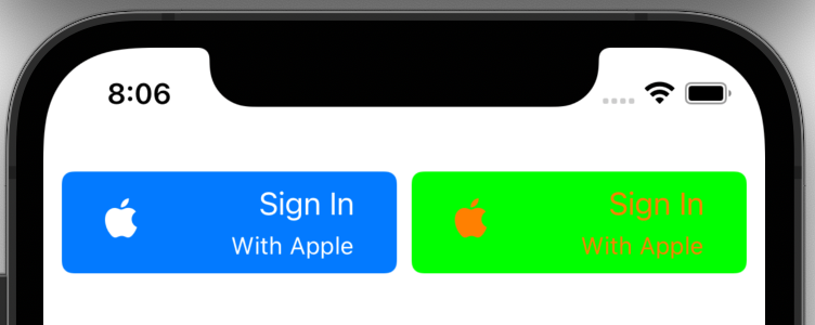
var config = UIButton.Configuration.filled()config.title = "Sign In"
config.image = UIImage(systemName: "applelogo")
config.imagePadding = 50
config.titlePadding = 5
config.subtitle = "With Apple"
config.titleAlignment = .trailing- The
titleAlignmentproperty is used to position the title with respect to the subtitle. textPaddingis used to set the spacing between thetitleandsubtitle.- There’s also an
imagePlacementproperty to set the relative position of the image with respect to the title.
Apart from content appearance, the new configuration system lets us customize the button color in a different way. ThebaseBackgroundColor and baseForegroundColor properties let you set the background and content color respectively.
Here’s a look at two custom button configuration appearances:
We’ve also got a new showsActivityIndicator property as a part of the UIButton.Configuration. It lets you display an indefinite progress indicator in place of the button. This is helpful when handling click state changes — which takes us to the last section.
Configuration Handler for Button State Changes
One of my favorite improvements in the UIKit’s UIButton system is the inclusion of a centralized closure to handle button state changes over time: configurationUpdateHandler.
Applying it in action over our previous button configuration gives us the following result:
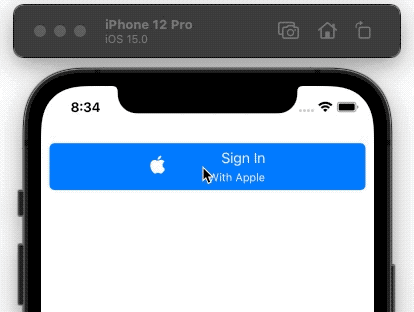
To trigger the configurationUpdateHandler programmatically, invoke the setNeedsUpdateConfiguration() function.
We’ve also got a imageColorTransformer property to transform an image on button state changes.
Conclusion
UIButton is the oldest control type in the UIKit system. It’s nice to see an overhaul in its API this year.
CoreLocationUI, a new framework introduced with iOS 15, also exposes a standardized button, CLLocationButton, to handle location authorization.
Besides UIKit, SwiftUI’s button system has also got similar changes. To know more, do check out Mohammad Azam’s piece that takes an in-depth look at customizing buttons in SwiftUI for iOS 15.


