
What's missing before the 'One Metric That Matters' in Threat Detection?
This is a short blog to help those focused on SOC metrics!
Although I have previously covered this topic, it remains evident that effectively tracking reliable metrics demands the team to adapt and potentially implement new processes to achieve their objectives.
I share here a few ideas that might be helpful and inspiring to get there.
The Recipe
Before getting into it, there are a few concepts, terminology and requirements to be discussed and agreed upon. That's key because there are some overlooked steps when it comes to the exciting topic of metrics.
Actually, that's perhaps the most important message you will get from here if you are just starting on the topic!
While conceptualizing a metric might be easy, implementing is not. Also, consider that simply displaying metrics in a dashboard is most times not enough to enable proper consumption or interpretation of them (value).
A significant change in a metric value should drive action.
Ultimately, the Detection Engineering practice should to be able to draw relationships between its product and its consumption.
A concrete example is to correlate detection rules (code/logic) and their corresponding outcome (alerts closure status) and drive quality in terms of bug fixes and optimizations from there.
There are mainly three steps for properly tracking a metric in that context.
1 — Define a Process: handling alerts — consistently
Before trusting a metric, one needs to consistently follow a routine so that when noticeable trends or gaps/spikes (outliers) appear, the team can accurately asses the situation and make well-informed decisions.
Now, let me ask you a question: Is it clear to all your security analysts how should a security alert be handled end-to-end? Is it clear what a false-positive (FP) or true-positive (TP) actually means?
It's common to have disagreements within the team about those ones. So guess what happens in case that's not fully agreed? In the end, you will not be able to trust the metrics — even if you instrument them right.
In other words: without a clear process, no way to base decisions on the metrics being gathered since the signal is not trustworthy.
I created a generic process for MDR and MSS providers which is applicable to pretty much any SecOps team with minor changes:
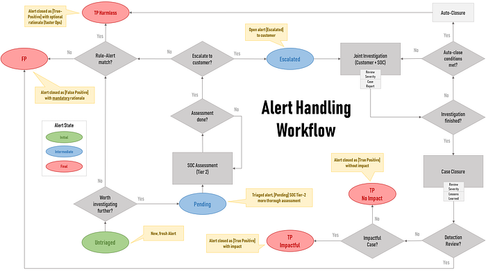
It all starts in the green state when an alert is generated (Untriaged).
The final states (red) can or perhaps must be broken down into more refined ones but it should suffice for most.
For instance, the true-positive state called TP — No Impact might be related to a known pentest or to a PoC or a new vulnerability scan product being rolled out in the environment.
Each of those refined states may pose a distinct value perception within an organization or within your customers. So it makes sense to draw a connection between your detections and those outcomes.
Note that above sketch makes use of a distinct team (Tier 2) for engaging on alerts after they are triaged. This is the most common scenario in large SecOps although this might change in a near future. 🤖
Another topic to discuss here: what’s the difference between Triage/Analysis/Investigation when it comes to security alert handling?
What are the clear conditions or instructions (playbooks, guidelines) to follow in order to elevate or escalate an alert to the next queue (Tier 2)?
Especially for service providers, when SLAs are involved, the Triage process should be fast and most times (semi-)automated. The deeper analysis or investigation is usually performed by more senior analysts.
Most fruitful investigations will involve some human analysis and those are the ones we'd like to see well highlighted in metrics and reports.
And here we drop a hint towards a good metric: is it enough to track a plain FP/TP for assessing a detection performance? Start with generic ones and later try to split and refine them. Many examples here.
2 — Instrument: gather alert/case data and compute Metrics
The instrumentation in this case refers to the process of properly gathering necessary data to generate or compute a metric.
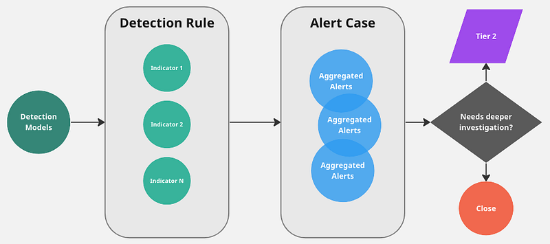
Assuming a standard enterprise SOC setup, there's a SIEM generating alerts and a Case Management System (CMS) or a SOAR aggregating those signals.
So in order to generate a Rule x Alert Status table as an example, one needs to either implement that in the CMS or in the SOAR — assuming the rule/indicator names and other necessary attributes are part of alerts.
The issue is sometimes those systems offer very rudimentary out-of-the-box reports, not to mention the inability to develop custom ones.
The issue gets even more challenging when we are not talking about traditional atomic-indicator-based alerts. So what to do here? Excel? Not for a good developer or SIEM engineer for sure!
If you are fluent in SPL, one way is to simply Splunk the CMS/SOAR transaction log/DB and generate the metrics and reports yourself. 🤠
3— Display: consuming the metrics
How to spot a significant change in a metric value? Comparing to previous values? That seems obvious but it's not that simple.
It’s easy to guess most teams are copying/pasting values in spreadsheets all over the place to display metrics. And don’t get embarrassed if that’s your case as most teams do not even track any metrics at all!
This is not only time-consuming but also more prone to errors, not only when gathering or computing the values but when interpreting them!
Data Visualization and Trends
This is the easiest one to miss after all the work done on defining and computing the metrics. Metrics are more easily assessed when in comparison with its previous values in time, especially when using visuals.
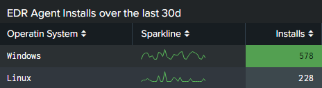
In Splunk, the easiest way to visualize trends (value change or direction in time) is by leveraging standard charts as seen in some examples below.
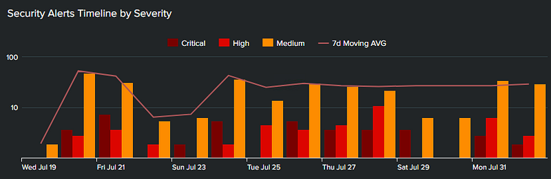
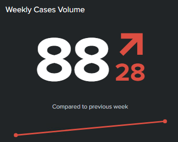
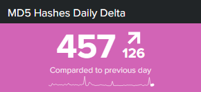
Sometimes, simple dataviz can be leverage in a table panel. Even sparklines will better convey the message, same goes for column heatmaps.
At the end of the day, good metrics rendered in charts will tell a story and better represent the team efforts. So what about your team?
- Which data visualizations are you using for displaying metrics?
- Which engineering-focused metrics are you leveraging?
Leave in the comments or feel free to drop me a message.
Further Ideas
Now, imagine being able to leverage those juicy and hopefully trustworthy metrics to support the practice on any human-related process?
One could use those data points as features in an ML/AI model and feed analysts with more context for faster and better informed decisions.