
What regular practice can bring joy to my creativity by using a photo as a texture and blender
3D modeling and rendering of curtain
We all know the regular practice of anything is hard.
But, we know it will improve whatever aspects we want.
If we engage a bit more in physical exercise, we will become a bit more physically fit.
If we eat a little more vegetables in the morning, for example, we probably develop a healthy eating habit and improve our internal health.
If we try to do something regularly, which probably doesn’t have to be long hours we perhaps find a bit of goodness in the process.
If not every day, then regularly — as often as we make ourselves try — it will help us improve something.
For me, I write more often and practice more on making images using the 3D modeling and rendering software: Blender.
Since last month I have been reading many other writers’ articles, seeing their artistic work with and without the bits of help of software such as Canva, DALL-E, and MidJourney.
I’ve been spending more time on the software (Blender) since last month, which allows me to spend less time on creating one image and lets me move on to the next image quicker than before.
A few days ago, I experimented using my photo, which was just a fabric I took with my smartphone. I applied to a half-transparent object. It then became like it seemingly had the check pattern in the glass.
So, it was fun discovering by trying different nodes, values, and connections under the “Shading” workspace.
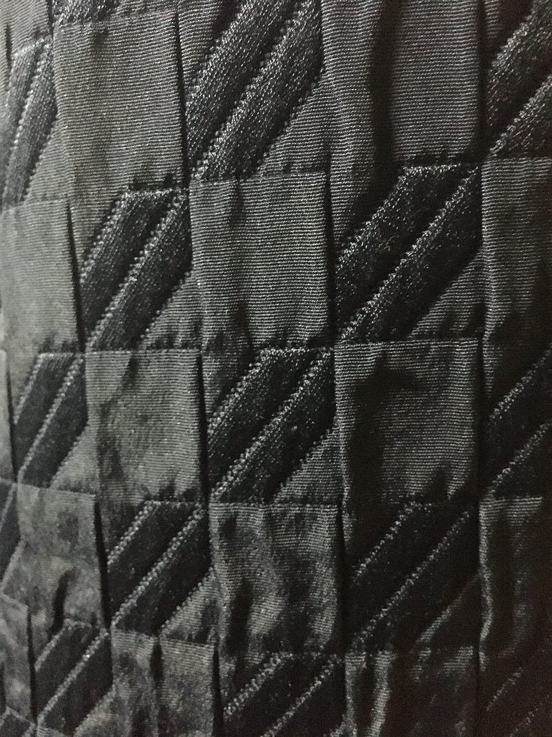
Yesterday was another practice. I used another fabric photo I took on the same day as the Black/White Check fabric I used a few days ago. This one was just from the shiny black jacket.
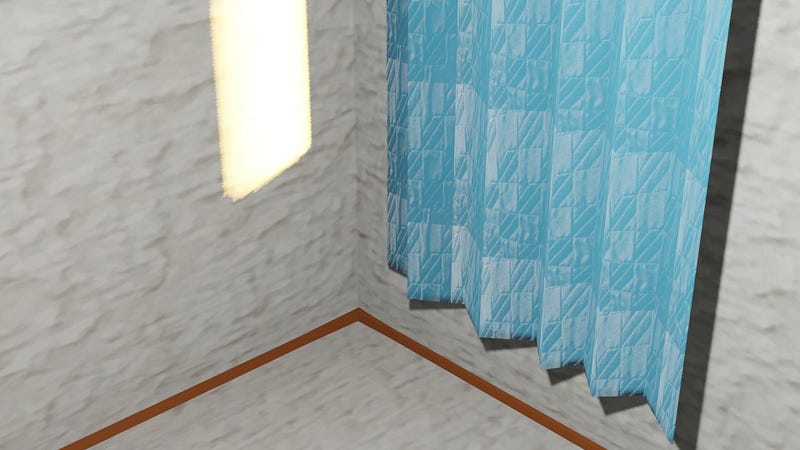
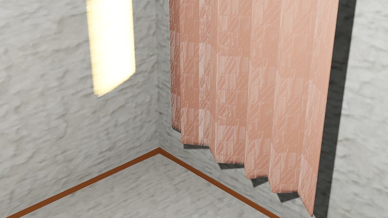
What I used it for was curtain, BUT different colors.
Before getting into it, as you see in the images below, there is another texture I applied. Yes, the wall. I used a photo I took with the other two photos. It was a photo of wallpaper. It looked good, and my focus was on the curtains, so I finished this wall instantly. I was interested in making curtains because I was so into interior images, decoration, and coloring yesterday. There was a point when I was thinking about which color of the curtain fit well with a white wall. There were two options for the curtains: a light blue one and a pinkish beige one (somewhere around RGB #E9BBBF).
So I opened the software (Blender) and started creating. I created simple images: walls and windows with the sunlight coming through the windows and the two curtains shielding the incoming light.
Then, I experimented with the photo I took. I applied it as a texture to each curtain. And it gave me the shiny fabric texture. I was happy to see it, keeping the colors of the curtains, suppressing the black color, and delivering the sense of a shiny surface.
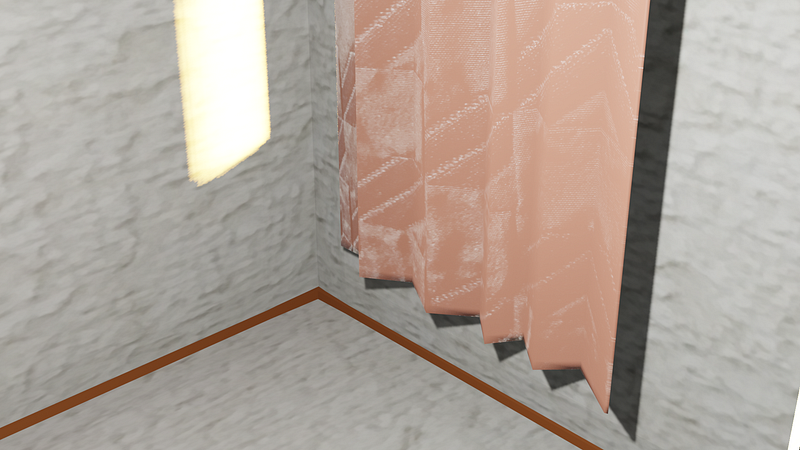
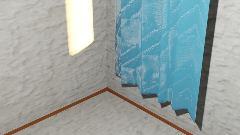
Each square was big, so I made them smaller, using “Texture Coordinate” object links to the “Mapping” vector.
They now look more real.
Because two brown wooden parts are on the bottom of the white wall, I may choose pink beige on this occasion; otherwise, I may prefer blueish or greenish curtains.
You may like my other stories:
Join my Medium referral link | Read my short fiction stories