
What Marketers Can Learn from The New York Times Sunday Cover
7 ways to maximize the impact of your message
If you’re paying attention to news or social media, the odds are that you saw The New York Times cover above. My friend actually alerted me to a Tweet teasing the cover on Saturday.
Admittedly, it is a fairly jarring depiction of the American lives that have been lost.
While a global pandemic might seem like a macabre place to find marketing lessons, I would argue that the last several months have revealed a significant number of insights about how consumers engage with and share information, how easily misinformation can spread and how to frame communications in a way that draws attention in a cacophony of voices.
To that end, the cover of Sunday’s New York Times is a tremendous example of how to effectively craft and frame a message so that it will cut through a very crowded market of competitive information sources.
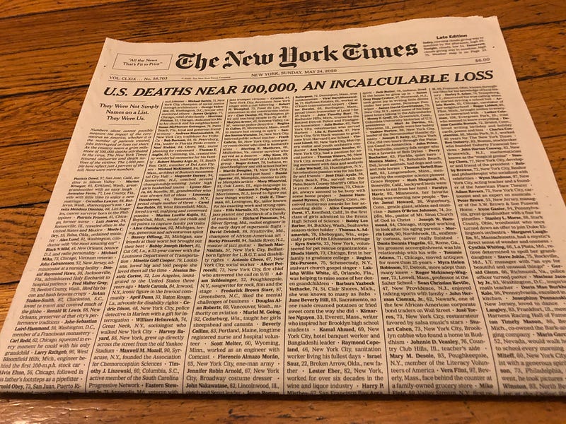
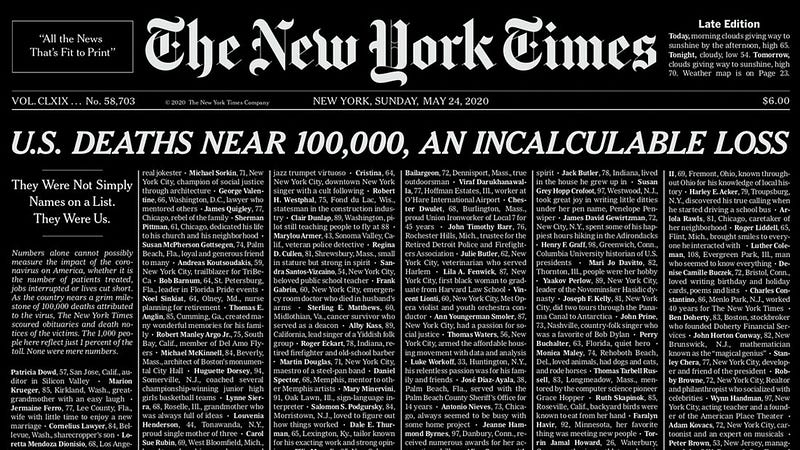
While The New York Times has been covering the coronavirus pandemic for several months through in-depth coverage and discussions with a wide range of expert sources, the news outlet had a very difficult task on its hands: mark the imminent milestone of 100,000 Covid-19 deaths in a lasting way.
Not only did The New York Times need to rise above the ongoing chorus of coronavirus media coverage, it also wanted to cover this grim milestone in an impactful way that brought life to such an “incalculable loss,” honoring the lives of all the American citizens who have passed to date.
I believe their treatment was very well done and will have a lasting impact. Here’s what we can learn from their expertise in design, editorial, and distribution.
1. Simplicity Breaks Through
Human beings have a hard time conceptualizing numbers once they rise above a certain point, and they become abstractions.
Indeed, the grim milestone of 100,000 deaths is difficult to wrap your head around. This Times Insider piece reports that The New York Times design team wanted to “represent the number in a way that conveyed both the vastness and variety of lives lost.”
The “all-type” concept was chosen to convey the magnitude of the loss of human lives. The paper’s researchers and editors combed through obits from hundreds of newspapers across the country, searching for “phrases that depicted the uniqueness of each life lost.”
When you see the image of the cover, you almost instinctively know what you’re looking at, and it is an image that translates across many different communication channels, including social media.
“I wanted something that people would look back on in 100 years and understand the toll of what we’re living through,” explains Marc Lacey, New York Times national editor.
Takeaway: Pick a simple, clear message to break through a crowded market filled with misleading and conflicting information.
2. Unexpected, Creative Design Concepts Can Be Powerful
Sometimes the most powerful messages can be made by simply exposing a stark reality in a new way.
Given the coronavirus pandemic has been referred to as a war against an invisible enemy, The New York Times effectively erected a war memorial to remember all of those lost — just a day before Memorial Day.
The publication did this in two different ways. First, the list of nearly 1,000 names on the print edition cover looks painfully long and is difficult to take in. We are reminded that this only represents around 1% of the “confirmed deaths” in the U.S.
By having no pictures, headlines, or imagery, the design concept breaks our visual expectations of a cover and transports readers back in time. This has the effect of drawing you in and leading you to want to learn more.
Tom Bodkin, New York Times chief creative officer, admits that the treatment was “hugely dramatic.” The Times Insider piece explains that “the design references that of centuries-old newspapers.”
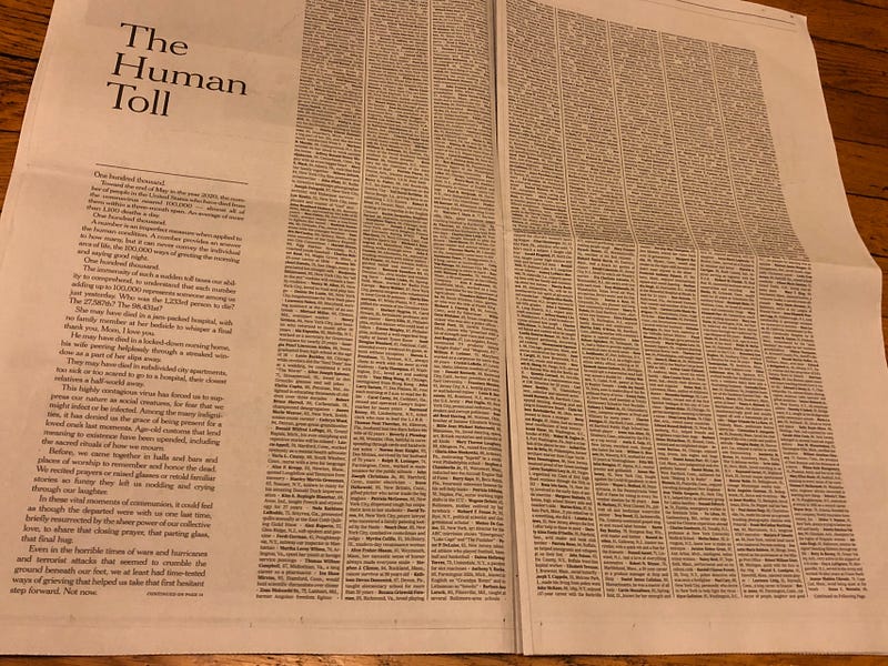
To accompany its “all-type” cover, The New York Times also published a digital display on its website, which showed the victims in chronological order of their passing.
“A number is an imperfect measure when applied to the human condition. A number provides an answer to how many, but it can never convey the individual arcs of life,” reads text within the display. “The immensity of such a sudden toll taxes our ability to comprehend, to understand that each number adding up to 100,000 represents someone among us just yesterday.”
Both of these treatments are very effective at grabbing the viewer’s attention and making them stop and contemplate the magnitude of America’s loss.
Takeaway: Surprising and bold deviations from traditional or expected design concepts can command the attention of your audience; explore variations in creative articulation to align with each media channel.
3. Scattering Digital Breadcrumbs Will Spark Interest
Before the special New York Times Sunday Edition hit newsstands and was delivered to apps and inboxes, the publication tweeted a teaser of the cover to draw readers’ interest on Saturday. This was a smart approach to ensure reader attention during a holiday weekend when its audience had the potential to be distracted by other plans.
Takeaway: While businesses are often loath to give early previews for fear of leaks, it is a proven strategy to maximize the reach and impact of your message.
4. Human Stories Are the Most Powerful Way to Reach Your Audience
In case you somehow missed this message over the years, this cover is yet another reminder that real human stories are the best way to ensure that your message will resonate with a broad audience.
While depicting only a tiny sliver of a COVID-19 victim’s life, the very brief descriptions that The New York Times gave each person are inherently relatable. In their inclusion on the cover and the digital display, these descriptors remind us intimately of the human lives that are behind the numbers.
“Loved to dance”
“Security worker who died the same day as his wife”
“Man who seemed to know everything”
“Retiree determined to spoil her granddaughter”
This is at once unimaginably saddening and an unforgettable way to drive home their message.
Takeaway: The impact on individuals living real lives and facing concrete challenges is typically the best way to make sure your message sticks.
5. Multi-Platform Distribution Is the Gold Standard to Maximize Reach
The Sunday Edition is just one more piece of evidence revealing the power of a multi-channel distribution strategy to amplify the reach and impact of your message.
In addition to its Saturday teaser image and other tactics, The New York Times took to Facebook, Twitter and Instagram on Sunday to expand the distribution of its message and drive up engagement.
And it worked, as of 6:30 pm on May 25, the Sunday Edition cover garnered the following across social channels:
- Twitter: 54.3K likes, 25.8K retweets, 1.7K comments
- Facebook: 96.6K likes, 68.7K shares, 6.5K comments
- Instagram: 332K likes, 4.8K comments
Takeaway: For the maximum distribution of major announcements, develop a campaign concept that can be easily shared with audiences across a variety of social channels; customize as appropriate.
6. Honest, Heartfelt Factual Admissions Trump Talking Heads
As we have seen, media coverage of the impact of and response to the coronavirus has been extremely ugly. The tragic public health emergency has been co-opted as a political platform for public leaders on both sides of the aisle.
Regardless of how I may feel about that (hint: disgusted), the point is that talking heads and pundits from every sector and part of the country have been clamoring for their piece of the commentary spotlight. It has led to an endless cacophony of often conflicting voices that can leave one more confused after tuning in than when they began.
As a former public relations executive with significant experience in crisis and issues management, I have paid close attention to the constant massaging of the coronavirus impact and the government’s response in press conference monologues and partisan news coverage.
Transparent, fact-based information will always hold more water than the manipulation of the message by self-interested parties. Misinformation may drive confusion in the moment, but its influence cannot hold up over time.
Takeaway: A brutally honest, stripped-down recounting of the facts will always win out over time. It’s better to be straight up and admit fault than try to walk back a tangled web of lies.
7. Always Check Your Facts, Repeatedly
Critics and competitors will always find a reason to come after you, but you don’t need to give them any ammunition.
As you may have read, several of the names listed in the cover were inaccurate and needed to be corrected. To be clear, I do not in any way think that this diminishes the value of this piece.
These oversights are, however, being used by a wide variety of critics, who, in all likelihood, would have just found another reason for criticism had these oversights not been revealed.
Takeaway: No matter how amazing and incredible a piece of work is, negativity bias will always draw our attention to errors and oversights, which can lessen impact.


