
Threads’ UX on all the users I’ve never followed
Why are they showing up on my feed?
An opinion piece
A feeling of initial data overload
If a social app was a room in my apartment, my Threads’ room would be my living room invaded by hundreds of unknown influencers and users.
All of a sudden, they showed up in my flat because I answered the door by signing up to Threads. They all want me to follow their agenda, like their posts, and repost whatever it is. Food, cats, traffic alerts, politics, weather phenomena.
Mega-brands appear, subtly cloaked as members of the tribe, but not exactly.
Wimbledon, for instance, is showing up on my Threads. I’m now reading about the intricacies of the Wimbledon tennis courts. I’ve never followed any tennis threads, but now, I’m made a tennis connoisseur and thus admiring the stories of all the stars of the Wimbledon court.
Or, it might be Threads’ algorithm feeding me unlimited themes and daily trends to entice me to like new things.
It’s confusing. It adds more media chaos in my already busy day. I scroll intuitively to find anything that makes me relax and breathe with confidence.
I sense that Threads was built to satisfy users’ urge for scrolling.
Scrolling up and down on Threads is a never-ending activity. It feels a lot like hand therapy. It is probably the most unhealthy habit we will develop and our hands and fingers will really hurt beyond the usual carpal tunnel syndrome.
{Note to UX: Test user behavior for hand/eye repetitive and addictive device interactions.}
Good things on Threads
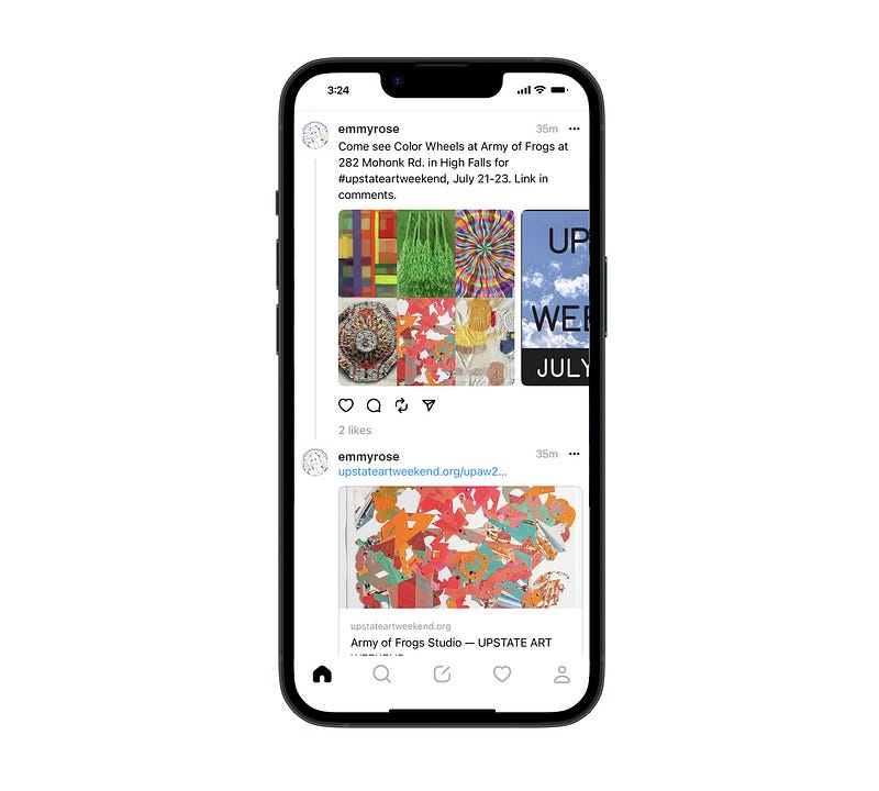
I like reading news from my IG friends posting images and informative text
Although Threads is built for sharing text updates and joining public conversations, I feel that the most interesting posts on Threads are made by my friends who drive their posts with succinct pictures and announcements.
My artist friend posted pictures of her recent works, time and date of her shows, and a live link to the venue. It’s interesting because it’s a post from a person I know, and I can relate to the content.
{Note to UX: Prioritize content of real friends over random posts from unknown people.}
Interesting to see is that this particular Threads’ screenshot looks familiar and a lot like IG. On closer comparison, we see that the interactivity features are almost identical between Threads and IG.
A comparison of 5 UI/UX features on Threads vs IG
1. Images
Easy to see is that IG features a full-width image placement, Threads has an 80% screen width on images. Also, the height of the images on Threads is shortened.
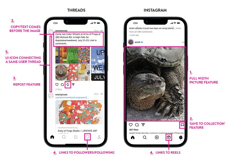
2. Placement of text
True to its promise to provide text updates and public converstations, Threads features the text input section ahead of the image. IG treats text like a caption to the image.
3. ‘Reposting’ vs ‘Saving to Collection’ UI icons and features
Threads has a repost UI feature. This has the potential to make some posts go viral, if there are a lot of reposts. IG has a ‘Save to Collection’ UI function. This provides a personal link to saved posts. It’s archival and private. The number of UI functions below the images are the same on Threads and IG, namely 4.
4. Bottom navs & nav details
The bottom nav bars on both Threads and IG are almost identical, each have 5 icons linking to a subset of features.
Threads uses the heart icon to link out to followers and following, not to liked posts. Once on the follower’s page, there is a sub-nav for activity logs such as replies, mentions, and verified. IG uses the same position UI button but it’s a link out to their popular reels feature.
5. Threads indicator UI icon
Threads has an interactive UI vertical rule element to the left of a user’s postings that indicate one or multiple replies to that post. If there is no reply, the rule does not show. It’s subtle.
{Note to UX: While the Threads interface feels intuitive, it also has many hidden features that makes the interactivity confusing.}
The structures of both the Threads & IG app feel linked
Threads and IG definitely feel connected. The folks at Meta actively promote the transition of followers from IG to Threads, with the promise to “…find more people who care about the same things you do”.
The Threads’ universe is founded on the all the work creators’ put in building their following on IG.
IG feels linear in a certain way, meaning posts from creators we follow, with some ads in-between, flow seamlessly in a chronological fashion.
Threads, on the other hand, feels more random and redundant in its content flow. We scroll and scroll to find something of interest.
{Note to UX: Would it be advantageous to differentiate more between the two apps?}
My top three takeaways
- Threads might become a key player in the text-based online app conversation sphere. But its familiarity with IG might also be its shortfall. Users might want to stay on IG rather than expanding into yet another social app.
- Threads is built on the creator economy. It needs users to post interesting stories for their friends to follow. However, brand creators whom we’re not following, but show up anyway, (see the example above about Wimbledon) will quickly inhabit the online space to inadvertently advertise for their experience. Especially as Meta poses this as ”…improved recommendations in feed”. This can become a turn-off to users despite Threads’ promise “…to help people find their community”.
- Creators are creators. They quickly adopt and accept new venues. Creators are needed to feed both IG and Threads. It’s up to the creators to choose their communities, some might opt to have smaller fields of interaction. Threads seems expansive, IG more intimate.
I hope you feel inspired to analyze this new app your way!
Thanks for reading!
Interested in learning more about UX design, AI, design tools, trends, and art? Join Medium with this link, and support my future writing.
Thank you! ✍️🧡
Screen captures by the author.