
What designers can learn from the practice of finding joy
When you are always focused on identifying the pain points, you miss seeing the things that already work well.

In UX, we are obsessed with solving problems. We want to eliminate friction (in most cases), make things easy and smooth, and remove stumbling blocks for users. But what about the things that already work well?
While it’s essential to identify users' struggles and pain points, we often neglect to focus on collecting data on the areas that bring them joy.
Recognizing Success in User Experience
In our pursuit of creating a good user experience, recognizing the already successful aspects of the design shouldn’t be ignored.
There are two attributes in UX that influence a user's satisfaction: pragmatic and hedonic. Pragmatic attributes focus on a user’s functional and usability needs, while hedonic ones fulfill a user’s psychological needs like emotion and pleasure (Makkan et al., 2020).
Due to the quick Agile Design Process, we pay more attention to the pragmatic attributes. But, neglecting the hedonic attributes can lead to a one-sided perspective (Makkan et al., 2020). This creates a bias we all know we want to avoid in our research. Additionally, ignoring this area prevents innovation and growth.
If we keep iterating on a product with this narrow focus, we can make it work beautifully…but the question remains: Is it the right product to begin with?
The Role of Delight in UX Design
UX research has shown that positive emotions, like joy, delight, and happiness, are crucial in creating a satisfying user experience. These positive sentiments enhance the overall user experience, increase user satisfaction, and contribute to brand loyalty.
Designers can learn a lot from the practice of finding joy by incorporating these positive sentiments into the design process (Sosa-Tzec et al., 2020). In doing this, we create memorable experiences beyond fixing more minor issues.
Consider the peak–end–rule. It is a bias affecting how humans recall past events. People are likelier to remember the highest emotional positive or negative moments of an experience and the final one. So we really should be capturing both.
Designing for Joy and Delight
Children excel at seeking out and finding joy. If you study how a child plays, it’s entirely centered around joy and happiness. They find small things that bring out a sense of excitement, and then they return to it repeatedly until that feeling fades. Then, onto the next thing.
(Read more about this in my recent article.)
Adults aren’t as great at this. Those feelings of excitement tend to be more limited and restricted to very special events. But UX has a unique opportunity here. We can infuse our designs with micro-interactions of joy. Not in a social media dopamine hit, addictive type of way. In a way that leaves the user feeling inspired, unrestricted, joyous, and more connected to themselves.
I recently ran a qualitative study to collect sentiments about the photographic style of product photos for a new clothing line. We had anecdotal evidence that the style wasn’t resonating with consumers. People felt the images were too dark, and conversion on the product line was lower than expected.
In my study, I asked users to review different product lines with varying photographic styles, including the new line. While we received some feedback on the target line we were studying, most users seemed to hone in on another line with brighter imagery. Image after image, the same comments arose, not about the product line in question but the brighter one.
Ultimately, we learned that the photo studio had ventured into a new photographic style unnecessarily. Aiming to connect with users in a new way, they failed to see how they were already connecting very strongly with users and providing immense delight in a photo style they already had running. We found that users didn’t need a new photo style; they already experienced joy from existing ones. If anything, they wanted more of that style.
The ecomm example
We want to think we’ve mastered helping users shop online. Ecomm is now close to a trillion-dollar industry. But the truth is we haven’t even come close.
- According to Raydiant, 46% of users still prefer the in-store experience where they can touch, feel, and see the items they purchase.
- Many online shoppers still prefer to see products in person before purchasing, especially for expensive or sensory-related items (Baymard)
- In summary, consumer confidence in their purchase when shopping online is iffy.
The online digital world (to date) still can’t replace the experience of a physical store where a user can connect with the product and their physical senses. Clearly, there is room for innovation.
We analyze a lot of user behavior online, evaluating and testing features for conversion optimization and usability. But we are still missing a key ingredient. Aside from promo codes and online discounting, the things that bring users joy while shopping are still tied to the live, in-store experience.
To try to improve this, we’ve integrated reviews, high-quality photography, compare tools, paragraphs upon paragraphs of product info copy, customer service chat, and free returns. But users still feel that it’s not quite getting them there. In some cases, we’ve overdone it, and Hick’s Law kicks in, causing people to go into decision paralysis about what to buy. They become overwhelmed by all of the information.
Consider the compare tool. It’s not a new feature; it’s been done a lot. Users often say they want to compare products on a website, so designers built this tool. At face value, it would appear it solved the problem, but unless you are Amazon.com, it’s not all that helpful.
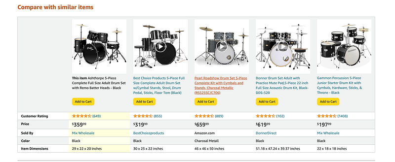
Compare tools only allow for a prescribed set of information to be compared, things like price, color, material, rating, size, fit, etc. Not to mention that if you still want to learn more about each area, you must click on the detail page, read the information, retain it, click back to the compare tool, and repeat for each subsequent product. Talk about user mental load and killing joy. It’s taken the fun parts of shopping and turned them into exhaustive research projects. So, consumers tend to skip this and go right to user-generated review content (UGC) and reviews to help them compare products.
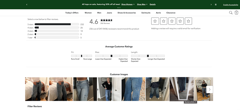
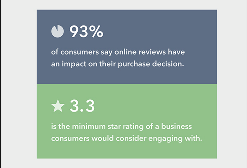
In fact, without reviews, ecomm would be in trouble. Around 93% of consumers rely on reviews to evaluate the products they want to purchase.
So, while a compare tool sounds like a nice idea up front, its value is low. There is already joy in the experience of seeing the product in real life in other people’s photos and reviews. We should be expanding on this more.
While reviews and UGC don’t 100% replicate the in-store experience of touching and trying on a product, they provide a benefit that the in-store experience does not: the ability to see the product in use by others.
This is the value that designing for joy can bring. It takes something that brings delight and innovates on it.
Is designing for joy ethical?
It’s important to note that designing for joy and delight differs from designing for addiction.
Designing something that a user can’t escape from or becomes dependent on is manipulation and unethical. It’s using human emotion against users. Designing for joy has a positive impact but allows the user to reconnect to the natural world again afterward. Users can complete a task efficiently and happily and then move on from it.
Social media plays on overstimulation, emotional ups and downs of feed scrolls, and the manipulation of targeted consumerism between those peaks and valleys. That isn’t joy; that is escape.
Designing for joy is aligning the system with the natural world (Usability Heuristic #2). It’s about creating an environment where people feel productive but still connected to the world around them. It’s about peace and presence.
Stepping back
The Agile development cycle and standard corporate planning structure don’t typically allow for UX Discovery research to be done early enough in the process to impact the types of projects put into plan for the year. This forces UX teams to work on projects that only solve minor problems, focused on pain points or conversion issues. And it’s reactionary.
If UX discovery work was at the forefront, we could take a proactive approach to designing and building things that expand on users' joy and push innovation in a whole new direction.
Beth J is a Global UX Design Lead, solopreneur, life and career coach, and deep feeler. She founded RebelSoul Digital, which helps burnt-out women in tech transfer their skills into purpose-driven entrepreneurship. Follow her on Medium for more articles like this, or subscribe to her weekly newsletter at rebelsouldigital.com.