What Can We Learn From Breaking Down Danny Forest’s Headlines?
Analyzing the analyzer’s 2020 articles

You have probably seen some of Danny’s breakdowns. The orange images with interesting headlines about headlines. He has blessed the writing community with a thorough analysis of writers — Top writers and the everyday writer. No one can hide from Danny Forest.
In his analyses, he tries to capture what makes a headline stand out. Another interesting aspect of a story is the response it gets from the readers. We don’t have much to go by, but we can use claps and responses as metrics for our analysis.
After I did my initial analysis of Danny, I arranged a call so we could talk about my findings. Thankfully, Danny accepted and we had a long chat about what we have found. (Notice the color of his chair)
Time to analyze
I already have an analysis tool that I have used on many writers so all I need is a CSV of Danny’s stories. I normally gather the data from around 100 stories. In Danny’s case, I have 93 articles ranging from April to November 2020.
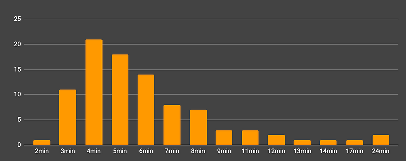
Read time
One of the first metrics we are going to look at is read-time. Read-time is precalculated and shown to you so you know how long it will take you to read a story. As with a lot of top writers, Danny’s read-time is around 3–6 minutes.
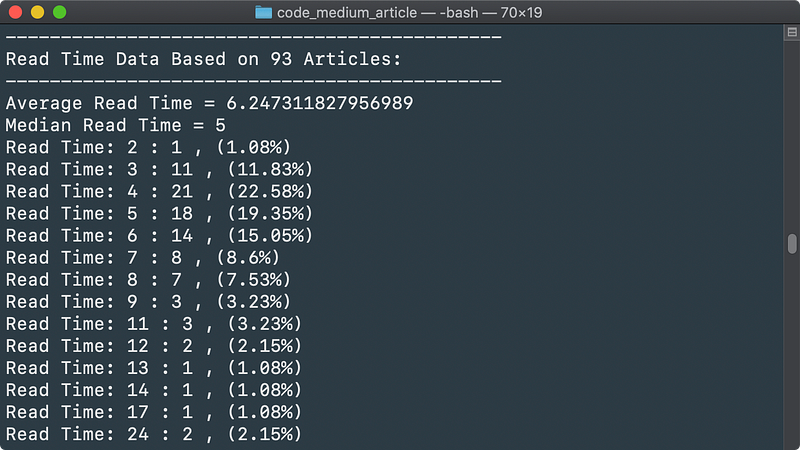
Here is a histogram for a more visual representation
Publish Frequency
When I pulled the data from Danny’s stories, I noticed he had published a lot of stories. Some times multiple stories in a single day. Let’s have a look at the publishing frequency
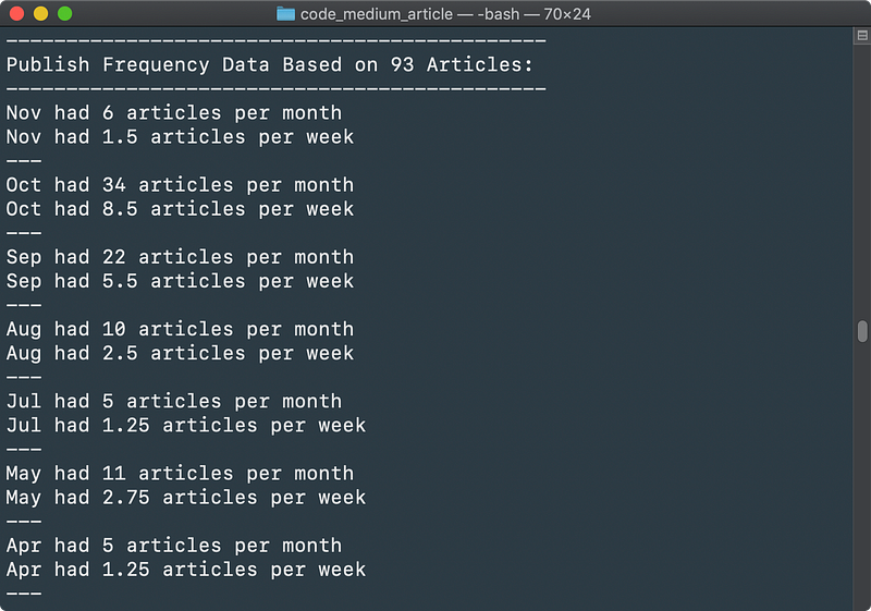
Before the summer of 2020, Danny published between 1 and 3 articles per week. June was radio silent. I assume it is due to Danny becoming a father on June 5th.
From August to November it has been steadily increasing and October had an all-time high of 8.5 articles per week! We are halfway through November, but there is no way he will be able to catch up with the October fest.
Publications
Danny is one of the editors of SkilledUp Ed and he contributes to several other publications. Here is an overview of the publications he works with most of the time.
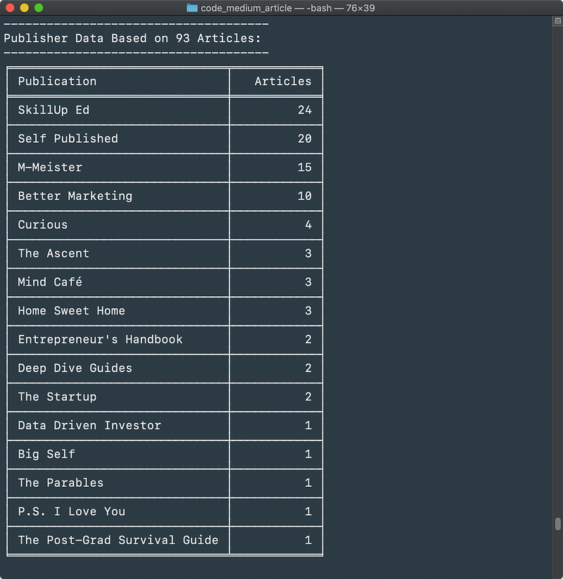
Danny has published a substantial amount of his articles in SkilledUp Ed, where he is one of the editors. He self publishes a lot and M-Meister and Better Marketing are right behind.
Headlines
Now we will move on to Danny’s specialty — Headlines. How do his headlines do in our analysis? We can’t tell how powerful each headline is, but we can see what headlines create the most engagement.
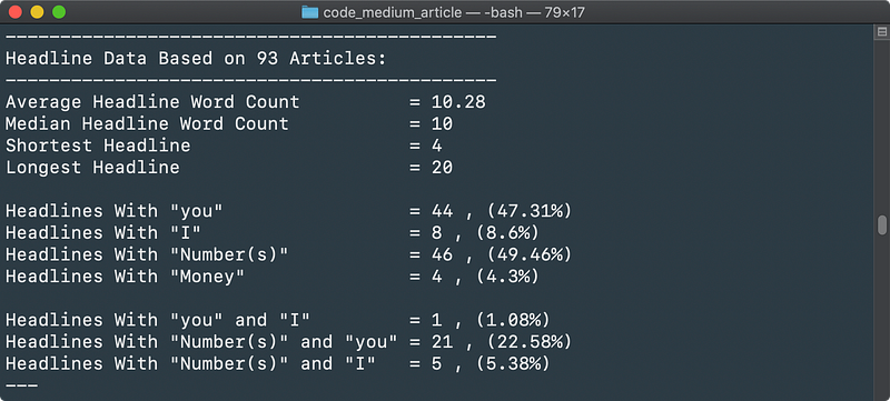
There are some really interesting numbers here. The headline word count varies from 4 to 20. There is no surprise that numbers are a vital part of Danny’s headlines, but I wasn’t expecting close to 50%.
We can see that headlines including the word “You” are heavily represented (47.31%) as well as headlines with numbers (49.46%). In combination — Meaning titles with “You” and number(s) — gathers 22.58% of the articles.
Reader Engagement
When it comes to reader engagement, we don’t have much to base it on. There are claps and there are responses.
This way we can create lists of the stories that got the readers engaged.
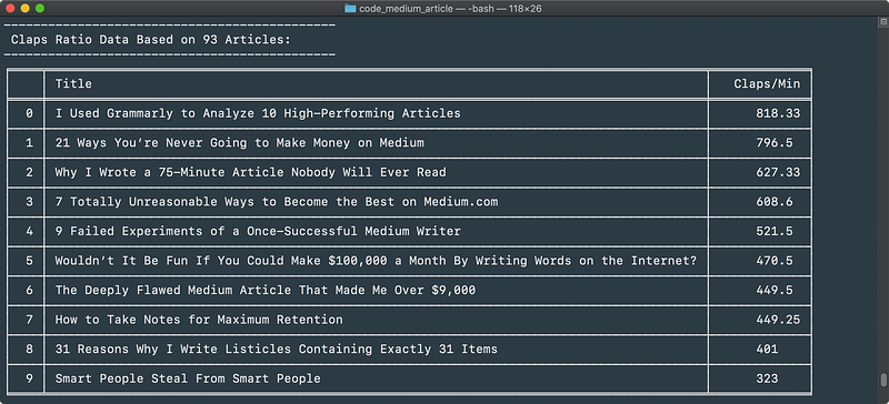
Read/Clap Ratio
Read/Response Ratio
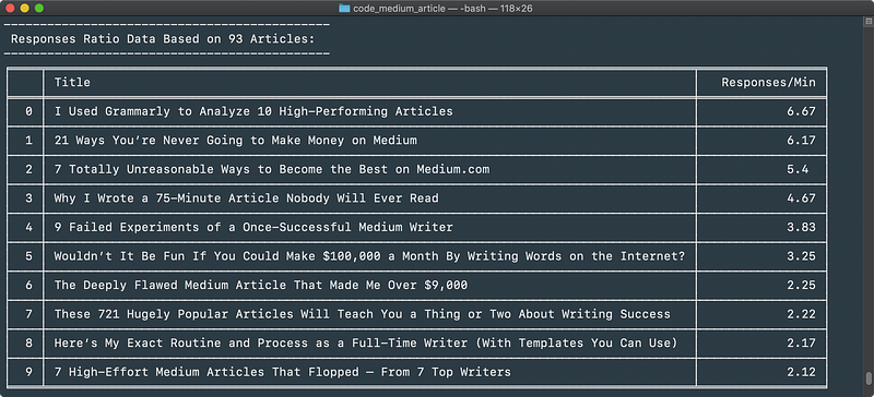
Danny’s Top 10
Let’s get down to business. Are we able to see any patterns for the top 10 stories? Do they all have numbers? Are they all about headlines?
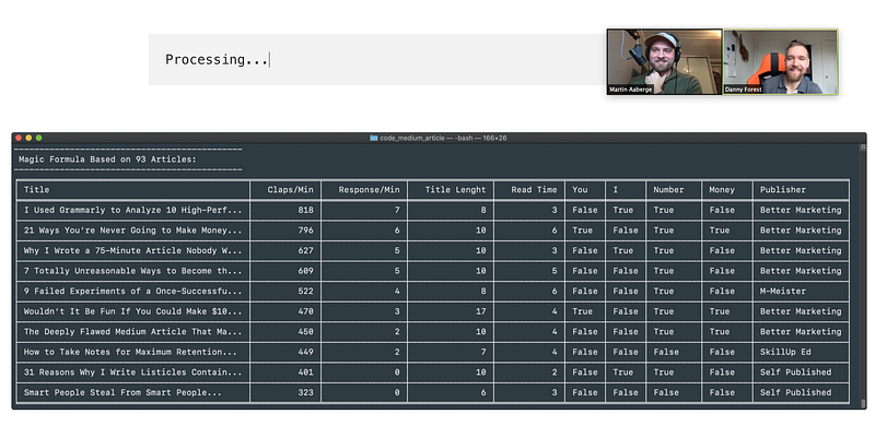
Processing...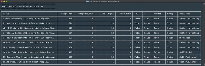
The top-10 list is one of my favorites. It is a very visual representation of what we are working with.
From this top-10 list, we can see that Danny does well when he publishes with Better Marketing. A couple of other interesting features is that the read time is normally very short, ranging from 2 to 6 minutes.
Short articles in Better Marketing seems to be the formula here. These articles must be really well written as well, so don’t make the mistake and think these are just some random jibberish. It’s impressive that Danny can get so much traction on these articles.
When Danny and I looked at this list, he found several of my findings interesting. We also went ahead and sorted them based on earnings. Were there any relations between claps, responses, and earnings? Here is how it sorted by earnings:
It’s very interesting to see how the articles re-arranged when we sorted them based on earnings. There was no relationship between claps/responses and earnings. Most articles in the top 5 went up, while “9 Failed Experiments…” stay still. Danny tells me that the rest of the articles did pretty much equal in regards to earnings.
Images
Danny has made huge efforts in making a brand for himself, so I was expecting this section to be completely orange. Here is a collage of his photos used in his top-10 articles. What is great about Danny’s work the last year is that you instantly recognize his articles. That’s a strong brand.

It is a nice mix. The female/male ratio is 50/50, there are two illustrations and one Grammarly GUI picture.
October was a special month for Danny. He has written several articles about his experiments and how it went. October is also the month he started the orange branding of the images he used. We expected to get a full orange collage by pulling all the images from October, so I did:

Final thoughts
It is always fun to analyze other writers. The analysis I do here is not very deep, because I don’t dive into the articles. It is a quick way to get some numbers on the essence of the articles based on the headline and how well they are perceived.
Now that Danny has written several stories on analyses himself, it was interesting to see where these stories would land in his top 10 list.
I was a bit surprised when I saw the data on the top-10 list. 80% have numbers in them, read time average is 4 (this wasn’t really a surprise as I found myself typing 4 a lot when collecting the data) and 60% of the articles are published in Better Marketing. Not a single article in the top-10 list is about headlines.
Danny’s latest analytics articles haven’t had time to settle. The result might look very different in 6 months.
It was also clear that there is no relationship between claps and responses and earnings. That might be one of the most interesting finds. An article that seemingly did well, might not do well in terms of earnings.
I hope you enjoyed the analysis.
If there are any other writers you wish to see analyzed, let me know and I might find time to set it up.