
Waterfall Charts with Plotly
Why & How

Waterfall Charts
AKA: Flying Bricks Charts, Floating Bricks Charts, Mario Charts
Why: is a 2D plot used to represent the cumulative effects of sequentially added positive or negative values over time or over multiple categorical steps. Over time or time-based waterfall charts represent additions and subtractions over a time period. Categorical steps or category-based waterfall charts represent additions and subtractions over revenues and expenses or any other variable with sequentially positive and negative values.
How: waterfall charts (WCs) are made up of a series of vertical bars (columns). Initial and final values are represented by full columns (usually starting at a zero baseline), while intermediate values are shown as floating columns representing the additions and subtractions. The last vertical bar indicates the outcome of such additions and subtractions. Additions are usually represented in green while subtractions are usually shown in red color. Also, it is customary to indicate the initial and final columns with another color. It is recommended to display the idea of cumulative effects by linking the columns with connecting horizontal lines.
It should be clear now why they are known as Flying Bricks or Floating Bricks charts. Someone named them Mario Charts because of a certain resemblance to the popular video game.
Storytelling: WCs are commonly used in finance and business for data that swings between positive and negative values. Time-based WCs show monthly or yearly total changes while showing profits or losses throughout the month or year. Category-based WCs show the cumulative effects of sequentially added positive or negative values for a given variable. Positive values may be revenues, gains, stock added in warehouses, positive changes, or incoming streams. Negative values may be expenses, losses, stock taken from warehouses, negative changes, or outgoing streams. Always keep in mind that the reading is done sequentially from left to right.
A WC is a valuable data visualization technique because it allows the analyst to clearly determine which periods or items showed the greatest gains, when the greatest losses were observed, and what the net change was over the time period evaluated. It provides more contextual information than other similar charts.
Waterfall Charts with Plotly
We used Plotly, an open source graphing library, which provides a group of classes called graph objects for constructing figures. Figure is a primary class with a data attribute and a layout attribute. The data attribute refers to a trace, a particular type of chart with its corresponding parameters. The layout attribute specifies the title, axes, legends, and other properties of the figure.
For the waterfall chart in this article, the Plotly trace is go.Waterfall() and the corresponding parameters are: x= to set the x coordinates (usually strings or date time objects); y= to set the y coordinates (usually a list con numerical values, including None); base= to set the numerical baseline.
The most important parameter is measure=, an array with one of the following values: relative; absolute; total. relative, the default value, indicates additions or subtractions. absolute sets the initial value while total compute the algebraic sums.
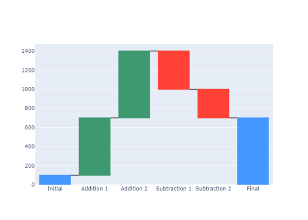
So this is the code for the waterfall chart in Figure 1:
import plotly.graph_objects as gofig1 = go.Figure()hrz = ["Initial", "Addition 1","Addition 2",
"Subtraction 1","Subtraction 2","Final"]vrt = [100, 600, 700, -400, -300, None]fig1.add_trace(go.Waterfall(
x = hrz, y = vrt,
base = 0,
measure = [ "absolute","relative",
"relative","relative",
"relative","total" ]
)) fig1.show()We updated the chart to improve the storytelling: text to set annotations for each bar; textposition to locate the text list inside or outside the bars; update.layout to set the title text and the title font.
This is the code for the waterfall chart in Figure 2:
import plotly.graph_objects as gofig2 = go.Figure()hrz = [ "Initial", "Addition 1", "Addition 2",
"Subtraction 1","Subtraction 2","Final"]vrt = [100, 600, 700, -400, -300, None]text = ['100', '+600', '+700', '-400', '-300', '700']fig2.add_trace(go.Waterfall(
x = hrz, y = vrt,
base = 0,
text = text, textposition = 'inside', measure = ["absolute", "relative", "relative",
"relative","relative","total"]
)) fig2.update_layout(
title_text = "Category-Based Waterfall Chart",
title_font=dict(size=25,family='Verdana',
color='darkred')
)fig2.show()
In our second example, we are going to represent with a time-based waterfall chart the cumulative effects of sequentially increasing and decreasing number of monthly visitors to a fictional place.
First, we are going to create a dataframe with the data we were supposed to collect about the increase and decrease in the number of visitors. We need to import the libraries Numpy & Pandas as np and pd respectively.
import numpy  as np
import pandas as pd
months = ['Initial', 'Jan', 'Feb', 'Mar', 'Apr', 'May', 'Jun',
'Jul', 'Aug', 'Sep', 'Oct', 'Nov', 'Dec', 'Final']visitors = [15000, +18000, +12000, -4000, +8000,
-10000, -5000, +20000, +15000, +18000,
-16000, -18000, +10000, 63000]df = pd.DataFrame({'months' : months, 'visitors' : visitors,
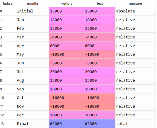
'text' : visitors})We need to create a column in the dataframe that indicates the values associated with measure. Remember that this parameter can take any of the following three values: absolute; relative; total. To fill the column named measure we used the Numpy method np.select() which returns an array drawn from elements in choicelist, depending on a conditions list.
conditionlist = [(df['months'] == 'Initial'),
                 (df['months'] == 'Final'),
            (df['months'] != 'Initial') & (df['months'] != 'Final')]
choicelist = ['absolute', 'total', 'relative']df['measure'] = np.select(conditionlist, choicelist,
default='absolute')The screenshot below shows the fourteen records of the dataset:
Now we are ready to draw the WC.
Plotly allows to customize the colors in the floating bars with increasing, decreasing, and totals.
fig3 = go.Figure()fig3.add_trace(go.Waterfall(
x = df['months'], y = df['visitors'],
measure = df['measure'],
base = 0,
text = df['visitors'],
textposition = 'outside',
decreasing = {"marker":{"color":"crimson",
"line":{"color":"lightsalmon","width":2}}},
increasing = {"marker":{"color":"forestgreen",
"line":{"color":"lightgreen", "width":2}}},
totals = {"marker":{"color":"mediumblue"}}
))We decided to locate the annotations outside the bars to avoid cluttering. Finally we set the title and updated the axes:
fig3.update_layout(
                   title_text = "Time-Based Waterfall Chart",
                   title_font = dict(size=25,family='Verdana',
color='darkred'))fig3.update_yaxes(title = 'Visitors' , range = [0, 100000])
fig3.update_xaxes(title = 'Year 2020')fig3.show()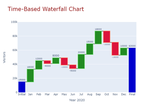
To sum up: the key concept in a Waterfall Chart is to communicate changes in positive and negative values across a time period or across a list of related items. They are very simple to implement, particularly with Plotly. They are widely used in financial analysis and business environments.
If you find this article of interest, please read my previous (https://medium.com/@dar.wtz):
Diverging Bars, Why & How, Storytelling with Divergences
Slope Charts, Why & How, Storytelling with Slopes


