
Want better visualizations? Design for information exploration
Understanding how users seek information.

What makes a good visualization? That’s a question I had to ask myself when one of my early visualizations was heavily critiqued. And it was an answer that I found when reading Alberto Cairo’s The Functional Art: An introduction to information graphics and visualization.
According to him,
“A good graphic has two basic goals: It presents information and then allows users to explore that information.”
That extra step, allowing exploring the information, is crucial in order to promote user understanding. And to understand this viewpoint, let’s revisit the Information-Knowledge gap.
DIKW and the User side gap
Previously, I talked about the DIKW information model (Data, Information, Knowledge, and Wisdom) and how structuring data efficiently can only get you so far.
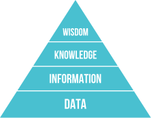
To jump from Information to Knowledge requires an understanding of how your user understands or finds patterns in the data.
But understanding how data goes from the designer to the user wasn’t something that I fully understood until I was presented with another model about how designers and users use visualizations.
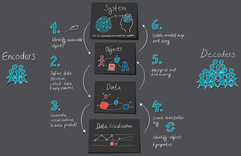
Simply put, visualizations are a cycle of encoding and decoding.
Designers encode, users decode
Designers, when they create visualizations, are often condensing a great deal of data into a single image. And the best analogy that I’ve seen for a similar process is with QR codes.

If you’re unaware of what QR codes are, they are essentially data encoded into a matrix barcode which, when scanned, allows the data to be decoded and often points to a website or a location.
Designers go through a very similar process of encoding and decoding, with one specific difference:
Unlike a fancy phone with standardized specifications, we’re relying on our diverse audience to decode the data in their minds.
If it successfully decodes, it can yield insights, understanding, and even knowledge.
But it if doesn’t? Then it’s just information.
So if that’s the case, how do we design visualizations that can be easily decoded?
By following Shneiderman’s mantra.
Ben Shneiderman’s information-seeking mantra
Dr. Ben Shneiderman is a professor at the University of Maryland with a focus on both Human-Centered Design and Information Visualization. This experience allowed him to come up with a mantra which helps to create effective visualizations: Overview first, Zoom and Filter, then Details-on-demand.
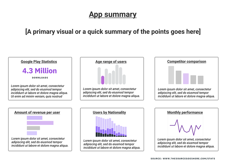
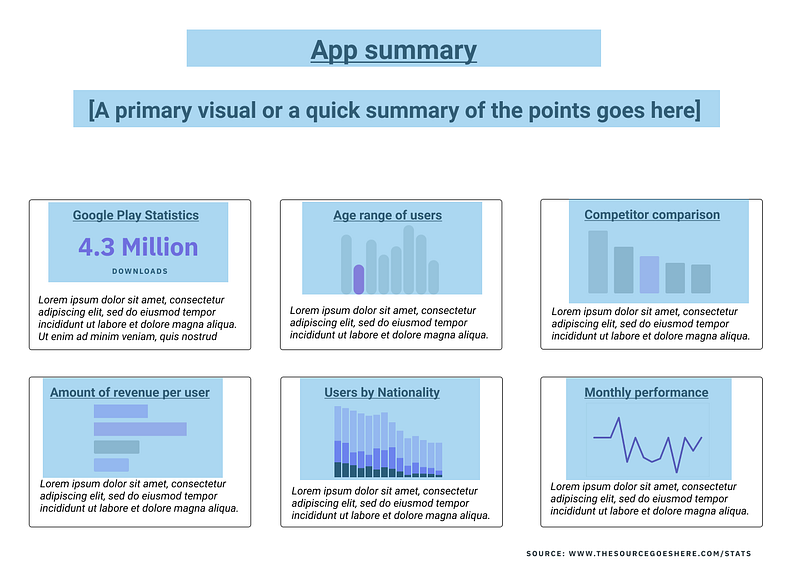
What does he mean by this? Well, let’s take his steps with an example chart.
Overview: Scanning for a story
Users will first scan over your document to try and glean a basic story out of it.
At this point, their attention is drawn to the visual aspects such as charts while not really paying attention to any of the minor details.
As a result, a significant amount of time should be spent on polishing and fine-tuning the overview in whatever form it takes.
Given that this is how the user is first encountering your information, you want to show them that this visualization may have what they’re looking for.
After all, if the information exists but is buried in the details, what’s the likelihood that they’ll read all of the ways down to find this out?
For this part, you should avoid presenting too much data: instead, things such as charts, visualizations, or maps can be used to reinforce the story and reduce data clutter.
Once you’ve shown them that this visualization likely has the information they need, then comes the next step.
Zoom and Filter:
At this point, users will want to start to focus on specific sections in greater detail.
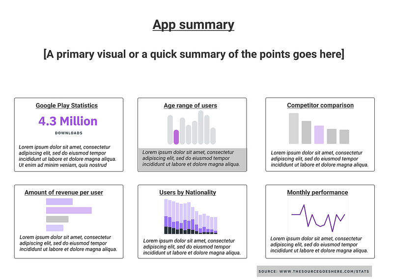
The easiest (and strongest) way to do that is to make sure that the information is well-grouped for focusing.
If the medium is interactive (like dashboards), then this is where things like panning, scrolling, zooming, and using filters can come into play.
But if not, then you want to make sure that a specific section contains all relevant information so they don’t have to scan the entire document for other bits.
There’s one other bit that you will need to keep in mind, but I’ll discuss that below.
Details-on-Demand:
After this comes the bulk of the information if there is space. At this point, the user has narrowed down past the overview, chosen a specific area of interest, but at this point perhaps they haven’t gotten the details that they’re looking for.
At this point, then the user is willing to deal with a significant amount of information. But even so, it’s already been filtered to their specific area of interest, which means that the information will not overwhelm them.
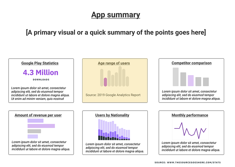
This is very easy to do with interactive mediums, but for non-interactive mediums, at the very least you should be prepared to show where this data comes from.
What if you don’t have enough space?
Users may seek this information in this manner, but that doesn’t always mean that you have space to include everything.
But by understanding the way that people search for information, you can add one extra thing to your infographic: a hook.
What I mean by this is that a good graphic entices the user to explore the information, which can often stretch beyond the visualization that you’re presenting.
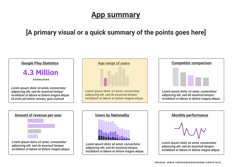
So if you don’t have enough space to include everything about the Age range of users, you can point them in the direction to learn more by including sources, having additional slides (in a presentation), or providing other references.
By structuring the information in this way, you allow the user to easily seek out the information they want, even if they have to explore other sources.
Exploring to learn
Often times, a good visualization goes beyond what is shown on the medium.
A good visualization can serve as a summary, but it’s almost certain that some audience members will want more details than provided.
And for others, exploration of that information beyond the visualization is what can help them turn structured information into actual knowledge.
So by making sure that your information is not only arranged well but also promotes exploration, you can start to create better visualizations.
I write about UX, Healthcare, and Productivity regularly. If you would like to learn more about UX, I’ve created courses about Design Communication and UX Research on a budget.


