
Visualizing Time Series Data in Python: A Comprehensive Guide with Code Examples
Time series data, characterized by observations over a sequence of time intervals, is prevalent in various domains such as finance, economics, and environmental sciences. Python, with its powerful libraries like Pandas and Matplotlib, equips data analysts and scientists with tools to effectively handle, analyze, and visualize time series data.

In this article, we’ll dive into the world of time series data handling, exploring essential techniques and providing hands-on code examples.
1. Basic Time Series Line Chart
import pandas as pd

# Sample time series data
dates = pd.date_range('2023-01-01', periods=5)
values = [10, 20, 15, 30, 25]

# Create a line chart with time series data
plt.plot(dates, values, marker='o', linestyle='-', color='purple', label='Time Series')
plt.xlabel('Date')
plt.ylabel('Value')
plt.title('Time Series Line Chart')
plt.legend()
plt.grid(True)
plt.show()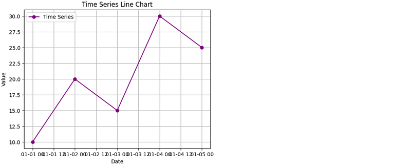
2. Multiple Time Series Lines
# Sample data for multiple time series
values1 = [12, 18, 14, 25, 20]
values2 = [8, 15, 10, 22, 18]

# Creating a line chart with multiple time series
plt.plot(dates, values1, marker='o', linestyle='-', color='green', label='Series 1')
plt.plot(dates, values2, marker='s', linestyle='--', color='orange', label='Series 2')
plt.xlabel('Date')
plt.ylabel('Value')
plt.title('Multiple Time Series Lines')
plt.legend()
plt.grid(True)
plt.show()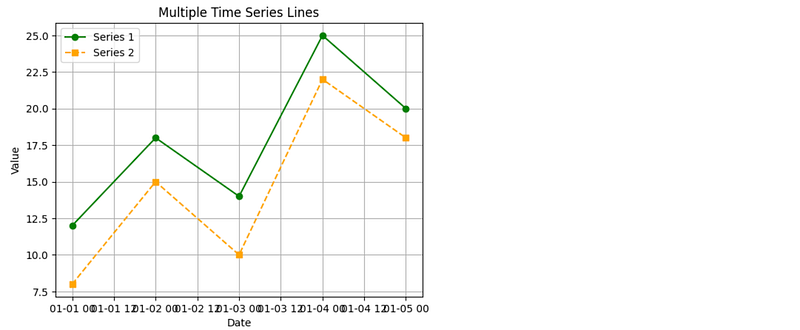
3. Customizing Time Axis Labels
# Creating a time series line chart with customized time axis labels
plt.plot(dates, values, marker='o', linestyle='-', color='purple', label='Time Series')
plt.xlabel('Date')
plt.ylabel('Value')
plt.title('Time Series Line Chart with Customized Time Axis Labels')
plt.xticks(rotation=45)
plt.legend()
plt.grid(True)
plt.show()
4. Adding Data Points and Annotations
# Creating a time series line chart with data points and annotations
plt.plot(dates, values, marker='o', linestyle='-', color='red', label='Time Series Data')
for date, value in zip(dates, values):
    plt.annotate(f'{value}', (date, value), textcoords="offset points", xytext=(0,10), ha='center')
plt.xlabel('Date')
plt.ylabel('Value')
plt.title('Time Series Line Chart with Data Points and Annotations')
plt.xticks(rotation=45)
plt.legend()
plt.grid(True)
plt.show()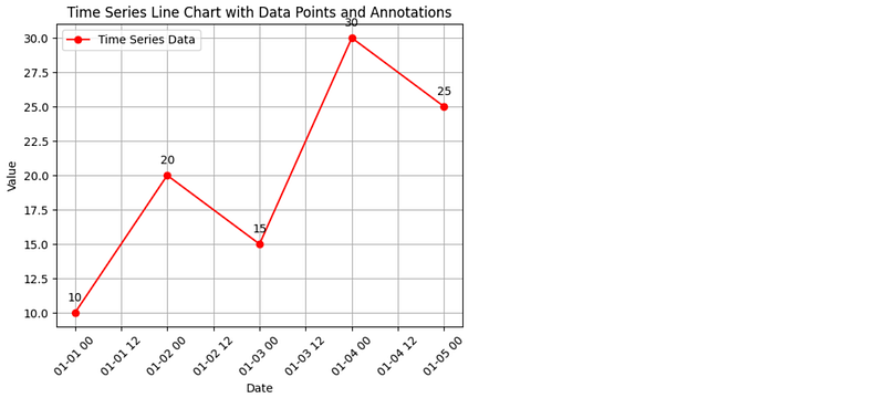
Conclusion
Effectively handling time series data is essential for extracting insights and making informed decisions. With Python, you have a robust toolkit at your disposal. From loading and preparing data to visualization and handling missing values, this article has provided a comprehensive overview of time series data handling techniques.
Python Fundamentals
Thank you for your time and interest! 🚀 You can find even more content at Python Fundamentals 💫
In Plain English
Thank you for being a part of our community! Before you go:
- Be sure to clap and follow the writer! 👏
- You can find even more content at PlainEnglish.io 🚀
- Sign up for our free weekly newsletter. 🗞️
- Follow us: Twitter(X), LinkedIn, YouTube, Discord.
- Check out our other platforms: Stackademic, CoFeed, Venture.


