
Python Science Plotting
Visualizing Three-Dimensional Data with Python — Heatmaps, Contours, and 3D Plots
Plotting heatmaps, contour plots, and 3D plots with Python

When you are measuring the dependence of a property on multiple independent variables, you now need to plot data in three dimensions. Examples of this typically occur with spatial measurements, where there is an intensity associated with each (x, y) point, like in a rastered microscopy measurement or spatial diffraction pattern. To visualize this data, we have a few options at our disposal — we will explore creating heatmaps, contour plots (unfilled and filled), and a 3D plot.
The dataset I will use for this example is a 2 µm x 2 µm micrograph from an atomic force microscope (AFM). First, we import packages — the two new packages we are adding this time are make_axes_locatable, which will help us with managing the colorbar for our plots, and Axes3D, which we need for our 3D plot:
# Import packages
%matplotlib inline
import matplotlib as mpl
import matplotlib.pyplot as plt
from mpl_toolkits.axes_grid1.axes_divider import make_axes_locatable
from mpl_toolkits.mplot3d import Axes3D
import numpy as np
We will now load our AFM data, again using numpy.loadtxt which will directly load our data into a 2D numpy array.
# Import AFM data
afm_data = np.loadtxt('./afm.txt')
We can then inspect a few rows our loaded data:
# Print some of the AFM data
print(afm_data[0:5])
>>> [[4.8379e-08 4.7485e-08 4.6752e-08 ... 6.0293e-08 5.7804e-08 5.4779e-08]
[5.0034e-08 4.9139e-08 4.7975e-08 ... 5.7221e-08 5.4744e-08 5.1316e-08]
[5.2966e-08 5.2099e-08 5.1076e-08 ... 5.4061e-08 5.0873e-08 4.7128e-08]
[5.7146e-08 5.6070e-08 5.4871e-08 ... 5.1104e-08 4.6898e-08 4.1961e-08]
[6.2167e-08 6.0804e-08 5.9588e-08 ... 4.7038e-08 4.2115e-08 3.7258e-08]]We have a 256 x 256 array of points with each value corresponding to the measured height (in meters) at that position. Since we know that our data would be more meaningful if presented in nanometers, we can scale all our values by this constant parameter:
# Convert data to nanometers (nm)
afm_data *= (10**9)
Now we can go ahead and start visualizing our data. We start with setting some global parameters (edit these as you like, but these are settings I use):
# Edit overall plot parameters# Font parameters
mpl.rcParams['font.family'] = 'Avenir'
mpl.rcParams['font.size'] = 18# Edit axes parameters
mpl.rcParams['axes.linewidth'] = 2# Tick properties
mpl.rcParams['xtick.major.size'] = 10
mpl.rcParams['xtick.major.width'] = 2
mpl.rcParams['xtick.direction'] = 'out'
mpl.rcParams['ytick.major.size'] = 10
mpl.rcParams['ytick.major.width'] = 2
mpl.rcParams['ytick.direction'] = 'out'Heatmap
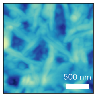
For the heatmap visualization, we will use the imshow function to display our data as an image. First, we create a figure and add a main axis to show our image. Additionally, we will remove tick marks since we will be adding a scale bar.
# Create figure and add axis
fig = plt.figure(figsize=(4,4))
ax = fig.add_subplot(111)
# Remove x and y ticks
ax.xaxis.set_tick_params(size=0)
ax.yaxis.set_tick_params(size=0)
ax.set_xticks([])
ax.set_yticks([])Now we display our image with the following command:
# Show AFM image
img = ax.imshow(afm_data, origin='lower', cmap='YlGnBu_r', extent=(0, 2, 0, 2), vmin=0, vmax=200)
origin — images are typically shown with their origin as the top left corner, so by using origin='lower' we force the origin to be a the bottom left
cmap — the colormap for our image. All available matplotlib colormaps can be found here, and adding _r to any colormap name will reverse it.
extent — imshow will plot our image using pixels unless we tell it what range these pixels correspond to. In this case, we know that our image is 2 µm x 2 µm, so we make our extent=(x_min, x_max, y_min, y_max) equal to (0, 2, 0, 2)
vmin — the value to set to the minimum of our colormap
vmax — the value to set to the maximum of our colormap

Now, we should add our scale bar, so anyone looking at the plot has an idea of the size scale. We will generate the bar using plt.fill_between to create a filled rectangle, and then add a text label on top.
# Create scale bar
ax.fill_between(x=[1.4, 1.9], y1=[0.1, 0.1], y2=[0.2, 0.2], color='white')
x — the x-range of our filled shape (since our image goes from [0, 2] the range specified [1.4, 1.9] is 0.5 µm or 500 nm)
y1 — the bottom y-value (corresponding to values of x) of our filled shape
y2 — the top y-value (corresponding to values of x) of our filled shape
ax.text(x=1.65, y=0.25, s='500 nm', va='bottom', ha='center', color='white', size=20)x — x-position of text
y — y-position of text
s — text string
va — vertical alignment ( bottom means that y corresponds to the bottom of the text)
ha — horizontal alignment ( center means that x corresponds to the center of the text)
Finally, we can add a colorbar to show how colors in our image correspond to height values. First, we create a new axis object for the colorbar, which we do by appending a new axis to the right of our original axis using the make_axes_locatable().append_axes function. We pass our original axes object ax to the function:
# Create axis for colorbar
cbar_ax = make_axes_locatable(ax).append_axes(position='right', size='5%', pad=0.1)
position — where to append next axes, in this case to the right of the original image
size — the size of the new axes along the position direction, relative to the original axes (5% of the image width)
pad — the padding (in absolute coordinates) between the two axes
Now, we turn this new axis object into a colorbar:
# Create colorbar
cbar = fig.colorbar(mappable=img, cax=cbar_ax)
mappable — the image/plot to map to the colorbar (we created img when we used imshow earlier)
cax — the axis to use for the colorbar
Finally, we adjust the tick marks and labels for the colorbar:
# Edit colorbar ticks and labels
cbar.set_ticks([0, 50, 100, 150, 200])
cbar.set_ticklabels(['0', '50', '100', '150', '200 nm'])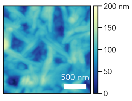
Contour Plots
Just like in a topographical map found at most hiking trails, we can also present three-dimensional data with contour lines of constant intensity. We will now plot the same AFM data using a contour plot.
We use the same code as before, with the following line changed (I have added zorder=1 to ensure that the contour plot is below the scale bar as lower z-order numbers are drawn first):
# Show AFM contour plot
ax.contour(afm_data, extent=(0, 2, 0, 2), cmap='YlGnBu_r', vmin=0, vmax=200, zorder=1)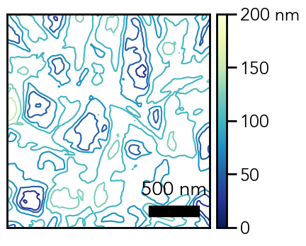
If we use contourf instead of contour, we can create filled contours instead of just contour lines:
# Show AFM filled contour plot
ax.contourf(afm_data, extent=(0, 2, 0, 2), cmap='YlGnBu_r', vmin=0, vmax=200)
In this case, a lot of the finer details from imshow are not well captured in contour or contourf. If you have fairly smooth data without a lot of smaller details, the contour images may look better than the heatmap. Ultimately, you want to present your data in as transparent and straightforward a manner as possible, so in this case, the heatmap with colorbar is probably best.
3D Plot
Up to this point, we have limited our plots to two-dimensions and used the color scale to let the reader infer the intensity. If we wanted to give a better sense of these intensity values, we can actually plot our data in 3D.
We start by creating a 3D axis with the following code, the key here is that we are using projection=’3d' when we generate our axis object:
# Create figure and add axis
fig = plt.figure(figsize=(8,6))
ax = plt.subplot(111, projection='3d')
The gray panes and axis grids add clutter to our plot, so let’s remove them. Additionally, I am going to add the colorbar again for height — the z-axis will get very compressed because of the perspective view, so I will remove it.
# Remove gray panes and axis grid
ax.xaxis.pane.fill = False
ax.xaxis.pane.set_edgecolor('white')
ax.yaxis.pane.fill = False
ax.yaxis.pane.set_edgecolor('white')
ax.zaxis.pane.fill = False
ax.zaxis.pane.set_edgecolor('white')
ax.grid(False)
# Remove z-axis
ax.w_zaxis.line.set_lw(0.)
ax.set_zticks([])
For the surface plot, we need 2D arrays of x and y values to correspond to the intensity values. We do this by creating a mesh-grid with np.meshgrid — our inputs to this function are an array of x-values and y-values to repeat in the grid, which we will generate using np.linspace.
# Create meshgrid
X, Y = np.meshgrid(np.linspace(0, 2, len(afm_data)), np.linspace(0, 2, len(afm_data)))
Now that we have our meshgrid, we can plot our 3D data:
# Plot surface
plot = ax.plot_surface(X=X, Y=Y, Z=afm_data, cmap='YlGnBu_r', vmin=0, vmax=200)
X — grid of x-values
Y — grid of y-values
Z — grid of z-values

Now, we can adjust the view of plot — there are three parameters that we control for this: elevation, azimuthal angle (in the x-y plane), and distance from the axes, which roughly correspond to the spherical coordinate system values of φ, θ, and r, respectively. I am setting the azimuthal angle to 225˚ because we want the x and y axes to meet at (0, 0).
# Adjust plot view
ax.view_init(elev=50, azim=225)
ax.dist=11
Add the colorbar:
# Add colorbar
cbar = fig.colorbar(plot, ax=ax, shrink=0.6)
cbar.set_ticks([0, 50, 100, 150, 200])
cbar.set_ticklabels(['0', '50', '100', '150', '200 nm'])
shrink — how much to shrink the colorbar relative to its default size
Finally, we edit some of the aesthetics — the tick marks on the x and y-axes, axis limits, and the axis labels.
# Set tick marks
ax.xaxis.set_major_locator(mpl.ticker.MultipleLocator(0.5))
ax.yaxis.set_major_locator(mpl.ticker.MultipleLocator(0.5))
# Set axis labels
ax.set_xlabel(r'$\mathregular{\mu}$m', labelpad=20)
ax.set_ylabel(r'$\mathregular{\mu}$m', labelpad=20)# Set z-limit
ax.set_zlim(50, 200)
This plot lets the reader actually see the height fluctuations in addition to using color for intensity values. However, a noisier dataset could lead to a very messy 3D plot.
Conclusion
I hope this tutorial was helpful is addressing different methods to plot three-dimensional datasets. Examples are available at this Github repository. Thanks for reading!


