
Visualizing SVM with RBF Kernel: Unveiling the Impact of C and Gamma
Hyperparameter Playground: Interactive Visualization with Streamlit
The Support Vector Machine (SVM) is a powerful tool for classification tasks. It’s known for its versatility, especially when combined with a Radial Basis Function (RBF) kernel. Understanding how SVM with an RBF kernel works is crucial for making informed decisions about its hyperparameters, specifically the regularization parameter C and the kernel coefficient (gamma). Visualization is a fantastic way to grasp the inner workings of this model and the effect of these hyperparameters.
SVM: A Brief Overview
Before diving into visualization, let’s quickly recap what SVM is. It’s a supervised learning algorithm used for classification and regression tasks. SVM identifies the best hyperplane that separates different classes in the input data. In cases where the data isn’t linearly separable, the RBF kernel comes to the rescue.
The RBF Kernel: A Non-linear Transformer
Before delving into the captivating world of SVM decision functions, let’s recap the RBF kernel’s essence. The RBF kernel, also known as the Gaussian kernel, is one of the most widely used kernels in SVM classification. It leverages the concept of similarity to transform data into a higher-dimensional space, making it more amenable to linear separation.
The beauty of the RBF kernel lies in its ability to capture non-linear decision boundaries with finesse. It achieves this by assigning higher similarity scores to data points that are closer to each other in the transformed space. The kernel function elegantly reflects the intuitive notion that points that are close to each other should have higher influence on the decision boundary.
Using Streamlit for Visualization
Streamlit is an excellent tool for creating interactive data visualizations and exploring SVM with RBF kernels. With Streamlit, you can build interactive apps to observe how changes in C and gamma affect the decision boundary and the overall performance of the SVM model.
By changing these hyperparameters interactively, you can immediately see how the decision boundary adapts, providing valuable insights into the model’s behavior.
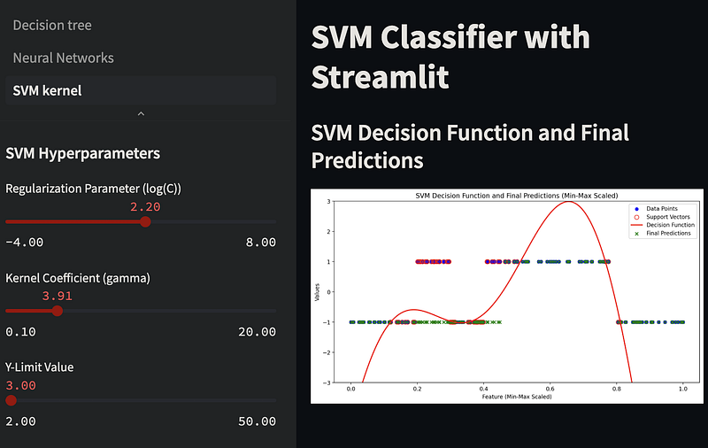
In the provided Streamlit app, the gamma parameter is a slider in the left sidebar. You can adjust this slider to interactively change the gamma value and observe its effect on the SVM decision boundary in the right-side plot. Experimenting with different gamma values can help you understand how it impacts the SVM model's behavior and performance.
We also added a slider for the logarithm of C (log_C) in a specified range, and then we exponentiate that value to obtain the actual C value for the SVM model. This allows you to set C on an exponential scale. Adjust the range and step size for log_C as needed to suit your requirements.
Python code explained
Let’s start with the basics. We import essential libraries for numerical operations, data visualization, and machine learning. numpy is our trusty companion for numerical operations, while matplotlib allows us to create visually appealing plots. We're using the SVC class from the scikit-learn library for SVM, and MinMaxScaler for scaling our data.
import numpy as np
import matplotlib.pyplot as plt
from sklearn.svm import SVC
from sklearn.preprocessing import MinMaxScaler
Generating Data
In any machine learning task, data is the starting point. We’re creating a synthetic dataset for this example. The X array represents our data points. We've generated data points in different ranges to mimic a real-world scenario. The y array contains corresponding labels, with 1 representing one class and -1 representing the other.
X = np.sort(np.concatenate([np.random.uniform(1, 3, 30),
                            np.random.uniform(3, 4, 20),
                            np.random.uniform(4, 5, 30),
                            np.random.uniform(5, 9, 40),
                            np.random.uniform(9, 11, 30)]).reshape(-1, 1), axis=0)

y = np.concatenate([-np.ones(30), np.ones(20), -np.ones(30), np.ones(40), -np.ones(30)]).astype(int)
Data Scaling
In practice, it’s often a good idea to scale the data to a common range. We use the MinMaxScaler to scale our data within the range of 0 to 1. Scaling helps algorithms perform better, especially SVMs.
scaler = MinMaxScaler()
X_scaled = scaler.fit_transform(X)
Creating and Training the SVM Model
The heart of this code lies in the SVM model creation and training. We create an SVM model with an RBF kernel, specifying other parameters such as regularization strength © and gamma. Then, we train the model with our scaled data.
svm_model = SVC(kernel='rbf', C=100.0, gamma='scale', probability=True, random_state=42)
svm_model.fit(X_scaled, y)
Generating Predictions and Decision Function
To truly comprehend the SVM’s classification and probability prediction, we define a range of X values. We leverage the predict_proba method to obtain probability estimates for class 1. Simultaneously, we calculate decision values using the decision_function method, offering insights into how the SVM model assigns scores to data points.
plot_x_scaled = np.linspace(X_scaled.min(), X_scaled.max(), 1000).reshape(-1, 1)
probability_predictions_class_1 = svm_model.predict_proba(plot_x_scaled)[:, 1]
decision_values = svm_model.decision_function(X_scaled)
Data Visualization
With the data and predictions ready, we proceed to visualize the results. We start by plotting the training data points using scatter. Each point is color-coded according to its class. Then, we plot the probability predictions for class 1, creating a visual representation of how the model assigns probabilities to different data points.
plt.scatter(X_scaled, (y + 1) // 2, c=y, cmap=plt.cm.Paired, edgecolors='k', marker='o', label='Training Data')
plt.plot(plot_x_scaled, probability_predictions_class_1, label='Probability for Class 1', color='blue')
Labeling and Display
To make the plot informative, we add labels to the axes, a title, and a legend. These elements make the plot more comprehensible to anyone viewing it.
plt.xlabel('X (Scaled)')
plt.ylabel('Probability for Class 1')
plt.title('SVM Probability Predictions for Class 1 with Training Data')
plt.legend()
Displaying the Plot
Finally, we use plt.show() to display the plot. This visual representation helps us understand how SVM with RBF assigns probabilities to different data points, making it a valuable tool in machine learning analysis.
And that’s how you explore SVM probability predictions in Python! This code demonstrates the steps from data generation to data visualization, giving you insights into the SVM’s inner workings.
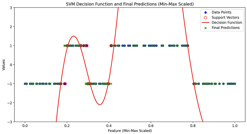
Visualizing the Decision Function
Visualizing the Decision Function
Before we delve into the elegance of visualizing the SVM decision function, let’s clarify what it represents. The decision function is the raw output of the SVM classifier. It provides the signed distance of data points from the decision boundary, which helps the model decide which class each data point belongs to. It is this raw output that will eventually be transformed into probability predictions through a sigmoid function or similar methods.
Visualizing the decision function is crucial for understanding how the SVM model makes decisions. It offers a window into the model’s decision-making process and reveals the confidence it has in its classifications. The decision function is a direct reflection of the structure of the feature space and how the model assigns scores to different data points. Let’s explore why visualizing it is so interesting.
Visualizing the decision function is where the fascination intensifies. With the power of modern data visualization libraries and tools, we can take a peek into the heart of SVM with RBF. These visualizations reveal the beauty and intricacy of the decision function, which often remains hidden in the mathematical equations.
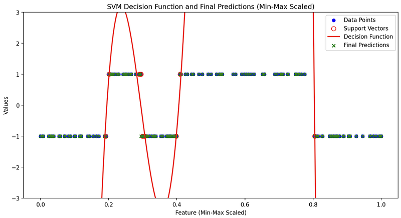
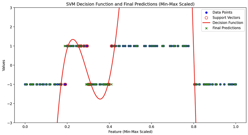
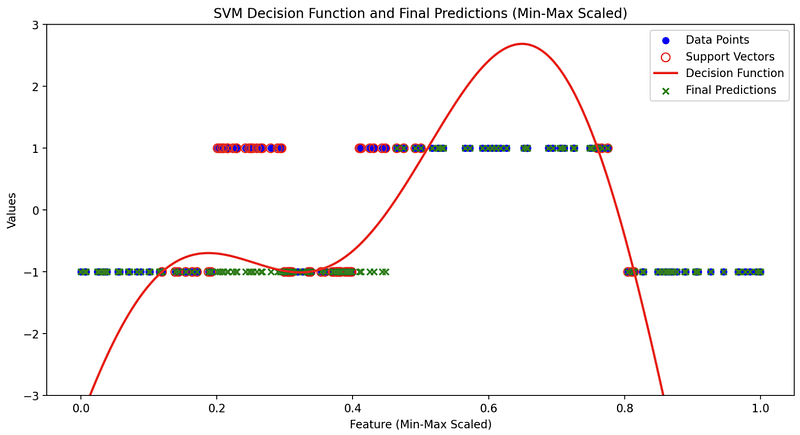
In the final plot, which encapsulates the essence of SVM with RBF, you will typically see four key elements:
- Training Dataset: The original data points from your training set are plotted, serving as the canvas upon which the SVM model works its magic.
- Support Vectors: Support vectors, the data points that play a pivotal role in defining the decision boundary, are often highlighted. They are the anchor points holding the decision function in place.
- Decision Function: The raw decision values are depicted, showcasing the model’s confidence in classifying different data points. It is here that you can truly appreciate the model’s mastery of complex decision boundaries.
As you gaze upon the visual representation of the SVM’s decision function with RBF, you’ll be mesmerized by its ability to capture the nuances of your data. The intricate curves and contours that emerge on your plot are a testament to the kernel’s power to adapt and separate data with remarkable precision.
This visualization showcases the kernel’s power to learn and map complex data distributions in a highly interpretable manner. It helps you appreciate the subtlety of the RBF SVM’s decision-making process, unveiling the elegance of non-linear classification.
Unveiling the Impact of C and Gamma
Now, let’s see how visualization helps us understand the influence of C and gamma on SVM with an RBF kernel.
The Role of C: Regularization Parameter
The regularization parameter, often denoted as C, influences the trade-off between maximizing the margin and minimizing classification errors.
Here’s what C represents and how it influences the SVM:
- Regularization Strength:
Cis a positive scalar value that determines the regularization strength. A smallerCleads to a softer margin, allowing some misclassifications to find a wider decision boundary, potentially increasing training error but reducing overfitting. A largerCenforces a harder margin by penalizing misclassifications more severely, which can reduce training error but may lead to overfitting. - Balance Between Margin and Misclassification:
Cinfluences the trade-off between achieving a wide margin and minimizing the misclassification of training examples. SmallerCvalues allow for a larger margin but may tolerate more misclassified points. LargerCvalues aim for a smaller margin with fewer misclassifications.
A small C results in a larger margin but allows some misclassification, whereas a large C leads to a smaller margin with stricter adherence to the training data.
- Large C: When C is substantial, SVM tries to fit the training data perfectly. This often results in a smaller margin and could lead to overfitting. Visualization helps us see how the decision boundary closely wraps around individual data points.
- Small C: A smaller C encourages a larger margin but might allow some misclassification. By visualizing, we can see how the decision boundary respects the margin even if it means misclassifying a few points.
The Impact of Gamma
The gamma coefficient is a parameter used in the radial basis function (RBF) kernel of a Support Vector Machine (SVM). It controls the shape of the decision boundary, and it essentially defines how far the influence of a single training example reaches.
A smaller gamma value makes the decision boundary smoother and can lead to underfitting, as it considers a wider range of points when making predictions. Conversely, a larger gamma value makes the decision boundary more complex, fitting the training data more closely and potentially leading to overfitting.
- Large Gamma: A large gamma results in a more complex, tightly fitted decision boundary that might be sensitive to individual data points. Visualization reveals how the decision boundary closely follows the training data, capturing fine details.
- Small Gamma: Smaller gamma values lead to a smoother decision boundary. Visualization showcases how the boundary is less influenced by individual data points and provides a more generalizable solution.
Conclusion
Visualizing SVM with an RBF kernel is an invaluable technique for understanding the impact of hyperparameters like C and gamma. It allows you to observe the trade-offs between model complexity and generalization, empowering you to make informed decisions in real-world machine learning scenarios. Streamlit, with its interactive capabilities, makes this process even more accessible, enabling you to experiment with different hyperparameter values and gain a deeper understanding of SVM’s behavior. So, don’t hesitate to explore and visualize — it’s a path to becoming a more proficient machine learning practitioner.
In Plain English
Thank you for being a part of our community! Before you go:
- Be sure to clap and follow the writer! 👏
- You can find even more content at PlainEnglish.io 🚀
- Sign up for our free weekly newsletter. 🗞️
- Follow us: Twitter(X), LinkedIn, YouTube, Discord.
- Check out our other platforms: Stackademic, CoFeed, Venture.


