
Hands-on Tutorials
Visualizing Satellite Data Using Matplotlib and Cartopy
Explore our changing climate using Python and passive microwave data
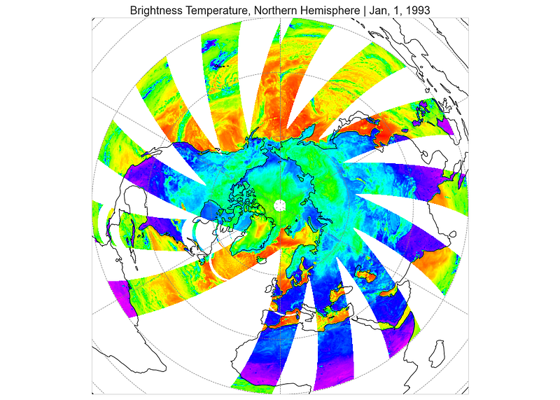
I recently wrote a post about how we can study snowpack using passive microwave imagery obtained from satellites. Using satellites to study snowpack unlocks information about regions that would be otherwise impossible to study, especially at large scales. On top of great coverage, the sun-synchronous satellites that carry passive microwave sensors take images of the poles at similar times every day. These consistent measurements make for incredible daily time series that date all the way back to 1978 with the launch of the Nimbus 7 satellite. The Nimbus program was the first NASA and NOAA collaboration to launch satellites specifically for meteorological research, and over 40 years later we are still benefiting from early investment in studying our climate.
In this post, we will walk through various ways to visualize satellite imagery with Matplotlib and Cartopy. These two libraries are my favorite tools when making maps for presentations; and while web mapping is all the rage, oftentimes we need a quality visualization that is not hosted online.
We will start with quick and informative image plots with Matplotlib and then dive into plotting geographic coordinates with Matplotlib using Cartopy. Finally, we will wrap up by discussing how to animate images and maps made with Matplotlib to show change over time. So sit back, relax, and let’s learn about using Matplotlib to visualize snowpack in Alaska.
The Data
Background
We will be working with the MEaSUREs Calibrated Enhanced-Resolution passive Microwave Dataset, which is part of the NASA Making Earth System Data Records for Use in Research Environments (MEaSUREs) program. This dataset is special because it has been resampled to a much higher resolution than originally captured by the sensors; the original pixels were 25km wide, but the new data has 6.25km wide pixels. This means we now have 16 pixels where we originally had one.
The radiation that is measured by these passive microwave sensors is very low energy, which forces us to measure it over wide areas to get a good reading. While 6.25km is still a wide pixel compared to other kinds of satellite imagery, it allows us to study snowpack with considerably more detail than before.
One of the main parameters measured by passive microwave radiometers is brightness temperature (TB), which is a measure of the radiance of the radiation moving towards the sensor on the satellite. We measure TB at different frequencies, indicated by gigahertz (GHz). For snow analysis, we focus on the 37GHz and 19GHz frequencies. When there is no snow on the ground, both frequencies are similar, but as snow accumulates on the ground there is far more scattering of the 37GHz frequency. This difference allows us to find a proxy variable for snow water equivalence (SWE), which is the amount of water stored in a body of snow.
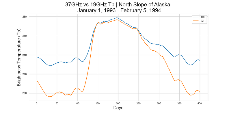
In this plot, you can see how the 19GHz and 37GHz bands diverge during the winter, which is due to the 37GHz band scattering more from snow.
I did a deep dive on this dataset and how we use brightness temperature measured with passive microwave sensors to estimate the amount of water stored in the snowpack in this post. If you are interested in the science behind using passive microwave imagery to study snow, read the first half of that article.
Choosing a Study Area
The full dataset, available via FTP, is nearly 70TB large. Luckily, to study SWE we only need to download two files per day for the duration of our time series. I have already written a Python library to do this work for us that ensures we get the optimal files for each year; there are multiple sensors available, and certain ones have lower error rates than others.
In order to work with a reasonable amount of data, we need to choose a study area since using a time series of the full Northern Hemisphere imagery — shown at the top of the post — requires storing massive amounts of data! Below you will see the area of Alaska we will be plotting.

Since this data uses the EASE-Grid 2.0 projection, we have to select our bounding box by choosing an upper left and lower right set of coordinates. Equal-Area Scalable Earth (EASE) Grids are versatile formats for global-scaled gridded data that do a great job preserving the area of mapped objects. EASE grids don’t use latitude and longitude though; instead, they opt for a row/column system measured in meters. Later I will show how to convert between latitude/longitude and row/column coordinates, which is called reprojecting.
Plotting SWE with Matplotlib
Matplotlib is the defacto plotting library available to Python programmers. While it is more graphically simplistic than interactive plotting libraries, it can still be a powerful tool. Matplotlib is my go-to library for quick plots and presentations where I want to convey a specific point. Interactive maps are simply difficult to present clearly; unless you are doing a live coding demo, you never really want to be interacting with your computer while speaking to an audience.
Simple Image Plotting with imshow
Plotting is a critical component of exploratory data analysis, and Matplotlib is well suited to the kinds of quick plots we need for EDA. With our SWE data, simply plotting one day of the time series can be a strong confirmation that we subsetted the imagery correctly.
fig = plt.figure(figsize=(12,6))
im = plt.imshow(swe[0,:,:])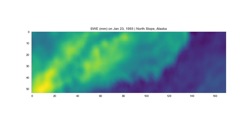
Using Matplotlib’s imshow function allows us to plot raster data like we would plot any image. We can see the rough resemblance between the coastline in this plot and the Google Earth outline I used to create the bounding box above, which means that we did indeed subset the data correctly!
This plot is lacking some critical components, though. Let’s make it a little more informative with some basic Matplotlib formatting:
fig = plt.figure(figsize=(12,6))
im = plt.imshow(swe[0,:,:],cmap='gist_rainbow')
plt.colorbar(im)
plt.title("SWE (mm) on Jan 23, 1993 | North Slope, Alaska");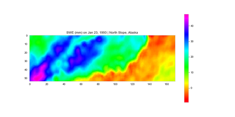
This is the kind of plot I like to use in presentations; it is simple to help avoid distractions and can be quickly digested so that the audience can focus on what I am saying. Using a more contrasting color map can help when presenting plots on a projector where colors aren’t always the most saturated. The strongly contrasting colors allow people to quickly see small differences that can be hard to make out on more subtle colormaps.
Taking Advantage of Subplots
Subplots provide us with a lot of extended functionality simply by allowing us to combine multiple plots on one canvas. We can use subplots to see snapshots of our study area during different seasons of the first year.
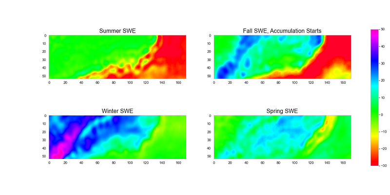
This is a cool plot. It’s interesting to see the snow accumulate in the Fall, peak in the Winter, and almost finish melting by the Spring image. The ocean is also clearly changing temperature significantly between the Summer/Fall images and the Winter/Spring images; we can see that the ocean likely takes longer to re-warm than the snow takes to melt on land.
While these plots are informative, since we are treating the data as a generic image we lose the coordinate reference system that actually conforms the grid to the Earth. We lose a lot of the proper shape and spatial context when we plot spatial data like this; let’s try plotting it on a map using Cartopy next.
Adding a Projection
Matplotlib by default is designed to plot in traditional grid spaces. In order to display data on a map, we have to have a base map with matching projection. Luckily, a library called Cartopy exists that is designed to process geospatial data for mapping with Matplotlib. One of my favorite things about Matplotlib is how easy it is for developers to build on top of it; Cartopy is somewhat similar to Seaborn in the way it builds on top of the Matplotlib API to bring users a more customized tool.
We start by defining the Cartopy coordinate reference system (CCRS) objects. These tell Cartopy what coordinate reference system (CRS) our data is using.
geod = ccrs.Geodetic()
proj = ccrs.LambertAzimuthalEqualArea(central_latitude=90.0)
The projection of our data is Lambert Azimuthal Equal Area with the center at the North Pole. Let’s go ahead and plot the Northern Hemisphere of the Earth using our new coordinate system by defining our projection and extent.
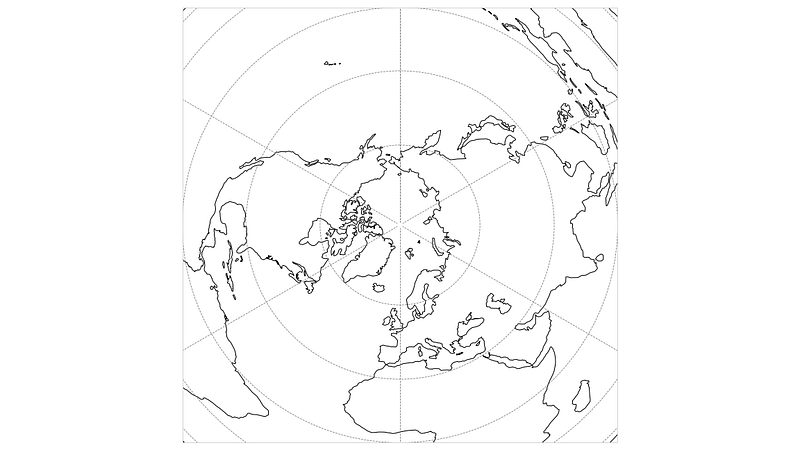
In this map, we are looking down on the North Pole with North America on the left and Africa on the bottom for reference. You will notice that we didn’t plot any data, and that is because this is essentially our new “canvas”. Matplotlib is now treating the EASE-Grid 2.0 Coordinates as the plotting space.
If we want to layer data on top of this base map then we need to find the data’s extent as well. You will notice that when we plotted the base map we defined the extent with four numbers. These are x/y coordinates of the upper left and lower right corners of the bounding box. In this case, -9,000,000–9,000,000 meters is the full extent of both x/y coordinates in the EASE-Grid 2.0 grid with the North Pole being at point (0,0).
I know that the upper left coordinates of my study area are [-145, 66] and the lower right coordinates are [-165, 72]. These are geodetic coordinates in degrees that can be converted to meters — used by EASE-Grid 2.0 — using the Cartopy object defined earlier.
You will notice that we set the source coordinate reference system as geod , which is another CCRS object indicating a geodetic CRS that uses degrees, latitude, and longitude. We transform the coordinates using our Lambert Azimuthal Equal Area CCRS object since that is our target projection.
Now that we have our new bounding coordinates in the proper CRS, we can go ahead and plot our study area:
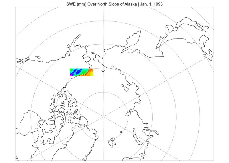
Nice! Now we have our data overlaid onto our map, and we can use the coastline to verify we did it correctly with the right projection and orientation. I originally plotted the SWE data upside down since it has a different “origin” than the base map, so don’t be afraid to play around with the orientations if something is off.
This map is a little zoomed out though. It is hard to see the SWE data very clearly. We can zoom in by adjusting the extent of the base map:
ease_extent = [-3000000., 1000000., -1000000., 3000000.]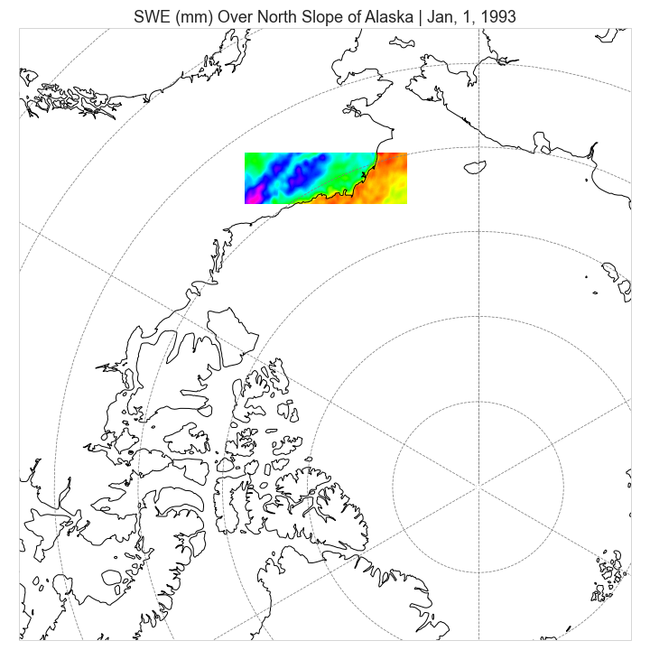
Cartopy brings a ton of power to Matplotlib, with support for a lot of projections.
Animated Matplotlib Plots
I have always found displaying continuous change to be very difficult with Matplotlib. We can make subplots to show discrete changes, however without using a dynamic plotting tool, displaying change is challenging. One solution to this is using animations. It is not difficult to create movies or gifs of plots changing over time, which can be very useful for visualizing change in geospatial data!
Let’s try animating our original plot that uses plt.imshow() to plot our SWE data.
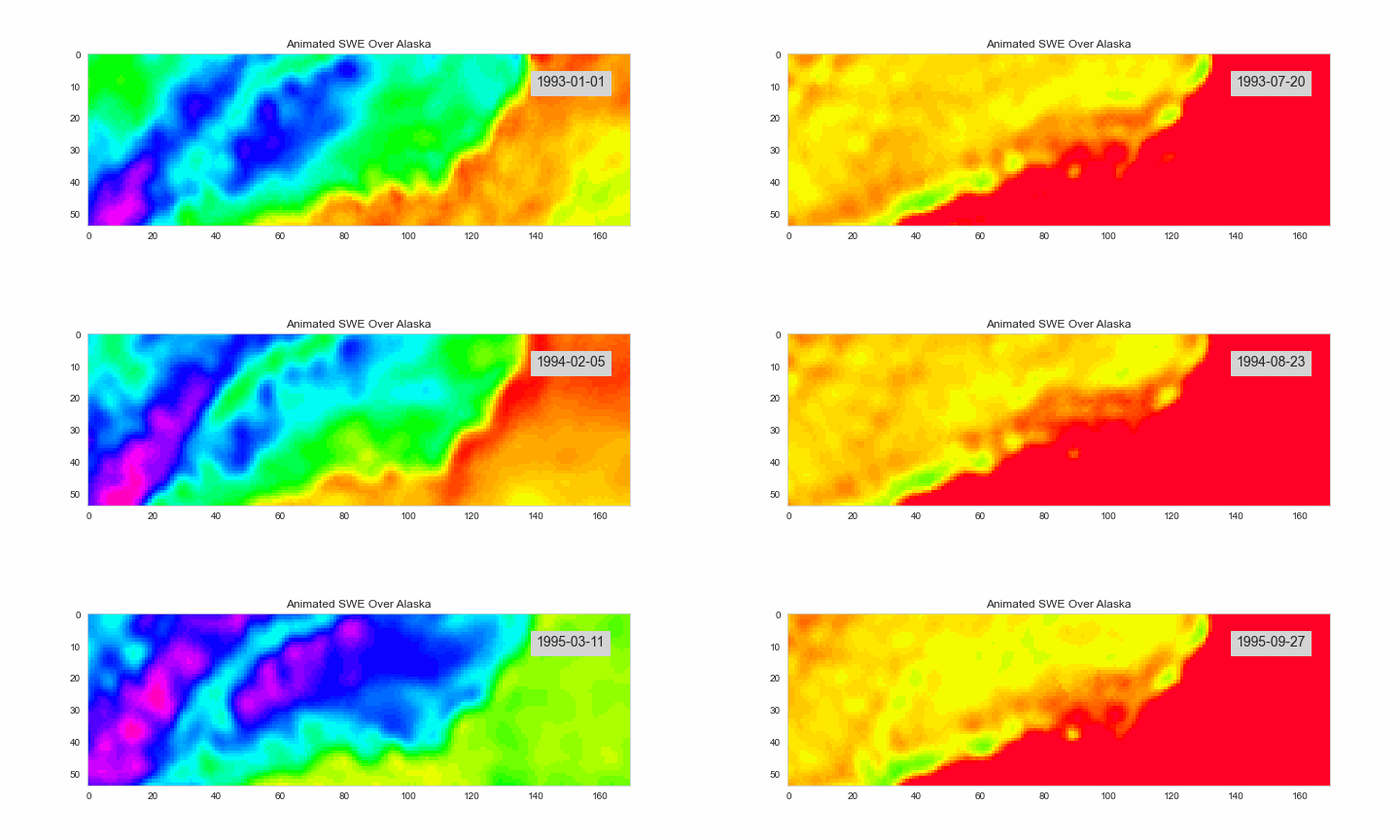
Making animated plots is really that easy! The key is that we have some method of iterating the plotting. In this case, I simply loop through 1000 days of the time series and save a snapshot of each plot that is then converted into a gif. So we first create a Matplotlib figure, fig , that we pass to the Camera() instantiator. Now, every time we iterate to create a new plot, we simply take a snapshot of the current Matplotlib figure with camera.snap() .
There are multiple ways to create animated Matplotlib plots. Most examples will likely use the built-in Matplotlib.animation module. Generally, this module works quite well, however, I have been experiencing dependency issues preventing exporting the animations on Windows 10. Matplotlib’s animation module also doesn’t export to GIF, which is my preferred format to share for presentations and articles.
To avoid dependency issues and export straight to a GIF we can use a library called celluloid. Celluloid is a lightweight library for creating animations out of existing plots. It isn't very actively developed, but I recommend trying it if you are having issues with the built-in Matplotlib functionality. I like that it can be easily added on top of an existing plot with minimal re-working of any functionality.
Essentially anything plotted on a Matplotlib figure can be animated. So we can animate our SWE imagery on top of our map as well!
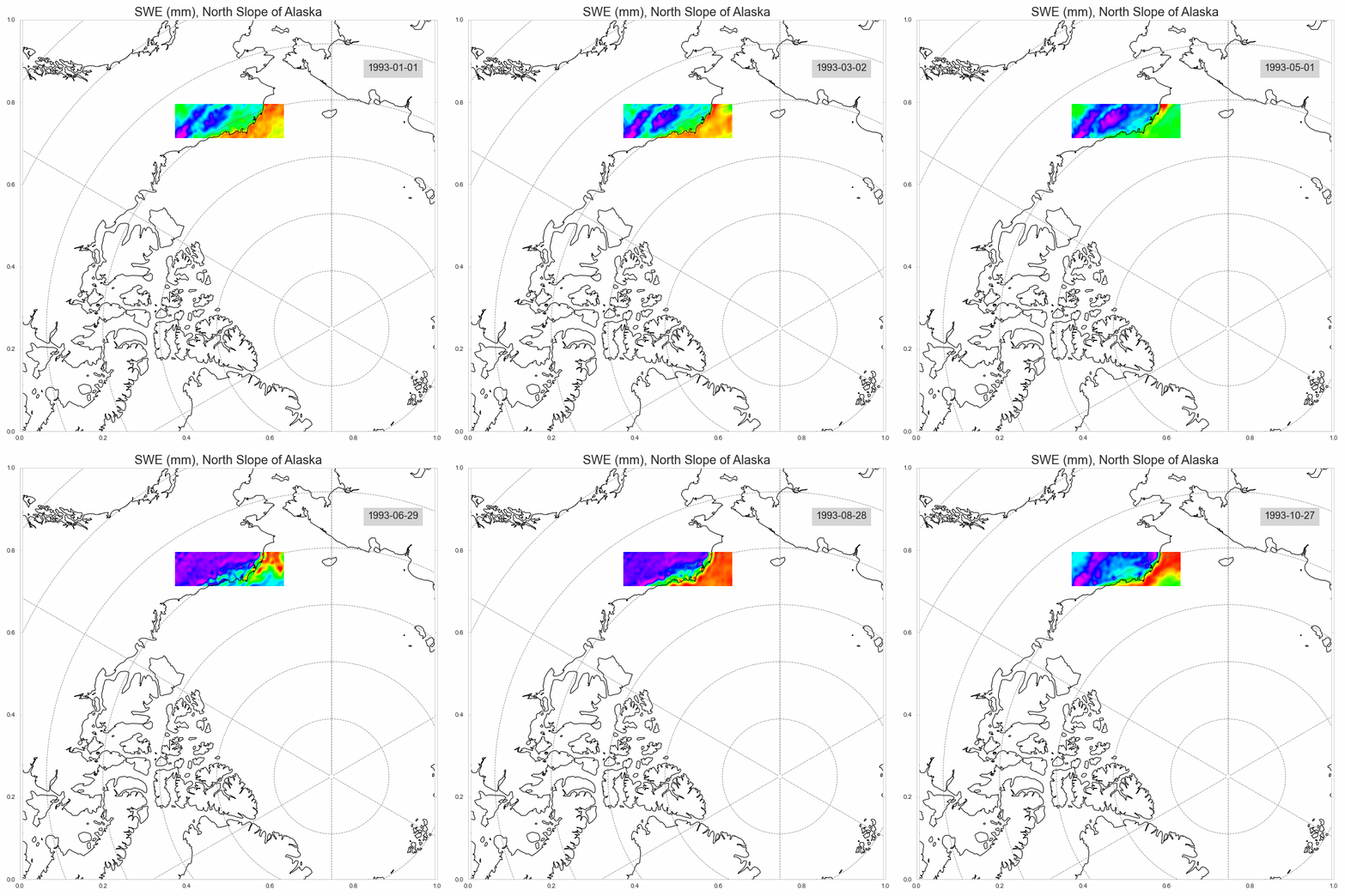
I think these animated plots are pretty fun. Being able to see how the values change over the land and ocean along with the corresponding dates really helps show the yearly cycle of accumulation and melt. We can also aggregate the data in all kinds of ways and then animate those aggregates.
Wrapping Up
While sometimes it may feel like there are superior options to Matplotlib for plotting in Python, it is still one of the most reliable and efficient plotting tools. Matplotlib does a great job providing us with a canvas that can be customized to our every desire. If you need to make plots for a presentation, paper, or article it is hard to argue with the customizability of Matplotlib.
Unless you need an interactive map, you will likely find yourself using Matplotlib at some point for visualizing geospatial data in Python. Luckily, libraries like Cartopy give Matplotlib the power to work with all kinds of geospatial data.


