
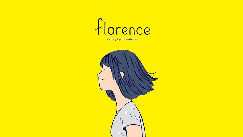
Visual Storytelling with Colours: Exploring Relationship Dynamics in the Video Game Florence
As a writer, it could be hard to wrap our heads around the idea of visual storytelling. Yet, there is so much that can be said without words, and that is what this beautiful story managed to achieve.
Released in 2018, Florence was widely renowned for its visual storytelling, and many have covered how it uses symbolic imagery to show the story of Florence Yeoh — a young woman in her 20s navigating through life and a relationship. However, I argue that the game does much more than that, and the use of colours in its art and design truly shines through upon inspection.
In this exploration, I aim to delve into how Florence employs colours throughout its entirety, effectively painting a vivid narrative from start to finish.
Mundane, Muted Blue: Everyday’s a Routine
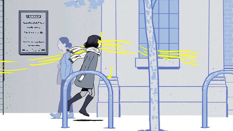
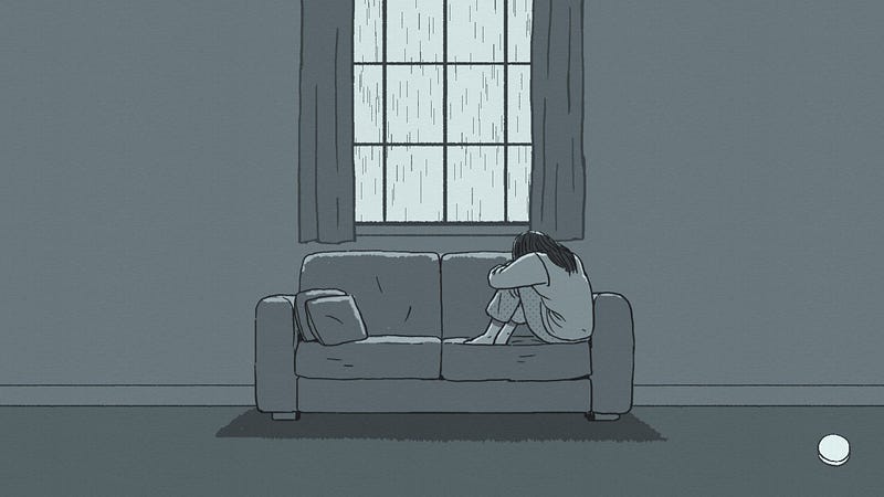
We start the story with Florence detailing her everyday life. Throughout the series, we recognise the colour blue as Florence’s colour. A melancholic colour, especially when muted, is prominent throughout this period of Florence’s life. Everything is gray-tinted, mundane, and boring, and Florence is just trying to get through life.

This use of blue sets the tone for Florence’s personality and how she views the world initially. Everything looks dreary and monotone, a feeling a lot of us can probably relate to as we first enter the adult world.
Sparkling, Shimmering Yellow: The Spark We Long For
Florence’s ordinary life finds a source of light when she meets the cute musician performing down the street. Throughout the game, Krish the heartthrob is often represented by the colour yellow. The colour yellow is associated with optimism, warmth, and happiness, the perfect counterpart to Florence’s muted blue. With the symbolism of the colour, Krish is presented as what she was searching for all along, the light in her life.
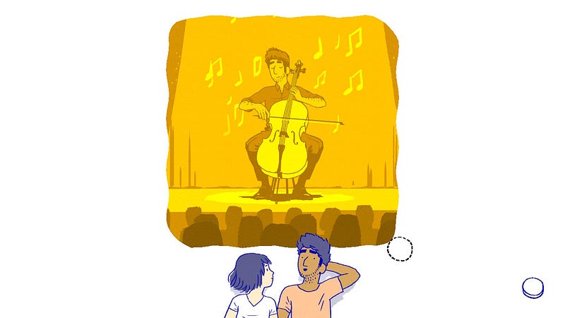
He thinks of his dreams in yellow and borderline gold, it’s a representation of his optimism towards his future. He sees everything through rose-tinted glasses, and that brings Florence out of her bubble as well. Soon, she begins to see things in brighter colours. In the beginning, we can see that he has a positive influence on her mindset, he encourages her to pursue and revisit her dreams as an artist, and their conversations flow like water.
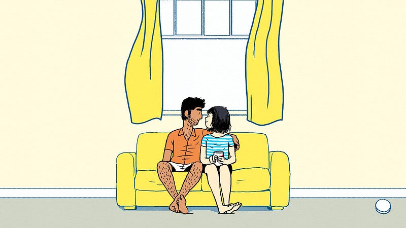
That is not to say it’s 100% positive, however, because when Krish moves into the house, everything seems to be yellow. Personally, I see this as a sign that the relationship is becoming a bit one-sided and that Florence starts to depend on Krish just a little too much for her happiness. It could be all sunshine and rainbows, and the person who lights up your whole world could seem to have no wrong in your eyes. This overuse of yellow seems to show both the good and the bad: Krish is able to bring positivity into Florence’s life, but now everything in her life is yellow, down to her wardrobe and curtains.
Aggressive, Defensive Red: Reaching the Breaking Point
For some, the honeymoon period may end sooner than you think. Here, the game contrasts their eventual descent into a new mundane life with bright red dialogue boxes during arguments. Passion, Anger, Power. The colour perfectly represents their heated conversations when they both seem to want to win the argument.

Heartbreaking, Soulless Gray: The Eventual Realisation
Instead of a muted blue, Florence’s world fades into a deep gray when the two decide to go their separate ways. Rather than showing sadness, the gray is numbing and soulless, and it perfectly embodies the hopelessness one initially feels when facing a life-altering event like a breakup.
Krish also faced his troubles leading up to the breakup when he realised his dreams of becoming a musician were becoming more futile. I liked this particular screen as it shows how his golden dreams were deeply affected by his lack of self-confidence over time. It also presented how both sides of the party have their own struggles, and sometimes relationships that go wrong may not be because of either party.

Calming, Peaceful Blue: The Art of Letting Go
Soon, Florence finds her path again after picking up the palette that Krish gave her at the start of their relationship. She quits her job and becomes a recognised artist, and her world becomes brighter and warmer.
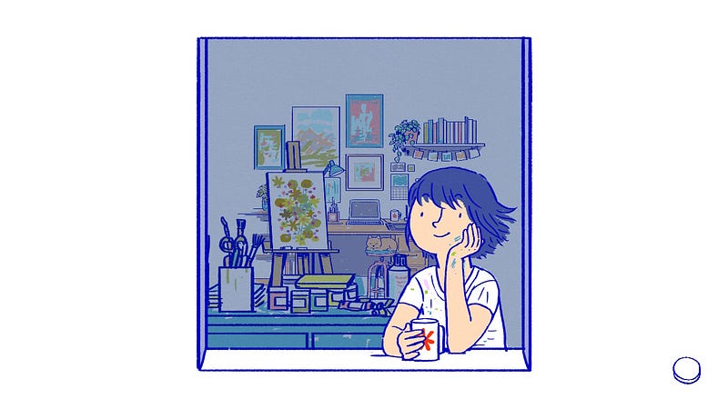
Through healing and letting go of herself, she realises that life is what you make of it, and even though sometimes you can feel blue, you just have to turn the saturation up and see things from a new perspective. In the end, you may find yourself a unique colour you can truly call yours.
Bonus: Lovey Dovey Pink
I love that the use of pink is scarce and therefore eye-catching whenever it’s used in the game. Sure, pink represents love, and it was used in a panel to depict Krish and Florence happily in love.

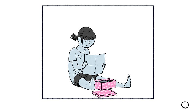
But the game also uses pink in the beginning sequence, when Florence finds a childhood box of hers in her room. The box brings us back to when she first discovered her love for art, and shows us where her passion truly lies. At the end, what I took from the game, was that no matter how far we seem to stray from our path, something we yearn for still calls out for us in that pink little box, awaiting us to rediscover it. Maybe that’s what life is about, finding what we love, and pursuing that to find what we are truly meant for.
Thank you for reading! I write other pieces about game design and game writing so make sure to check out my Medium or my social media here!


