
Visual Storytelling in Python: 5 Innovative Hacks to Make Your Data Speak
Adding drama to your data visualizations
Hey, Pythonistas! Data visualization — it is a phrase that gets thrown around quite a lot these days. But we’re not just talking about plain old charts and graphs.
No, no, no. We’re talking about storytelling. We’re talking about turning those rows and columns of numbers into captivating narratives that stick.
It’s high time we moved from “just visualizing” to “visual storytelling.” Ready to take your Python data visualization game to the next level?
Let’s get hacking!
Hack 1: Using Metaphors in Visualization
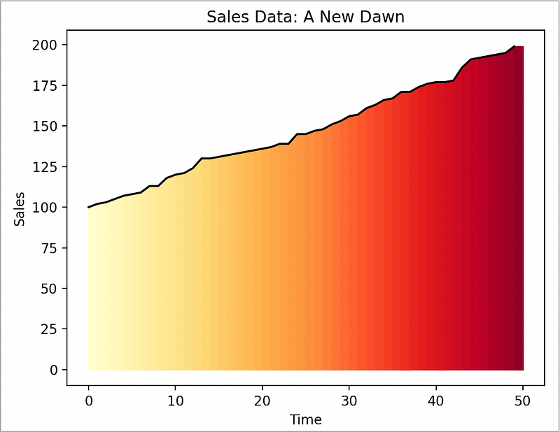
Let’s transform our sales data into a stunning sunrise, representing a ‘new dawn’ for the business. We can do this using matplotlib's fill_between method to create a gradient effect:
import matplotlib.pyplot as plt
import numpy as np
import seaborn as sns

# Sales data as a rising sun
sales_data = np.random.randint(100, 200, 50).tolist()
sales_data.sort()
fig, ax = plt.subplots()
ax.plot(sales_data, color='black')
# Create a gradient effect for the sunrise
for i in range(len(sales_data)):
    ax.fill_between(range(i, i+2), 0, sales_data[i:i+2], color=plt.get_cmap('YlOrRd')(i*5))
plt.title('Sales Data: A New Dawn')
plt.xlabel('Time')
plt.ylabel('Sales')
plt.show()
This creates a striking sunrise effect:
And helps turn your boring sales data into a beautiful narrative of growth and new beginnings.
Hack 2: Mastering the Art of Suspense in Data Visualization
We’re going to turn a regular line chart into an emotional rollercoaster. Instead of simply revealing the stock price, we’ll make the audience anticipate the highs and the lows. We can achieve this by using the FuncAnimation function from matplotlib.animation:
import matplotlib.pyplot as plt
import matplotlib.animation as animation
import numpy as np
# A suspenseful reveal of a stock price
stock_price = np.random.randint(50, 100, 50)
fig, ax = plt.subplots()
line, = ax.plot(stock_price, color='red')
def update(num, line):
    line.set_data(np.arange(num), stock_price[:num])
    return line,
ani = animation.FuncAnimation(fig, update, frames=len(stock_price), fargs=[line], repeat=False)
plt.title('Stock Price Reveal')
plt.xlabel('Time')
plt.ylabel('Price')
plt.show()
This line chart unfolds over time, creating suspense and anticipation.
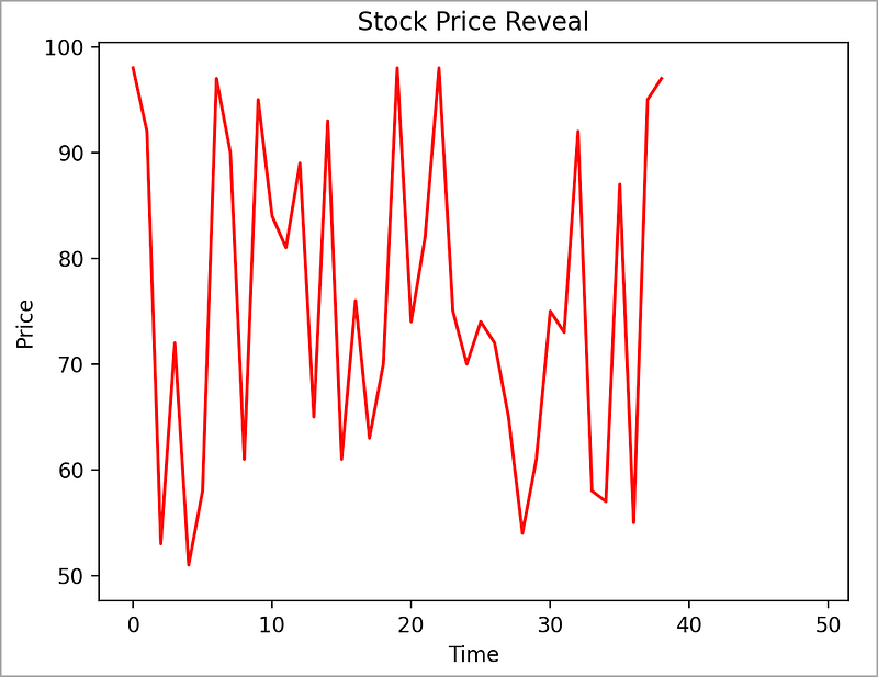
It’s a tale of rises and falls, a visual cliffhanger that keeps your audience glued to the screen.
Hack 3: Emotionally-Charged Color Schemes
Instead of a plain bar chart, let’s create a vibrant heatmap. This will give us an emotional color palette, creating a deeper connection with the audience:
import seaborn as sns
import matplotlib.pyplot as plt
import pandas as pd
import numpy as np
# Sales data with emotionally-charged colors
months = ['Jan', 'Feb', 'Mar', 'Apr', 'May', 'Jun', 'Jul', 'Aug', 'Sep', 'Oct', 'Nov', 'Dec']
sales_data = np.random.randint(50, 100, 12)
# Convert to DataFrame
df = pd.DataFrame(sales_data.reshape(-1, len(months)),
                  columns=months)
# Create a heatmap
sns.heatmap(df, cmap='coolwarm', annot=True)
plt.title('Sales Data with Emotionally-Charged Colors')
plt.xlabel('Month')
plt.ylabel('Sales')
plt.show()
This heatmap uses warm and cool colors to evoke emotions, making the sales data feel more personal and relatable.
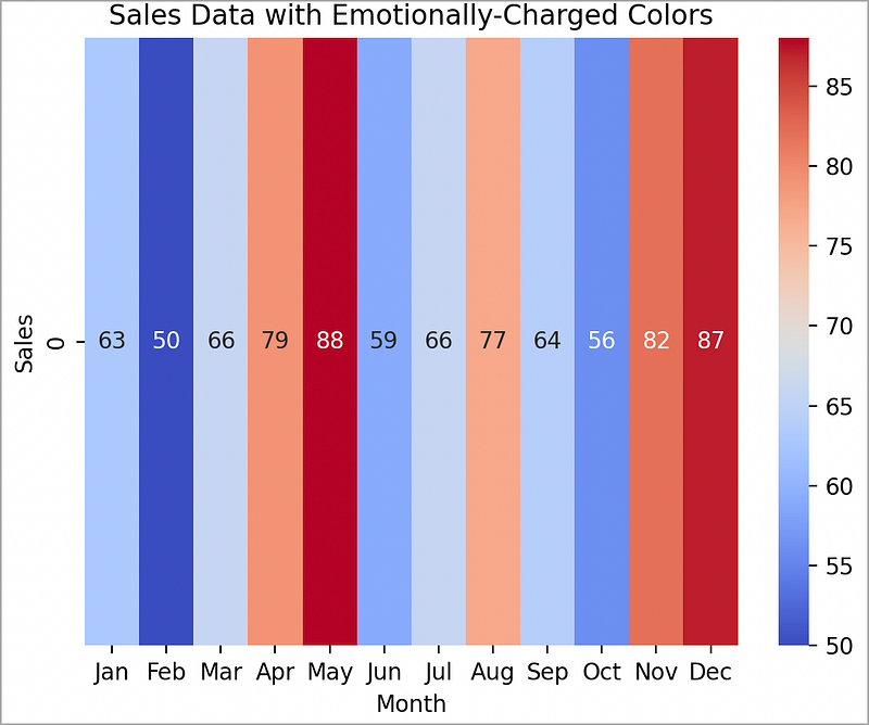
You’re either running HOT (red) or COLD (blue). Either way, there are dramatic contrasts between the two.
Hack 4: Pareto Front Comparison — The Game Changer
Ever heard of the Pareto Principle? It’s a concept named after the Italian economist Vilfredo Pareto, which states that roughly 80% of effects come from 20% of the causes. In data visualization, we can use this principle to showcase the “best” options, where “best” is a subjective term based on the variables you’re considering.
Imagine you’re comparing performance of different marketing strategies. You have the cost and the resulting increase in sales for each strategy. A Pareto Front plot will let you identify the strategies that give you the most bang for your buck.
Here’s how you can create such a plot, with a list of strategies, and then for demonstration, some random costs and related sales-increases. And lastly, a color coded scatterplot with annotations:
import matplotlib.pyplot as plt
import numpy as np

# Marketing strategies
strategies = ['SEO', 'Email', 'Affiliate', 'PPC', 'Content', 'Social', 'Display', 'Direct', 'Referral', 'PR']

# Cost and sales increase for each strategy
cost = np.random.randint(1000, 5000, 10)
sales_increase = np.random.randint(500, 2000, 10)

# Pareto front
pareto_front = sales_increase - cost
pareto_front_sorted = np.argsort(pareto_front)

plt.figure(figsize=(10,6))
plt.scatter(cost, sales_increase, c=pareto_front, cmap='viridis', s=100)
plt.colorbar(label='Pareto Front')
plt.xlabel('Cost')
plt.ylabel('Sales Increase')
for i, txt in enumerate(strategies):
    plt.annotate(txt, (cost[i], sales_increase[i]))
plt.title('Pareto Front Comparison of Marketing Strategies')
plt.show()
And the resulting chart:
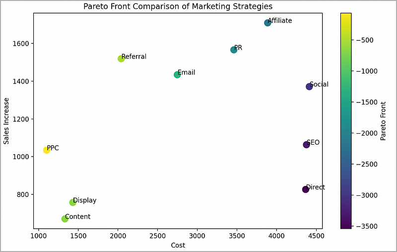
In this visualization, the color of each point represents the Pareto Front value, i.e., the sales increase minus the cost. The strategies with the highest values are our “best” options according to the Pareto Principle.
Not only does this plot provide a clear comparison, but its vibrant colors and strategic annotations make it a memorable one.
Talk about storytelling with data!
Hack 5: Use of Interactivity for Personalized Stories
Let’s elevate our scatter plot to a 3D interactive plot, giving our audience the control to navigate and explore the data:
import plotly.express as px

# Interactive 3D scatter plot
df = px.data.iris()
fig = px.scatter_3d(df, x='sepal_width', y='sepal_length', z='petal_length', color='species',
                    size='petal_length', hover_data=['petal_width'])
fig.show()
This 3D interactive plot allows the audience to hover over and rotate the plot, providing a personal, hands-on experience and promoting exploration.
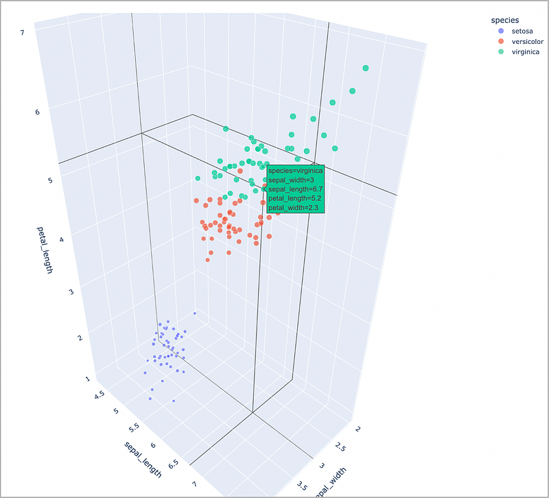
By mousing-over each point on the chart, you are able to read all of the information associated with that point. Very interactive, and very cool.
Wrapping Up…
Each plot showcases the power of creative storytelling in data visualizations.
Remember, a well-crafted visual story can be a powerful tool for understanding, remembering, and making decisions based on data. Don’t just present data, tell a data story.
Just remember, the goal here isn’t to misrepresent data or confuse your audience. Instead, it’s to make your data more relatable and memorable.
At the end of the day, we’re not just number crunchers — we’re storytellers, and our medium is data.
Happy storytelling!
Before you go… If you want to start writing on Medium yourself and earn money passively you only need a membership for $5 a month. If you sign up with my link, you support me with a part of your membership fee without additional costs.
If you’re interested, here’s a link to more articles I’ve written. There’s articles on Python, Generative AI, Expat living, Marathon training, Travel, and more!
More content at PlainEnglish.io.
Sign up for our free weekly newsletter. Follow us on Twitter, LinkedIn, YouTube, and Discord.