
UX Research: Unearthing your design’s success levers (and inhibitors)

UX research and UX testing are capabilities that increase the effectiveness of a Product Manager and create additional value for the customer if applied well. The findings from your UX tests can be the difference between your product being dead-on-arrival and achieving stellar adoption and retention. The best part of UX research and running experiments is that it doesn’t require monetary investment to get started, just time and thoughtfulness.
Over the past seven years, I’ve had the opportunity to participate in, design, and moderate UX tests at Xbox, AR wearables & applications (RIP, Daqri), and B2B/enterprise software (GIS analytics and Talent Management). This piece will share some practical learnings from those experiences. Namely,
- What are we trying to accomplish with UX research and testing
- Seven basic principles when designing studies
- Three testing techniques that you can use immediately
If testing is not yet common practice for you, my goal is to get you and your team testing quickly and confidently.
UX Research and Testing: What’s the purpose?
The goal is simple: Uncover insights about the user that inhibit or assist the effectiveness of your product design.
Product managers spend so much time obsessing over the problem, solution design, development, and go-to-market. At the heart of the problem-identification and solution design is the user. What do we know about her facilitates the problem we’re solving? What preferences or motivations that we don’t know about might enhance the solution we’re building?
What we’re trying to do is uncover insights about the user that may inhibit or assist the effectiveness of the product we’re building. We want to dig for the relationship between a user’s context and outcomes. Specifically,
- User psychographics — preferences, biases, and motivations
- How outcomes are achieved — processes, constraints, and tools
- Situations that precipitate outcomes — when, where, and why a user needs/wants to act
- Observable behaviors — how and why the user acts in a given context
- Psychological and emotional changes — what the user thinks or feels given a situation
These insights, once uncovered, can inform the product design.
Principles for UX research and experimentation
Know what you want to understand. Iterate. Expand your scope of understanding. A confirmation of assumption doesn’t translate into confirmation of omniscience.
Out of the gate, I want to establish that quality research is influenced more by the amount of time invested and not as much by money spent. Let’s talk about some principles that you can follow to set up your UX research and tests to return meaningful insights.
Sidebar: Dedicated research budget buys you time, expertise, and research breadth/depth. Don’t quote me on it, but I’m pretty sure Biggie Smalls once said, “Mo’ research money, mo’ problems solved.”
Principle 0: Clearly define what you want to understand
Goal-setting is as essential as it gets, but I’ve worked with PMs that gloss over this and end up wasting time and energy. Some research is discovery-driven and exploratory, like forming personas, identifying key actors, or mapping a user’s tools ecosystem. Other research might be keen on A/B testing aspects of a design or qualitatively mapping a user’s emotional journey through a workflow.
Principle 1: Align questions and experiment with the goal in mind
Thinking about your research goals, make a list of questions that help you build that understanding. Similarly, you can design your experiment to highlight or facilitate things you want to understand.
Principle 2: Pursue a line of questioning that you didn’t expect
With that said, interview guides are just that — guides. They keep you directionally on track, but sometimes interviewees might uncover an interesting angle that you weren’t expecting. Follow your intuition, explore, and expand the scope of your understanding.
Principle 3: Iterate on your experiment design
Before committing to a large scale experiment, test your questions to see if they’re yielding meaningful signal. Keep what works and adapt what doesn’t.
Principle 4: You don’t need grand experiments at the start
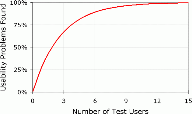
Statistical significance and large volumes of participants are ideal, but sometimes a small number of subjects can uncover important patterns or behaviors. Studies by Jakob Nielsen and Tom Landauer have shown that 5–7 participants are sufficient to discover ~90% of usability issues.
Principle 5: Be conscious of cognitive load and fatigue
From my experience, tests running more than 25 minutes start to wear on the subject. We would notice the subject’s energy and demeanor begin to dwindle, and responses shorter. If you’re asking participants to do tasks for extended periods, provide breaks to reduce the risk of the test becoming invalid.
Principle 6: At the end, you might confirm what you already thought
That’s a good thing, especially if you haven’t tested it before. Too many times, I’ve seen teams throw their hands up when their intuition is confirmed. “Looks like we wasted time running that experiment.” Assured in their apparent all-knowing, they write off the entire process of experimentation. A confirmation of assumption doesn’t translate into proof of omniscience. One wrong thing can cost and undermine all of the good guesses combined. We’re not questioning expertise; we’re building momentum.
The list of principles can go on and on, but I think the above is sufficient and simple-enough to embody and execute on.
Some stories, some techniques, and some lessons
To keep this section concise, I’m going to write about UX research and experiments I ran at Cornerstone for a product we were developing in 2017. We ran several different types of studies within six weeks and gathered some unique insights that we didn’t anticipate.
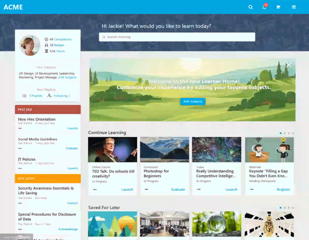
LXP: Origins
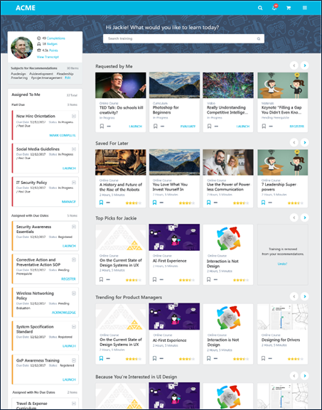
Early 2017, Cornerstone announced that we would offer a Learning Experience Platform. Historically, Cornerstone’s bread and butter corporate learning solution has been facilitating compliance-based training through a Learning Management System. The thesis was that organizations now wanted to go beyond compliance — to improve employee retention and productivity by making training content widely available. This LXP would spark self-directed learning and development for our users, and deepen Cornerstone’s foothold in corporate learning software.
Our CEO handed us the requirements, the features to be developed, and mock-ups on the whiteboard. Mock-ups were due to be reviewed by Friday that week, and the mandate was to build this in 6 months. (Mmm… Let’s pretend that a rigorous discovery process got us to this point.)
Later that day, our product leader and the head of design locked themselves in a room for two days and designed away (presumably with a short, two-person design sprint). Ready to be designed, built, and shipped, right?
Wrong. We obviously needed to test our designs at different altitudes, specifically understandability, preference, and usability.
Test #1: Paper Prototypes — Qualitative Feedback
We wanted to know if potential users understood the product to be a tool for discovering training and personalized recommendations. (Again, let’s assume that the problem was significant, large, and solvable with our capabilities.) We genuinely wanted them to say something like, “Wow, this is like Netflix for training.” Given the haste of the initiative and a front-dev team waiting on “final designs,” we had to test quickly and cheaply.
Cue paper prototypes.
The thrust of the research was simple: Get initial impressions from subjects while providing no context.
Our primary target audience comprised of knowledge workers and individuals primarily used computers to do their work. Arguably this audience definition is a bit generic.
With several hundred employees in the building that matched our audience, we decided to deploy the test in our hallways.
Three of us printed the mock-up on A4 in full-color and asked random people for five minutes of their time. Our script read as follows:
- What do you think is the primary purpose of this page?
- Walk me through other things you can do on this page?
- What do you expect to happen if you click this?
- What are you drawn to on the page?
- What do you like and dislike?
After two hours, we had interviewed over a dozen people. We compared notes and synthesized our findings into a preliminary report.
- Strikingly, many lit up and mentioned the similarity to Netflix.
- Most subjects picked up on the personalized nature of the content.
- Many called out that the recommendation quality and relevance could make or break the experience.
- Several were worried about too much going on the page.
- A few mentioned that the reminder to complete compliance training made it less exciting.
We had positive aspects to celebrate along with concerns to address.
Paper prototypes can help collect feedback with minimal cost. The qualitative feedback, coupled with visceral reactions (furrowed brows, smiles, pensive stares), is packed with actionable intel. Things to watch out for include an unrepresentative test audience, results in a vacuum (subjects don’t have the right context for the tasks), and visual-level feedback. The assumptions can pile on top of each other if the scenario gets too complicated.
Test #2: Paper Prototype-Preference Test
A few days later, we got an injected requirement. The HiPPO du jour was that the user profile block needed to be on the right-hand side. Reflecting on the quick success of our paper prototype earlier in the week, we decided to rerun it.
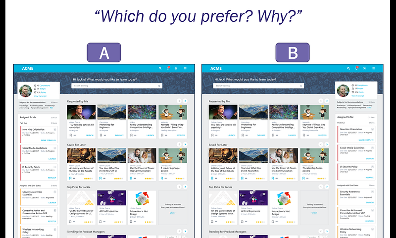
We printed out two sheets — one for the left-hand profile and the other for the right hand. Our protocol was simple: Ask people what they expected to accomplish on the page, and then ask which version they prefer and why. We made sure to balance the A/B test by showing left-hand first for half of the subjects and showing right-hand first for the other half.
During our lunch hour, we trawled the business park to conduct this short test with people outside of our company. We got 60 responses. The overwhelming majority preferred Left-Hand. We were able to disarm the HiPPO within a couple of hours.
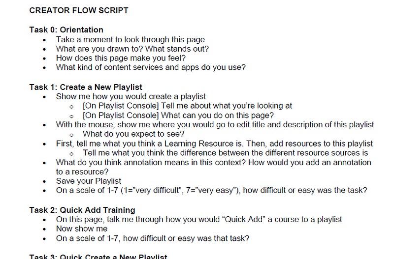
Test #3: Moderated Usability Studies
Fast-forward three weeks, and we had comprehensive designs for the critical workflows — searching, navigating playlists, and launching training from the home page. Our research questions were clear:
- How effectively could a target user complete each flow?
- How would users behave with minimal guidance?
- What expectations did they have with a product like this?
Our medium was no longer paper — we had a full-blown InVision clickable prototype. We spent about two days carefully crafting the test script. The protocol would ask the participant to navigate the home page, adjust some personalization settings, search, and launch a training module.
We made some critical decisions with the protocol:
- We would offer a minimal amount of context was to each participant — they only knew their organization provided online training and gave them access to this tool.
- We would not guide participants to the right action.
- We would allow participants to struggle.
- If the participant did not complete the task within 2 minutes of being stuck, that task would constitute a failure.
- We would regularly ask participants to explain their thoughts, feelings, and actions.
- We would ask standard metrics questions at the end of each task.
The metrics we cared about were standard usability metrics — task completion rate, task completion time, error rate, and satisfaction.
(Side note: Shout out to John Ogata from whom I learned so much about UX research, developing protocols, and moderating. Our work at Daqri together is worth a separate post.)
We decided to run this test along two parallel paths: (1) we would conduct the test on 3–5 users from our client base, and (2) use an external research team to help scale our study. We asked for some budget to have an external research team to help us recruit participants, moderate the test, and synthesize results. That cost us about $10,000 for a dedicated UX researcher, a panel of 7 participants, and a thorough 30+ page report (detailed and insightful).
All of the tests we completed within two weeks and the initial findings reported one week later. (From my overall experience, moderated studies can be completed in one to two days. The results can take a while to synthesize.)
Without diving into the details of the study, we were able to identify:
- Several aspects of the design that confused people
- Misunderstood search filters
- Ignored iconography and functionality
- Areas in which people were not confident in their ability to complete specific tasks
Not only were the insights qualitative, but we also gathered supporting quantitative metrics. The results were undoubtedly actionable.
It’s worth calling out that the contextual and behavioral differences in people become more pronounced as the tasks become more complex and have multiple steps. We learned things that simple paper prototypes and preference tests kept buried.
It’s all about uncovering user-centered levers of success
Three years after the LXP blitz, we’re still finding success in tens of millions of users across pretty much our entire client base. I believe that the testing helped us identify and address several issues that could have been deal-breakers for our users. That’s not to say that we wouldn’t have resurrected them had they churned. However, we did save time and energy investment to build/redesign/re-build/re-market those features.
If there’s anything to take-away from this article, it’s these three points:
- UX research and testing, like any skill, can be built through practice.
- Time, not money, is the currency that has the highest return.
- It’s about uncovering insights that assist or inhibit your product’s success.
Happy testing.
Subscribe to my Strategy and Analytics newsletter! Sign up here.


