
UX Anatomy of Dashboards
Even though the future of BI is in putting data to work rather than putting it on screen, dashboards are and will be omnipresent in today’s, and most likely tomorrow’s, businesses. At GoodData, in the process of designing a product to guide our users through creating great dashboards, we have deconstructed hundreds of dashboards and BI applications designed by our team to understand them well enough for the task. This post shares the anatomy we have developed as well as some of the key learnings.

Building dashboards is, on many levels, similar to building a house — it could be built from individual bricks, assembled from prefabricated components such as entire walls or even entire blocks representing individual rooms. The larger the building block, the faster the building is, with less potential for design and construction errors but also less flexibility. An experienced architect and construction company can design and build a great functional house from bricks, but unlike houses, which are commonly designed by professional architects, most dashboards are not designed and built by professionals in the field of information design and UX — and this is not necessarily a bad thing.

When deconstructing dashboards into building blocks corresponding to bricks/walls/rooms in the example above, we’ve taken Brad Frost’s Atomic Design model:
These represent the essential building blocks that dashboards are built from. We also have two additional building blocks — ecosystems and solutions — but we will leave those for the future posts.
Let’s start from the most high-level components presented above.
Organisms & Use-cases
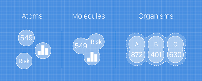
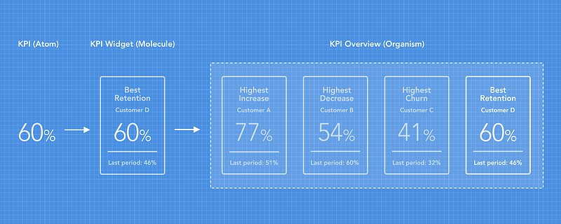
Organisms are the most interesting from a designer’s perspective. Each organism solves a specific use-case or need:
In the “building a house” metaphor, organisms correspond to the prefabricated rooms. Just as building the house from prefabricated, ready-made rooms would naturally move the designer’s attention away from the detail to the big picture — what rooms are needed, how they’ll be used, and how people will move through them in the course of the day — building a dashboard from organisms brings attention to actual user needs.
Being able to choose the right organisms means you need to understand what the purpose of the dashboard is, who will be using it, why they’re arriving there, what questions they need answered, and how they will apply the data to their business domain.
Understanding these user needs is more challenging than it sounds for most businesses. It requires a solid definition of a target user and a thorough understanding of their problems through qualitative research techniques that not all teams have skills in. Even data-driven teams can easily struggle as the data may help to guide what questions to ask but does not give the qualitative understanding of the user necessary to focus the dashboard.
But when the team does achieve this understanding, building the dashboard from organisms becomes a breeze:
On the other hand, when a designer is focused on the smaller components (molecules or even atoms) and building the dashboard bottom-up, it is very easy to get carried away and design a dashboard that may look beautiful but does not answer the common questions dashboard users have. Such dashboards are a collection of unrelated (or loosely related) data points rather than a focused business tool and hence take a lot of effort and time to dig through for meaningful insights. Such dashboards take a lot of cognitive effort to extract value and are often left with very little engagement and consequently little business value.
Molecules
Organisms consist of individual molecules and in dashboards, they represent individual charts:
Molecules usually represent a specific view on a business metric or set of related metrics and already carry enough information to base a decision on or understand what’s going on.
In the “building a house” metaphor, molecules represent individual walls. Just as assembling a house from the prefabricated walls saves an inexperienced builder from building crooked walls and imprecise angles, building a dashboard from molecules saves one from frequent design mistakes but does not ensure a house that’s enjoyable to live in.
Atoms
Atoms are the basic building blocks of all matter and dashboards alike. Each atom has distinct properties, and they cannot be broken into anything meaningful.
Atoms carry the visual identity and are the smallest CSS-style-able elements but at the same time, they don’t have any informational value on their own. In the example below, what does the number 60% mean? Has it increased or decreased? Is it good? Is it bad?
The right tool for the right job
None of the building blocks are better or worse. It’s clear that an architect aspiring to design custom-made million dollar homes would be frustrated if we only gave them blocks with entire rooms to build from and on the other hand, a DIY construction builder can build a terrible house from bricks.
At GoodData, we want to provide tools for both. We want to provide the full flexibility of building a house from bricks .. ehm, pardon me .. dashboard, from atoms and molecules, but at the same time strive to provide entire rooms (organisms) to quickly build usable dashboards without much time and skill investment.
An important lesson learned along the way is that identifying and understanding the purpose of the rooms/organisms helps providing these as a ready-made components that can both focus the dashboard creator on thinking about and understanding who and what they’re building for, which we see as a necessary prerequisite for creating useful and engaging dashboards, as well as significantly speed up the design and creation of a dashboard.


