
Using Plotly Express to Create Interactive Scatter Plots
An Example of Creating Interactive Scatter Plots Using Well Log Data
Scatter plots allow us to plot two variables from a dataset and compare them. From these plots, we can understand if there is a relationship between the two variables, and what the strength of that relationship is.
Within petrophysics scatter plots, are commonly known as crossplots. They are routinely used as part of the petrophysical interpretation workflow and can be used for a variety of tasks, including:
- clay and shale endpoints identification for our clay or shale volume calculations
- outlier detection
- lithology identification
- hydrocarbon identification
- rock typing
- regression analysis
- and more
Within this short tutorial, we are going to see how to generate scatter plots using a popular Python plotting library called Plotly.
The Plotly Library
Plotly is a web-based toolkit that is used to generate powerful and interactive data visualisations. It is very efficient and plots can be generated with very few lines of code. It is a popular library that contains a wide range of charts, including statistical, financial, maps, machine learning, and much more.
The Plotly library can be used in two main ways:
- Plotly Graph Objects, which is a low-level interface for creating figures, traces, and layouts
- Plotly Express, which is a high level wrapper around Plotly Graph Objects. Plotly Express allows users to type much simpler syntax to generate the same plot.
And it is Plotly Express that we are going to focus on for this tutorial. Within the following tutorial, we are going to see how to:
- Create 2D Scatter Plots Coloured with Categorical Data
- Create 2D Scatter Plots Coloured with Continuous Data
- Set Axes to Logarithmic
A video version of this tutorial is available on my YouTube channel:
Jupyter Plotly Tutorial
Importing Libraries
For this tutorial, we will be working with two libraries. Pandas, which is imported as pd and will be used to load and store our data, and Plotly Express, which is the main focus of this tutorial and will be used to generate interactive visualisations.
import plotly.express as px
import pandas as pd
Loading & Checking Data
The dataset we will be using for this article comes from a Machine Learning competition for lithology prediction that was run by Xeek and FORCE (https://xeek.ai/challenges/force-well-logs/overview). The objective of the competition was to predict lithology from a dataset consisting 98 training wells each with varying degrees of log completeness. The objective was to predict lithofacies based on the log measurements. To download the file, navigate to the Data section of the link above. The original data source can be downloaded at: https://github.com/bolgebrygg/Force-2020-Machine-Learning-competition
Once the data has been loaded in, we can view the dataframe by calling df . As you can see below the dataset has 18,270 rows and 30 columns, which makes it difficult to visualise in a single view. As a result, pandas truncates the number of columns that are presented.
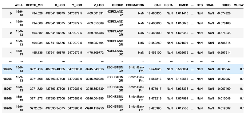
To view all of the columns we can call upon df.columns to view all of the available columns:
Index(['WELL', 'DEPTH_MD', 'X_LOC', 'Y_LOC', 'Z_LOC', 'GROUP', 'FORMATION','CALI', 'RSHA', 'RMED', 'RDEP', 'RHOB', 'GR', 'SGR', 'NPHI', 'PEF','DTC', 'SP', 'BS', 'ROP', 'DTS', 'DCAL', 'DRHO', 'MUDWEIGHT', 'RMIC','ROPA', 'RXO', 'FORCE_2020_LITHOFACIES_LITHOLOGY', 'FORCE_2020_LITHOFACIES_CONFIDENCE', 'LITH'],
      dtype='object')
Now that we can see all of our columns, we can easily call upon them if needed.
Creating a Simple 2D Scatter Plot
Creating scatter plots with plotly express is very simple. We call upon px.scatter and pass in the dataframe, along with the keyword arguments for the x-axis and the y-axis.
px.scatter(df, x='NPHI', y='RHOB')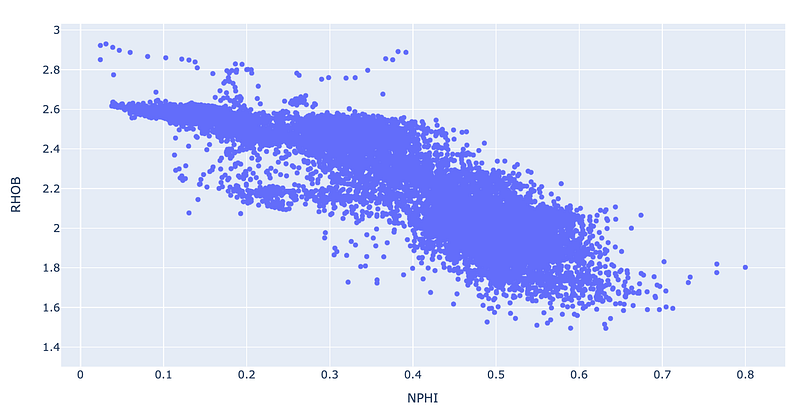
When we run the above code, we get a basic scatter plot of our density (RHOB) and neutron porosity (NPHI) data.
When working with this type of data it is common to scale the y-axis (RHOB) from about 1.5 g/cc to about 3 g/cc, and to have the scale inverted so that the largest value is at the bottom and the smallest is at the top of the axis.
For the x-axis, the data is usually scaled from -0.05 to 0.6, however, as we have data points in excess of 0.6 we will set the maximum to 1 (which represents 100% porosity).
To achieve this, we need to pass in two arguments: range_x and range_y. To invert the y-axis, we can pass the highest number first followed by the smallest number like so: range_x=[3, 1.5].
Once we add in the range arguments, we will have the following code:
px.scatter(df_well, x='NPHI', y='RHOB', range_x=[-0.05, 1], range_y=[3, 1])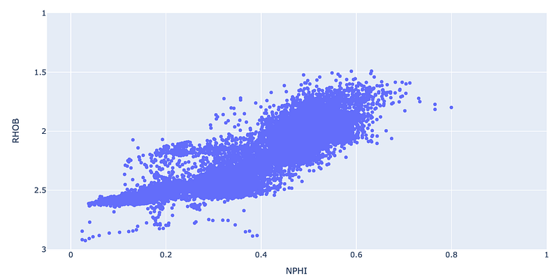
Changing Axes to Logarithmic
There are situations where we want to display data on a logarithmic scale. This can be applied to a single axis or both.
In the example below, we are using slightly different data. This data is obtained from core plug measurements that have been taken at specified intervals along a core sample.
core_data = pd.read_csv('L05_09_CORE.csv')
core_data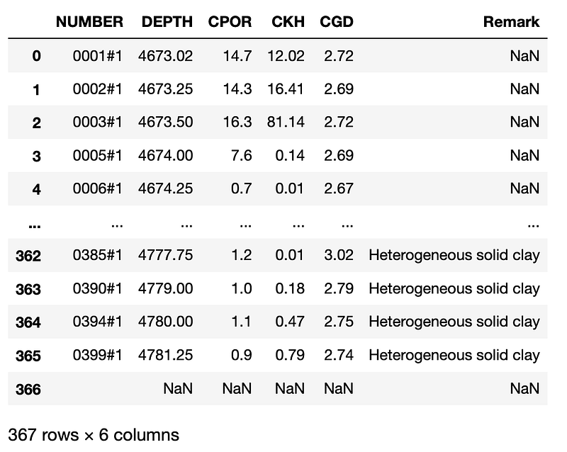
Let’s now create a simple scatter plot known as a poro-perm crossplot. This type of plot is commonly used to analyse trends within core data and to derive a relationship between core measured porosity and permeability. This can then be applied to log-derived porosity to predict a continuous permeability.
As before, creating the scatter plot is as simple as calling upon px.scatter.
px.scatter(core_data, x='CPOR', y='CKH', color='CGD', range_color=[2.64, 2.7])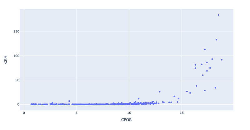
We can see that the generated plot doesn’t look right. That is because permeability (CKH) can range from values as low as 0.01 mD to 10’s of thousands of mD. To get a better understanding of the data we commonly display it on a logarithmic scale.
To achieve this, we can add in an argument called log_y and then specify a logarithmic range we want to display the data. In this case we will set to between 0.01 and 1,000 mD.
px.scatter(core_data, x='CPOR', y='CKH', log_y=[0.01, 1000])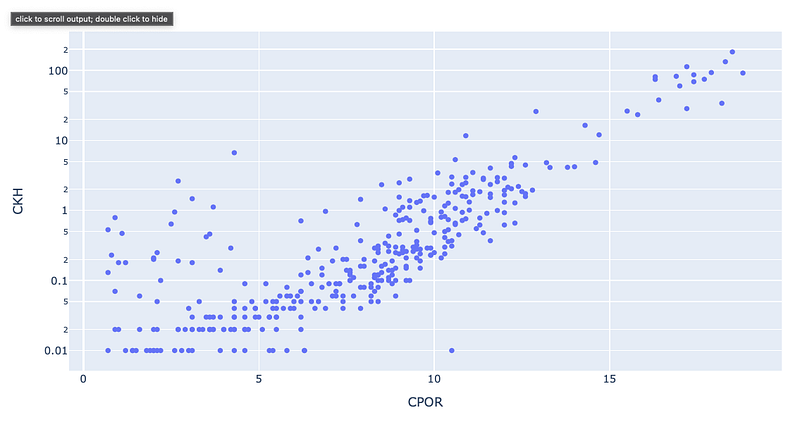
Adding Colour With a Continuous Variable
To gain more insight into our data, we can add a third variable onto the scatter plot by setting it in the colour argument. In this example, we are going to pass in the GR (Gamma Ray) curve.
px.scatter(df_well, x='NPHI', y='RHOB', range_x=[-0.05, 1], range_y=[3.5, 1], color='GR')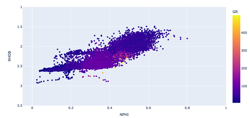
As you can see the colour is a little subdued. That is due to the range for the GR curve extending from 0 to a value in excess of 400 API. Typically this type of data is in the range of 0 to 150 API. To bring out more detail from the third variable, we can change the colour range by setting a range_color argument to go from 0 to 150.
px.scatter(df_well, x='NPHI', y='RHOB', range_x=[-0.05, 1], range_y=[3.5, 1], color='GR', range_color=[0,150])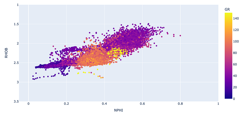
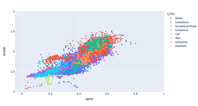
Adding Colour With a Categorical Variable
We can also use categorical variables to visualise the trends within the data. This can easily be added to our scatter plot by passing the GROUP column from the dataframe into the color argument.
px.scatter(df_well, x='NPHI', y='RHOB', range_x=[-0.05, 1], range_y=[3.5, 1], color='GROUP')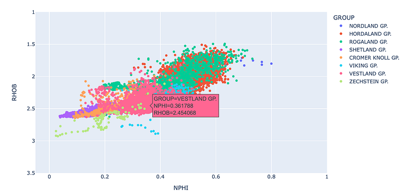
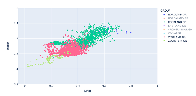
If we only want to visualise a few groups, we can left-mouse click on the name in the legend and it will turn that group off.
Summary
As seen in the above examples, Plotly Express is a powerful library for visualising data. It allows you to create very powerful and interactive plots with minimal amounts of code. Extra information in the form of colour can enhance our understanding of the data and how it is distributed amongst different categories or varies with another variable.
Thanks for reading!
If you have found this article useful, please feel free to check out my other articles looking at various aspects of Python and well log data. You can also find my code used in this article and others at GitHub.
If you want to get in touch you can find me on LinkedIn or at my website.
Interested in learning more about python and well log data or petrophysics? Follow me on Medium.
If you enjoy reading these tutorials and want to support me as a writer and creator, then please consider signing up to become a Medium member. It’s $5 a month and you get unlimited access to many thousands of articles on a wide range of topics. If you sign up using my link, I will earn a small commission with no extra cost to you!


