
Using Pandas Method Chaining to improve code readability
A tutorial for the best practice with Pandas Method Chaining

We have been talking about using the Pandas pipe function to improve code readability. In this article, let’s have a look at Pandas Method Chaining.
In Data Processing, it is often necessary to perform operations on a certain row or column to obtain new data. Instead of writing
df = pd.read_csv('data.csv')
df = df.fillna(...)
df = df.query('some_condition')
df['new_column'] = df.cut(...)
df = df.pivot_table(...)
df = df.rename(...)
We can do
(pd.read_csv('data.csv')
   .fillna(...)
   .query('some_condition')
   .assign(new_column = df.cut(...))
   .pivot_table(...)
   .rename(...)
)
Method Chaining has always been available in Pandas, but support for chaining has increased through the addition of new “chain-able” methods. For example, query(), assign(), pivot_table(), and in particular pipe() for allowing user-defined methods in method chaining.
Method chaining is a programmatic style of invoking multiple method calls sequentially with each call performing an action on the same object and returning it.
It eliminates the cognitive burden of naming variables at each intermediate step. Fluent Interface, a method of creating object-oriented API relies on method cascading (aka method chaining). This is akin to piping in Unix systems.
By Adiamaan Keerthi
Method chaining substantially increases the readability of the code. Let’s dive into a tutorial to see how it improves our code readability.
For source code, please visit my Github notebook.
Dataset preparation
For this tutorial, we will be working on the Titanic Dataset from Kaggle. This is a very famous dataset and very often is a student’s first step in data science. Let’s import some libraries and load data to get started.
import pandas as pd
import sys
import seaborn as sns
import matplotlib.pyplot as plt
%matplotlib inline
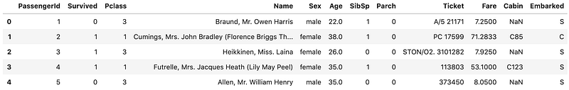
%config InlineBackend.figure_format = 'svg'df = pd.read_csv('data/train.csv')
df.head()We load train.csv file into Pandas DataFrame
Let’s start by checking out missing values. We can use seaborn to create a simple heatmap to see where are missing values
sns.heatmap(df.isnull(),
            yticklabels=False,
            cbar=False,
            cmap='viridis')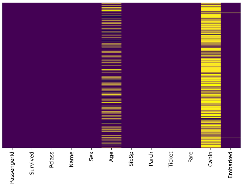
Age, Cabin, and Embarked have missing values. The proportion of Age missing is likely small enough for reasonable replacement with some form of imputation. Looking at the Cabin column, it looks like a lot of missing values. The proportion of Embarked missing is very small.
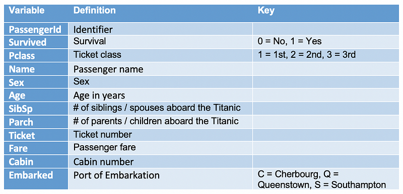
Task
Suppose we have been asked to take a look at passengers departed from Southampton, and work out the survival rate for different age groups and Pclass.
Let’s split this task into several steps and accomplish them step by step.
- Data cleaning: replace the missing Age with some form of imputation
- Select passengers departed from Southampton
- Convert ages to groups of age ranges: ≤12, Teen (≤ 18), Adult (≤ 60) and Older (>60)
- Create a pivot table to display the survival rate for different age groups and Pclass
- Improve the display of pivot table by renaming axis labels and formatting values.
Cool, let’s go ahead and use Pandas Method Chaining to accomplish them.
1. Replacing the missing Age with some form of imputation
As mentioned in the Data preparation, we would like to replace the missing Age with some form of imputation. One way to do this is by filling in the mean age of all the passengers. However, we can be smarter about this and check the average age by passenger class. For example:
sns.boxplot(x='Pclass',
            y='Age',
            data=df,
            palette='winter')
We can see the wealthier passengers in the higher classes tend to be older, which makes sense. We’ll use these average age values to impute based on Pclass for Age.
pclass_age_map = {
  1: 37,
  2: 29,
  3: 24,
}
def replace_age_na(x_df, fill_map):
cond=x_df['Age'].isna()
res=x_df.loc[cond,'Pclass'].map(fill_map)
x_df.loc[cond,'Age']=res return x_dfx_df['Age'].isna() selects the Age column and detects the missing values. Then, x_df.loc[cond, 'Pclass'] is used to access Pclass values conditionally and call Pandas map() for substituting each value with another value. Finally, x_df.loc[cond, 'Age']=res conditionally replace all missing Age values with res.
Running the following code
res = (
  pd.read_csv('data/train.csv')
    .pipe(replace_age_na, pclass_age_map)
)res.head()All missing ages should be replaced based on Pclass for Age. Let’s check this by running the heatmap on res.
sns.heatmap(res.isnull(),
            yticklabels=False,
            cbar=False,
            cmap='viridis')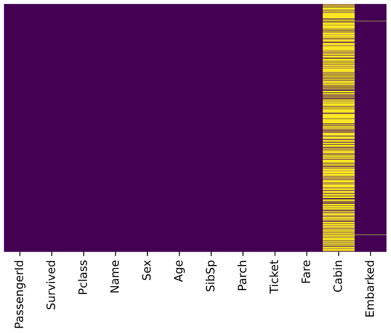
Great, it works!
2. Select passengers departed from Southampton
According to Titanic Data Dictionary, passengers departed from Southampton should have Embarked with value S . Let’s query that using the Pandas query() function.
res = (
  pd.read_csv('data/train.csv')
    .pipe(replace_age_na, pclass_age_map)
    .query('Embarked == "S"')
)res.head()To evaluate the query result, we can check it with value_counts()
res.Embarked.value_counts()S 644
Name: Embarked, dtype: int643. Convert ages to groups of age ranges: ≤12, Teen (≤ 18), Adult (≤ 60) and Older (>60)
We did this with a custom function in the Pandas pipe function article. Alternatively, we can use Pandas built-in function assign() to add new columns to a DataFrame. Let’s go ahead withassign().
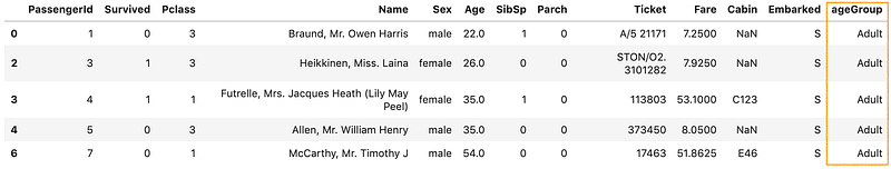
bins=[0, 13, 19, 61, sys.maxsize]
labels=['<12', 'Teen', 'Adult', 'Older']
res = (
pd.read_csv('data/train.csv')
.pipe(replace_age_na, pclass_age_map)
.query('Embarked == "S"')
.assign(ageGroup = lambda df: pd.cut(df['Age'], bins=bins, labels=labels))
)res.head()Pandas assign() is used to create a new column ageGroup. The new column is created with a lambda function together with Pandas cut() to convert ages to groups of ranges.
By running the code, we should get an output like below:
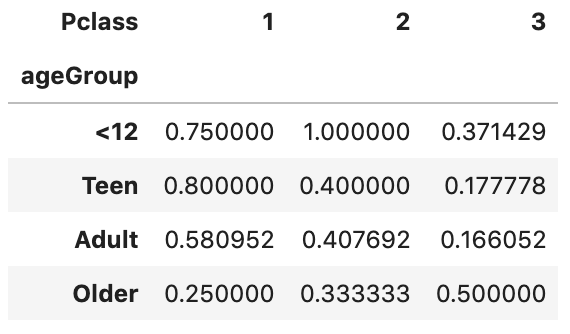
4. Create a pivot table to display the survival rate for different age groups and Pclass
A pivot table allows us to insights into our data. Let’s figure out the survival rate with it.
bins=[0, 13, 19, 61, sys.maxsize]
labels=['<12', 'Teen', 'Adult', 'Older']
(
pd.read_csv('data/train.csv')
.pipe(replace_age_na, pclass_age_map)
.query('Embarked == "S"')
.assign(ageGroup = lambda df: pd.cut(df['Age'], bins=bins, labels=labels))
.pivot_table(
values='Survived',
columns='Pclass',
index='ageGroup',
aggfunc='mean')
)The first parameter values='Survived' specifies the column Survived to aggregate. Since the value of Survived is 1 or 0, we can use the aggregation function mean to calculate the survival rate and therefore aggfunc='mean' is used. index='ageGroup' and columns='Pclass' will display ageGroup as rows and Pclass as columns in the output table.
By running the code, we should get an output like below:
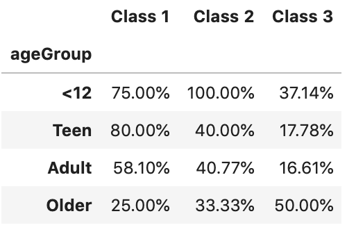
5. Improve the display of pivot table by renaming axis labels and formatting values.
The output we have got so far is not very self-explanatory. Let’s go ahead and improve the display.
bins=[0, 13, 19, 61, sys.maxsize]
labels=['<12', 'Teen', 'Adult', 'Older']
(
pd.read_csv('data/train.csv')
.pipe(replace_age_na, pclass_age_map)
.query('Embarked == "S"')
.assign(ageGroup = lambda df: pd.cut(df['Age'], bins=bins, labels=labels))
.pivot_table(
values='Survived',
columns='Pclass',
index='ageGroup',
aggfunc='mean')
.rename_axis('', axis='columns')
.rename('Class {}'.format, axis='columns')
.style.format('{:.2%}')
)rename_axis() is used to clear the columns label. After that, rename('Class {}'.format, axis='columns') is used to format the columns label. Finally,style.format('{:.2%}') is used to format values into percentages with 2 decimal places.
By running the code, we should get an output like below
Performance and drawback
In terms of performance, according to DataSchool [2], the method chain tells pandas everything ahead of time, so pandas can plan its operations more efficiently, and thus it should have better performance than conventional ways.
Method Chainings are more readable. However, a very long method chaining could be less readable, especially when other functions get called inside the chain, for example, the cut() is used inside the assign() method in our tutorial.
In addition, a major drawback of using Method Chaining is that debugging can be harder, especially in a very long chain. If something looks wrong at the end, you don’t have intermediate values to inspect.
For a longer discussion of this topic, see Tom Augspurger’s Method Chaining post [1].
That’s it
Thanks for reading.
Please checkout the notebook on my Github for the source code.
Stay tuned if you are interested in the practical aspect of machine learning.
Lastly, here are 2 related articles you may be interested in
References
- [1] Method Chaining from Tom Augspurger https://tomaugspurger.github.io/method-chaining.html
- [2] Future of Pandas from DataSchool.io


