
Using Comparative Visuals: 3 Hands-on Examples With Python Plotly
The value of data often lies in its comparability — Tufte

The world is boiling over with data, making it a tough process to transform this information into understandable data visualizations.
Edward Tufte, a pioneer in data visualization, has spent his entire career distilling complex information into clear, insightful visuals.
In Tufte’s view, data rarely exists in a vacuum. It may make the most sense when contrasted with other data.
The value of data often lies in its comparability.
By making comparisons explicit, viewers can better see the differences and similarities among datasets. How can we be explicit?
Using a UN global data set, let’s look at 3 awesome Python examples: comparative bar chart, line chart, and choropleth heat map.
The Data Set
For our examples let’s use the“Global Peace Index” (GPI) data downloaded from the visionofhumanity.org website (located HERE).
Once we download the file, we can open it up in Excel (or Numbers) and click on the “Overall Scores” tab. You should see this view:
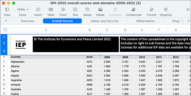
Next, you want to select and delete the first 3 rows (highlighted in the image above). Once these rows are removed, you can then Export this sheet as a CSV file called global_peace_index.csv.
Now we are ready to write some Python code for comparative analysis!
Example 1: Comparative Bar Chart
A simple and effective way to demonstrate comparisons is through a comparative bar chart.
To create a simple comparative bar chart using Python’s plotly library:
import plotly.graph_objects as go
import pandas as pd

# Load your dataset here
data = pd.read_csv('global_peace_index.csv')

# Calculating the GPI average for 2022
gpi_average_2022 = data['2022'].mean()

selected_countries = ['China', 'Canada', 'Italy', 'Yemen', 'Brazil', 'Russia', 'Afghanistan', 'Egypt']

# Re-selecting the GPI scores for the specified countries in 2022 with corrected names
gpi_selected_countries = data[data['Country'].isin(selected_countries)]

# Extracting GPI scores for these countries in 2022
gpi_scores_2022 = gpi_selected_countries[['Country', '2022']].set_index('Country').loc[selected_countries, '2022']

# Creating the grouped bar chart
fig = go.Figure()

# Bars for selected countries
fig.add_trace(go.Bar(
    x=gpi_scores_2022.index,
    y=gpi_scores_2022.values,
    name='GPI Scores 2022',
    marker_color='indianred'
))

# Line for GPI average
fig.add_trace(go.Scatter(
    x=gpi_scores_2022.index,
    y=[gpi_average_2022] * len(selected_countries),
    mode='lines',
    name='GPI Average 2022',
    line=dict(color='blue', width=3, dash='dot')
))

# Update layout
fig.update_layout(
    title='Global Peace Index 2022: Selected Countries vs Average',
    xaxis_title='Country',
    yaxis_title='Global Peace Index Score',
    barmode='group'
)

# Run this in a Python environment to display the figure
fig.show()
In this example, the bar chart compares the global safety index (the bar chart) for each country to the average for all countries (the dotted line).
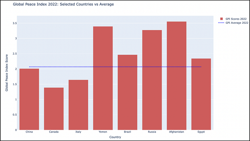
We can see the safer countries have a lower index value (China, Canada, Italy) and the less-safe countries with a higher value (Yemen, Russia, Afghanistan).
Example 2: Comparative Line Chart
Line charts are another excellent tool for showing comparisons, particularly for time series data.
We can easily transition to a line chart for this dataset by tracking the 8 countries (from the previous example) over a period of 15 years (2008–2022).
Here is the working Python Plotly code to generate a comparative line chart:
import plotly.graph_objects as go
import pandas as pd

# Load your dataset here
data = pd.read_csv('global_peace_index.csv')

selected_countries = ['China', 'Canada', 'Italy', 'Yemen', 'Brazil', 'Russia', 'Afghanistan', 'Egypt']

# Re-selecting the GPI scores for the specified countries
gpi_selected_countries = data[data['Country'].isin(selected_countries)]

# Preparing the data for the time-series plot
years = [str(year) for year in range(2008, 2023)]
gpi_time_series = gpi_selected_countries[['Country'] + years].set_index('Country')

# Calculating the GPI global average for each year
gpi_global_average = data[years].mean()

# Creating the time-series line graph
fig = go.Figure()

# Adding lines for each selected country
for country in selected_countries:
    fig.add_trace(go.Scatter(
        x=years,
        y=gpi_time_series.loc[country],
        mode='lines',
        name=country
    ))

# Adding line for the GPI global average
fig.add_trace(go.Scatter(
    x=years,
    y=gpi_global_average,
    mode='lines',
    name='GPI Global Average',
    line=dict(color='black', width=2, dash='dash')
))

# Update layout
fig.update_layout(
    title='Global Peace Index (2008-2022): Selected Countries and Global Average',
    xaxis_title='Year',
    yaxis_title='Global Peace Index Score'
)

# Run this in a Python environment to display the figure
fig.show()
This code reads the GPI dataset into a pandas DataFrame, and filters the data for a predefined list of countries.
The code then prepares a DataFrame for plotting, with GPI scores for each selected country across the specified years.
It also calculates the global GPI average for each year. Using Plotly, the code plots each country line and a distinct line for the global average.
The resulting comparative time-series line chart:
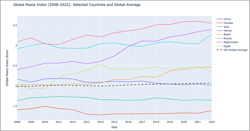
This line chart shows each country’s relative safety over time. We can see if a country is increasing/decreasing in safety and how this is related to the GPI global average (the black dotted line).
Very simple, yet useful, line chart.
Plotly does a terrific job in displaying these types of charts in an accessible, user-friendly way.
Example 3: Choropleth Heat Maps
A choropleth map allows the viewer to perform temporal comparative analysis of GPI scores across different countries.
By implementing a choropleth map with a slider, we can observe global patterns over time.
The working Python Plotly code to generate a global choropleth with a Year slider:
import pandas as pd
import plotly.express as px

# Assuming the dataset is in the same directory as your Python script
# and named 'global_peace_index.csv'.
data = pd.read_csv('global_peace_index.csv')

# Reshaping the dataset to have one row per country-year pair
data_long = data.melt(id_vars=['Country', 'iso3c'],
                      value_vars=[str(year) for year in range(2008, 2023)],
                      var_name='Year',
                      value_name='GPI')

# Creating the choropleth map with a slider for the year
fig = px.choropleth(data_long,
                    locations="iso3c",
                    color="GPI",
                    hover_name="Country",
                    animation_frame="Year",
                    color_continuous_scale=px.colors.sequential.Plasma,
                    projection="natural earth")

# Update the layout to include a title
fig.update_layout(
    title_text='Global Peace Index by Country and Year',
    geo=dict(showframe=False, showcoastlines=False)
)

fig.show()
As with the previous 2 examples, the dataset is loaded from a CSV file into a DataFrame using Pandas. The DataFrame is reshaped to create a pair for each country and year with the corresponding GPI score.
Plotly Express is used to create an interactive choropleth map. The locations parameter takes the ISO country codes, color is set to the GPI score, hover_name is the country's name, and animation_frame allows for year-by-year exploration.
And the resulting choropleth map with slider:

The choropleth map provides a visual representation of the GPI scores across different countries.
The slider (on the bottom) allows the user to select an individual year, or to click the “Play” icon to animate the changes over time.
Pretty awesome.
In Summary…
Edward Tufte’s principle of “showing comparisons” is an important foundational data visualization concept.
It enables viewers to immediately and easily perceive differences and similarities in a data set.
The Python plotly library allows us to easily create these comparative visualizations from a pandas data frame.
As data scientists, we must strive to create visualizations that don’t just show data, but also demonstrate visually the ability to differentiate in a useful and pragmatic way.
Thank you for reading!
If this type of story is right up your alley, and you want to support me as a writer, subscribe to my Substack.
On Substack, I publish a bi-weekly newsletter and articles that you won’t find on the other platforms where I create content.


