
Using Color and Color Theory in Midjourney
I am experimenting with the use of color in Midjourney and tried lots of different combinations of color and descriptions of color. The use of color can have a dramatic effect and really heighten the impact of a Midjourney image.
Color theory is the study of how colors interact with each other and the effects they have on visual perception. In photography and cinematography, color theory is used to create specific moods, emotions, and meanings in images and videos.
Color theory in photography and cinematography generally consists of three main elements: color harmony, color contrast and color meaning.
- Color harmony refers to how colors are used together to create a sense of balance and visual interest. This can include the use of analogous colors, complementary colors, and monochromatic color schemes.
- Color contrast refers to how colors are used to create a sense of depth and visual hierarchy. This can include the use of high contrast colors, such as black and white, to create a bold and graphic effect, or the use of low contrast colors, such as pastels, to create a soft and delicate effect.
- Color meaning refers to the symbolic and emotional associations that colors have. Different colors can evoke different emotions and meanings, and photographers and cinematographers use this to their advantage to create a specific atmosphere or mood in their work. For example, blue is often associated with calmness and tranquility, while red is associated with passion and energy.
A decent reference for color in Midjourney is at Github: https://github.com/willwulfken/MidJourney-Styles-and-Keywords-Reference/blob/main/Pages/MJ_V4/Style_Pages/Colors_and_Palettes.md
In photography and cinematography, color theory is used to enhance the visual impact of an image or video, as well as to communicate a message or evoke a particular emotion. Photographers and Cinematographers use color theory to create compositions that are visually pleasing and meaningful. They use color to create contrast, depth, and to direct the viewer’s attention to certain elements in the frame.
It’s worth noting that color theory is not an exact science and the way colors are perceived can be subjective, so the impact of color depends on the context, medium, and the way it’s used.
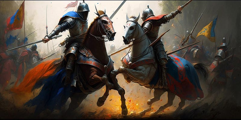
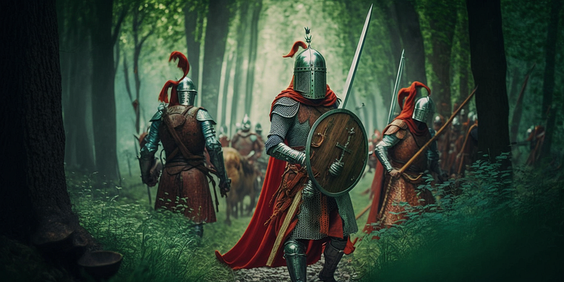
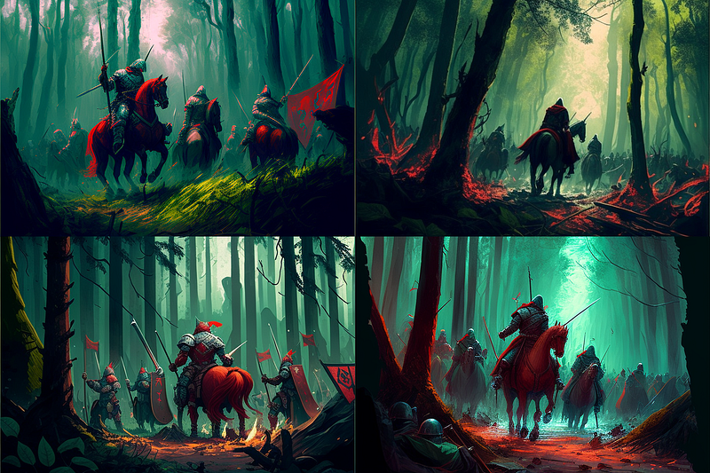
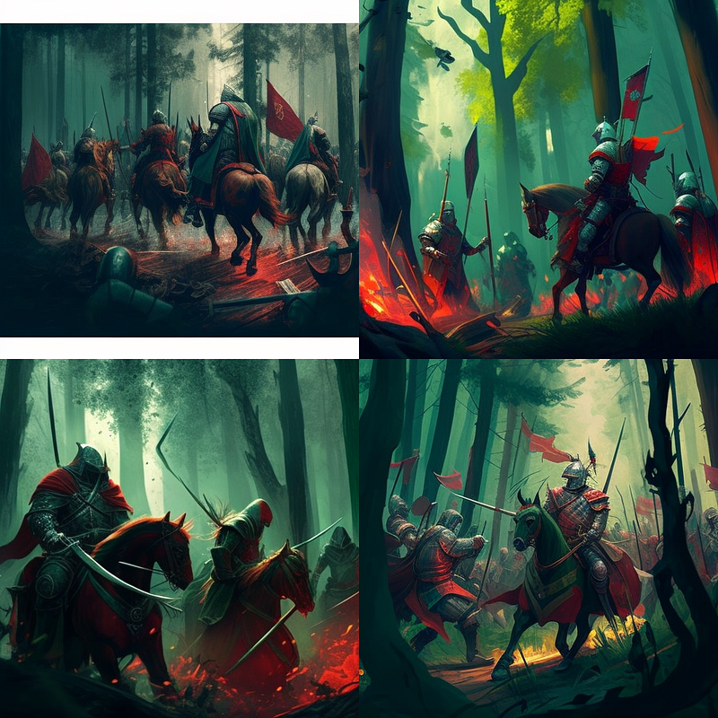
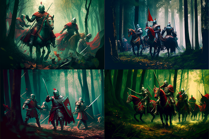
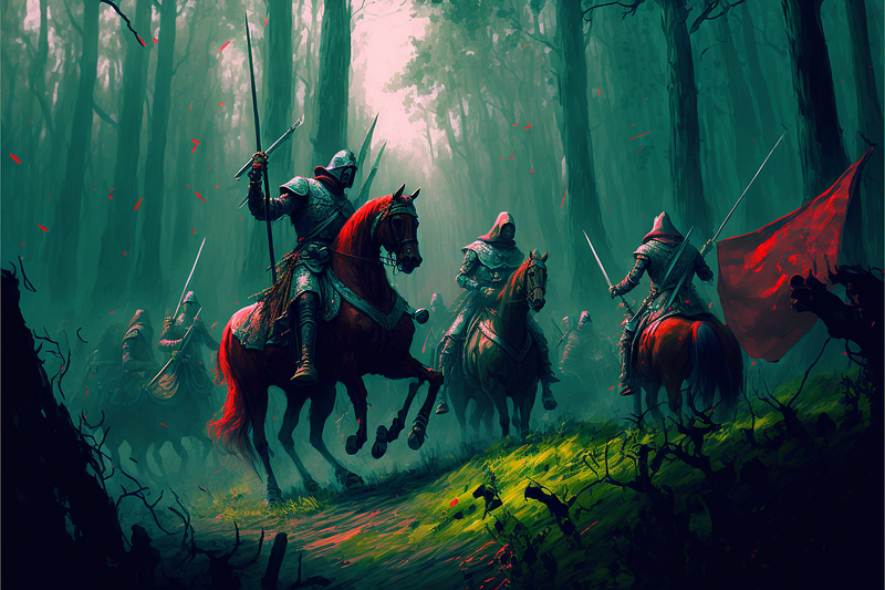
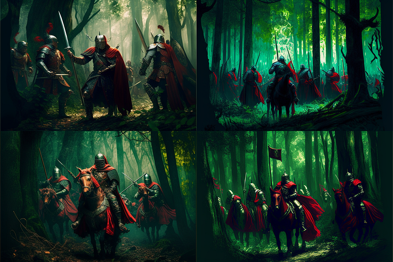
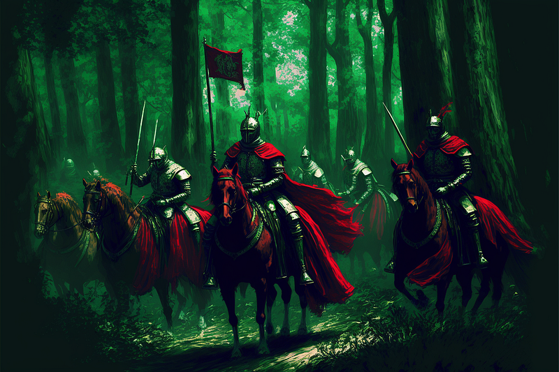
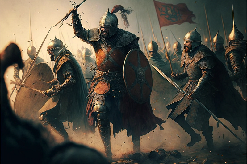
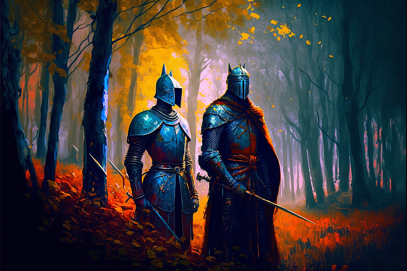
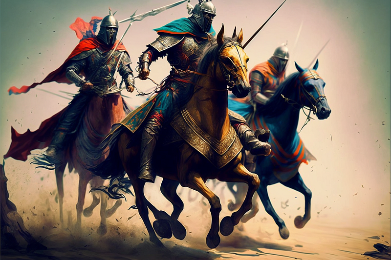
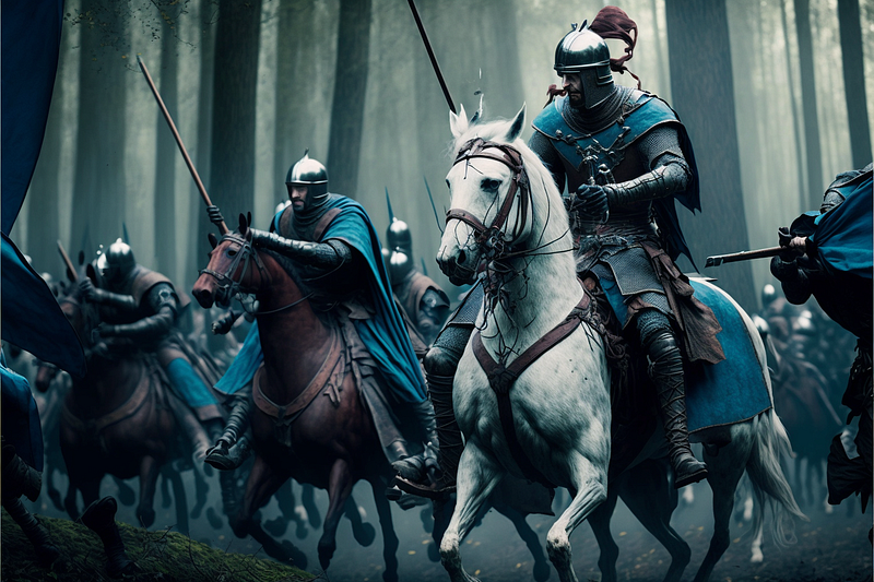
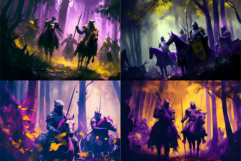
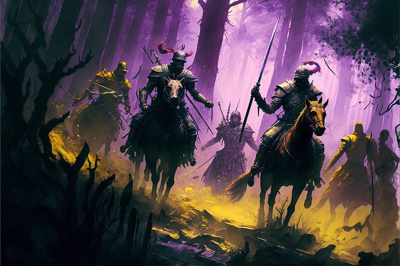
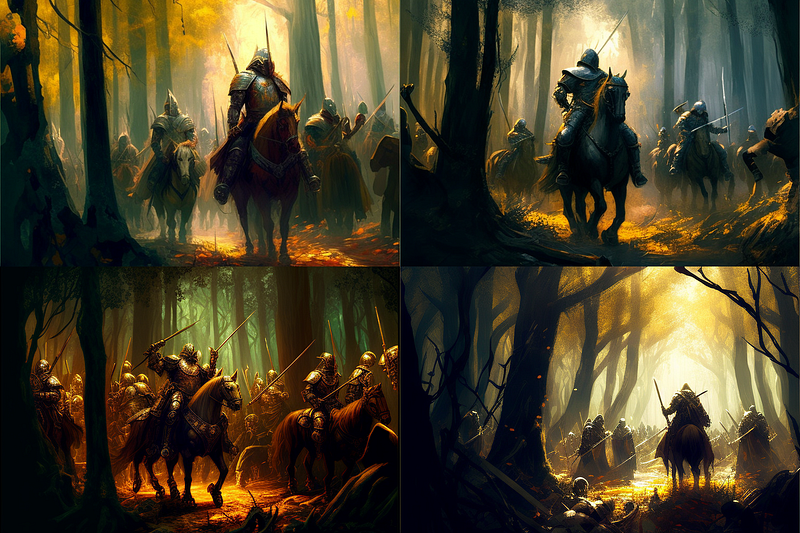
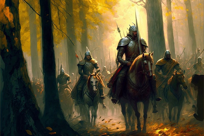
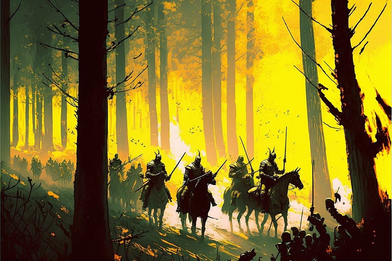
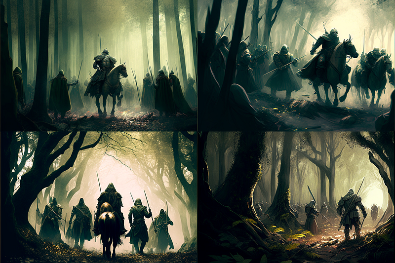
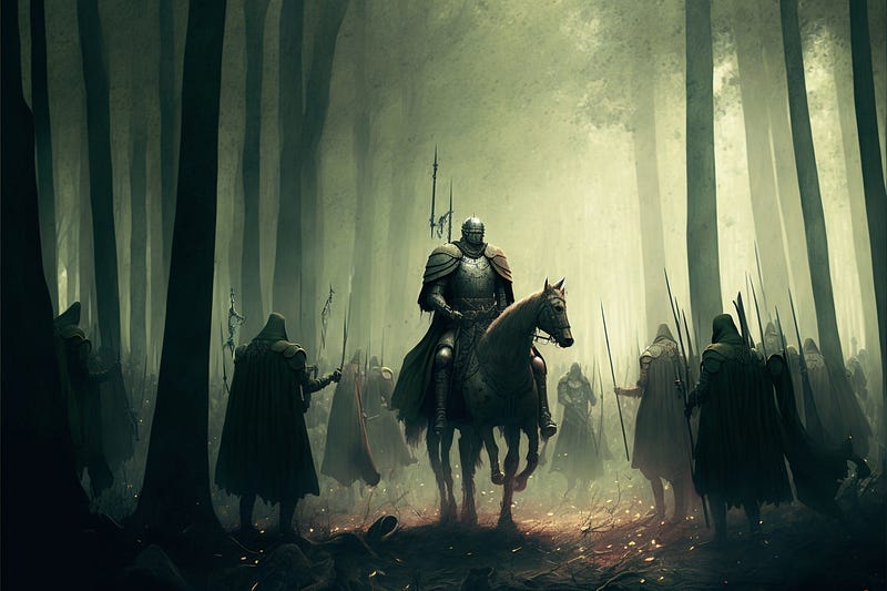
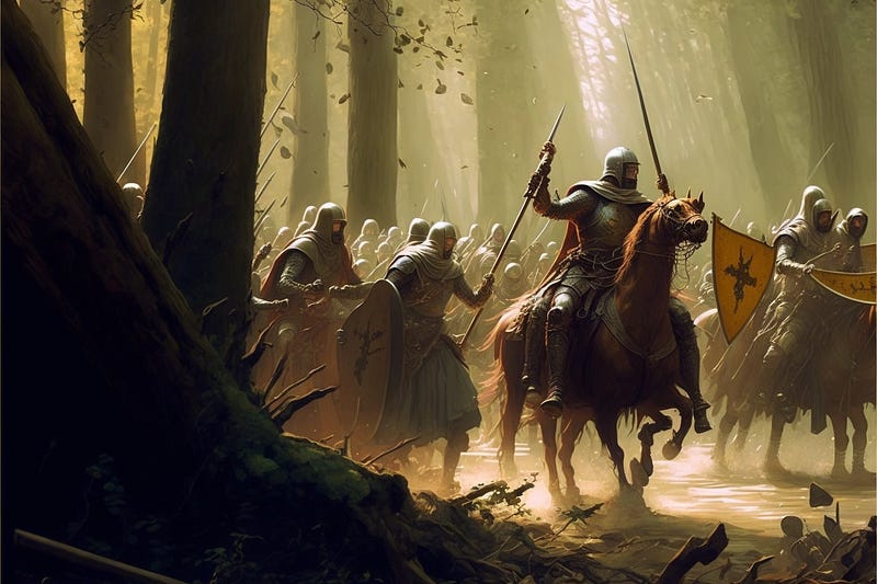
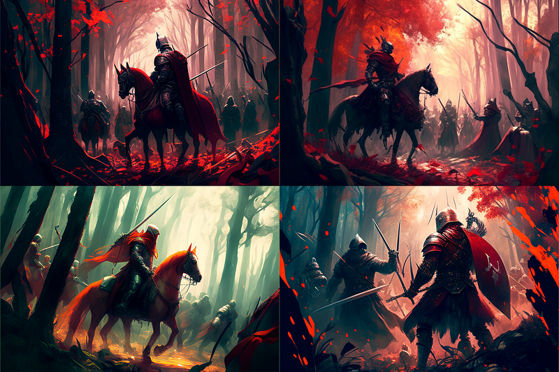
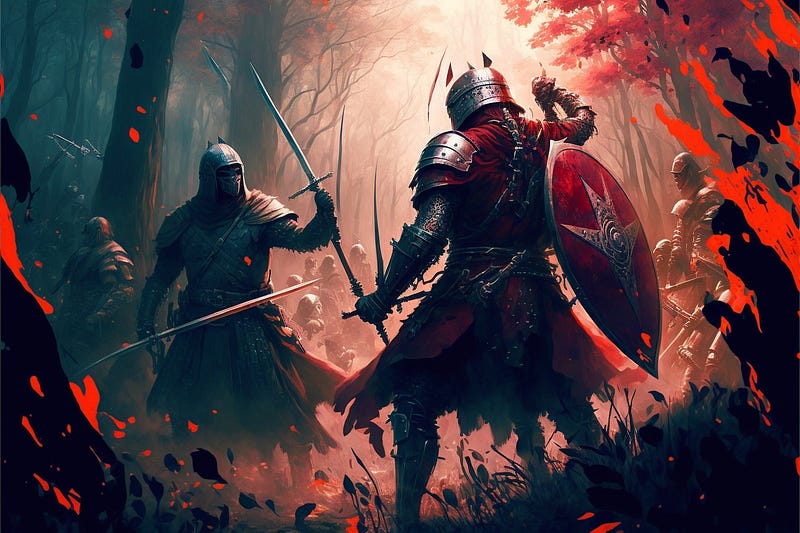
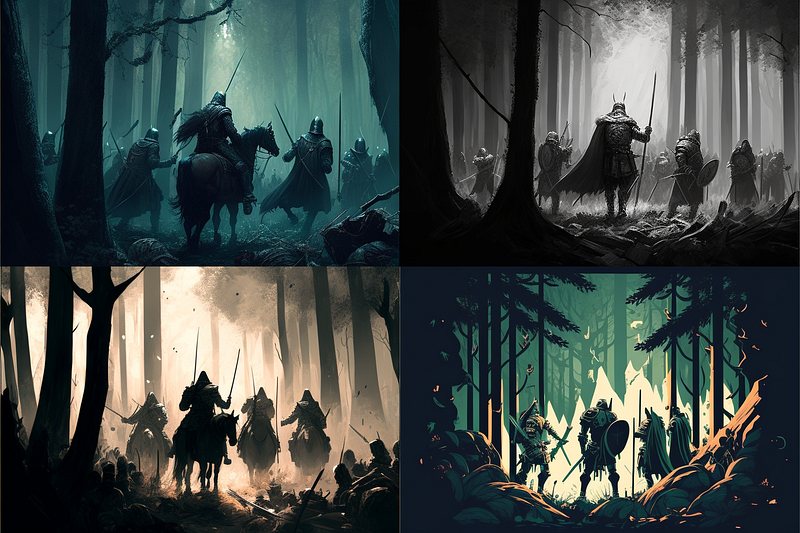
Red and Green Colors
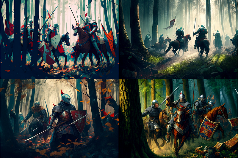
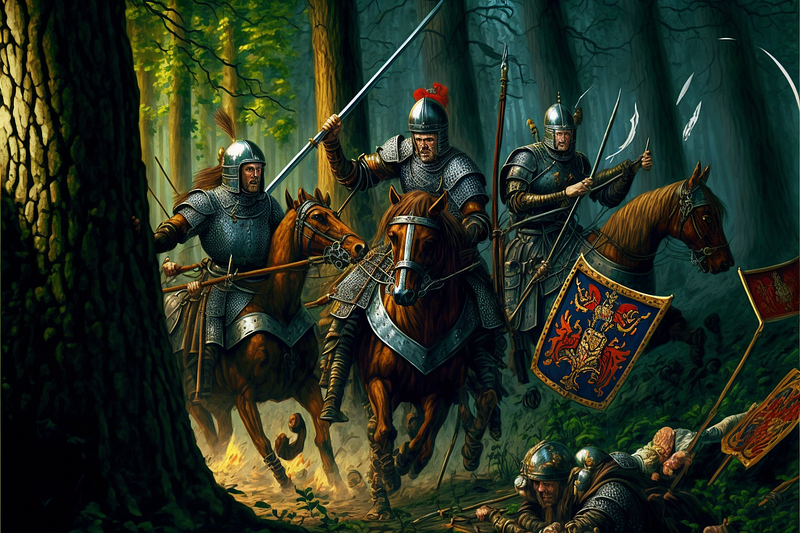
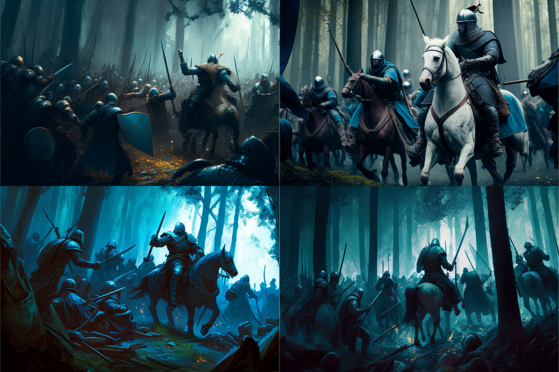
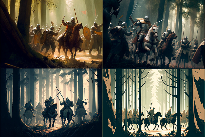
One example of a color scheme that could be used for a battle scene is a complementary color scheme using red and green.
- Red is often associated with danger, aggression, and energy, which would be fitting for a battle scene.
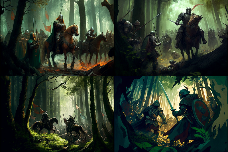
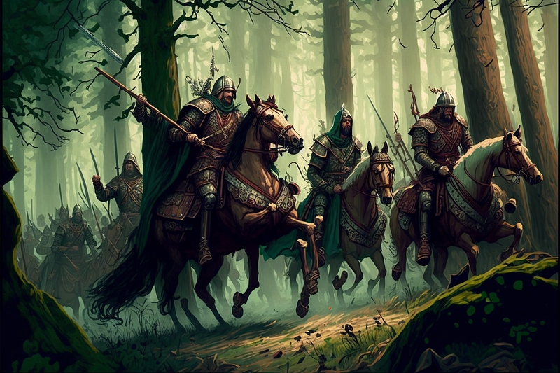
- Green is often associated with nature, growth, and life, which could be used to contrast the violence and destruction of a battle.
Using this complementary color scheme, the battle scene could feature a lot of red tones for the action, weapons, and armor of the soldiers, while also incorporating green tones to represent the lush and verdant landscape they are fighting in.
This color scheme could also be used to create a sense of tension and drama, by having the red and green tones in close proximity to each other, it would create a high contrast that would draw the viewer’s attention to the key elements of the scene, such as the soldiers’ weapons, the blood on the ground, and the overall chaos of the battle.
Perhaps a more effective approach is to specify what color to use for the subjects and objects in an image.
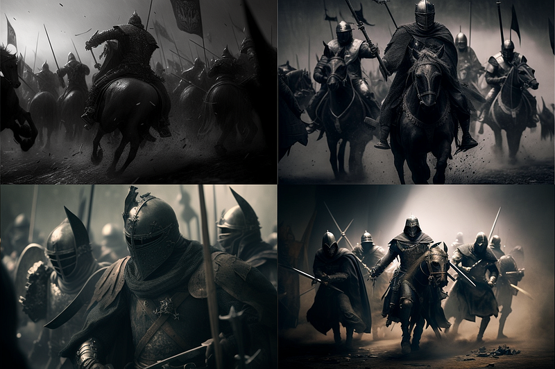
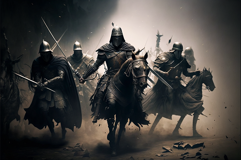
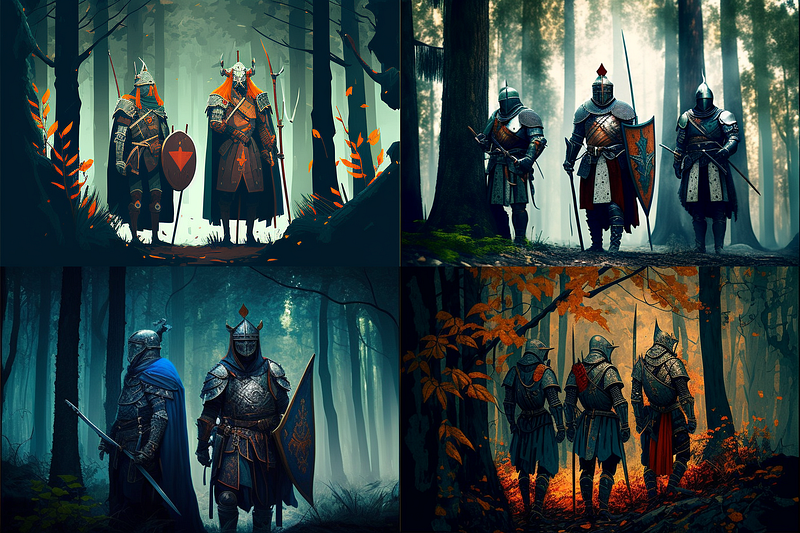
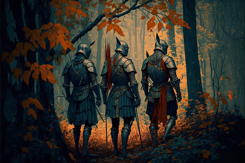
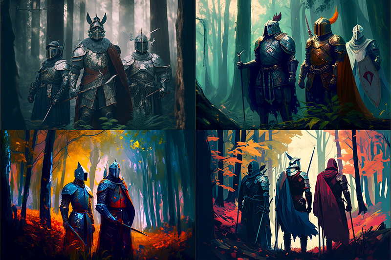
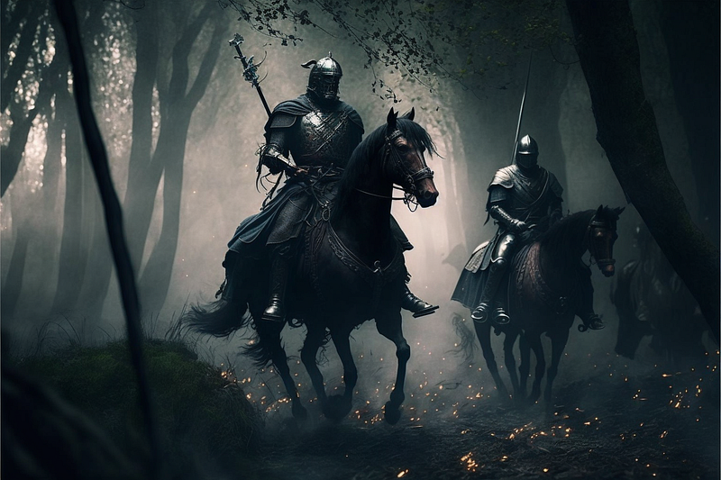
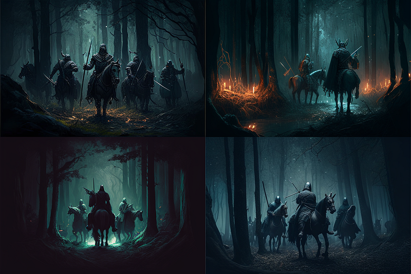
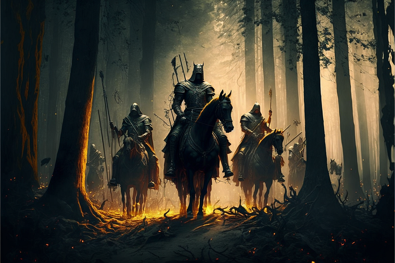
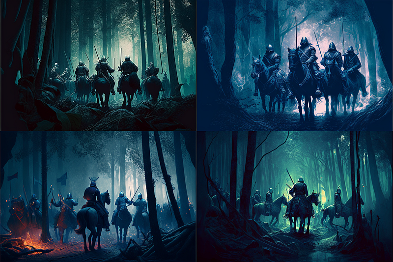
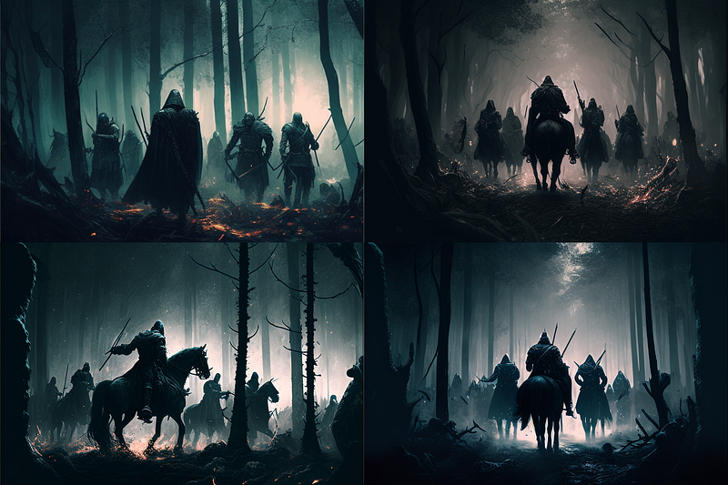
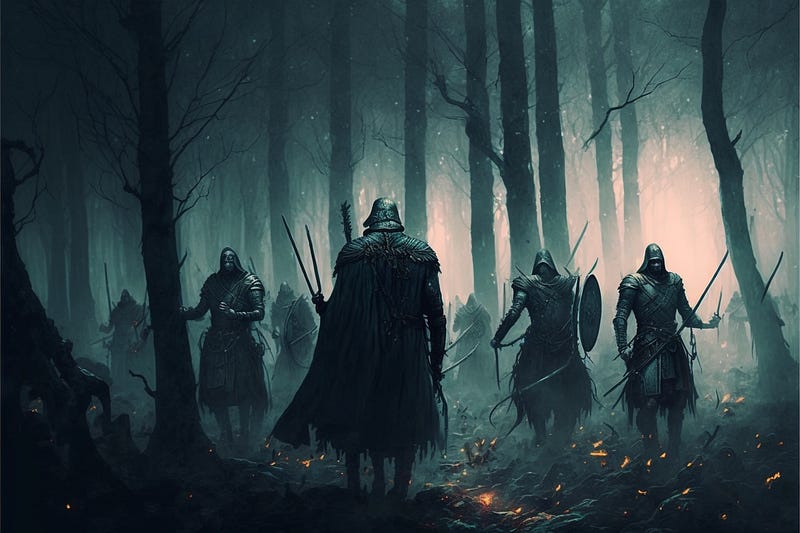
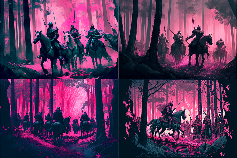
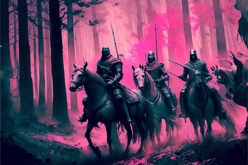
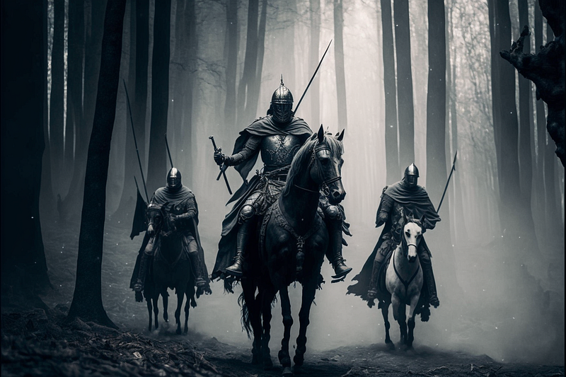
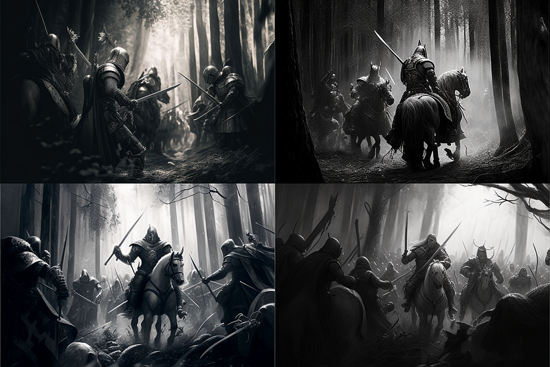
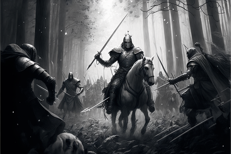
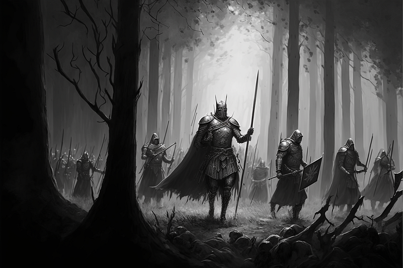
Tones of Black
Tonal Colors
Tonal colors refer to variations of a single color that are created by adding black or white to the original color. Tonal colors are also known as “shades” or “tones.”
When black is added to a color, it creates a darker, more subdued version of that color. This is known as a “shade.” For example, a “shade of blue” would be a darker, more muted version of blue.
When white is added to a color, it creates a lighter, more pastel version of that color. This is known as a “tint.” For example, a “tint of pink” would be a lighter, more pastel version of pink.
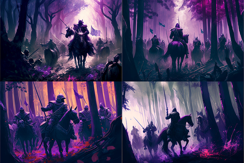
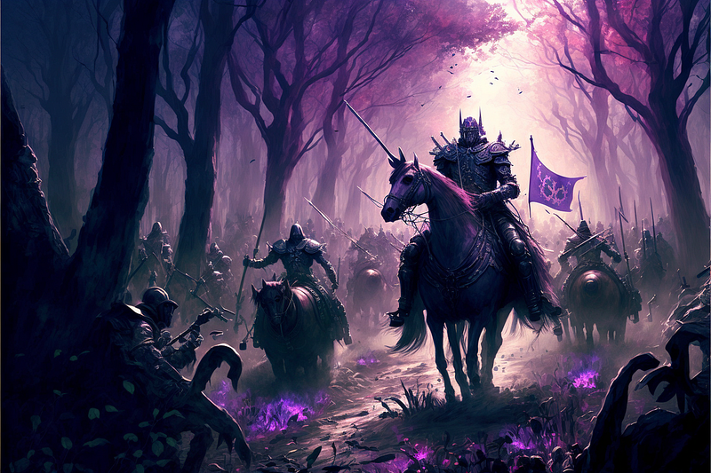
Complimentary Colors
Complimentary colors are colors that are opposite each other on the color wheel. They are also known as “opposites” or “complementary hues.”
The color wheel is a visual representation of the colors of the spectrum arranged in a circle. It’s a useful tool for understanding color relationships and how colors interact with each other.
The primary colors on the color wheel are red, blue, and yellow. When these colors are mixed together in different combinations, they create secondary colors, such as green, purple, and orange.
Complimentary colors are opposite each other on the color wheel. For example, red and green are complimentary colors, as are blue and orange, and purple and yellow.
When used together, complimentary colors create a high level of visual contrast and can be used to create a dynamic effect. They can be used to create emphasis and draw attention to certain elements in an image or design.
Analogous Colors
Analogous colors are colors that are next to each other on the color wheel. They are also known as “neighboring” or “harmonious” colors.
The color wheel is a visual representation of the colors of the spectrum arranged in a circle. It’s a useful tool for understanding color relationships and how colors interact with each other.
Analogous colors are those that are located next to each other on the color wheel. For example, blue, blue-green, and green are analogous colors. Yellow, yellow-green, and green-yellow are also analogous colors.
Tetradic Colors
Tetradic colors, also known as double complementary colors, are two sets of complementary colors used together.
A tetradic color scheme is created by choosing two sets of complementary colors that are opposite each other on the color wheel. For example, a tetradic color scheme could consist of the colors red and green, and blue and orange.
Triadic Colors
Triadic colors are three colors that are evenly spaced around the color wheel. They are also known as “triadic harmonies.”
The color wheel is a visual representation of the colors of the spectrum arranged in a circle. It’s a useful tool for understanding color relationships and how colors interact with each other.
A triadic color scheme is created by choosing three colors that are evenly spaced around the color wheel. For example, a triadic color scheme could consist of the colors red, yellow, and blue, or purple, orange and green.
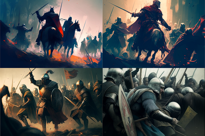
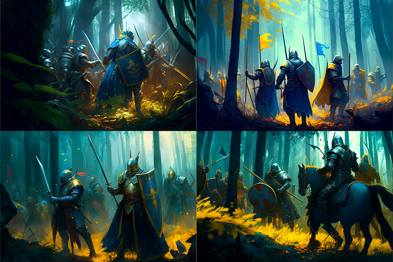
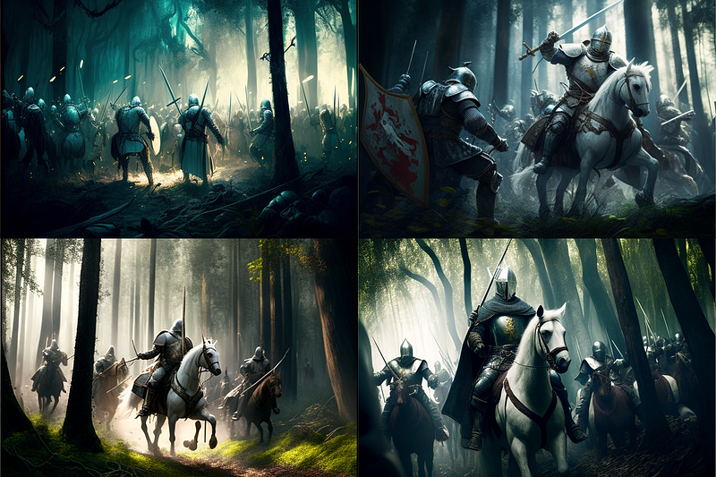
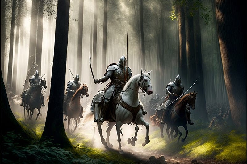
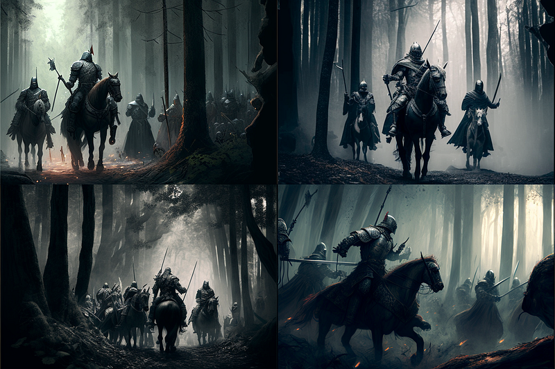
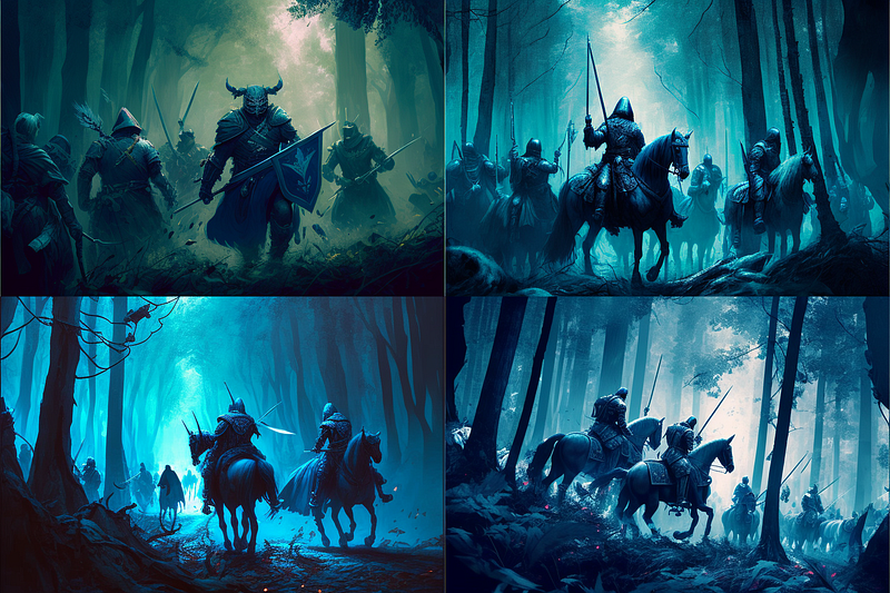
Light Mode
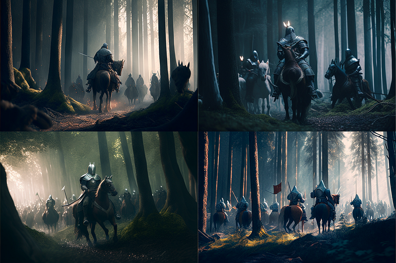
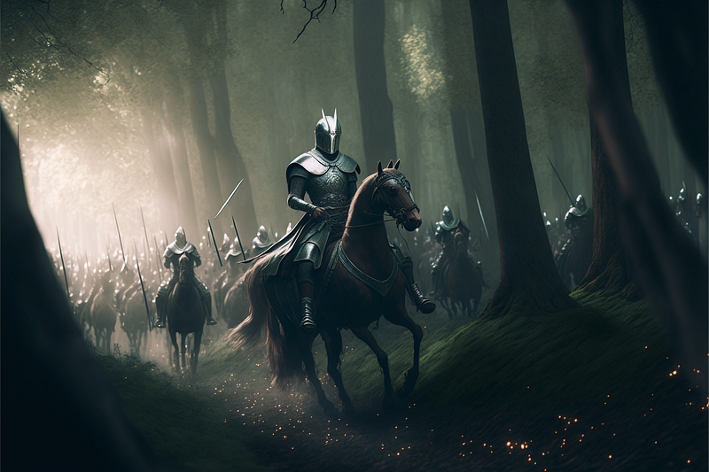
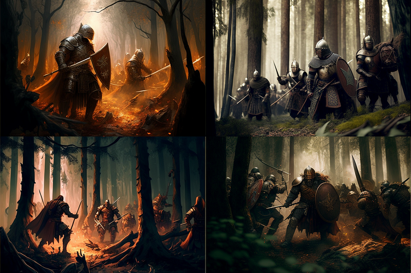
Tones of Black in Background
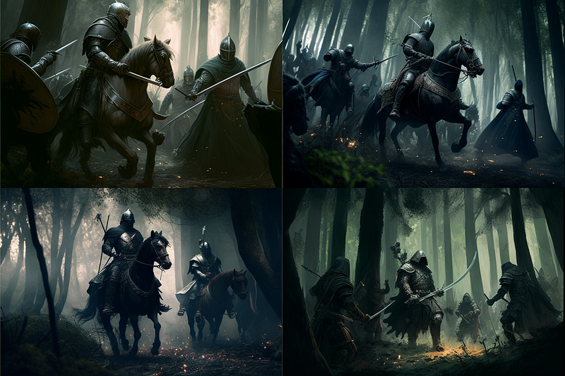
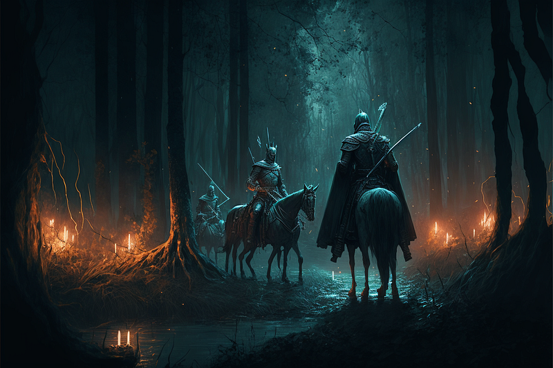
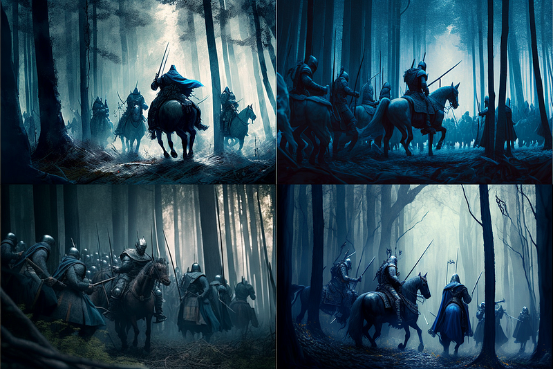
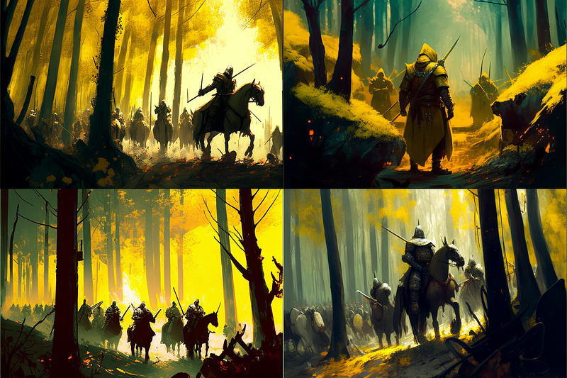
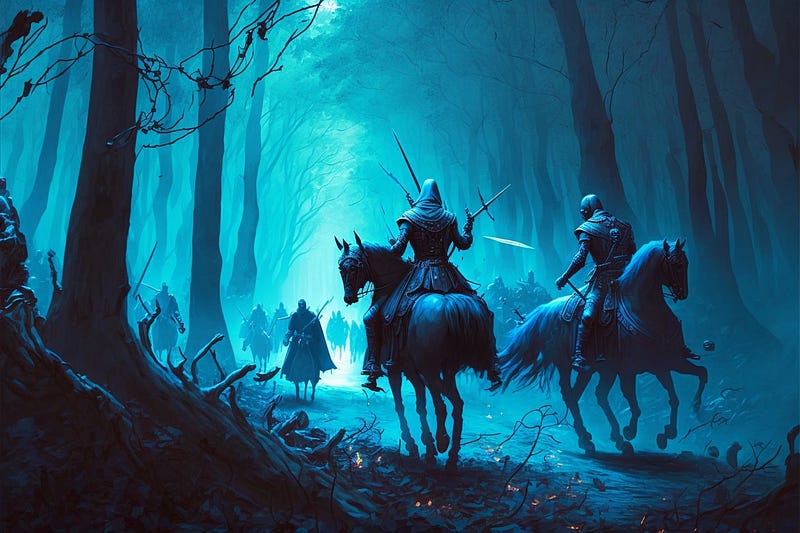
Dark Mode
Blue and yellow colors
These colors are next to each other on the color wheel, which makes them analogous. This combination creates a sense of warmth.
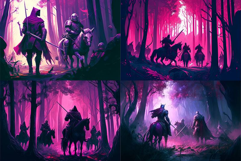
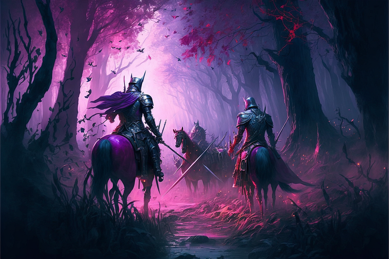
Pink and purple colors
These colors are close to each other on the color wheel, making them analogous. This combination creates a sense of femininity and romance, and can be used to create a delicate and soft visual effect.
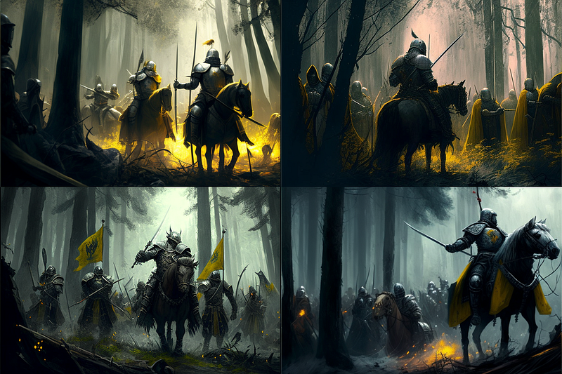
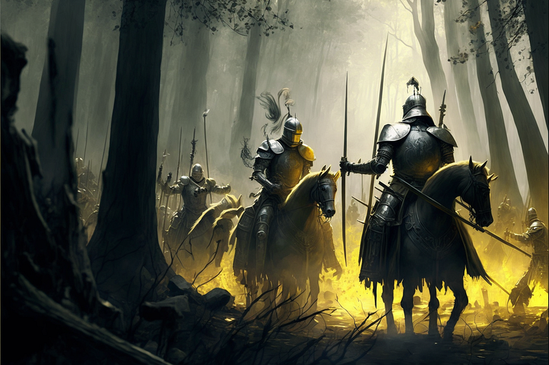
Black and gold colors
These colors are not on the color wheel but work well together, creating a sense of luxury and elegance.
Brown and green colors
This combination creates a sense of nature and grounding, often used in designs related to gardening, landscaping and ecology.
Gray and blue colors
This combination creates a sense of calm, often used in designs related to technology, industry and minimalism.
Gray and yellow colors
This combination creates a sense of softness and warmth
Brown and blue colors
This combination creates a sense of grounding, natural, and calm.
Pink and green colors
These colors are close to each other on the color wheel, making them analogous. This combination creates a sense of balance and can be used to create a soothing visual effect
Purple and yellow colors
These colors are also opposite each other on the color wheel, making them complementary. This combination creates a sense of harmony and can be used to create a calming visual effect.
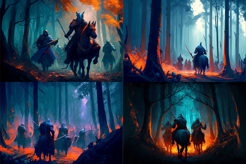
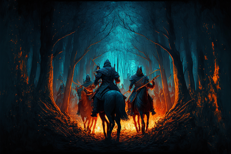
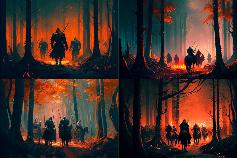
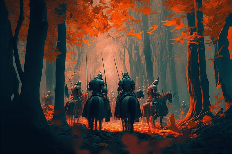
Blue and orange colors
These colors are opposite each other on the color wheel, which makes them complementary. This combination creates a high contrast and can be used to create a dynamic visual effect.
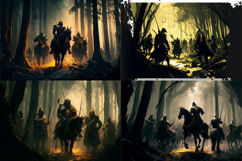
Sheen of gold colors
Intensity of orange colors
Depth of navy-blue colors

Richness of purple colors
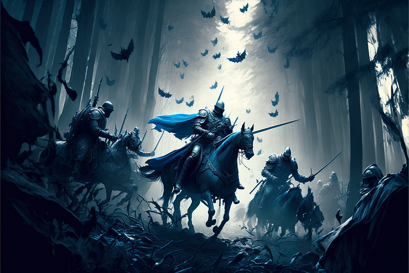
Darkness of black colors
Brightness of white colors
Saturations of yellow colors
Tints of pink colors
Shades of grays
Hues of blue colors
Earth tones of brown colors

Muted tones of olive colors
Vibrant hues of turquoise colors
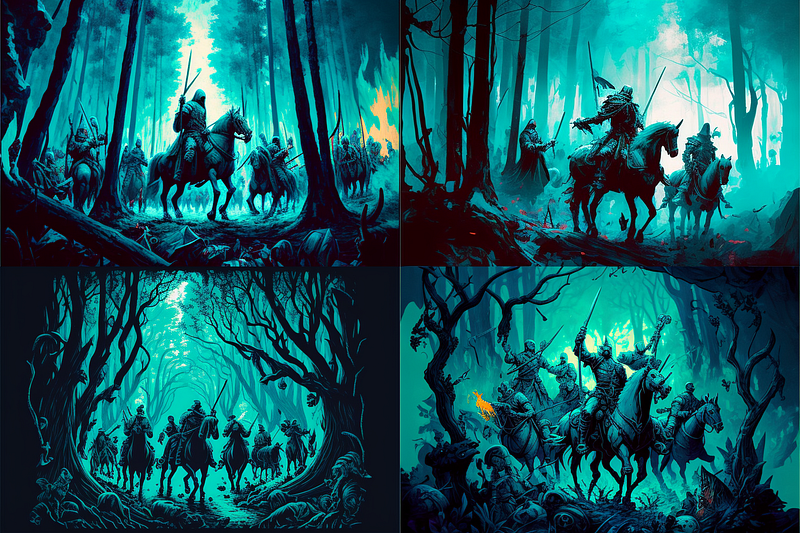
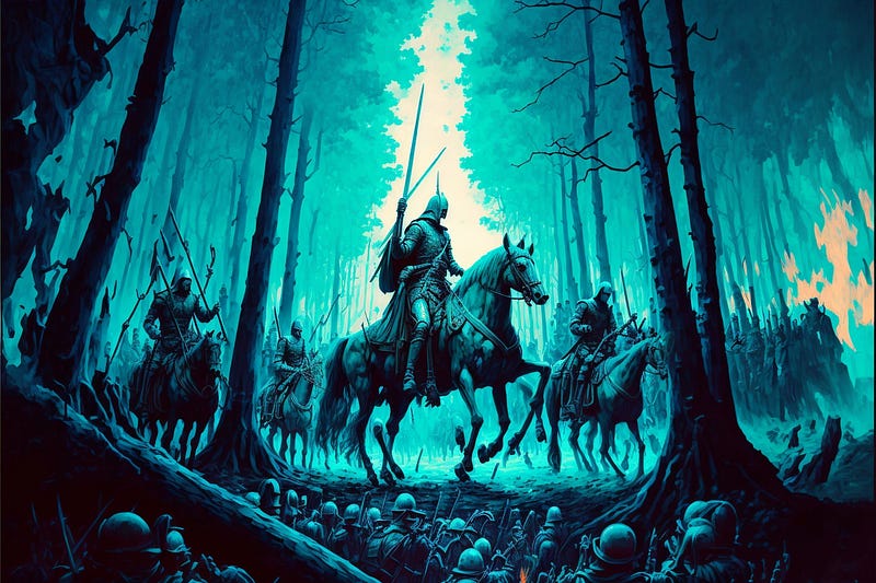
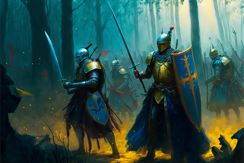
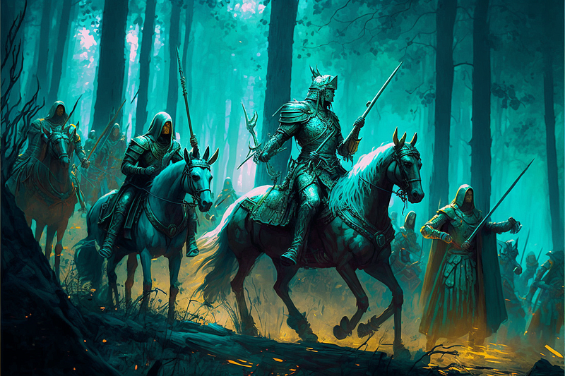
Turquoise and Orange colors
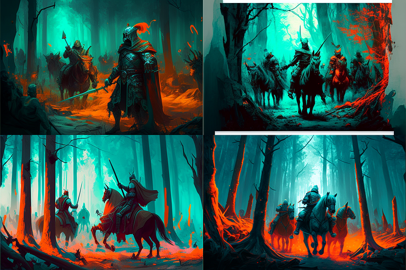
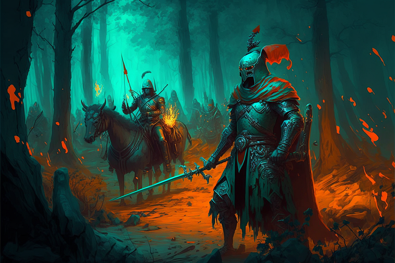
Turquoise and Gold colors
Subtle shades of beige colors
Bold saturations of red colors
Achromatic grayscale colors
Monochromatic Colors
Monochromatic colors are variations of a single color created by using different shades, tints, and tones of that color. They are also known as “monochrome.”
A monochromatic color scheme is created by using different values of a single color. For example, a monochromatic color scheme using the color blue could include different shades of blue, such as navy, royal blue, and baby blue.
I hope you find this guide to color in Midjourney useful. It seems like there is a lot of scope to using in Midjourney. One can generate amazing images using MJ, but it seems like one can really push it to its limit.
- Unleashing the Power of Midjourney and AI Art: Generating Dynamic Poses and Interactions for Your Characters (Part 1)
- Creating Facial Expressions on a Consistent Character in Midjourney, along with Image Prompts and Backgrounds
- A Guide to Using Different Shot Types in Midjourney, including Close-up, Medium-shot, Long-Shots


