Using Figma component properties to design faster
Let’s be honest, we’ve all dealt with components that look like this.
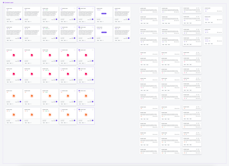
A sea of endless variants that showcase the different states of your component. It’s hard to find what you’re looking for at a quick glance and even harder to manage. What if I told you that there was an easier way?
Imagine that you could take all of those variants and scale them down into this.
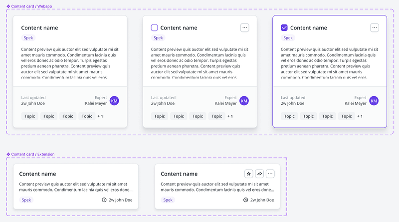
Gorgeous, right? You can do this too. To start, let’s break down the steps so that you can scale down your variant heavy components using a combination of Figma properties.
The first step to simplifying your components is understanding the component properties that are available in Figma and what they do.
What are Figma component properties?
In simple terms, component properties are the changeable aspects of a component. These properties help you build more scalable components and prevent the urge to just detach the instance 😱.
Figma currently has four different component properties available:
- Boolean = allows you to toggle an attribute on or off by setting a true / false value
- Instance swap = allows you to change out specific instances of a variant within the component
- Text = allows you to indicate which text fields should be edited and gives you the option to edit the text from the right sidebar
- Variant = allows you to create an individual component within a component set (especially helpful when defining attributes such as state, size, and color)
These can seem daunting at first but once you begin to understand them, they become much easier to use in your own components.
Dive deeper into these properties by reading the Figma help center article.
Always create a parent component first
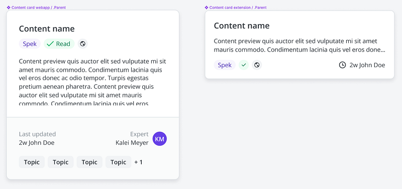
Although it may seem like a tedious step, creating a base or parent component is extremely beneficial in the long term. Instead of having to update each component variant when a change is required, using a base component allows you to make the changes once and have them apply to all instances.
The base component also allows you to limit the amount of variants you need to create. I like to load up my base component by including all possible elements that could be shown to the user and then creating properties that allow me to control how those elements display.
Don’t forget to use a . or _ in front of your parent component’s name to ensure that it’s hidden when you publish. The parent will be used as a base to create new components of the same type, so you shouldn’t publish it.
Don’t be afraid of booleans
When I started using the boolean property in my components, I was admittedly nervous. The name boolean alone was daunting enough to want to revert back to my beloved variants. If you also got flashbacks to high school math class, don’t worry, there’s no algebra involved here 😉.
In actuality, the boolean property is incredibly simple and easy to use. The two booleans values (true and false) help you to control whether a element within your component is hidden or shown.
In my component example, I use the boolean property to hide and show certain tags on the content card. Since the marked as read tag as well as the external sharing tag will not always be displayed, I want to easily toggle them on and off when I’m designing.
Create a new boolean property
To create a boolean property, first ensure that your base component is selected and then click the plus icon in the properties section of the right sidebar and select “Boolean.”
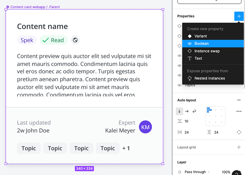
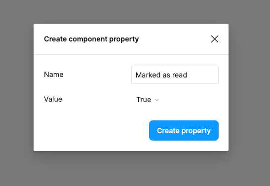
Name your boolean based on the element within the component you want to hide or show. I created this boolean to control my green read tag so I named it “Marked as read.”
Since I want my base component to display all possible elements, I left the value set to true.
Link your new boolean property to the component
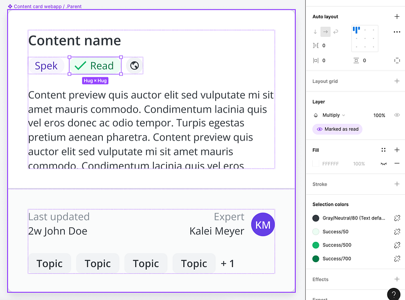
When you first create your boolean, you’ll notice that the property has an exclamation indicator that lets you know that it’s not used within the component.
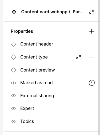
To link your boolean, select the element within the component that you want to apply your property to. Then click the apply boolean property icon in the layers section of the right sidebar and select the boolean you want to apply.
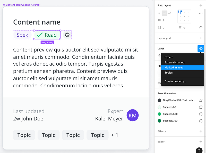
Once you select your boolean from the list, it will be linked to the selected element in the component. You’ll know it’s linked when you see a purple tag with your boolean name in the layer section.
See your boolean in use
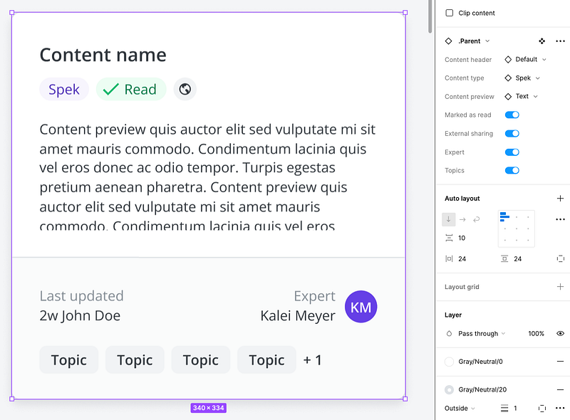
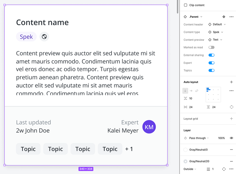
If you copy and paste an instance of your parent component, you’ll notice that you can now toggle on and off your boolean element. It’s that easy!
Use the instance swap property to change elements with ease
Now that we’ve tackled the scariest component property first, this next one should be a breeze 🍃.
In cases when you want an element of the component to always stay visible but need the flexibility to change out variants of that element, the instance swap property is perfect.
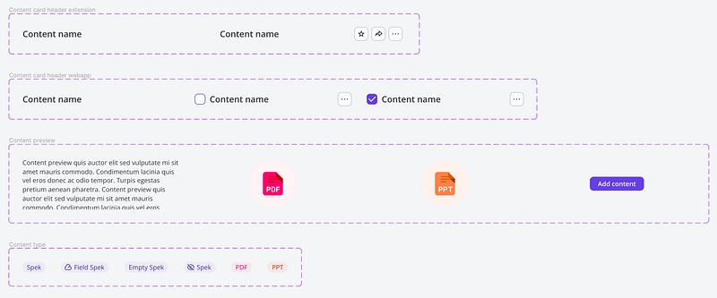
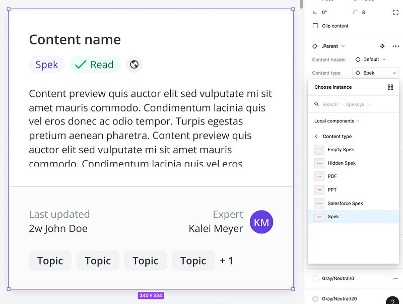
In my component example, I used the instance swap property to swap various elements such as the content type badge, content preview, and content card header.
Setting up your instance
To use the instance swap property, you’ll need to set up your components without traditional variants. This means that rather than using the variant property within the component, you’ll create each variation as it’s own component.
For the content type tag components that I created, I named them using the format “Content type / [Name]” so that they stay nested within each other in the instance panel.

Create a new instance swap property
To create an instance swap property, first ensure that your base component is selected and then click the plus icon in the properties section of the right sidebar and select “Instance swap.”
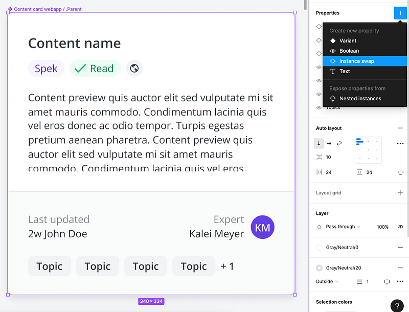
Name your instance based on the element within the component you want to swap. I created this instance swap to control my content type tag so I named it “Content type.”
Search for the name of your instance that you want to pick as your default value and select it from the panel.
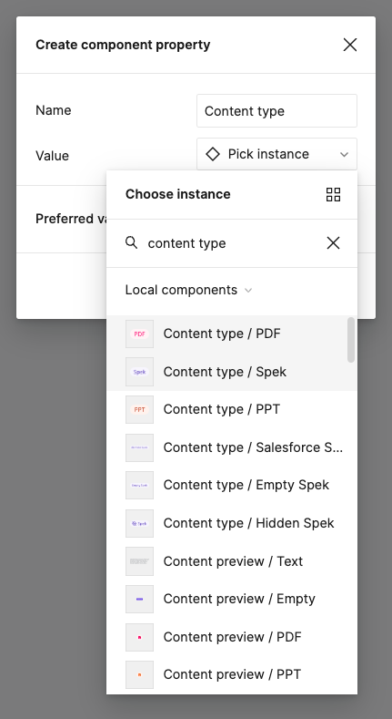
Link your new instance swap property to the component
To link your instance swap, select the element within the component that you want to apply your property to. Then click the apply instance swap property icon in the component section of the right sidebar and select the instance you want to apply.
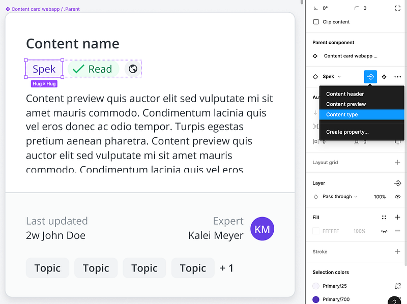
Once you select your instance from the list, it will be linked to the selected element in the component. You’ll know it’s linked when you see a purple tag with your instance name in the component section.
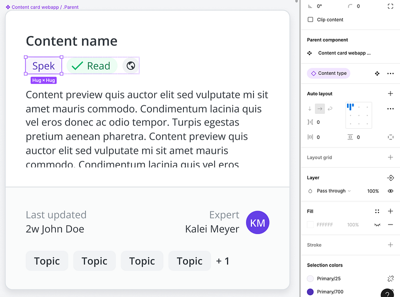
See your instance swap in use
If you copy and paste an instance of your parent component, you’ll notice that you can now choose from your linked components in the dropdown to easily swap out variations. Sweet! 🍭
Use variants sparingly
Now that you’ve learned about the magic of booleans and instance swap, you’re probably ready to get rid of variants all together, right? While these additional component properties are amazing, variants still serve a good purpose when it comes to defining attributes such as size, color, and state.
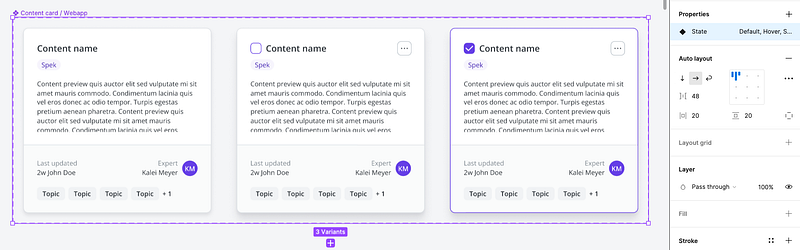
This is where your parent component comes in handy. Use your parent component as a base to create a completely new component. With this new component, create variants as you see fit! In my example, I only needed to create variants for the card states which simplified things a lot.
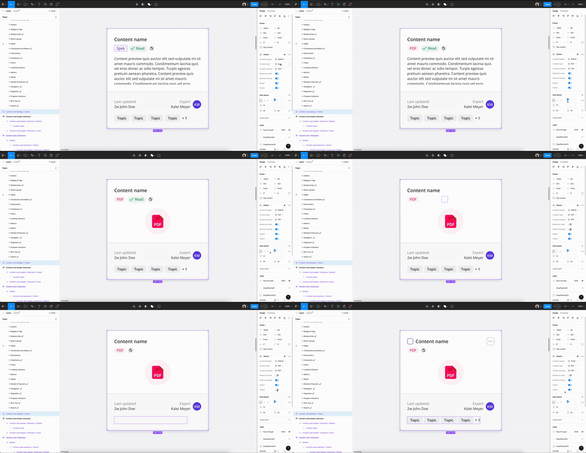
Watch the magic happen within a single component
Now that you’ve done the work to set your component up for success, see how easy it is to make changes with just a few clicks. No more never ending variants! ✨