
Use Python To Pull Energy Data From The Department of Energy’s EIA API

The Energy Information Administration (EIA) is responsible for the US Department of Energy’s statistics and data. There is a wealth of data and information about all things related to energy in the United States including data on renewable energy, nuclear energy, crude oil, gasoline, jet fuel, diesel, electricity, and natural gas.
However, navigating and finding data in the EIA’s website can be tricky. To help with this, the EIA created an API for ease of access. You can find the API at www.eia.com/opendata. The EIA releases new data weekly, monthly, or annually depending on the different types of data. The API is very useful for refreshing weekly and monthly data when they are released.
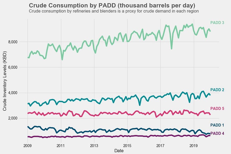
For example, I created the graph below using data pulled from the EIA’s API. Every time monthly data is released, I can re-run the code and the graph will update automatically. For the visualization, I got the code from this article.
API Access — API Key
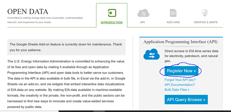
To begin, you need to obtain an API key from the EIA. Go to www.eia.com/opendata and click on the “Register Now” button.
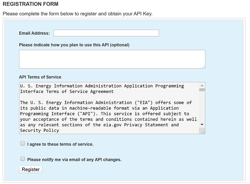
This will bring you to a registration form that looks like this. Enter your information and click “Register”. You will be sent an email containing your new API key. It might be sent to your junk folder so be sure to check there if you haven’t received the API key within a few minutes.
Finding Data Sets
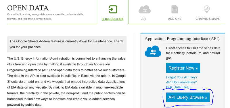
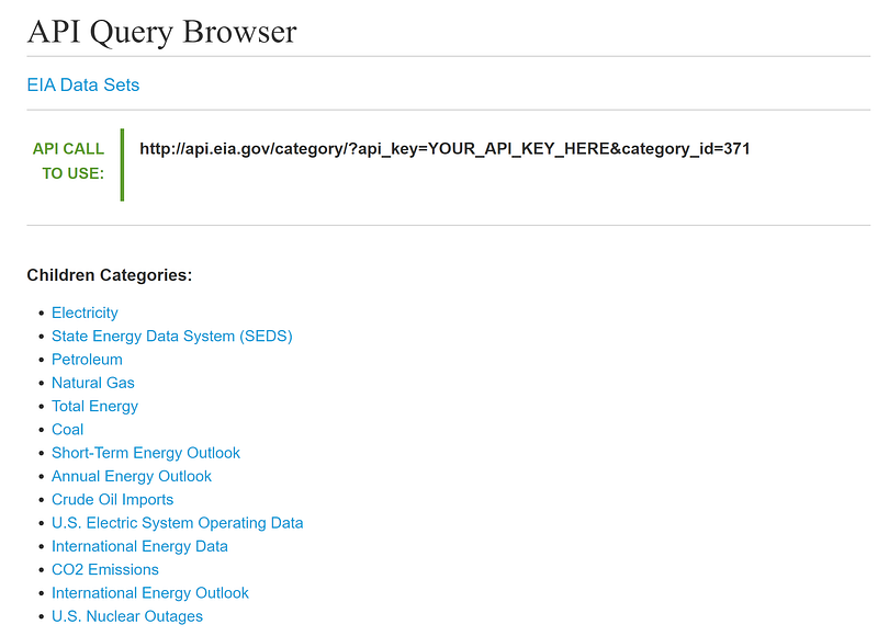
Now you can search for the data sets you want to pull via the API. You can browse the data sets by clicking on “API Query Browse” on the API’s homepage.
On the next page, you can click on the links under “Children Categories” to search for the data you need.
Another way to search for data is through clicking “Sources & Uses” at the top of the page and browsing the website. When you come across a data set you want, the EIA typically publishes a link to that data set in the API.
Obtaining the Series ID
Every series of data comes with a particular Series ID. You’ll use this Series ID along with your API key to pull the data set from the database. For example, the picture below shows the Series ID for crude oil consumption data in PADD 3 (US Gulf Coast). The code allows you to pull multiple series in at once. Keep track of all the series IDs you want to use.
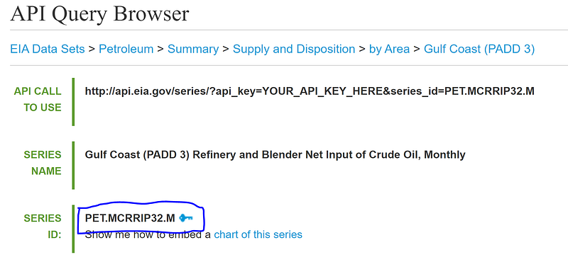
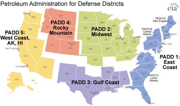
Fun fact: PADD stands for Petroleum Administration for Defense District. These districts were created in 1942 during World War II to organize the distribution of fuel like gasoline and diesel. Today PADDs are still used to organize data by region.
Pulling in Data Using Python
Now that we have our API key and the Series IDs, we can write the Python code to access the data. First, import the necessary libraries. We’ll use pandas, numpy, requests, matplotlib, and datetime. The data is in json format so we’ll need the requests library to read the data correctly.
#Import libraries
import pandas as pd
import requests
import matplotlib.pyplot as plt
import numpy as np
from datetime import date
import matplotlib.ticker as ticker
Now, paste your API key into the code. Then paste in the series IDs you want to pull. Separate your series IDs by commas. In the code below, the “PADD_NAMES” variable serves as the column names you want in your final dataframe. You can also choose the date range you want to pull using the “startDate” and “endDate” variables.
# API Key from EIA
api_key = 'PASTE YOUR API KEY HERE'
# PADD Names to Label Columns
# Change to whatever column labels you want to use.PADD_NAMES = ['PADD 1','PADD 2','PADD 3','PADD 4','PADD 5']# Enter all your Series IDs here separated by commas
PADD_KEY = ['PET.MCRRIP12.M',
'PET.MCRRIP22.M',
'PET.MCRRIP32.M',
'PET.MCRRIP42.M',
'PET.MCRRIP52.M']# Initialize list - this is the final list that you will store all the data from the json pull. Then you will use this list to concat into a pandas dataframe. final_data = []# Choose start and end dates
startDate = '2009-01-01'
endDate = '2021-01-01'Finally, make calls to the API to pull the data in json format. Your url link may change depending on what data set you are pulling. To check the exact url needed, look at the “API CALL TO USE” link in the API Query Browser.
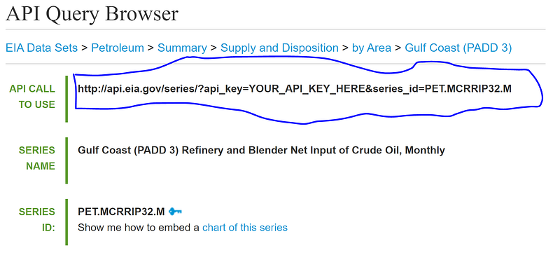
# Pull in data via EIA APIfor i in range(len(PADD_KEY)): url = 'http://api.eia.gov/series/?api_key=' + api_key +
'&series_id=' + PADD_KEY[i] r = requests.get(url)
json_data = r.json()
if r.status_code == 200:
print('Success!')
else:
print('Error')
df = pd.DataFrame(json_data.get('series')[0].get('data'),
columns = ['Date', PADD_NAMES[i]]) df.set_index('Date', drop=True, inplace=True)
final_data.append(df)Creating a Pandas DataFrame
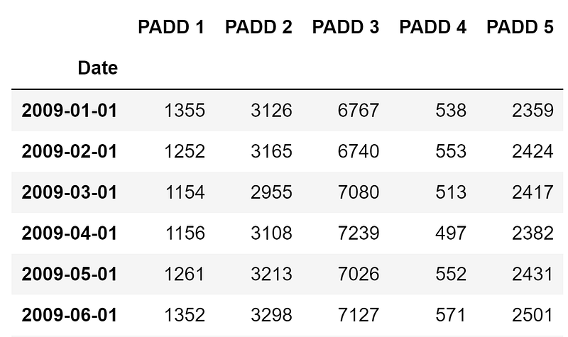
Now combine all your data into one pandas dataframe and edit the dates to create a time series.
# Combine all the data into one dataframe
crude = pd.concat(final_data, axis=1)
# Create date as datetype datatype
crude['Year'] = crude.index.astype(str).str[:4]
crude['Month'] = crude.index.astype(str).str[4:]
crude['Day'] = 1
crude['Date'] = pd.to_datetime(crude[['Year','Month','Day']])
crude.set_index('Date',drop=True,inplace=True)
crude.sort_index(inplace=True)
crude = crude[startDate:endDate]
crude = crude.iloc[:,:5]Now you have a pandas dataframe that is easy to manipulate, analyze, and visualize however you want!
Below is the graph of the dataframe above. Again, the code for the visualization comes from this article, but I’ve reproduced my exact code below.
# Generating Colours and Style
colors = {'PADD 1':'#045275',
          'PADD 2':'#089099',
          'PADD 3':'#7CCBA2',
          'PADD 4':'#7C1D6F',
'PADD 5':'#DC3977'}plt.style.use('fivethirtyeight')# Creating the Visualization
plot = crude.plot(figsize=(12,8),
color=list(colors.values()),
linewidth=5,
legend=False)plot.yaxis.set_major_formatter(ticker.StrMethodFormatter('{x:,.0f}'))
plot.grid(color='#d4d4d4')
plot.set_xlabel('Date')
plot.set_ylabel('Crude Inventory Levels (KBD)')# Assigning Colour
for padd in list(colors.keys()):
plot.text(x = crude.index[-1], y = crude[padd].max(), color =
colors[padd], s = padd, weight = 'bold')# Adding Labels
plot.text(x = crude.index[1],
y = int(crude.max().max())+1300,
s = "Crude Consumption by PADD (thousand barrels per
day)",
fontsize = 23,
weight = 'bold',
alpha = .75)plot.text(x = crude.index[1],
y = int(crude.max().max())+900,
s = "Crude consumption by refineries and blenders is a
proxy for crude demand in each region",
fontsize = 16,
alpha = .75)plot.text(x = crude.index[1],
y = -1000,
s = 'Source: Energy Information Administration
www.eia.gov',
fontsize = 10)If you found this interesting:
You can subscribe to get notified when new articles are published. You can also find me on LinkedIn or at my GitHub repository.