
Use Power BI to Design Data Ranking: A Comprehensive Guide to Charts and Graphs
Unlocking Insights with Power BI charts for Visualizing Data Ranking

Introduction
Data ranking is crucial for analyzing and understanding the performance and importance of entities in a dataset.
Power BI offers a diverse range of charts and visualizations to showcase data ranking.
In this blog post, we will explore the various chart options available in Power BI which helps to find out the ranking information of a particular dataset.
Bar & Column Chart:
Bar charts are commonly used in Power BI to rank data by displaying it as horizontal or vertical bars, with the length or height of the bars representing the values being ranked.
Column charts are similar to bar charts but display data vertically. They are particularly useful when you have limited horizontal space on your report canvas.
In Power BI, there are 6 types of bar or column charts.
- Stacked bar chart
- Stacked column chart
- Clustered bar chart
- Clustered column chart
- 100% stacked bar chart
- 100% stacked column chart
How to Create Column and Bar Charts in Power BI
Download code:
Please find the code in the location below
Data Analysis in Power BI — Chapter 10
Line Chart
The line chart is a standard visualization for displaying changes over time. It helps to observe the progression, differences, and patterns in data. This helps to visualize data ranking. Line charts are mainly effective for displaying continuous data, such as stock prices or temperature changes.
How to Create Line Chart in Power BI
https://www.youtube.com/embed/ueenXepkdVY?t=84&start=84&end=255
Download:
Please find the code in the location below
Data Analysis in Power BI — Chapter 11
Treemap
Treemaps are useful for displaying hierarchical data and entity ranking simultaneously.
Rectangles within the treemap represent the magnitude or ranking of entities, making it easy to identify the top-ranked entities in each category or hierarchy.
Treemaps are useful for analyzing complex data and comparing different contributions.
Why is it known as a treemap?
Using a treemap we can visualize hierarchical information in a tree-like diagram. Data is organised into branches and sub-branches.
In the below video, you will find the step-by-step process to create a treemap
Download code:
Please find the code in the location below
Data Analysis in Power BI — Chapter 20 (Treemap)
Bullet Chart
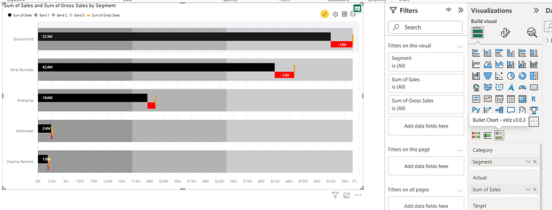
Bullet charts are ideal for displaying ranking data in the context of target values or benchmarks. By representing the actual ranking as a horizontal bar and overlaying it with a reference line indicating the target ranking, users can assess the performance and deviation from the desired ranking.
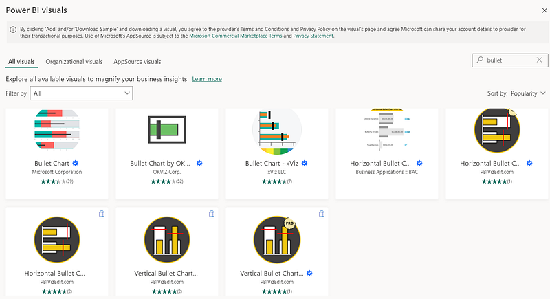
In the Power BI custom visual section, you can search with “Bullet” and the below list of charts will be displayed. However, it is better to use “Microsoft Certified” visuals for your project.
I have selected one of the options and created the below visualization. This is just for your reference. You can explore more with other options.
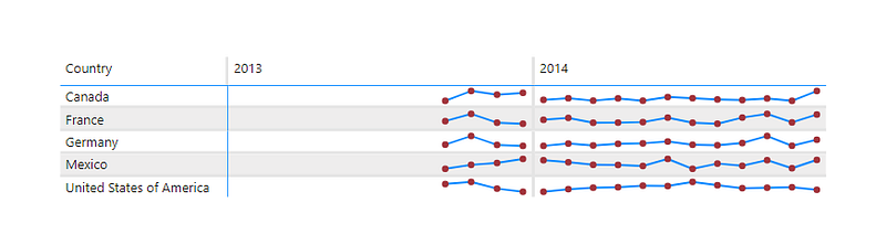
Sparkline
Sparklines are small line charts that can be included in tables or other visualizations to provide a compact representation of data rankings, enabling users to easily understand the relative positions and changes in ranking over time.
You can try this visualization in your own free time.
For example,
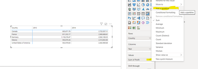
- Just create one table or matrix view report.
- Then add some columns including measure fields. We need at least one measure column to add the “sparkline” effect. See the below picture for your reference.
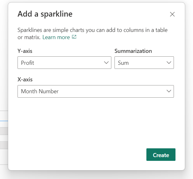
3. Click on “Add a sparkline” and one property box will open like below, then add the field for the X-axis.
4. It will add the “sparkline” and now you can modify the formatting based on your requirements. See below for some examples.
Card Visualization
One way to display the ranking of a particular entity is through a customized card visualization that can show either the exact ranking value or a rank number.
How to Create Card and Multi-Row Card Views
In the below video, as a bonus content, you can have a look at the KPI view.
Download Code
Data Analysis in Power BI — Chapter 18
Conclusion:
In this blog, you learn about the below items
In Power BI, there are many chart options available to design for data rankings.
From traditional bar and column charts to specialized visualizations such as treemaps, bullet charts, and sparklines, each type of visualization offers a unique perspective on the relative importance and positions of entities within a dataset.
If you have any questions related to this project, please feel free to post your comments.
Please like, comment and subscribe to my YouTube channel which you have already seen. :-) Keep Learning.


