
Urban Accessibility — How to Reach Defibrillators on Time
In this piece, I combine earlier work on urban accessibility or walkability with open-source data on the location of public defibrillator devices. Additionally, I incorporate global population data and Uber’s H3 grid system to estimate the share of the population within reasonable reach to any device within Budapest and Vienna.
The root of urban accessibility, or walkability, lies in a graph-based computation measuring the Euclidean distance (transforming it into walking minutes, assuming constant speed and no traffic jams and obstacles). The results of such analyses can tell us how easy it is to reach specific types of amenities from every single location within the city. To be more precise, from every single node within the city’s road network, but due to a large number of road crossings, this approximation is mostly negligible.
In this current case study, I focus on one particular type of Point of Interest (POI): the location of defibrillator devices. While the Austrian Government’s Open Data Portal shares official records on this, in Hungary, I could only obtain a less-then-half coverage crowd-sourced data set — which, hopefully, will later grow both in absolute size and data coverage.
In the first section of my article, I will create the accessibility map for each city, visualizing the time needed to reach the nearest defibrillator units within a range of 2.5km at a running speed of 15km/h. Then, I will split the cities into hexagon grids using Uber’s H3 library to compute the average defibrillator-accessibility time for each grid cell. I also estimate the population level at each hexagon cell following my previous article. Finally, I combine these and compute the fraction of the population reachable as a function of reachability (running) time.
As a disclaimer, I want to emphasize that I am not a trained medical expert by any means — and I do not intend to take a stand on the importance of defibrillator devices compared to other means of life support. However, building on common sense and urban planning principles, I assume that the easier it is to reach such devices, the better.
1. Data source
As always, I like to start by exploring the data types I use. First, I will collect the administrative boundaries of the cities I study in — Budapest, Hungary, and Vienna, Austria.
Then, building on a previous article of mine on how to process rasterized population data, I add city-level population information from the WorldPop hub. Finally, I incorporate official governmental data on defibrillator devices in Vienna and my own web-scraped version of the same, though crowded sources and intrinsically incomplete, for Budapest.
1.1. Administrative boundaries
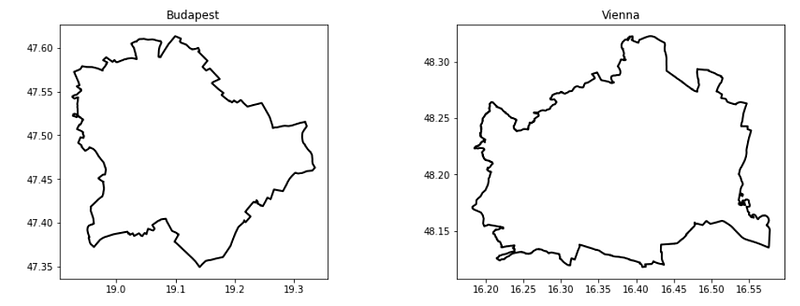
First, I query the admin boundaries of Budapest and Vienna from OpenStreetMap using the OSMNx library:
import osmnx as ox # version: 1.0.1
import matplotlib.pyplot as plt # version: 3.7.1

admin  = {}
cities = ['Budapest', 'Vienna']
f, ax  = plt.subplots(1,2, figsize = (15,5))

# visualize the admin boundaries
for idx, city in enumerate(cities):
    admin[city] = ox.geocode_to_gdf(city)
    admin[city].plot(ax=ax[idx],color='none',edgecolor= 'k', linewidth = 2)    ax[idx].set_title(city, fontsize = 16)
The result of this code block:
1.2. Population data
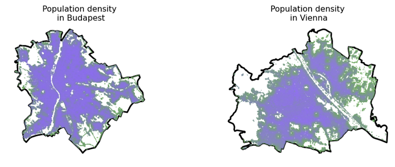
Second, following the steps in this article, I created the population grid in vector data format for both cities, building on the WorldPop online Demographic Database. Without repeating the steps, I just read in the output files of that process containing population information for these cities.
Also, to make things look nice, I created a colormap from the color of 2022, Very Peri, using Matplotlib and a quick script from ChatGPT.
import matplotlib.pyplot as plt
from matplotlib.colors import LinearSegmentedColormap

very_peri = '#8C6BF3'
second_color = '#6BAB55'

colors = [second_color, very_peri ]
n_bins = 100
cmap_name = "VeryPeri"
colormap = LinearSegmentedColormap.from_list(cmap_name, colors, N=n_bins)
import geopandas as gpd # version: 0.9.0
demographics = {}
f, ax = plt.subplots(1,2, figsize = (15,5))
for idx, city in enumerate(cities):
demographics[city] = gpd.read_file(city.lower() + \
'_population_grid.geojson')[['population', 'geometry']]
admin[city].plot(ax=ax[idx], color = 'none', edgecolor = 'k', \
linewidth = 3)
demographics[city].plot(column = 'population', cmap = colormap, \
ax=ax[idx], alpha = 0.9, markersize = 0.25)
ax[idx].set_title(city)
ax[idx].set_title('Population density\n in ' + city, fontsize = 16)
ax[idx].axis('off')The result of this code block:
1.3. Defibrillator locations
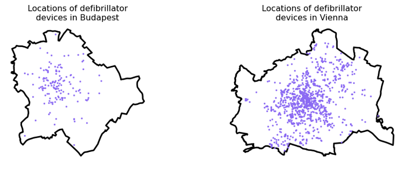
Third, I collected locational data on the available defibrillators in both cities.
For Vienna, I downloaded this data set from the official open data portal of the Austrian government containing the point location of 1044 units:
While such an official open data portal does not exist in Budapest/Hungary, the Hungarian National Heart Foundation runs a crowd-sourced website where operators can update the location of their defibrillator units. Their country-wide database consists of 677 units; however, their disclaimer says they know about at least one thousand units operating in the country — and are waiting for their owners to upload them. With a simple web crawler, I downloaded the location of each of the 677 registered units and filtered the data set down to those in Budapest, resulting in a set of 148 units.
# parse the data for each city
gdf_units= {}

gdf_units['Vienna'] = gpd.read_file('DEFIBRILLATOROGD')
gdf_units['Budapest'] = gpd.read_file('budapest_defibrillator.geojson')

for city in cities:
    gdf_units[city] = gpd.overlay(gdf_units[city], admin[city])


# visualize the units
f, ax = plt.subplots(1,2, figsize = (15,5))

for idx, city in enumerate(cities):
    admin[city].plot(ax=ax[idx],color='none',edgecolor= 'k', linewidth = 3)
    gdf_units[city].plot( ax=ax[idx], alpha = 0.9, color = very_peri, \
      markersize = 6.0)
    ax[idx].set_title('Locations of defibrillator\ndevices in ' + city, \
      fontsize = 16)
    ax[idx].axis('off')
The result of this code block:
2. Accessibilty computation
Next, I wrapped up this great article written by Nick Jones in 2018 on how to compute pedestrian accessibility:
import os
import pandana # version: 0.6
import pandas as pd # version: 1.4.2
import numpy as np # version: 1.22.4
from shapely.geometry import Point # version:  1.7.1
from pandana.loaders import osm

def get_city_accessibility(admin, POIs):

    # walkability parameters
    walkingspeed_kmh = 15
    walkingspeed_mm  = walkingspeed_kmh * 1000 / 60
    distance = 2500


    # bounding box as a list of llcrnrlat, llcrnrlng, urcrnrlat, urcrnrlng
    minx, miny, maxx, maxy = admin.bounds.T[0].to_list()
    bbox = [miny, minx, maxy, maxx]

    # setting the input params, going for the nearest POI
    num_pois = 1
    num_categories = 1
    bbox_string = '_'.join([str(x) for x in bbox])
    net_filename = 'data/network_{}.h5'.format(bbox_string)
    if not os.path.exists('data'): os.makedirs('data')

    # precomputing nework distances

    if os.path.isfile(net_filename):
        # if a street network file already exists, just load the dataset from that
        network = pandana.network.Network.from_hdf5(net_filename)
        method = 'loaded from HDF5'
    else:
        # otherwise, query the OSM API for the street network within the specified bounding box
        network = osm.pdna_network_from_bbox(bbox[0], bbox[1], bbox[2], bbox[3])
        method = 'downloaded from OSM'

        # identify nodes that are connected to fewer than some threshold of other nodes within a given distance
        lcn = network.low_connectivity_nodes(impedance=1000, count=10, imp_name='distance')
        network.save_hdf5(net_filename, rm_nodes=lcn) #remove low-connectivity nodes and save to h5


    # precomputes the range queries (the reachable nodes within this maximum distance)
    # so, as long as you use a smaller distance, cached results will be used
    network.precompute(distance + 1)


    # compute accessibilities on POIs
    pois = POIs.copy()
    pois['lon'] = pois.geometry.apply(lambda g: g.x)
    pois['lat'] = pois.geometry.apply(lambda g: g.y)
    pois = pois.drop(columns = ['geometry'])
    network.init_pois(num_categories=num_categories, max_dist=distance, max_pois=num_pois)

    network.set_pois(category='all', x_col=pois['lon'], y_col=pois['lat'])

    # searches for the n nearest amenities (of all types) to each node in the network
    all_access = network.nearest_pois(distance=distance, category='all', num_pois=num_pois)

    # transform the results into a geodataframe
    nodes = network.nodes_df
    nodes_acc = nodes.merge(all_access[[1]], left_index = True, right_index = True).rename(columns = {1 : 'distance'})
    nodes_acc['time'] = nodes_acc.distance / walkingspeed_mm
    xs = list(nodes_acc.x)
    ys = list(nodes_acc.y)
    nodes_acc['geometry'] = [Point(xs[i], ys[i]) for i in range(len(xs))]
    nodes_acc = gpd.GeoDataFrame(nodes_acc)
    nodes_acc = gpd.overlay(nodes_acc, admin)

    nodes_acc[['time', 'geometry']].to_file(city + '_accessibility.geojson', driver = 'GeoJSON')

    return nodes_acc[['time', 'geometry']]


accessibilities = {}
for city in cities:
    accessibilities[city] = get_city_accessibility(admin[city], gdf_units[city])
for city in cities:
print('Number of road network nodes in ' + \
city + ': ' + str(len(accessibilities[city])))This code block outputs the number of road network nodes in Budapest (116,056) and in Vienna (148,212).
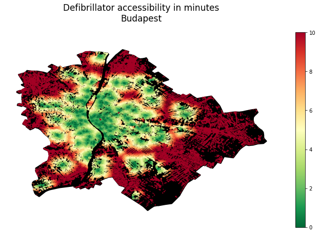
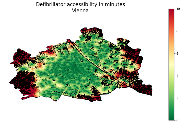
Now visualize the accessibility maps:
for city in cities:
f, ax = plt.subplots(1,1,figsize=(15,8))
admin[city].plot(ax=ax, color = 'k', edgecolor = 'k', linewidth = 3)
accessibilities[city].plot(column = 'time', cmap = 'RdYlGn_r', \
legend = True, ax = ax, markersize = 2, alpha = 0.5)
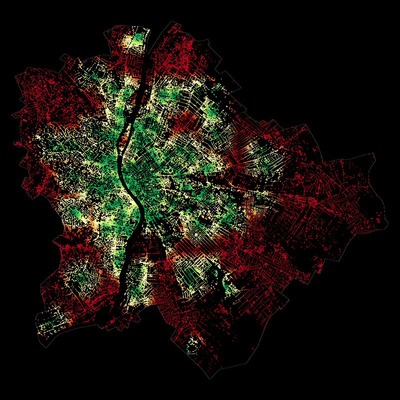
ax.set_title('Defibrillator accessibility in minutes\n' + city, \
pad = 40, fontsize = 24)
ax.axis('off')This code block outputs the following figures:
3. Mapping to H3 grid cells
At this point, I have both the population and the accessibility data; I just have to bring them together. The only trick is that their spatial units differ:
- Accessibility is measured and attached to each node within the road network of each city
- Population data is derived from a raster grid, now described by the POI of each raster grid’s centroid
While rehabilitating the original raster grid may be an option, in the hope of a more pronounced universality (and adding a bit of my personal taste), I now map these two types of point data sets into the H3 grid system of Uber for those who haven’t used it before, for now, its enough to know that it’s an elegant, efficient spacial indexing system using hexagon tiles. And for more reading, hit this link!
3.1. Creating H3 cells
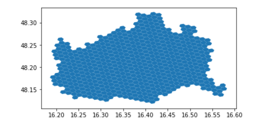
First, put together a function that splits a city into hexagons at any given resolution:
import geopandas as gpd
import h3 # version: 3.7.3
from shapely.geometry import Polygon # version: 1.7.1
import numpy as np

def split_admin_boundary_to_hexagons(admin_gdf, resolution):
    coords = list(admin_gdf.geometry.to_list()[0].exterior.coords)
    admin_geojson = {"type": "Polygon",  "coordinates": [coords]}
    hexagons = h3.polyfill(admin_geojson, resolution, \
      geo_json_conformant=True)
    hexagon_geometries = {hex_id : Polygon(h3.h3_to_geo_boundary(hex_id, \
      geo_json=True)) for hex_id in hexagons}
    return gpd.GeoDataFrame(hexagon_geometries.items(), columns = ['hex_id', 'geometry'])


resolution = 8
hexagons_gdf = split_admin_boundary_to_hexagons(admin[city], resolution)
hexagons_gdf.plot()
The result of this code block:
Now, see a few different resolutions:
for resolution in [7,8,9]:

    admin_h3 = {}
    for city in cities:
        admin_h3[city] = split_admin_boundary_to_hexagons(admin[city], resolution)

    f, ax = plt.subplots(1,2, figsize = (15,5))

    for idx, city in enumerate(cities):
        admin[city].plot(ax=ax[idx], color = 'none', edgecolor = 'k', \
          linewidth = 3)
        admin_h3[city].plot( ax=ax[idx], alpha = 0.8, edgecolor = 'k', \
           color = 'none')
        ax[idx].set_title(city + ' (resolution = '+str(resolution)+')', \
            fontsize = 14)
        ax[idx].axis('off')
The result of this code block:
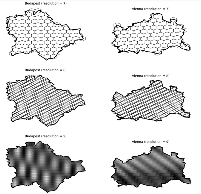
Let’s keep resolution 9!
3.2. Map values into h3 cells
Now, I have both our cities in a hexagon grid format. Next, I shall map the population and accessibility data into the hexagon cells based on which grid cells each point geometry falls into. For this, the sjoin function of GeoPandasa, doing a nice spatial joint, is a good choice.
Additionally, as we have more than 100k road network nodes in each city and thousands of population grid centroids, most likely, there will be multiple POIs mapped into each hexagon grid cell. Therefore, aggregation will be needed. As the population is an additive quantity, I will aggregate population levels within the same hexagon by summing them up. However, accessibility is not extensive, so I would instead compute the average defibrillator accessibility time for each tile.
demographics_h3 = {}
accessibility_h3 = {}
for city in cities:
# do the spatial join, aggregate on the population level of each \
# hexagon, and then map these population values to the grid ids
demographics_dict = gpd.sjoin(admin_h3[city], demographics[city]).groupby(by = 'hex_id').sum('population').to_dict()['population']
demographics_h3[city] = admin_h3[city].copy()
demographics_h3[city]['population'] = demographics_h3[city].hex_id.map(demographics_dict)
# do the spatial join, aggregate on the population level by averaging
# accessiblity times within each hexagon, and then map these time score # to the grid ids
accessibility_dict = gpd.sjoin(admin_h3[city], accessibilities[city]).groupby(by = 'hex_id').mean('time').to_dict()['time']
accessibility_h3[city] = admin_h3[city].copy()
accessibility_h3[city]['time'] = \
accessibility_h3[city].hex_id.map(accessibility_dict)
# now show the results
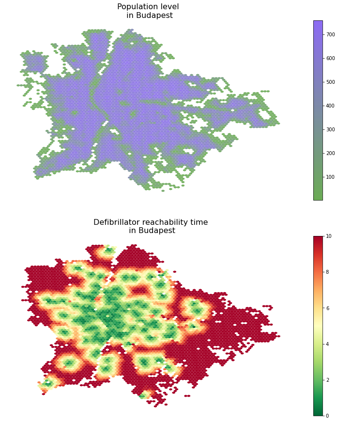
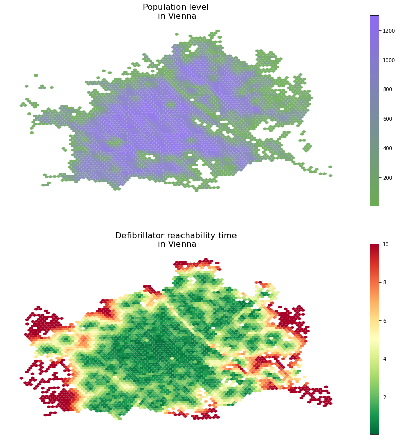
f, ax = plt.subplots(2,1,figsize = (15,15))
demographics_h3[city].plot(column = 'population', legend = True, \
cmap = colormap, ax=ax[0], alpha = 0.9, markersize = 0.25)
accessibility_h3[city].plot(column = 'time', cmap = 'RdYlGn_r', \
legend = True, ax = ax[1])
ax[0].set_title('Population level\n in ' + city, fontsize = 16)
ax[1].set_title('Defibrillator reachability time\n in ' + city, \
fontsize = 16)
for ax_i in ax: ax_i.axis('off')The results of this code block are the following figures:
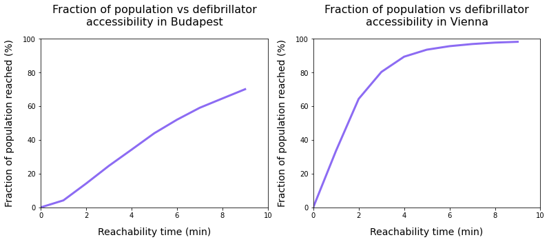
4. Computing population reach
In this final step, I will estimate the fraction of the reachable population from the nearest defibrillator unit within a certain amount of time. Here, I still build on the relatively fast 15km/h running pace and the 2.5km distance limit.
From the technical perspective, I merge the H3-level population and accessibility time data frames and then do a simple thresholding on the time dimension and a sum on the population dimension.
f, ax = plt.subplots(1,2, figsize = (15,5))

for idx, city in enumerate(cities):

    total_pop  = demographics_h3[city].population.sum()
    merged = demographics_h3[city].merge(accessibility_h3[city].drop(columns =\
     ['geometry']), left_on = 'hex_id', right_on = 'hex_id')

    time_thresholds = range(10)
    population_reached = [100*merged[merged.time<limit].population.sum()/total_pop for limit in time_thresholds]

    ax[idx].plot(time_thresholds, population_reached, linewidth = 3, \
      color = very_peri)
    ax[idx].set_xlabel('Reachability time (min)', fontsize = 14, \
      labelpad = 12)
    ax[idx].set_ylabel('Fraction of population reached (%)', fontsize = 14, labelpad = 12)
    ax[idx].set_xlim([0,10])
    ax[idx].set_ylim([0,100])
    ax[idx].set_title('Fraction of population vs defibrillator\naccessibility in ' + city, pad = 20, fontsize = 16)
The result of this code block are the following figures:
5. Conclusion
When interpreting these results, I would like to emphasize that, on the one hand, defibrillator accessibility may not be directly linked to heart-attack survival rate; judging that effect is beyond both my expertise and this project’s scope. Also, the data used for Budapest is knowingly incomplete and crowded sources, as opposed to the official Austrian data source.
After the disclaimers, what do we see? On the one hand, we see that in Budapest, about 75–80% of the population can get to a device within 10 minutes, while in Vienna, we reach nearly complete coverage in around 6–7 minutes already. Additionally, we need to read these time values carefully: if we happen to be at an unfortunate incident, we need to get to the device, pick it up, go back (making the travel time double of the reachability time), install it, etc. in a situation where every minute may be a matter of life and death.
So the takeaways, from a development perspective, the takeaways are to ensure we have complete data and then use the accessibility and population maps, combine them, analyze them, and build on them when deploying new devices and new locations to maximize the effective population reached.


