
Unveiling the Secrets of S&P 500: Using MACD to Navigate Major Market Events
The Moving Average Convergence Divergence (MACD) is a popular technical analysis tool used by traders to identify potential buy and sell signals in the market. It is a momentum indicator that can help traders understand the direction of a trend and the strength of that trend. The MACD is based on two moving averages, the 12-day exponential moving average (EMA) and the 26-day EMA, and it is represented as a line on a chart.
The Standard & Poor’s 500 (S&P 500) is a stock market index that tracks the performance of 500 large-cap companies in the United States. It is one of the most widely followed stock market indices and is often used as a benchmark for the overall health of the U.S. economy. The S&P 500 is important to track because it can provide insight into the overall health of the stock market and the economy as a whole.
The purpose of this article is to explore how the MACD on monthly charts has shown the main SP500 trends over the last major market events. Readers can expect to learn how to use the MACD on monthly charts to identify trends and potential buy/sell signals, the importance of monthly charts for long-term trend analysis, and how the MACD can be applied in different market conditions.

Understanding the MACD Indicator
The MACD is a powerful tool for traders and investors, especially when it comes to analyzing long-term trends in the stock market. By using monthly charts, we can identify major market events and track the overall direction of the market over time. But what exactly is the MACD, and how can we use it to our advantage?
The MACD is made up of three components: the MACD line, the signal line, and the histogram. The MACD line is calculated by subtracting the 26-day Exponential Moving Average (EMA) from the 12-day EMA, while the signal line is a 9-day EMA of the MACD line. The histogram is simply the difference between the MACD line and the signal line, represented as bars on a separate chart below the MACD line and signal line.
To further illustrate the calculation of the MACD, we can use the following python code:
# Calculate MACD
def macd(close, fast_period=12, slow_period=26, signal_period=9):
    fast_ema = close.ewm(span=fast_period, adjust=False).mean()
    slow_ema = close.ewm(span=slow_period, adjust=False).mean()
    macd_line = fast_ema - slow_ema
    signal_line = macd_line.ewm(span=signal_period, adjust=False).mean()
    histogram = macd_line - signal_line

    return macd_line, signal_line, histogram
Now that we know how the MACD is calculated, let’s talk about how we can use it to identify trends, momentum, and potential buy/sell signals. When the MACD line crosses above the signal line, it’s a sign that the stock or market is trending upwards, making it a potential buy signal. On the other hand, when the MACD line crosses below the signal line, it’s an indication that the market is trending downwards, making it a potential sell signal.
But the MACD isn’t just about buy and sell signals. By analyzing the distance between the MACD line and the signal line, we can also gauge momentum. When the distance between the two lines is increasing, it suggests that the trend is gaining momentum, while a decreasing distance suggests a loss of momentum.
Now, how do we apply the MACD to different market conditions? In a trending market, the MACD can help us confirm the direction of the trend and identify potential buy/sell signals.
The Importance of Monthly Charts
Monthly charts are useful for long-term trend analysis because they provide a broader perspective of market trends. Monthly charts are less noisy than daily or weekly charts, which can have many fluctuations and noise due to market volatility. The monthly charts can help traders identify the overall direction of the market, which can be beneficial for long-term investment strategies. Since monthly charts are based on longer timeframes, they can help traders identify trends that may not be as apparent on shorter timeframes.
Daily and weekly charts are useful for short-term trend analysis because they provide a more detailed view of market trends. Daily charts provide insight into intraday price movements, which can be useful for day trading strategies. Weekly charts provide a more comprehensive view of price movements over a week, which can be helpful for swing trading strategies. However, monthly charts provide a more comprehensive view of market trends over a longer period of time, making them useful for long-term investment strategies.
To demonstrate the usefulness of monthly charts for long-term trend analysis, we will use the S&P 500 as an example. We will download the S&P 500 data using the yfinance library and plot the monthly charts for the past 28 years.
import yfinance as yf

start_date = "1995-01-01"

# Download S&P 500 data
spx = yf.Ticker("^GSPC")
spx_history = spx.history(start=start_date, interval="1mo")
Now that we have the S&P 500 data, we can plot the monthly charts for the past 28 years using the matplotlib library.
import matplotlib.pyplot as plt

# Plot S&P 500 monthly charts
plt.plot(spx_history["Close"])
plt.title("S&P 500 Monthly Charts (1995-2023)")
plt.xlabel("Date")
plt.ylabel("Price")
plt.show()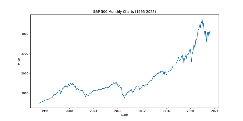
As we can see from the monthly chart of the S&P 500, there are clear trends that have emerged over the past 20 years. We can see that the S&P 500 experienced a significant uptrend from 2003 to 2007, followed by a significant downtrend from 2007 to 2009 due to the global financial crisis. After the crisis, the S&P 500 entered into a long-term uptrend that continued until early 2020. However, the COVID-19 pandemic caused a significant drop in the S&P 500 in early 2020, followed by a sharp recovery in the second half of 2020.
By analyzing the monthly charts, we can identify these trends and potential buy/sell signals that would not have been as apparent on daily or weekly charts. For example, if we had analyzed only the daily or weekly charts, we may have missed the long-term uptrend that began in 2009 and continued until 2020. Additionally, the monthly charts can help traders identify potential entry and exit points for long-term investment strategies.
A. Overview of the SP500’s performance over the last years
Before we dive into the MACD analysis, it’s important to have an understanding of the SP500’s performance over the last 20 years. Since the year 2000, the index has gone through various periods of growth and decline. The early 2000s were marked by the dot-com bubble, which led to a significant decline in the index. The mid-2000s were relatively stable until the financial crisis of 2008, which was one of the worst financial crises in modern history. The SP500 experienced a significant decline during this period, but it eventually recovered and reached new highs. In 2020, the COVID-19 pandemic caused another sharp decline in the index, but it quickly recovered again and reached new all-time highs in 2021.
Using the macd() function defined earlier, we can calculate the MACD and signal lines for the SP500's monthly data.
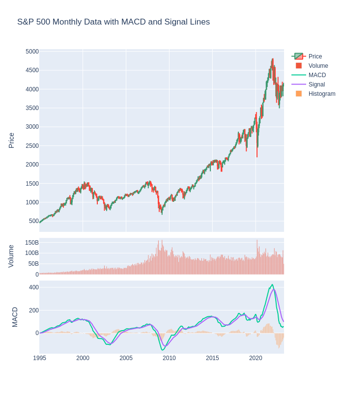
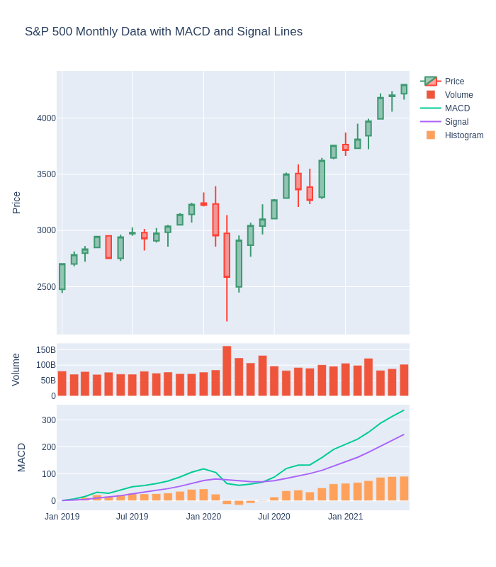
To provide a visual representation of the SP500’s performance over the last 20 years, I have created with plotly the main plot of the MACD analysis below.
import pandas as pd
import plotly.graph_objects as go
from plotly.subplots import make_subplots

# Calculate MACD and signal lines
macd_line, signal_line, histogram = macd(spx_history["Close"])


# Create a subplots figure with 3 rows and 1 column
fig = make_subplots(rows=3, cols=1, shared_xaxes=True, vertical_spacing=0.02, row_heights=[0.5,0.1,0.2])

# Add candlestick trace to first subplot
fig.add_trace(go.Candlestick(x=spx_history.index,
                             open=spx_history['Open'],
                             high=spx_history['High'],
                             low=spx_history['Low'],
                             close=spx_history['Close'],
                             name='Price'), row=1, col=1)

# Add volume bar trace to second subplot
fig.add_trace(go.Bar(x=spx_history.index,
                     y=spx_history['Volume'],
                     name='Volume'), row=2, col=1)

# Add MACD lines and histogram to third subplot
fig.add_trace(go.Scatter(x=spx_history.index, y=macd_line, name='MACD'), row=3, col=1)
fig.add_trace(go.Scatter(x=spx_history.index, y=signal_line, name='Signal'), row=3, col=1)
fig.add_trace(go.Bar(x=spx_history.index, y=histogram, name='Histogram'), row=3, col=1)

# Set the chart layout
fig.update_layout(title='S&P 500 Monthly Data with MACD and Signal Lines',
                  yaxis=dict(title='Price'),
                  yaxis2=dict(title='Volume'),
                  yaxis3=dict(title='MACD'),
                  xaxis_rangeslider_visible=False,
                  height=800)

# Show the chart
fig.show()
The resulting interactive plot shows the SP500’s monthly price data along with the Volume and the MACD and signal lines:
Analysis of Major Market Events Using MACD
Over the last two decades, there have been several major market events that have impacted the global economy and financial markets. Understanding how technical indicators, such as the Moving Average Convergence Divergence (MACD), have reacted during these events can provide valuable insights for investors and traders.
In this section, we will analyze the MACD on monthly charts during three significant market events: the dot-com bubble, the 2008 financial crisis, and the COVID-19 pandemic. We will identify key trends, potential buy/sell signals, and compare the MACD to other technical indicators during these events. By doing so, we hope to provide a comprehensive analysis of the MACD’s performance in these volatile market conditions.
The dot-com bubble (2000–2002)
The dot-com bubble of the late 1990s and early 2000s was a period of rapid growth and speculation in the technology sector. Many internet-based companies experienced huge increases in their stock prices, despite having little or no earnings. However, the bubble eventually burst in 2000, resulting in a sharp decline in stock prices and widespread losses for investors. In this section, we will use the MACD on monthly charts to analyze the performance of the S&P 500 during the dot-com bubble and its aftermath.
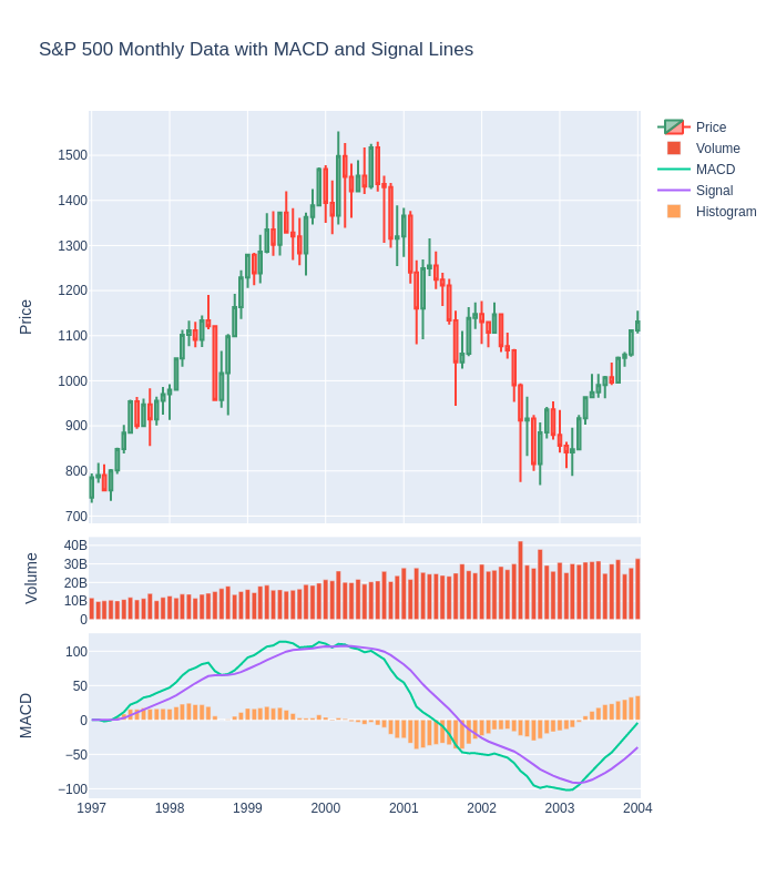
As you can see from the screenshot above, the MACD line crossed below the signal line in early 2000, which was an early indication of a potential trend reversal. This was followed by a sharp decline in the SP500, which lasted until late 2002. During this period, the MACD remained below the signal line, which indicated a continued downtrend. This was a very good example of how the monthly MACD can be used to identify potential trend reversals.
The financial crisis of 2008
The 2008 financial crisis was a major event that impacted the global economy and financial markets. It was caused by a combination of factors, including the housing bubble, subprime mortgages, and “complex” financial instruments. The crisis led to widespread panic and uncertainty in the financial markets, resulting in significant declines in stock prices and other asset values. In this section, we will analyze the MACD on monthly charts during the 2008 financial crisis and examine key trends and signals that emerged during this period.
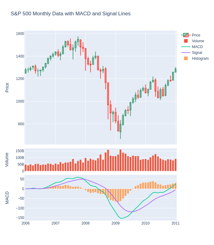
The screenshot above shows the MACD on monthly charts during the financial crisis of 2008. As you can see, the MACD line crossed below the signal line in mid-2007, which was an indication of a potential trend reversal. This was followed by a significant decline in the SP500, which lasted until early 2009. During this period, the MACD remained below the signal line, which indicated a continued downtrend. This was another good example of how the monthly MACD can be used to identify potential trend reversals and recessions.
COVID-19 pandemic (2020)
The Covid-19 pandemic, which began in early 2020, had a significant impact on the global economy, causing a sharp decline in stock prices as governments implemented measures to contain the spread of the virus. In this section, we will analyze the MACD on monthly charts during this period, and identify key trends and potential signals.
The screenshot above shows the MACD on monthly charts during the COVID-19 pandemic. As you can see, the MACD line crossed below the signal line in early 2020, which was an early indication of a potential trend reversal. This was followed by a sharp decline in the SP500, which lasted until March 2020. During this period, the MACD remained below the signal line, which indicated a continued downtrend. However, the SP500 quickly recovered and reached new all-time highs in 2021, indicating a potential trend reversal. This was a good but short example of how the MACD can be used to identify potential trend reversals and recessions.
Analyzing the S&P 500 Using MACD: Insights from Major Market Events
In this section, we will provide an analysis of the current market situation by examining the S&P 500 index on a monthly basis using the MACD indicator. We will also include a screenshot of the period from March 2022 to the present date (April 2023) to provide a visual representation of the current state of the market.
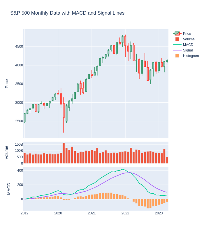
Looking at the MACD on the monthly charts, we can see that it has been giving a sell signal since March 1st, 2022. This is an indication of a continued downtrend in the stock market. Taking into account the previous analysis that we have done, we can confirm that we are in a recession.
While the MACD is trending to reverse, it seems that it is going to continue the downtrend. This suggests that investors should be cautious in making any significant investments and should closely monitor the market for any potential trend reversals.
Conclusion
In conclusion, the analysis of the S&P 500 using the MACD on monthly charts has proven to be a valuable tool for traders and investors. Through the examination of major market events such as the dot-com bubble, the 2008 financial crisis, and the COVID-19 pandemic, we have seen how the MACD can provide early signals for potential trend reversals and help identify key market trends. By analyzing the MACD on monthly charts, traders and investors can gain a long-term perspective on market movements and make informed decisions based on the data provided by the indicator.
Furthermore, the analysis of the present date shows that the MACD is currently giving a sell signal, indicating that the market may continue its downtrend. This highlights the importance of regularly monitoring market conditions and using technical indicators like the MACD to inform investment decisions.
Overall, the MACD analysis on monthly S&P 500 data has performed very well, and it is a useful tool that traders and investors can use to enhance their decision-making process and improve their chances of success in the market.

Subscribe to DDIntel Here.
Visit our website here: https://www.datadriveninvestor.com
Join our network here: https://datadriveninvestor.com/collaborate