
UI/UX Design: The Fastest Way to Present Your Work Professionally
How to frame and present your work, in a way that’s hard to beat, in about 20 minutes.
Let’s get it
You’ve got work, and you need to present it yesterday.
Open Figma and let’s get started.
Creating the perfect frame
Hit “f” on your keyboard, this will open the frame palette on the right of your screen.
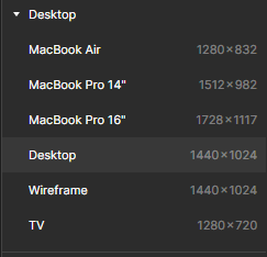
Choose “Desktop” (1440 x 1024) and you should now have something like this:
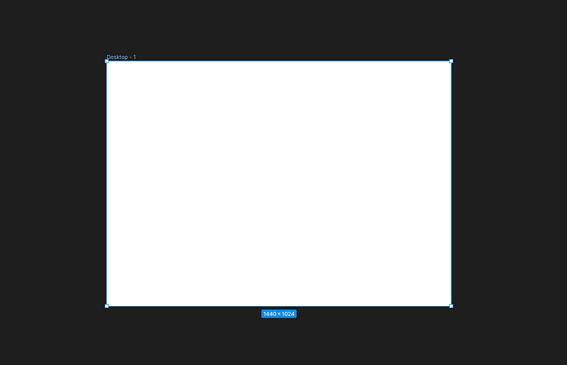
Now resize it using the frame properties box:
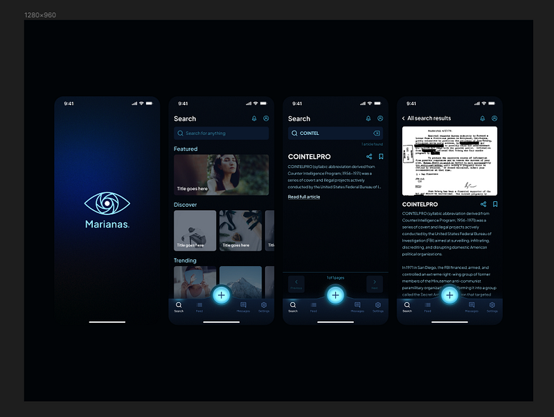
For our purposes in this tutorial we will be using a 4:3 frame (1280x960) for web presentation because:
- It loads faster
- While maintaining a reasonable degree of quality.
— — — — — — — — — — —
Note: You also have the option of using a 16:9 frame (1920x1080) for presenting full screen on FHD devices and projectors.
This is typically the resolution you’d use if you’re going to present your work in person on a large screen or overhead, though it loads slower which is why we’re using the 4:3, smaller resolution for web presentation above (also because typically in a web portfolio, your work isn’t being viewed in full screen).
Placing your content
Make sure your frames have a 34pt border radius applied to them.
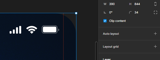
Also make sure that “clip content” is checked.
Slap your content in the dead middle of the frame.
Press “k” on your keyboard, this will switch you into scale mode.
hold “shift” and “alt” simultaneously while dragging a corner to scale your work to fit nicely within the frame.
Give it nice background
Choose the darkest color on in your design and set it as the background color of your frame:
“BUT IT DOESN’T POP!!!!”
Relax, I promise it will.
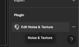
WITH THE FRAME SELECTED, open your plugins panel and search for “Noise and Texture”
You’re gonna get a screen that looks like this. Now you’ve got some options
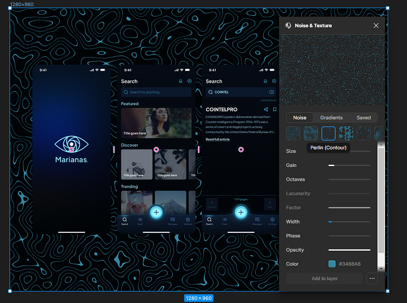
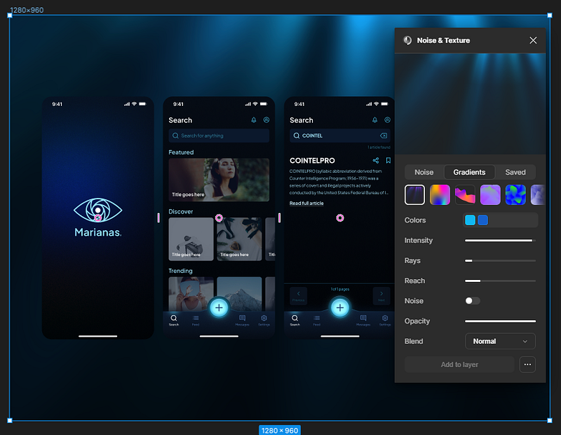
Now what you choose at this point is entirely up to you.
Just hit “add to layer” and you can keep modifying the settings until it looks the way you want. I ended up fading it to about 50% opacity.
When you’re satisfied with the results, feel free to close the plugin. Figma will remember that you used it there, and you can continue to modify the settings as-desired.
So far, so good. Let’s make it dynamic.
Pop-out features
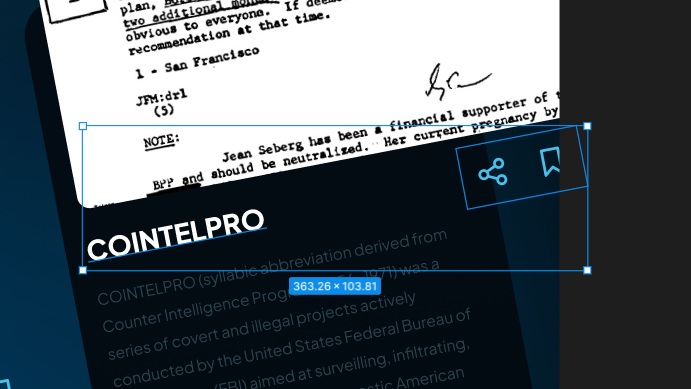
Cut and paste features you want to showcase outside of the smaller frame they’re currently in, and into the larger presentation frame.
Use your arrow keys to move them around, shift plus arrows to move them faster.
Make sure to group your popouts for their respective screens (not altogether), you’ll need it here in a minute.
Stagger, rotate, and engage edges
Vertically stagger your content
Rotate your content about 11 degrees
and scale to engage the edges of your frame
Nice. Onto the next part.
Scale and move content for best fit
Now this is where some artistic license comes into play.
Basically what you’re trying to do is show off the good parts of what you’ve got, so we’ll use scale and placement to make that happen.
Let me show you what I mean.
Ripped out some of the content that didn’t matter, scaled to fit a little better.
We’re getting there but we’re far from done. Now, we need to make it pop.
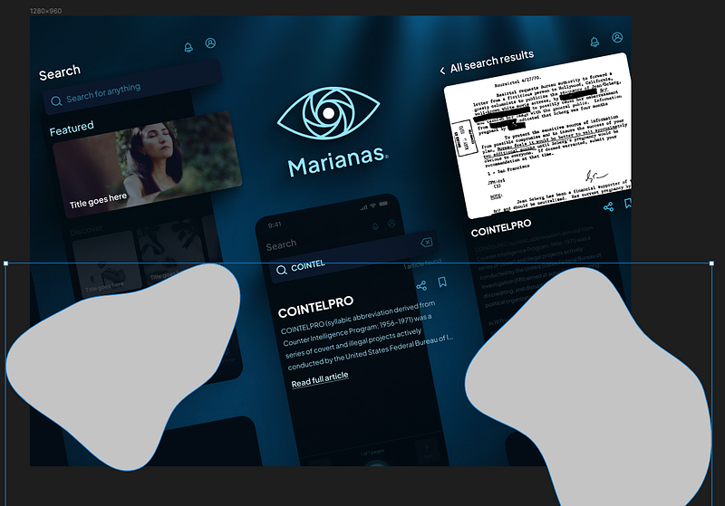
Make it pop
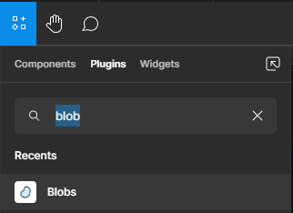
Open your plugins panel and search for “blobs”
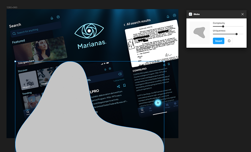
Insert a more complex blob, and change the color to the lightest color within your design.
Then change the color.
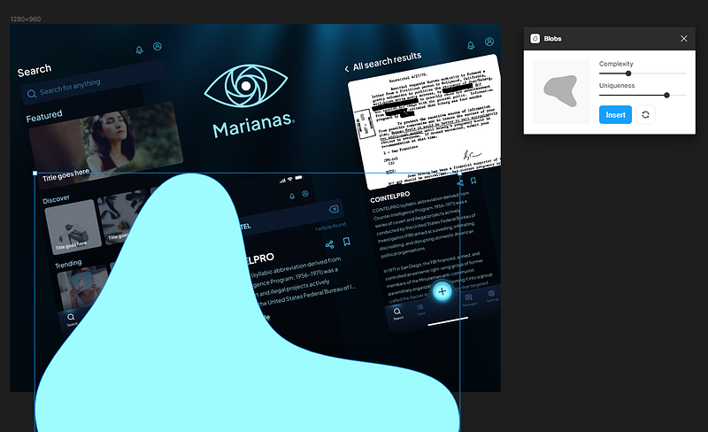
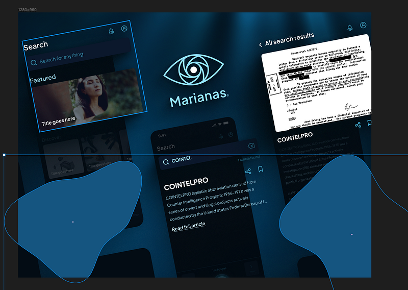
Effects, layer blur, 400.
Move it to the back of your frame with shift + control + [
There we go, now we’re getting somewhere.
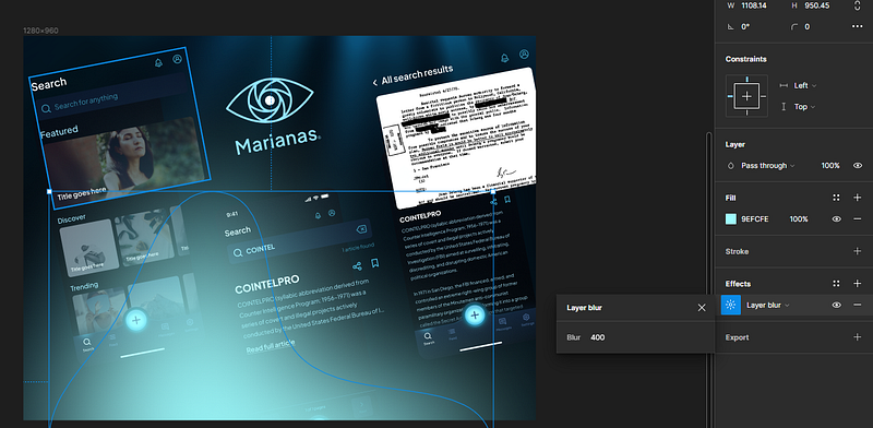
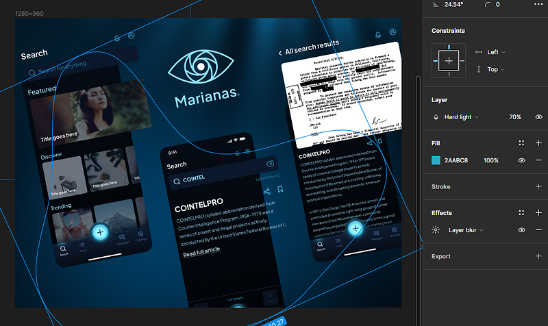
Set the blend mode to hard light:
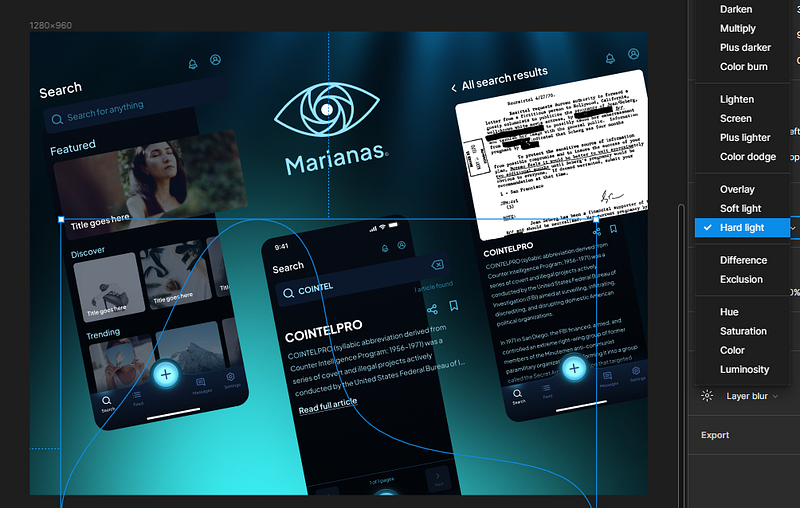
And modify the layer blur, opacity, color, and positioning until it’s looking good. Dark modes pop in reverse, so backlighting is key here.
Now that’s poppin’ pretty hard, but almost a little too hard. Let’s take it down a notch so that the backlighting doesn’t overwhelm our composition.
You’re almost never gonna get it exactly right the first time, so keep modifying it until you’re happy with the results.
Remember, you’re looking for good contrast here, you don’t have to go overboard.
That looks pretty good. Now let’s add some depth.
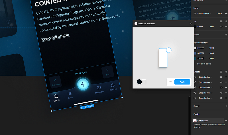
Add depth
We need to convincingly add some depth to our presentation or no one is going to care.
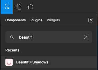
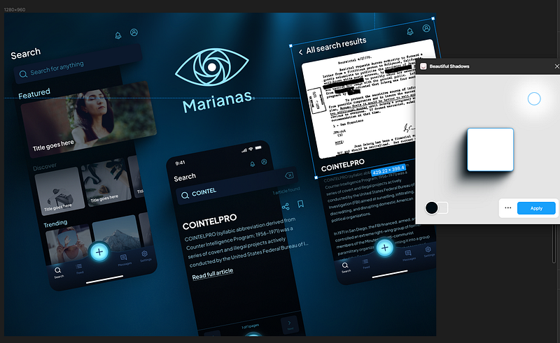
Open your plugins panel, and search for “beautiful shadows”
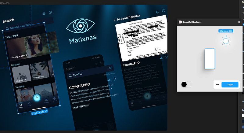
Rerun and reapply the shadow to every non-popout frame in your presentation.
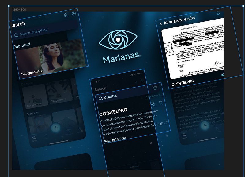
You should have something that looks like this:
Now we’re about to get into it.
Do the exact same thing to your popouts, but CRANK UP the shadows until it’s almost too much.
This is gonna make a whole lot more sense here in a minute.
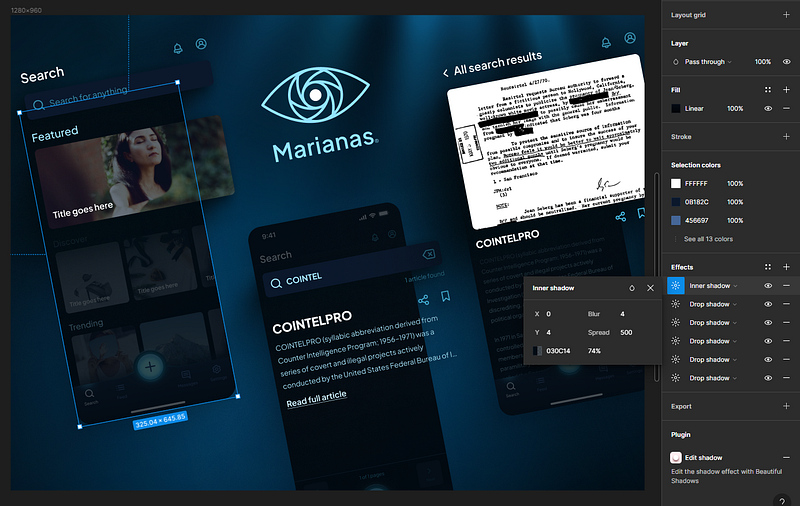
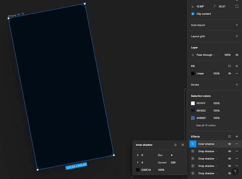
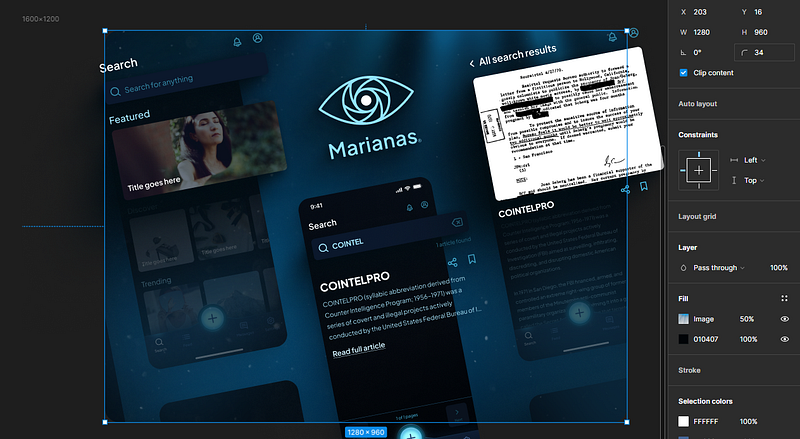
Select your non-popout frames, go to effects, and add an “inner shadow”
→ This inner shadow must be on top of all the other shadows in your frame effects stack.
Set the spread to like 500, the color to the darkest color in your design, and the opacity to around 70%.
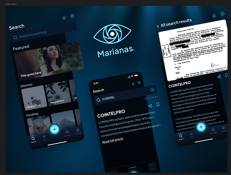
If all goes well, you should now have something that looks like this:
You see what we’re doing here? Our goal is to fade out the less important parts of our design to make room for the more important parts.
If you decide you want to add anything to your popouts, feel free.
But now it looks kinda weird, right? Like there’s a little too much negative space?
We’ll fix this problem with blanks.
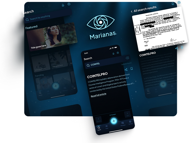
Add screen blanks
Grab literally any screen in your presentation, copy it, paste it outside of your working frame, and set that inner shadow’s opacity to 100%.
Congratulations, you now have a screen blank that can be used to fill that excess white space.
Make sure that while you’re placing your blanks to fill your excess white space that you are respecting your layout’s spacing, rhythm, and visual weight.
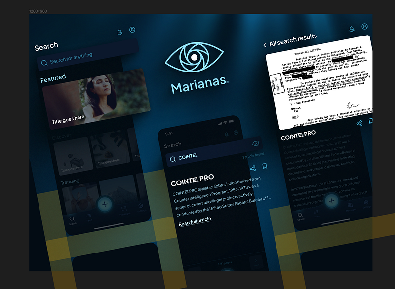
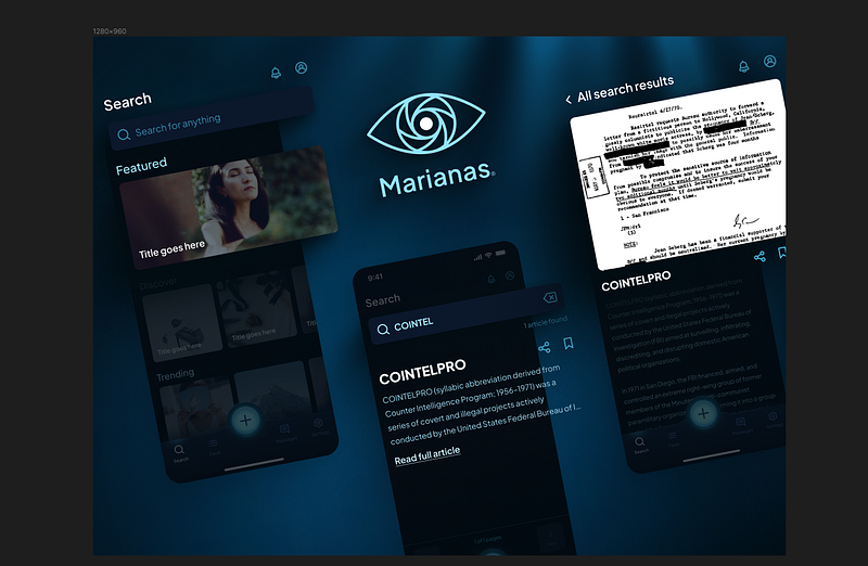
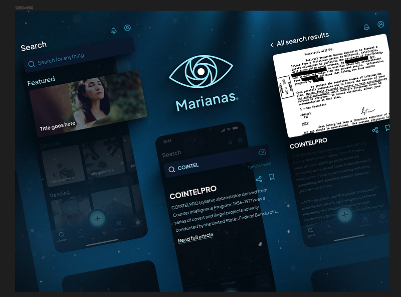
If all goes well, you should now have something that looks like this:
And this looks pretty good. But something is still missing.
Let’s ad some highlights.
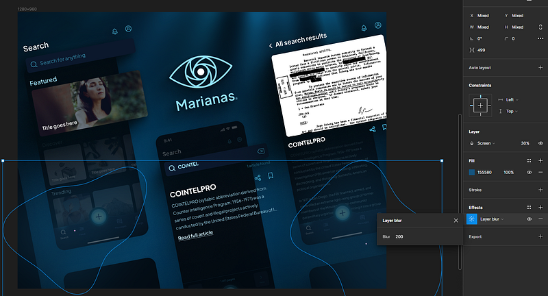
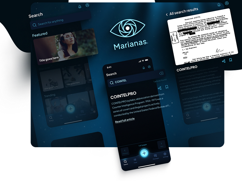
Add amorphous highlights
What we can do now to help offset our blanks and round out our presentation is to add some amorphous highlights.
Load up the blobs plugin again.
And now we’re gonna place some of these blobs around the more sparse spaces of our presentation.
Now we’re gonna take these blobs, set them to a reasonably light color, but NOT LIGHTER than our popout colors.
Again these are covering the areas of low importance within our design.
Now, same as before, we add a layer blur to them, set the blending mode to screen, and fade them out.
As you can see, the change is subtle, but definitely noticeable, and that’s what we’re going for.
This step is purely optional. We could leave it like this, honestly, and it would probably be fine.
But what if we really wanted to turn this presentation up to 11 and blow the windows out?
Let’s add some post-processing effects, and a full content pop-out just for fun.
Add post-processing
Now I do want to be clear: some people consider this step cheating.
The reason for this is simple, you will almost never see post-processing effects like these applied to a design in the real world.
I personally don’t have a problem with it for presentations, and have never actually seen it be a problem in the real world, but I figured I’d mention it here because, again, people love to complain.
Head on over to Pexels and search for whatever you want as an overlay.
For this one, I chose dust particles.
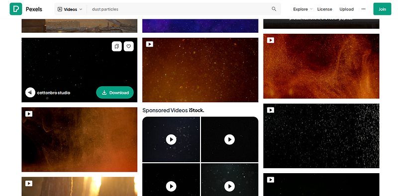
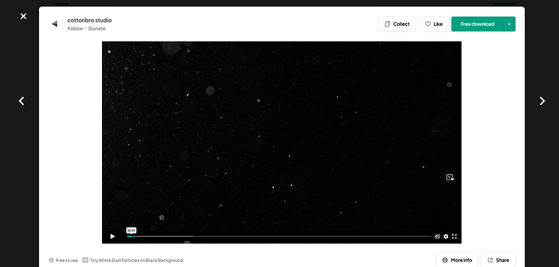
Now this video we’ve got here is 1080p which means if you grab a frame from it, you should be able to use it in your design without issue.
It is totally free to use without attribution, but give whoever the author is a shoutout because they do great work on there.
→ Speaking of, massive shoutout to Cottonbro Studio for the exceptional assets on Pexels, thank you so much!
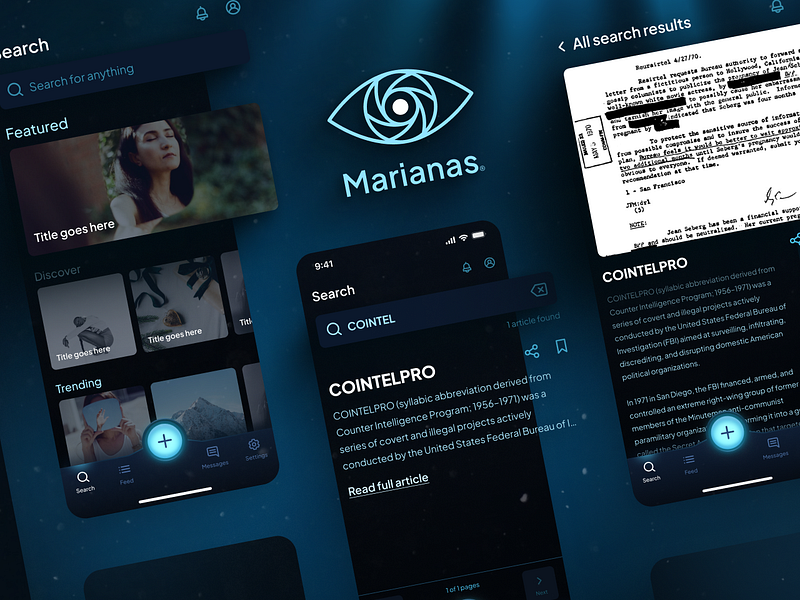
We’ll throw in our framegrab behind our popouts, but above everything else.
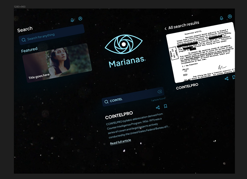
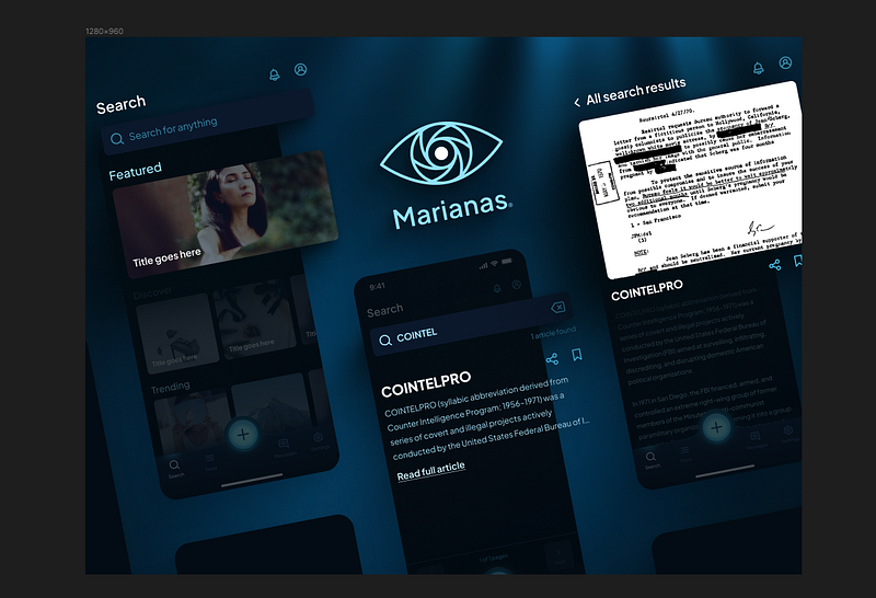
Ready to see the magic happen? Change the blend mode of your overlay to screen, fade it to about 50%, and you’ll get something like this:
Make sure to play with the opacity and placement to get it looking exactly how you want it.
By now, I should mention that if you’re not crazy about the way the screen fades and amorphous highlights are looking at this point, you can also remove them and it should still look pretty good.
A little less visual depth and hierarchy, but it’s honestly a matter of personal taste and what you’re going for.
Again, we could stop here, but we want to turn up to 11, so we’re gonna add a full content pop-out.
Add full content pop-out
This last technique is a little old-school but I think you’ll find it can work wonders when applied to modern presentational graphics.
→ Worth mentioning for most projects a technique like this is overkill, and doesn’t even work in some cases, so if you want to skip it, feel free.
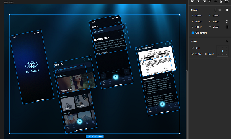
Grab all of your screens, and scale them up so some of the content is being clipped by the frame.
Now select the content you want to pop-out of the frame, and cut it with control+x.
Paste it over your designs, but outside of your frame.
We now have our content bleeding off the frame.
However, to make this work effectively, we need to add a frame around everything so that it will export correctly.
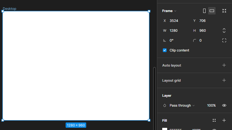
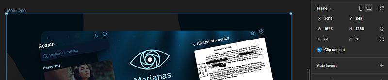
So we’ll add a new frame, with no background color around every object in our design, that is the next size up for the aspect ratio we’re targeting.
In our example here, I’ll use a 1600x1200 frame as a container.
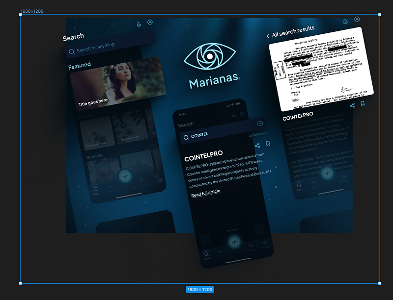
You may notice at this point we have a problem: our shadow is clipping to our frame edge.
Not good.
To fix this, we can select the phone frame, load beautiful shadows back up, and cheat the shadow in a little bit so that it doesn’t clip.
Note this will get rid of your fading inner shadow from before, but in this case, it actually works out pretty good.
You can even add a border radius to your original content frame for good measure, if you want.
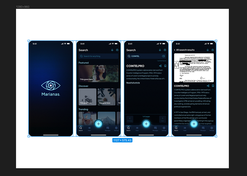
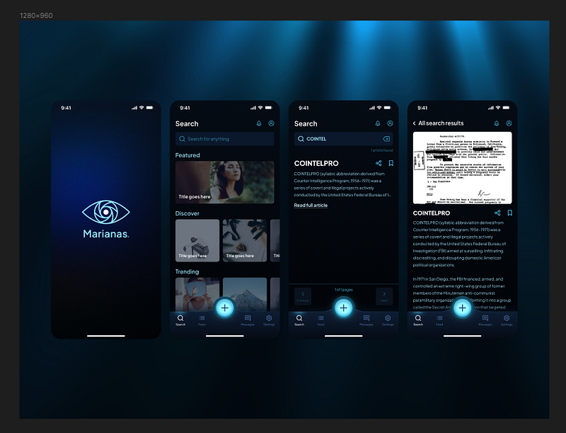
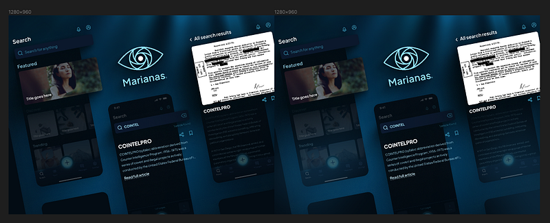
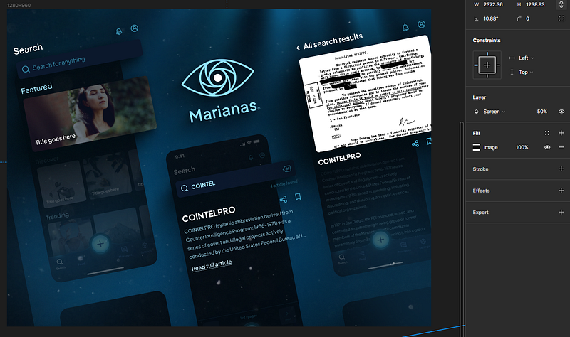
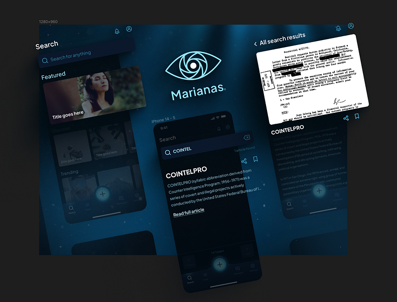
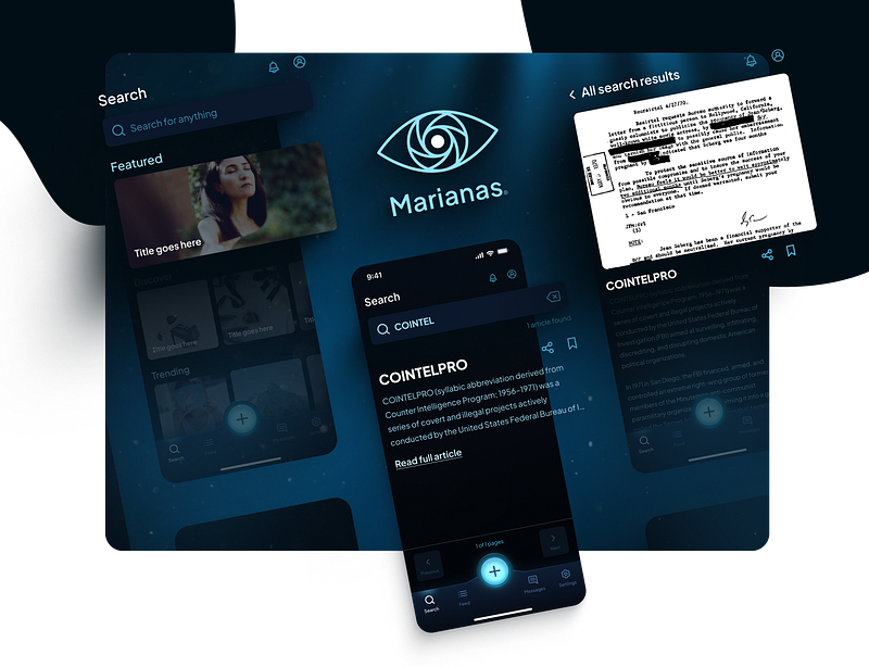
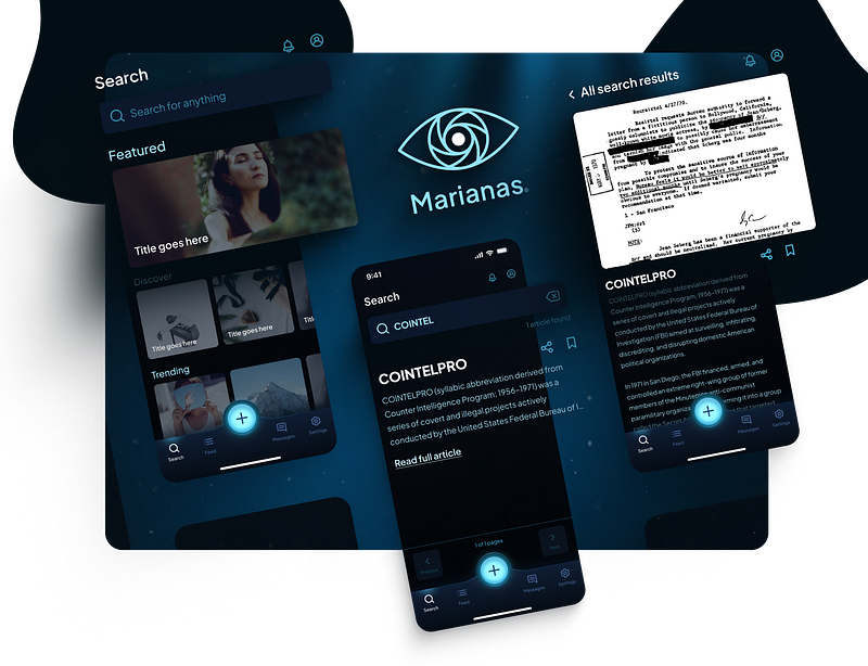
And if everything went well, you should now have a presentational image that looks like this:
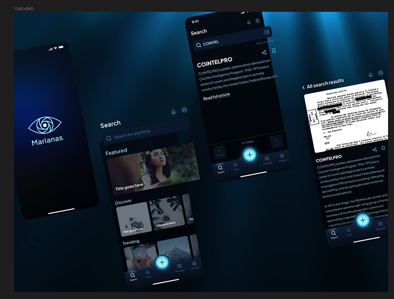
We can also add some decorative elements to compensate for contrast outside of the content frame.
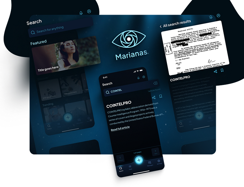
Additionally, if aspect ratio also isn’t a major concern for you, you can definitely cheat the frame size to whatever you want to make it look even nicer,
and to get something that looks more like this:
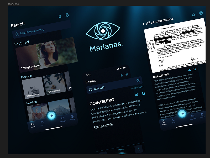
Now there are certain things about this that we could fix, but eventually you’re gonna hit diminishing returns.
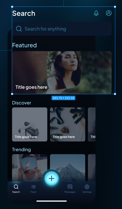
For example, the user profile icon in the upper right corner of the first screen is a little tight with the original frame, so if we wanted to we could cheat scale it up, and move some things around, to make it look a little nicer.
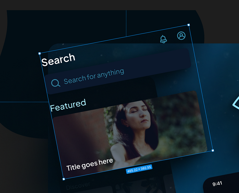
And that looks pretty good.
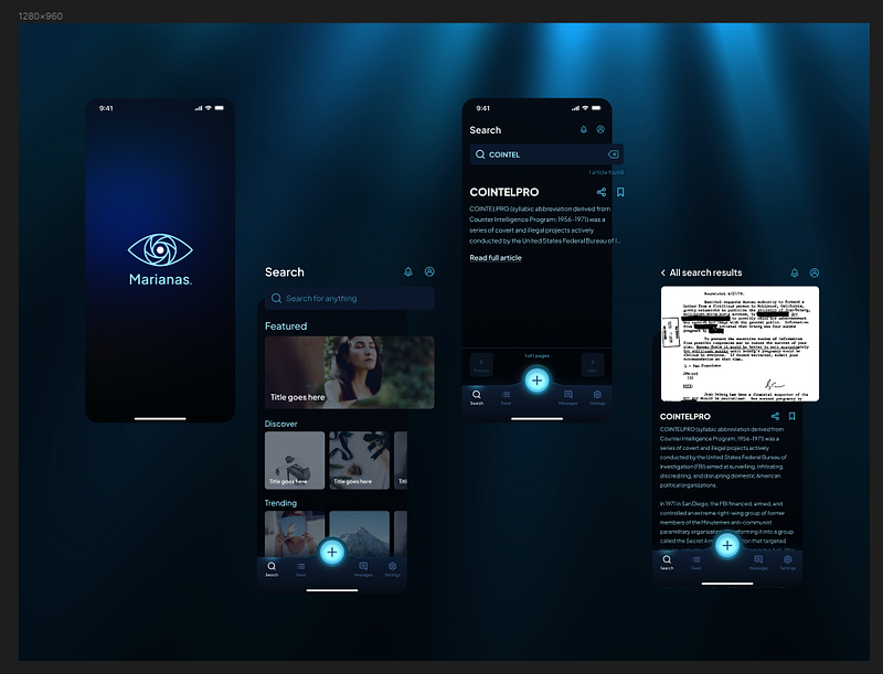
Alternatively, we could also do it with the other two content screens at full saturation.
Again, is there more we could do? Probably.
But by now, we’re well past the point of diminishing returns, so let’s call it a day.
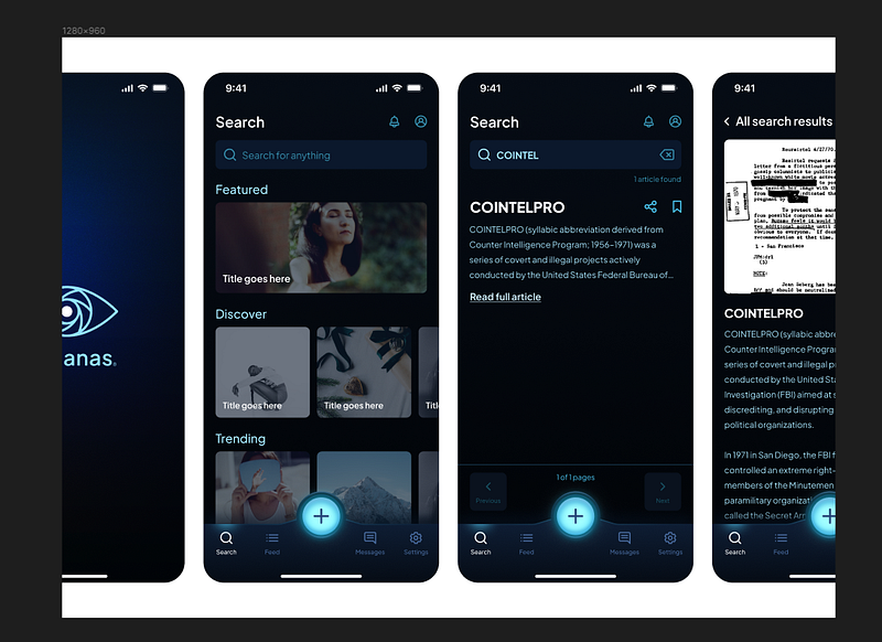
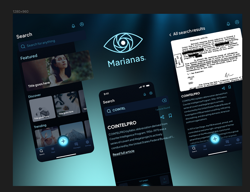
Let’s recap
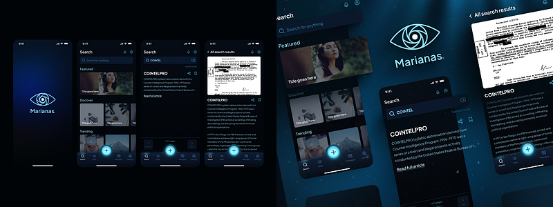
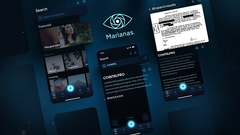
Now I don’t know about you, but I think the one on the right is a clear winner in terms of presentation, and you can use these same techniques to present your work too.
So what all did we do here?
- Create a 1280x960 frame for your work.
- Add your work and scale to fit.
- Add a background color that looks nice.
- Use Noise & Textures plugin to create a nice background.
- Add some background highlights with the Blobs plugin to give dark mode presentations good contrast.
- Scale up and pop-out any items you want to highlight.
- Throw on some nice shadows with the Beautiful Shadows plugin.
- Play with the layout and positioning.
- Add some blanks to round it out.
- Fade out your less important content, or don’t, totally up to you.
- Add some highlights if you like.
- Throw on some post-processing, and
- Even do a full content pop-out if you really feel like it.
Put altogether, this should help you present your work in a way that’s eye-catching without having to put in a ridiculous amount of effort, and allow you to create compelling portfolio shots in record time.
I know this is a lot. If you have questions, let me know in the comments, and until next time, keep designing.


