

UI/UX: Advanced Web Layouts
How to use flexbox and grid to create modern layouts for your next project.
You need a responsive layout
It’s the 21st century, the mobile web is (and has been) here to stay, and there are millions of devices on the internet at any given time. It is therefore imperative that you have a responsive web presence if you want your product to be successful and connect with your users.
The data doesn’t lie: A non-responsive web experience will make your users bail on your product hard and fast.
Traditionally, you had two options: Bootstrap or Foundation (not strictly the only two, but the most popular by far in their day).
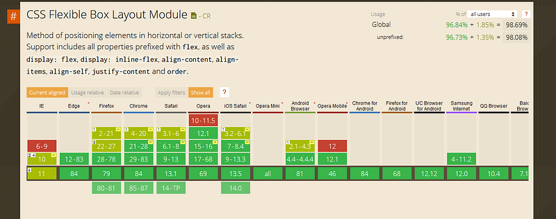
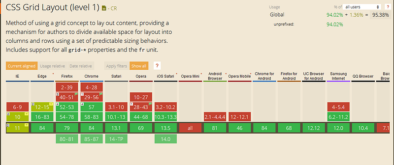
But in the last few years we have been graced with some new web specifications that have made our lives as designers far easier. These come in the form of CSS flexbox and grid.
Both of these technologies are well-supported across popular browsers.
The trouble with CSS libraries
Now you may be thinking: if there are css libraries that take care of managing layouts, why should I worry about learning flexbox and grid?
While I agree with the sentiment whole-heartedly, the problems begin where these libraries end.
That is to say that when you encounter a specific layout that you need to build with specific parameters, these libraries can, and often will, specifically fail to deliver what you need.
Now don’t get me wrong, a lot of these libraries are updating their specifications; making these issues less and less of a problem. That said, it can still be very powerful to know what it going on under the hood in terms of creating UI that renders to the view exactly the way you need it to.
Is it a little more work up front than col-lg-12? Yes.
Are there times that it makes far more sense to start with a CSS library? You bet, I do it all the time.
It is worth it in the end to know how the system really works? Absolutely.
I value your time and sanity
Now I could write an entire tutorial on how to use both flexbox and grid, but I do not want you to have to wade through that.
A picture is worth a thousand words, and if it moves with sound so much the better. I have included links to some of the best free flexbox and grid video tutorials that I have found.
How to use flexbox
How to use grid
The bottom line
To clarify: just because flexbox and grid are options for your next design project doesn’t mean that you have to go whole-hog and use them, and them alone.
It can be very cathartic to use a CSS library that you and your team already know, and add some additional CSS functionality to bridge any gaps.
As with learning any new thing, there is always a “J-curve” associated with it, and it is best to take implementation at your own pace. Bootstrap is not going away anytime soon, and learning flexbox and grid is only going to make you a stronger designer.