
Part 3
UI design shapes & objects basics: Shadows and Blurs
Shadows, blurs and how they connect to neumorphism ;-)
Welcome to the third part of the UI Design super-basics. This time we’ll cover two of the most commonly used effects — shadows and blurs.
Shadows
Drop Shadow
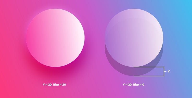
Outer shadows (or drop-shadows) are easily the most common effect used in UI. A typical shadow relies on an offset from center (x, y, or both) a blur and an opacity value. In the example above the shadow is moved 20 points down on the Y axis and then blurred on the left side, or left without the blur on the right.
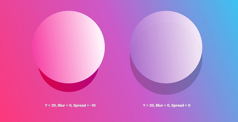
Some tools like Sketch also have a “spread” value, which makes the shadow look like a smaller element is casting it.
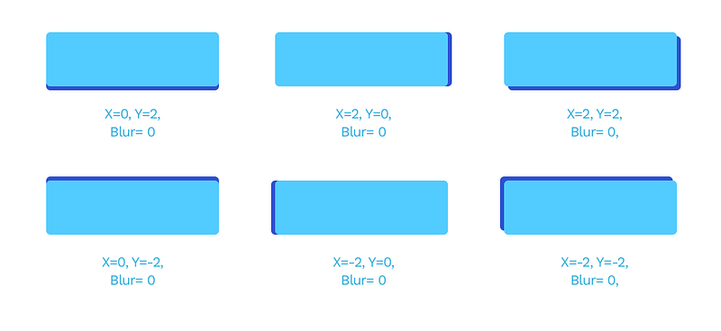
The most important parts of any shadows are the X, the Y and the Blur. The latter has to be a number larger than 0, while X and Y can also be negative numbers, moving the shadow in practically every direction.
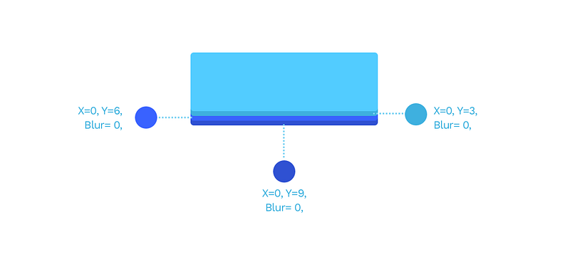
You can also stack shadows by adding more than one to the same object for pretty interesting results. The example below has three shadows in three darker shades of blue, each transposed by 3 points down.
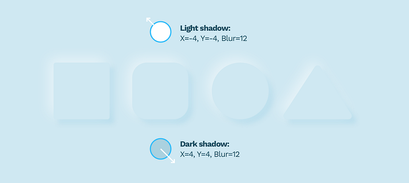
Neumorphism
Knowing that we simply have to mention Neumorphism again. This stacking of shadows and negative X and Y values are the core principles necessary for making Neumorphism work.
Natural looking, soft shadows
A natural-looking shadow is one of those elements that can make the biggest impact in a design. The most important part of looking natural is avoiding pure black shadows and using a shadow derived from our primary color instead. Pure black makes the contrast ratio too big to look natural. If you study real-life shadows, you’ll notice they often vary in shade and tone.
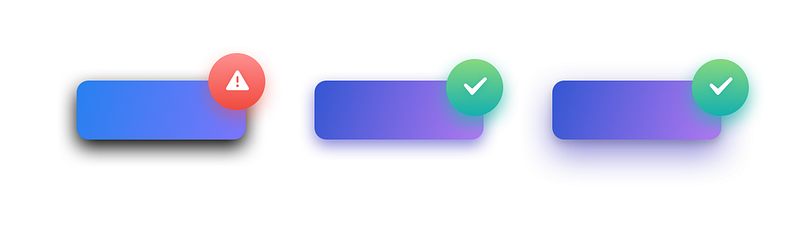
The best way to fix your shadows is to change them from black (default) to a darker shade of your primary color. In the example above the shadow is a dark purple with decreased opacity.
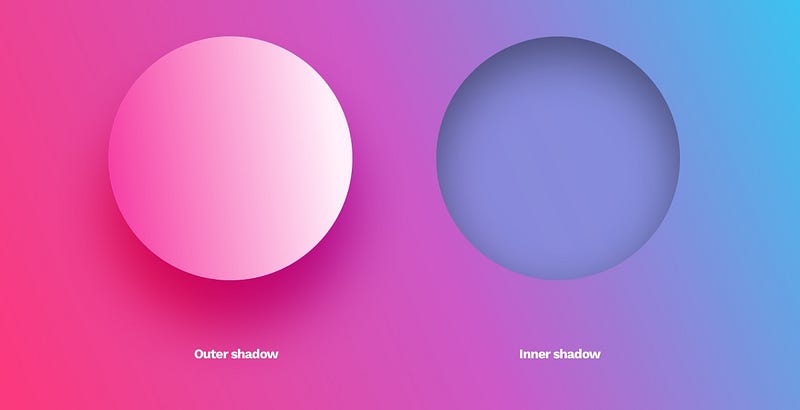
Inner shadows
Inner shadows are relatively rare in UI. It has the same parameters as a drop shadow, but it appears inside of the object.
They are not as popular because most interfaces are a series of layers stacked on top of one another. In that case, an outer shadow makes sense as it provides the depth. An inner shadow would suggest the object has a hole in it.
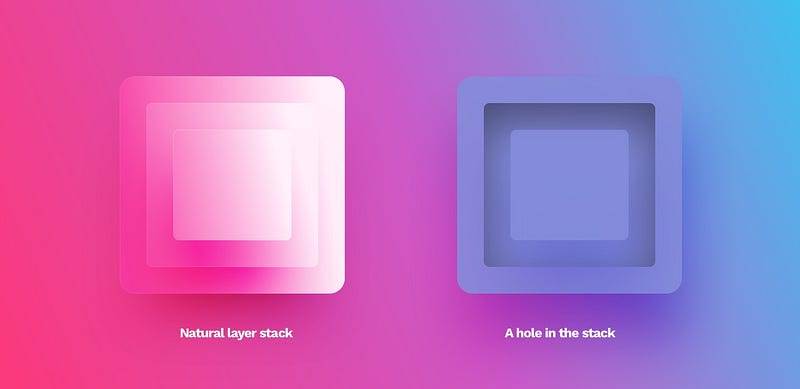
The only use-cases of this style are form inputs (both form fields and checkboxes or radio-buttons) and extruded shapes in the Neumorphism method. They can be used to make the objects appear more life-like in some instances but should only be used moderately.
The main issue with Neumorphism is the notion of using inner shadows and extruded shapes as a “selected” state. The perceivable difference between the standard and selected state is so small, that even non-visually impaired users can sometimes completely miss it. This in turn leads to one of the biggest accessibility flaws of Neumorphism.
Blurs
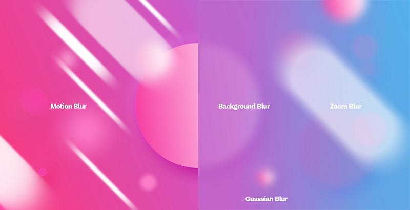
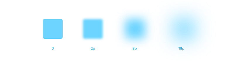
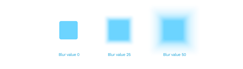
Most design tools nowadays have a Gaussian type blur that extends the effect in every direction evenly. Its primary value is the radius. The larger it gets, the more prominent the blur effect.
Gaussian blur is the most often used blur type. You can employ it into transitions between screens, or show a bit of realistic depth of field by selectively blurring the background.
Gaussian blur as a Shadow

This type of blur can also help you generate non-standard, point-shadows under objects. Just blur an ellipse and place it under the object casting the shadow. You can either use it on its own or combine it with a standard drop shadow for an even more unique result.
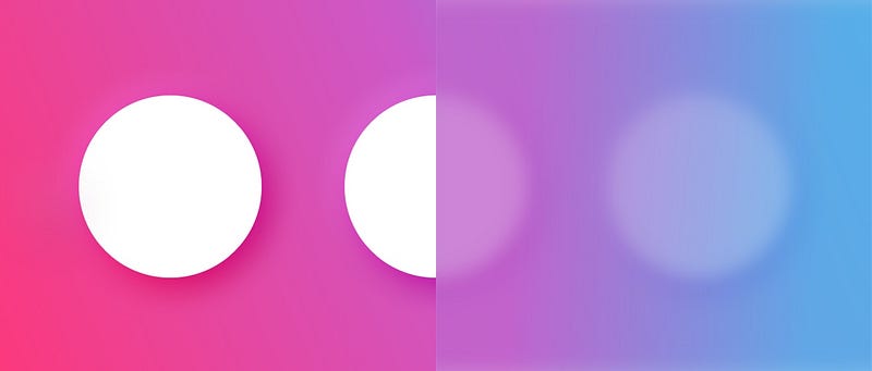
Background blur
Background blur became popular when Apple started using it in their OS to achieve that behind smoked-glass effect in some screens. An object with this effect applied blurs everything under it.
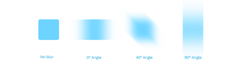
Motion blur
A motion blur simulates the movement of an object in a direction defined by the angle value. The blur value works the same as with Gaussian blur here.
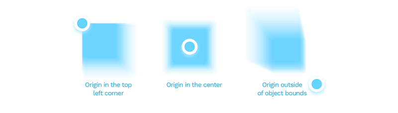
Zoom blur
A zoom blur happens when the object becomes blurry from the inside out. It’s often used in photography, but not a great pick for interface design.
In this particular blur type, you can also set the origin of the blur. By moving that point around, you can achieve some interesting effects.
You can also watch me talk about shadows and blurs on video:
The basics of UI design
This concludes our three part series on basics of shapes, objects and effects used in UI design. This has been a part of the free chapters of 📘 Designing User Interfaces Ebook, and you can download these chapters free 🍒 Learn the basics of design in this YouTube playlist:📺 Design Basics!
You can find both the previous parts here:


