TRI-X vs. TMAX
The story of Kodak black and white films and their digital simulations

At the outset, all the images shown here were acquired digitally using a 40MP black and white-only sensor. They were rendered using the Kodak TRI-X 400 or TMAX 400 profile in Nik Silver effects.
The digital comparison of these two films should nevertheless be instructive and permissible for several reasons. (a) I did not have the guts to shoot actual film. So, we can ignore variation due to processing. (b) The Leica M10 sensor has no color filter, so we can abstract from the different color sensitivities of the two film emulsions (see below). (c ) We can dial out the amount of grain, which is a crucial difference between the two. This helps us understand how the characteristic tone curves translate into aesthetic form.
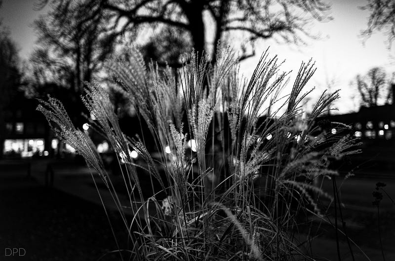
What is the aesthetic form of TRI-X? The “classic” look is a combination of grain, strong contrast across the middle, and non-linear (blow-out) highlights. A particular detail either jumps out or seems visually suppressed.
Notice that the classic look, as above, also includes early, i.e., non-aspherical optics, which were sharp only in the center of the frame and had strong vignetting (see photo above using a Trioplan lens).
This article will say nothing about the different chemical development processes used in each film. Others have written extensively about the subject, as much as it is not a trade secret. Interestingly enough, both films are still commercially available, and some labs will develop and scan the film negative if mailed in.
Both films are negative, i.e., print films. They can be pushed and pulled, enlarged, dodged, and burned, and the photo’s appearance changed in post-production — just like digital images today.
Magnum has a very nice, if expensive collection of darkroom prints that shows just how much selective post-processing was typically done to yield those iconic TRI-X black-and-white images. Localized adjustments were all the rage back then and always will be.
On a modern lens, with good light, both film settings are very close (even with simulated grain). You may spot differences in the bricks in the top right corner, the shroud of the main ghoul, and the shadows of the entryway. Tri-X is a little lighter.

Why bother trying to learn these technicalities at all? Because photography is trying to communicate the image that you have in your mind, not the one that is a perfect reproduction of reality. Exploring these two different, non-linear light/ shadow response profiles helped me understand how to shape tone and contrast to fit my inner vision.
TRI-X was introduced around 1940, and TMAX in 1986. Since then there have been tweaks in the chemistry, tweaks in sensitivity, and tweaks in manufacturing driven by price as well as quality considerations.
In 1960, the ASA standard was significantly revised, doubling the film speed number, but not the chemistry. Today, TRI-X film is available at ISO400, and TMAX is available at ISO100, ISO400, and ISO3200. Those speeds are mimicked by digital filters, which have different tonal curves and simulate different grain sizes. It is surprising how different these curves are for the same chemistry. TMAX100 and TMAX400 render shadows completely different.
Because I shoot black-and-white images with a black-and-white sensor, yielding a grayscale file, the digital filters cannot mimic the differential color sensitivity of TMAX and TRI-X.
Differential color sensitivity is a vital characteristic of these films. TMAX has boosted sensitivity for red and yellow and TRI-X for blue and magenta (according to their Nik profile).
Because I shoot black and white images with a deep red (Wratten #25) or a yellow filter (Wratten #8) to bring out the contrast in the highlights and the sky, I get boosted sensitivity for red and yellow the old-fashioned way.
These glass filters make a mighty difference, like a polarizing filter for color sensors. Purists will point out that a deep red filter on TMAX (boosted for red) has a different effect than on TRI-X (boosted for blue).
I do not add artificial grain to any of my images. Why would you artificially degrade your image when every monitor and printer downsamples the original file? Downsampling degrades artificial noise.
To expand upon the math, a 40-megapixel sensor has 40 million pixels. There is no Bayer filter in a black-and-white sensor, so each sensor pixel becomes a file pixel. A 4K monitor has 8 million pixels. Five pixels have to be merged into one by the video card. Adding artificial noise makes that so much more difficult for the computer brain.
Using Tri-X settings gave me the courage to preset the camera to ISO1000 and above. Now, the higher digital ISO noise matches the film grain and extends your recording reach to the blue hour and into the night!
The most significant difference is in the blacks. Tri-X 400 is linear in the shadows to mid-tones but cuts to black very early. TMAX 400 also cuts to black early but is not linear in the shadows. It artificially darkens them. Both cut the highlights. Cutting down to full black rather than having a linear curve in the shadows is the defining characteristic of Kodak as compared to Ilford tonal curves. I do not have a rational explanation, but this cut to black in the shadows gives Kodak films/filters their punch. There is more complete black in a Kodak print than in an Ilford print.
This tonal sensitivity plays well with modern color monitors because cheaper monitors experience “backlight bleed “ rather than full black; the red/green/blue LEDs mix to charcoal gray. On the other hand, the tonality in the shadows is lost on printed paper. This is one reason why Ilford or Rolex looks better for portraits of subtle graduations and does not emphasize blemishes as much.
To summarize, we like the TRI-X look because it reminds us of the great photographers of yesteryear who had nothing else to choose from. TMAX came out at a time when magazines were already using color photographs and, at the same time, were publishing photos at much higher resolution.
Is there a hard and fast rule for using one digital post-production setting over the other? No, except do not use either for portraits or high-key scenarios and fall in love with the many shades of gray.