Trading & Back-testing the Slingshot Candlestick Pattern — The Full Guide.
Full Introduction on the Slingshot Candlestick Pattern.
Candlestick patterns deserve to be studied thoroughly and even though a strategy relying solely on them will be unstable and unprofitable, they can be a valuable addition into a full trading system that uses other techniques. In this article, we will see a full presentation and code of a multiple candles continuation pattern.
I have just published a new book after the success of New Technical Indicators in Python. It features a more complete description and addition of complex trading strategies with a Github page dedicated to the continuously updated code. If you feel that this interests you, feel free to visit the below link, or if you prefer the PDF version, you could contact me on Linkedin.
Candlestick Charts
Candlestick charts are among the most famous ways to analyze the time series visually. They contain more information than a simple line chart and have more visual interpretability than bar charts. Many libraries in Python offer charting functions but being someone who suffers from malfunctioning import of libraries and functions alongside their fogginess, I have created my own simple function that charts candlesticks manually with no exogenous help needed.
OHLC data is an abbreviation for Open, High, Low, and Close price. They are the four main ingredients for a timestamp. It is always better to have these four values together so that our analysis reflects more the reality. Here is a table that summarizes the OHLC data of hypothetical security:
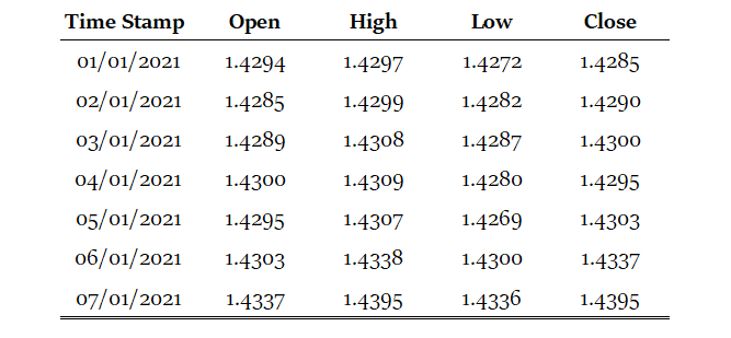
Our job now is to plot the data so that we can visually interpret what kind of trend is the price following. We will start with the basic line plot before we move on to candlestick plotting.
Note that you can download the data manually or using Python. In case you have an excel file that has OHLC only data starting from the first row and column, you can import it using the below code snippet:
import numpy as np
import pandas as pd
# Importing the OHLC Historical Data in Excel format
my_ohlc_data = pd.read_excel('my_ohlc_data.xlsx')# Converting to Array
my_ohlc_data = np.array(my_ohlc_data)Plotting basic line plots is extremely easy in Python and requires only one line of code. We have to make sure that we have imported a library called matplotlib and then we will call a function that plots the data for us.
# Importing the necessary charting library
import matplotlib.pyplot as plt
# The syntax to plot a line chart
plt.plot(my_data[-100:, 3], color = 'black', label = 'EURUSD')# The syntax to add the label created above
plt.legend()# The syntax to add a grid
plt.grid()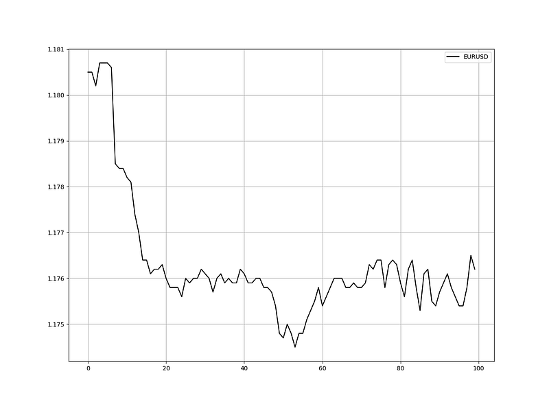
Now that we have seen how to create normal line charts, it is time to take it to the next level with candlestick charts. The way to do this with no complications is to think about vertical lines. Here is the intuition (followed by an application of the function below):
- Select a lookback period. This is the number of values you want to appear on the chart.
- Plot vertical lines for each row representing the highs and lows. For example, on OHLC data, we will use a matplotlib function called vlines which plots a vertical line on the chart using a minimum (low) value and a maximum (high value).
- Make a color condition which states that if the closing price is greater than the opening price, then execute the selected block of code (which naturally contains the color green). Do this with the color red (bearish candle) and the color black (Doji candle).
- Plot vertical lines using the conditions with the min and max values representing closing prices and opening prices. Make sure to make the line’s width extra big so that the body of the candle appears sufficiently enough that the chart is deemed a candlestick chart.
def ohlc_plot(Data, window, name):

    Chosen = Data[-window:, ]

    for i in range(len(Chosen)):

      plt.vlines(x = i, ymin = Chosen[i, 2], ymax = Chosen[i, 1], color = 'black', linewidth = 1)

      if Chosen[i, 3] > Chosen[i, 0]:
            color_chosen = 'green'
            plt.vlines(x = i, ymin = Chosen[i, 0], ymax = Chosen[i, 3], color = color_chosen, linewidth = 4)
if Chosen[i, 3] < Chosen[i, 0]:
color_chosen = 'red'
plt.vlines(x = i, ymin = Chosen[i, 3], ymax = Chosen[i, 0], color = color_chosen, linewidth = 4)
if Chosen[i, 3] == Chosen[i, 0]:
color_chosen = 'black'
plt.vlines(x = i, ymin = Chosen[i, 3], ymax = Chosen[i, 0], color = color_chosen, linewidth = 4)
plt.grid()
plt.title(name)# Using the function
ohlc_plot(my_ohlc_data, 50, '')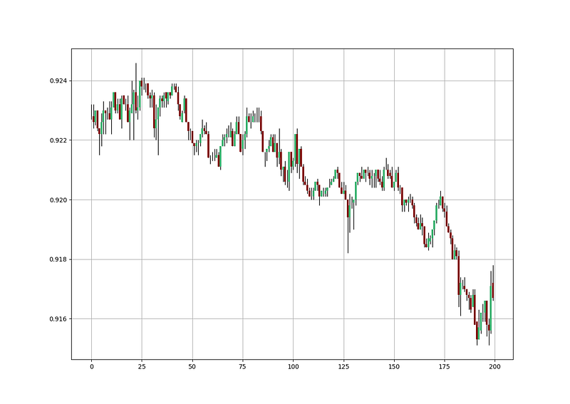
If you are interested in seeing more technical indicators and back-tests, feel free to check out the below article:
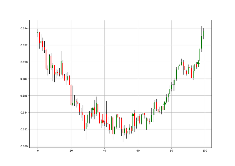
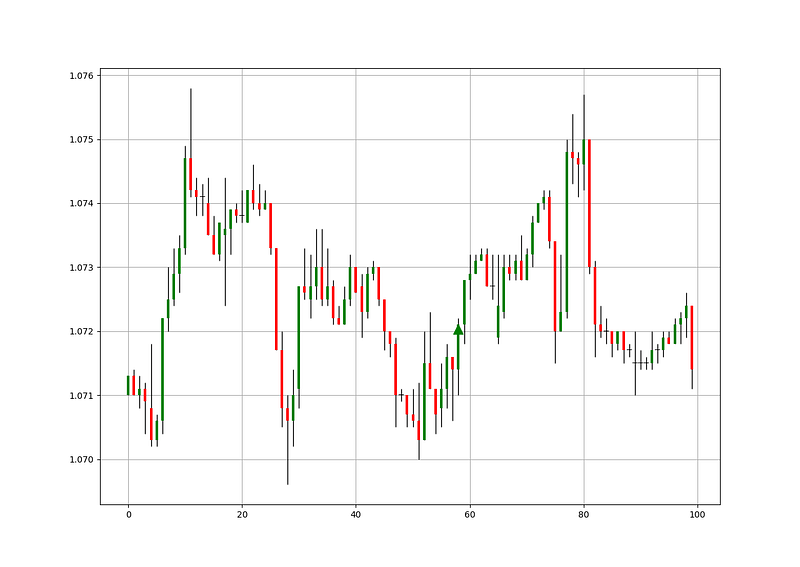
The Bullish Slingshot Pattern
The bullish Slingshot pattern is based on the concept of the pull-back after a breakout. This is extremely interesting because we need more objective patterns in technical analysis which is why I have made all efforts to give clear parameters. The pattern is characterized by having a first bullish candle followed by a higher one denoting a bullish bias, then a correction can occur which is assumed to be a pull-back. Finally, the last candle should touch or go lower than the high of the first candle but also must close above the high of the second candle thus confirming the bullish trend and the end of the pull-back.
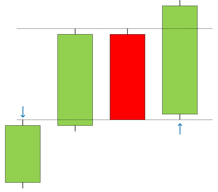
Ideally, the high of the first candle must not surpass the close of the second candle. There is no strict rule about the color of the second and third candle but the above shows the perfect configuration. The pattern signals the continuation of the move higher and the algorithm developed next will buy at the close of the fourth candle.
The Bearish Slingshot Pattern
The bearish Slingshot pattern is based on the concept of the pull-back after a breakout. The pattern is characterized by having a first bearish candle followed by a lower one denoting a bearish bias, then a correction can occur which is assumed to be a pull-back. Finally, the last candle should touch or go higher than the low of the first candle but also must close below the low of the second candle thus confirming the bearish trend and the end of the pull-back.
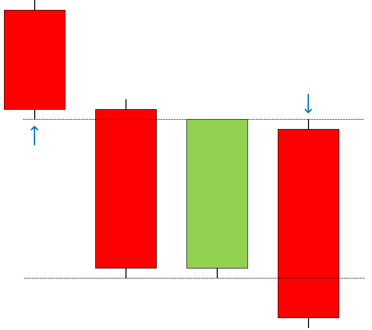
Ideally, the low of the first candle must not be lower than the close of the second candle. There is no strict rule about the color of the second and third candle but the above shows the perfect configuration. The pattern signals the continuation of the move lower and the algorithm developed next will sell short at the close of the fourth candle.
Creating a Scanning Algorithm
Our aim is to create an algorithm that detects this pattern and places theoretical buy and sell orders. But first, we need to code the intuition of the pattern. Let us review what we will need for the bullish Slingshot pattern:
- The first candle is bullish, the second candle is also bullish and closes higher.
- The third candle is bearish and the fourth candle is bullish and closes higher than the high of the second candle.
- The fourth candle has a low equal to or lower than the high of the first candle.
- The high of the first candle must not surpass the close of the second candle.
Similarly, for the bearish Slingshot pattern, we need the following conditions:
- The first candle is bearish, the second candle is also bearish and closes lower.
- The third candle is bullish and the fourth candle is bearish and closes lower than the low of the second candle.
- The fourth candle has a high equal to or higher than the low of the first candle.
- The low of the first candle must not be lower than the close of the second candle.
def signal(Data):

    for i in range(len(Data)):

       # Bullish Slingshot
       if Data[i - 3, 3] > Data[i - 3, 0] and Data[i - 2, 3] > Data[i - 2, 0] and Data[i - 1, 3] < Data[i - 1, 0] and Data[i, 3] > Data[i, 0] and Data[i - 2, 3] > Data[i - 3, 3] and Data[i, 2] <= Data[i - 3, 1] and Data[i, 1] > Data[i - 2, 1] and Data[i - 3, 1] < Data[i - 2, 3]:

                Data[i, 6] = 1

       # Bearish Slingshot
       elif Data[i - 3, 3] < Data[i - 3, 0] and Data[i - 2, 3] < Data[i - 2, 0] and Data[i - 1, 3] > Data[i - 1, 0] and Data[i, 3] < Data[i, 0] and Data[i - 2, 3] < Data[i - 3, 3] and Data[i, 1] >= Data[i - 3, 2] and Data[i, 2] < Data[i - 2, 2] and Data[i - 3, 2] > Data[i - 2, 3]:

                Data[i, 7] = -1

    return Data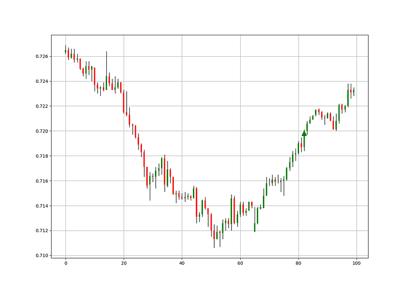
The above function takes an OHLC data array with multiple empty columns to spare and populates columns 6 (Buy) and 7 (Sell) with the conditions that we discussed earlier. We want to input 1’s in the column we call “buy” and -1 in the column we call “sell”.
This later allows you to create a function that calculates the profit and loss by looping around these two columns and taking differences in the market price to find the profit and loss of a close-to-close strategy. Then you can use a risk management function that uses stops and profit orders.
If you are also interested by more technical indicators and using Python to create strategies, then my best-selling book on Technical Indicators may interest you:
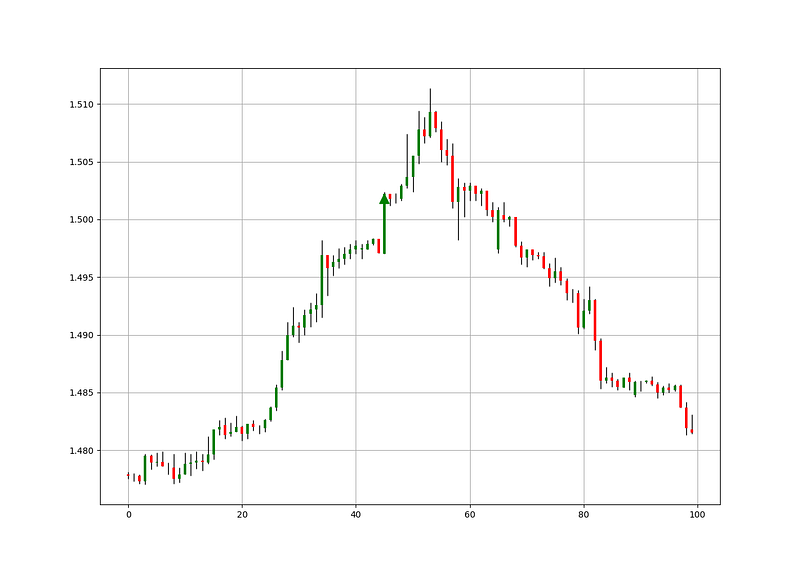
The red arrows point to a sell short signal while the green arrows point to a buy signal based on the closing prices. The next step is evaluating the signal quality.
Evaluating the Signal Quality
Having had the signals, we now know when the algorithm would have placed its buy and sell orders, meaning, that we have an approximate replica of the past where can can control our decisions with no hindsight bias. We have to simulate how the strategy would have done given our conditions. This means that we need to calculate the returns and analyze the performance metrics. Let us see a neutral metric that can give us somewhat a clue on the predictability of the indicator or the strategy. For this study, we will use the Signal Quality metric.
The signal quality is a metric that resembles a fixed holding period strategy. It is simply the reaction of the market after a specified time period following the signal. Generally, when trading, we tend to use a variable period where we open the positions and close out when we get a signal on the other direction or when we get stopped out (either positively or negatively).
Sometimes, we close out at random time periods. Therefore, the signal quality is a very simple measure that assumes a fixed holding period and then checks the market level at that time point to compare it with the entry level. In other words, it measures market timing by checking the reaction of the market.
# Choosing the holding period
period = 34
def signal_quality(Data, closing, buy, sell, period, where):
Data = adder(Data, 1)
for i in range(len(Data)): try: if Data[i, buy] == 1:
Data[i + period, where] = Data[i + period, closing] - Data[i, closing]
if Data[i, sell] == -1:
Data[i + period, where] = Data[i, closing] - Data[i + period, closing] except IndexError: pass return Data# Using the selected period as a window of signal Quality check
my_data = signal_quality(my_data, 3, 6, 7, period, 8)positives = my_data[my_data[:, 8] > 0]
negatives = my_data[my_data[:, 8] < 0]# Calculating Signal Quality
signal_quality = len(positives) / (len(negatives) + len(positives))print('Signal Quality = ', round(signal_quality * 100, 2), '%')
# Output EURUSD Hourly since 2011: 50.81%
# Output USDCHF Hourly since 2011: 54.97%
# Output AUDUSD Hourly since 2011: 53.14%As this is a continuation pattern, longer holding periods should correspond to better quality and this is why I have used 34 periods. A signal quality of 54.97% means that on 100 trades, we tend to see in 55 of the cases the right predicted direction.
I tend to use the Fibonacci sequence for holding periods from time to time but I do not believe it has any difference from other holding periods. For example, I use 21 holding periods sometimes instead of 20 which is more of a personal choice but in reality, even the differences in the results between the two periods is random, so I encourage you to loop around the periods and select the one that fits you.
Conclusion & Important Disclaimer
Remember to always do your back-tests. You should always believe that other people are wrong. My indicators and style of trading may work for me but maybe not for you.
I am a firm believer of not spoon-feeding. I have learnt by doing and not by copying. You should get the idea, the function, the intuition, the conditions of the strategy, and then elaborate (an even better) one yourself so that you back-test and improve it before deciding to take it live or to eliminate it. My choice of not providing Back-testing results should lead the reader to explore more herself the strategy and work on it more.
To sum up, are the strategies I provide realistic? Yes, but only by optimizing the environment (robust algorithm, low costs, honest broker, proper risk management, and order management). Are the strategies provided only for the sole use of trading? No, it is to stimulate brainstorming and getting more trading ideas as we are all sick of hearing about an oversold RSI as a reason to go short or a resistance being surpassed as a reason to go long. I am trying to introduce a new field called Objective Technical Analysis where we use hard data to judge our techniques rather than rely on outdated classical methods.
One Last Word
I have recently started an NFT collection that aims to support different humanitarian and medical causes. The Society of Light is a set of limited collectibles which will help make the world slightly better as each sale will see a percentage of it sent directly to the charity attributed to the avatar. As I always say, nothing better than a bullet list to outline the benefits of buying these NFT’s:
- High-potential gain: By concentrating the remaining sales proceedings on marketing and promoting The Society of Light, I am aiming to maximize their value as much as possible in the secondary market. Remember that trading in the secondary market also means that a portion of royalties will be donated to the same charity.
- Art collection and portfolio diversification: Having a collection of avatars that symbolize good deeds is truly satisfying. Investing does not need to only have selfish needs even though there is nothing wrong with investing to make money. But what about investing to make money, help others, and collect art?
- Donating to your preferred cause(s): This is a flexible way of allocating different funds to your charities.
- A free copy of my book in PDF: Any buyer of any NFT will receive a free copy of my latest book shown in the link of the article.