
Track your Habits with Obsidian Charts and Heatmap Calendar

Today I want to show you an alternative way to keep track of your habits in Obsidian.
I already wrote an article about this four months ago, but at that time I was using a community plugin, that I don’t use anymore, called Tracker. You can still use it of course. It’s still working and it’s a good plugin and easy to use, but the fact is that I was looking for something more versatile and a plugin that would be updated more frequently.
Note that if a plugin hasn’t been updated for more than a year, it doesn’t mean it doesn’t work anymore, but if I have an alternative, I tend to trust more a plugin that receives updates more frequently.
That’s why I started to use Obsidian Charts and Heatmap Calendar!
Obsidian Charts
Obsidian Charts is a plugin that allows you to create beautiful and interactive charts directly within your notes. Whether you want to visualize data, track progress, or analyze trends, this plugin offers a seamless way to present information visually. With support for various chart types like bar graphs, line charts, and pie charts, Obsidian Charts empowers you to transform your raw data into meaningful visual representations.
For example, I record my weight data in a property field called “weight” inside my “Daily Note”.

Then, I visualize the trend of my weight in a line chart, and this was the result with the Tracker plugin:

This is the result with Obsidian Charts:

This is the syntax:
```dataviewjs
dv.span("**Weight Log**")

const pages = dv.pages('#daily_note').sort(p => p.file.name)
const dates = pages.map(p => p.file.name).values
const weights = pages.map(p => p.weight).values

const chartData = {
 type: 'line',
 data: {
  labels: dates,
  datasets: [{
   label: 'Weight (Kg)',
   data: weights,
   backgroundColor: [
    'rgba(53, 252, 167, 1)'
   ],
   borderColor: [
    'rgba(138, 102, 204, 0.8)'
   ],
   borderWidth: 1.5,
   spanGaps: true,
  }],
 },
};

window.renderChart(chartData, this.container)
```
Heatmap Calendar
The Heatmap Calendar provides a visual representation of your activity over time. Thanks to the different colors and shades, this plugin allows you to identify patterns, track your progress, and stay motivated. Heatmap Calendar not only helps you visualize your habits but also encourages you to maintain consistency.

To give you an easy example, after lunch, I started to take a 30/40 minutes walk while listening to podcasts. So, I created a checkbox property called “walked” inside my “Daily Note” that I check when I take my walk.

The result with the Tracker plugin was:

But now, with the Heatmap Calendar, it looks like this:
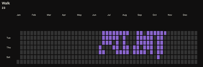
Now with a fast look I know how my activity is going. Also, one thing that I really like is that I see the entire year instantly.
This is the syntax:
```dataviewjs

dv.span("** Walk **")

const calendarData = {
    colors: {
        purple: ["#8a66cc"],
    },
    entries: []
}

for(let page of dv.pages('#daily_note').where(p=>p.walked)){

    calendarData.entries.push({
        date: page.file.name,
        content: await dv.span(`[](${page.file.name})`),
    })
}

renderHeatmapCalendar(this.container, calendarData)

```
Conclusion
Obsidian Charts and Heatmap Calendar are two powerful and versatile plugins that allow you to visualize data, and gain insights into your habits.
These plugins can be “scary” at the beginning if you don’t know how to write dataviewjs queries, but trust me, if you go through the documentation of the plugins and resources like Charts.js, you will be able to do create your visualizations!
You can join my new Discord server HERE, and follow me on:
- YouTube: https://www.youtube.com/@Marco_Mindstone - X: https://twitter.com/Marco_Mindstone - Mastodon: https://mstdn.business/@Marco_Mindstone


