Free AI web copilot to create summaries, insights and extended knowledge, download it at here
5445
Abstract
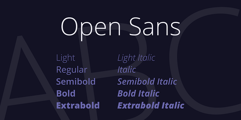
id="bb11"><b>Price: Free</b></p><p id="3cd0"><i>Disclaimer: Prices may change over time</i></p><figure id="787a"><img src="https://cdn-images-1.readmedium.com/v2/resize:fit:800/1*ga9PvJ6A6C9n3or5hrrReg.png"><figcaption><a href="https://www.1001fonts.com/open-sans-font.html">https://www.1001fonts.com/open-sans-font.html</a></figcaption></figure><p id="b599"><a href="https://fonts.google.com/specimen/Open+Sans">Open Sans is a humanist sans serif typeface designed by Steve Matteson, Type Director of Ascender Corp. This version contains the complete 897 character set, which includes the standard ISO Latin 1, Latin CE, Greek and Cyrillic character sets. Open Sans was designed with an upright stress, open forms and a neutral, yet friendly appearance. It was optimized for print, web, and mobile interfaces, and has excellent legibility characteristics in its letterforms.</a></p><div id="1897" class="link-block">
<a href="https://fonts.google.com/specimen/Open+Sans">
<div>
<div>
<h2>Google Fonts</h2>
<div><h3>Making the web more beautiful, fast, and open through great typography</h3></div>
<div><p>fonts.google.com</p></div>
</div>
<div>
<div style="background-image: url(https://miro.readmedium.com/v2/resize:fit:320/0*2efd6egb3OBqceir.)"></div>
</div>
</div>
</a>
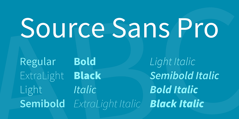
</div><h2 id="53ea">Source Sans Pro</h2><p id="1b4d"><b>Price: Free</b></p><p id="f93d"><i>Disclaimer: Prices may change over time</i></p><figure id="fe01"><img src="https://cdn-images-1.readmedium.com/v2/resize:fit:800/1*0AC_OxG1p5QIfuJjWcYtlw.png"><figcaption><a href="https://www.1001fonts.com/source-sans-pro-font.html">https://www.1001fonts.com/source-sans-pro-font.html</a></figcaption></figure><p id="f172"><a href="https://fonts.google.com/specimen/Source+Sans+Pro">Source® Sans Pro, Adobe’s first open source typeface family, was designed by Paul D. Hunt. It is a sans serif typeface intended to work well in user interfaces.</a></p><div id="4b41" class="link-block">
<a href="https://fonts.google.com/specimen/Source+Sans+Pro">
<div>
<div>
<h2>Google Fonts</h2>
<div><h3>Making the web more beautiful, fast, and open through great typography</h3></div>
<div><p>fonts.google.com</p></div>
</div>
<div>
<div style="background-image: url(https://miro.readmedium.com/v2/resize:fit:320/)"></div>
</div>
</div>
</a>
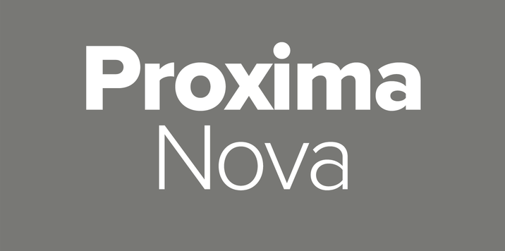
</div><h2 id="e726">Proxima Nova</h2><p id="c0b9"><b>Price: 5.29 per style</b></p><p id="171c"><i>Disclaimer: Prices may change over time</i></p><figure id="6ea5"><img src="https://cdn-images-1.readmedium.com/v2/resize:fit:800/1*MOaiU1D1pA-qmyYRJDxUdw.png"><figcaption><a href="https://www.myfonts.com/fonts/marksimonson/proxima-nova/">https://www.myfonts.com/fonts/marksimonson/proxima-nova/</a></figcaption></figure><p id="32c1"><a href="https://www.myfonts.com/fonts/marksimonson/proxima-nova/">he <b>Proxima Nova</b> family is a complete reworking of <b>Proxima</b> Sans (1994). The original six <b>fonts</b> (three weights with italics) have been expanded to 48 full-featured OpenType <b>fonts</b>. … Stylistically, <b>Proxima Nova</b> straddles the gap between typefaces like Futura and classic sans faces.</a></p><div id="7b55" class="link-block">
<a href="https://fonts.adobe.com/fonts/proxima-nova">
<div>
<div>
<h2>Proxima Nova | Adobe Fonts</h2>
<div><h3>A sans serif typeface with 48 styles, available from Adobe Fonts for sync and web use. Adobe Fonts is the easiest way…</h3></div>
<div><p>fonts.adobe.com</p></div>
</div>
<div>
<div style="background-image: url(https://miro.readmedium.com/v2/resize:fit:320/)"></div>
</div>
</div>
</a>
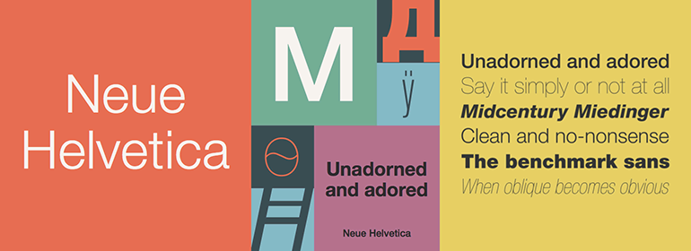
</div><h2 id="74c6">Helvetica Neue</h2><p id="3606"><b>Price:</b> <b>35.00 per style</b></p><p id="c167"><i>Disclaimer: Prices may change over time</i></p><figure id="e179"><img src="https://cdn-images-1.readmedium.com/v2/resize:fit:800/1*AgV8UtMjW5Ve55E1hsexyQ.png"><figcaption><a href="https://www.fonts.com/font/linotype/neue-helvetica/complete-family">https://www.fonts.com/font/linotype/neue-helvetica/complete-family</a></figcaption></figure><p id="1928"><a href="https://www.myfonts.com/fonts/linotype/neue-helvetica/?lastItem=200&tab=individualStyles">This typeface, designed by Max Miedinger and other project members at the Haas’sche Schriftgiesserei, has become one of the most famous and popular typefaces in the world, thanks to the marketing strategy of Stempel and Linotype. It forms an integral part of many printers and operating systems. The original letterforms of Helvetica had to be modified for the Linotype system. Over the years, Helvetica was expanded to include many different weights, but these were not coordinated with each other.</a></p><div id="8d7e" class="link-block">
<a href="https://www.fonts.com/font/linotype/neue-helvetica">
<div>
<div>
<h2>Neue Helvetica® Font Family - Fonts.com</h2>
<div><h3>The Helvetica design is a classic that has stood the test of time - and ch
Options
anged with technological advances in the…</h3></div>
<div><p>www.fonts.com</p></div>
</div>
<div>
<div style="background-image: url(https://miro.readmedium.com/v2/resize:fit:320/0*d7NebTxv05PNTaMq)"></div>
</div>
</div>
</a>
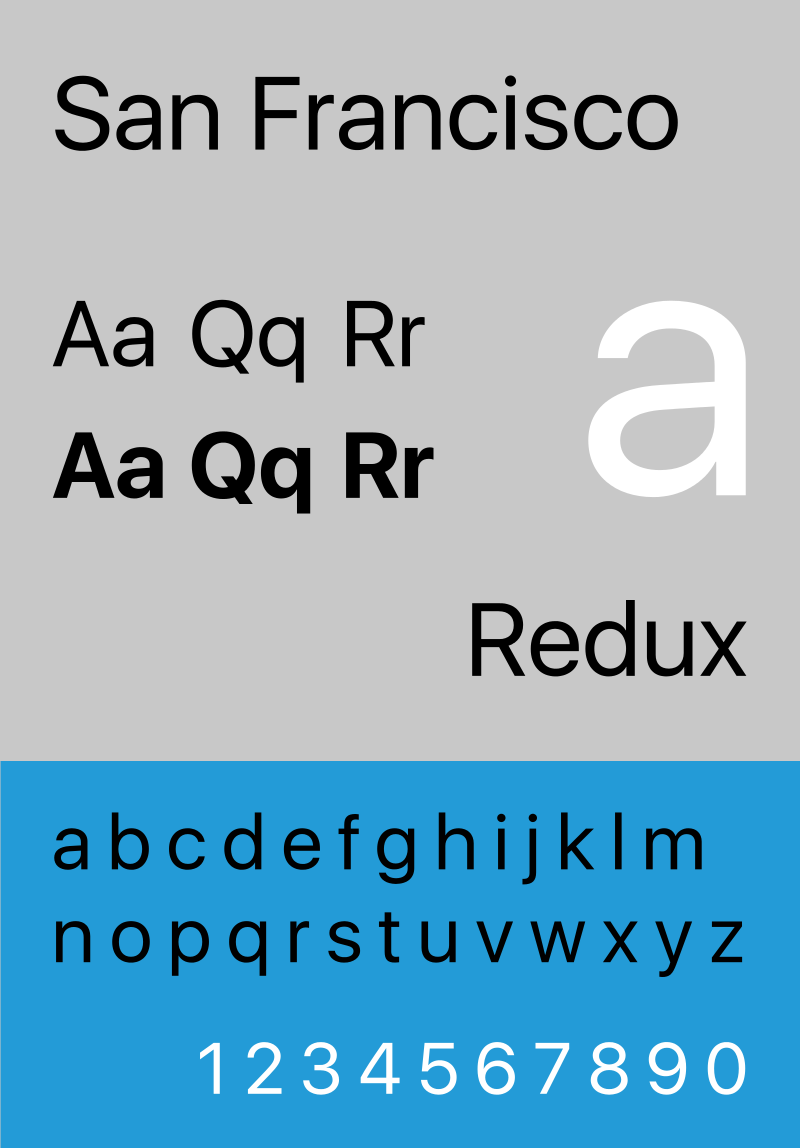
</div><h2 id="1cfb">San Francisco</h2><p id="e78a"><b>Price: Free</b></p><p id="c0a5"><i>Disclaimer: Prices may change over time</i></p><figure id="cd76"><img src="https://cdn-images-1.readmedium.com/v2/resize:fit:800/1*9ePPaPsbcQo17W6KAr98rQ.png"><figcaption><a href="https://en.wikipedia.org/wiki/San_Francisco_(sans-serif_typeface)">https://en.wikipedia.org/wiki/San_Francisco_(sans-serif_typeface)</a></figcaption></figure><p id="0849">San Francisco is a neo-grotesque sans-serif typeface made by Apple Inc. It was first released to developers on November 18, 2014. It is the first new typeface designed at Apple in nearly 20 years and has been inspired by Helvetica and DIN. <a href="https://en.wikipedia.org/wiki/San_Francisco_(sans-serif_typeface)">Wikipedia</a></p><div id="8dee" class="link-block">
<a href="https://developer.apple.com/fonts/">
<div>
<div>
<h2>Fonts - Apple Developer</h2>
<div><h3>Get the details, frameworks, and tools you need to use San Francisco, the system UI font for Apple platforms, in your…</h3></div>
<div><p>developer.apple.com</p></div>
</div>
<div>
<div style="background-image: url(https://miro.readmedium.com/v2/resize:fit:320/)"></div>
</div>
</div>
</a>
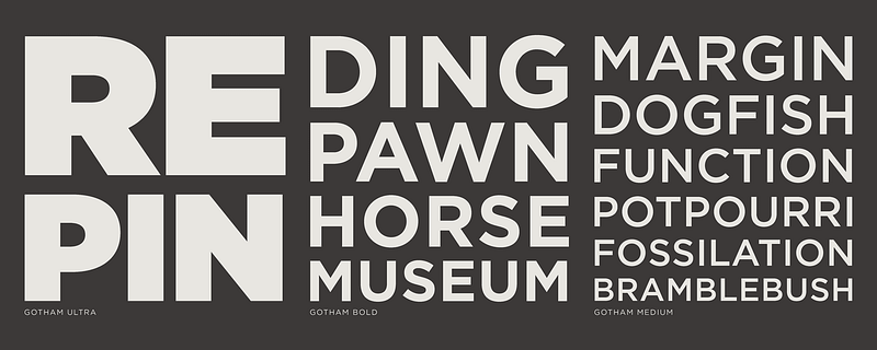
</div><h2 id="50dc">Gotham</h2><p id="c4ea"><b>Price: From $169 per Pack</b></p><p id="6373"><i>Disclaimer: Prices may change over time</i></p><figure id="9ddf"><img src="https://cdn-images-1.readmedium.com/v2/resize:fit:800/1*sqy4DGXgAzjeCfwQudmh1g.png"><figcaption><a href="https://www.typography.com/fonts/gotham/inside/">https://www.typography.com/fonts/gotham/inside/</a></figcaption></figure><p id="299e"><a href="https://www.typography.com/fonts/gotham/overview/">Gotham is that rarest of designs, the new typeface that feels somehow familiar. From the lettering that inspired it, Gotham inherited an honest tone that’s assertive but never imposing, friendly but never folksy, confident but never aloof. The inclusion of so many original ingredients without historical precedent — a lowercase, italics, a comprehensive range of weights and widths, and a character set that transcends the Latin alphabet — enhances these forms’ plainspokenness with a welcome sophistication, and brings a broad range of expressive voices to the Gotham family</a></p><div id="fec2" class="link-block">
<a href="https://www.typography.com/fonts/gotham/overview/">
<div>
<div>
<h2>Gotham Fonts | Hoefler & Co.</h2>
<div><h3>Gotham. What letters look like. Every designer has admired the no-nonsense lettering of the American vernacular, those…</h3></div>
<div><p>www.typography.com</p></div>
</div>
<div>
<div style="background-image: url(https://miro.readmedium.com/v2/resize:fit:320/0*SsqlOxemKaPbPNza)"></div>
</div>
</div>
</a>
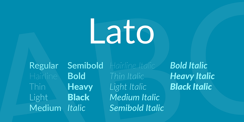
</div><h2 id="d4eb">Lato</h2><p id="2dc7"><b>Price: Free</b></p><p id="04c8"><i>Disclaimer: Prices may change over time</i></p><figure id="3119"><img src="https://cdn-images-1.readmedium.com/v2/resize:fit:800/1*lSUKDAm8kbQYrYgxmChhTA.png"><figcaption><a href="https://www.1001fonts.com/lato-font.html">https://www.1001fonts.com/lato-font.html</a></figcaption></figure><p id="6d8e"><b>Lato</b> is a sanserif typeface family designed in the Summer 2010 by Warsaw-based designer <a href="http://www.latofonts.com/team/"><b>Łukasz Dziedzic</b></a> (“Lato” means “Summer” in Polish). In December 2010 the Lato family was published under the open-source Open Font License by his foundry tyPoland, with support from Google.</p><div id="9c46" class="link-block">
<a href="http://www.latofonts.com/lato-free-fonts/">
<div>
<div>
<h2>The Fonts - Lato</h2>
<div><h3>Lato is a sanserif typeface family designed in the Summer 2010 by Warsaw-based designer Łukasz Dziedzic ("Lato"…</h3></div>
<div><p>www.latofonts.com</p></div>
</div>
<div>
<div style="background-image: url(https://miro.readmedium.com/v2/resize:fit:320/)"></div>
</div>
</div>
</a>
</div><p id="a342">Might also consider…</p><div id="5c17" class="link-block">
<a href="https://uxplanet.org/top-10-logo-fonts-6e4df4490f65">
<div>
<div>
<h2>Top 10 Logo Fonts</h2>
<div><h3>Best fonts to use when designing logos</h3></div>
<div><p>uxplanet.org</p></div>
</div>
<div>
<div style="background-image: url(https://miro.readmedium.com/v2/resize:fit:320/1*fPb6ETIwuEfAixSYyQdhtw.gif)"></div>
</div>
</div>
</a>
</div><p id="7c3a"><i>Thanks for reading!</i></p><p id="8a26"><i>Let’s keep in touch, hit the follow button…</i></p></article></body>