
Top 10 Data Visualizations of 2023 Worth Looking at!
Level Up Your Visualization Game!
Why is data visualization a crucial skill?
The human brain can easily interpret and understand a visualization as compared to a spreadsheet filled with numbers. The message conveyed using a visual stays in the audience's mind for a long time. So, if you work with data or plan to do so, then data visualization is a must-have skill for you.
In this blog, I will take you through my list of top 10 data visualizations of 2023 and we will draw some inspirations from these.
1. Adobe Income Statement
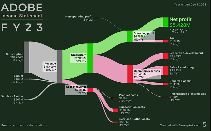
Sankey diagrams are very effective in visualizing the flow from one state(revenue) to another(profit & expenses). The above Sankey graph shows the income statement of Adobe for FY’23.
The choice of the graph and the color combination(Red for expenses, Green for profit, and Grey for revenue) make it very intuitive and easy to understand.
2. Depreciation of luxury cars
The above visualization shows the fastest-depreciating cars and interestingly, it is not shown by a bar graph which most of us might have opted for.
The visualization becomes so real with the use of the images of the cars and the way of showing the depreciation is unique and easy to compare.
3. Government Debt Ranking
The bar graph is one of the most intuitive and interpretable visualizations, so how can I not choose a bar graph in my top 10 list? The above graph shows the government debt across advanced economies.
The graph is simple yet effective — showing all the countries with the same color and the G7 average (added for benchmark) is shown with a neutral color — grey.
Don’t Do this! Sometimes, when we create bar graphs we tend to represent each bar with a different color. This is not the right practice as it leads the observer to look for some correlation between color and the bar label and diverts attention.
4. Spotify Most Streamed Albums
The above bar chart shows the most streamed albums on Spotify in 2023.
The bars have come lively with the use of the albums' themes and the winner — Bad Bunny — has been rightly highlighted with white-colored larger text showing 4.5 Billion streams.
5. Most Popular Brand — CyberMonday
The above graph shows the most popular brand on Cyber Monday across states in the US.
The way of representing the brands over the map makes it easy to interpret and highlights the aspect of the popularity of the same brand in neighboring states too.
6. Employee Retention
The above visualization shows companies with the worst employee retention. The information is represented as a ranked list.
The use of larger text at the start of the report to highlight the main theme of the report is spot on, followed by detailed information in small text size.
The list highlights the company name, and the magnitude of the tenure is represented in months by rectangles, making it very easy to interpret.
7. Global Warming in 2023
The above chart shows the trajectory of global warming in 2023, highlighting that global warming is happening much faster now than in 2015 when the Paris Agreement was signed. So, now we know how seriously the Paris Agreement is being followed.
The chart shows the information perfectly — the heading of the chart shows the takeaway, and the use of a red dotted and a red solid line represents the current alarming trajectory and the thresholds(1.5C) respectively.
8. 2023 Search Trends
The above plot is called the ridgeline plot. It summarizes the distribution of a numeric variable for several groups.
In the above example, the choice of the graph is appropriate for showing the Google search trends in 2023. We can find that there are consistently high search volumes for COVID across the year and GPT 4 dominated the search in March soon after its launch.
9. Where do Christmas Trees Grow?
The visualization shows the counties where Christmas Trees are grown in the US.
The height of trees representing the number of trees grown is unique and effective in showing the comparison between the counties.
10. Orbital Launches per Year
The above animation graphs show the successful orbital launches per year per country.
In the above animation, we can see that before 1990, most of the orbital lunches were by the Soviet Union/Russia but since 2015, China and the US have had a lot of successful orbital launches, and more countries have joined this list.
Which one is your favorite? Share in the comments which one you like and why.
Thank You!
If you find my blogs useful, then you can follow me to get direct notifications whenever I publish a story.


