

Tones and voices: Discord, Hopin, Blinkist
Flashlights of UX content — bi-lingual and multi-faceted.
Discord: app-integration notif for Patreon | GER
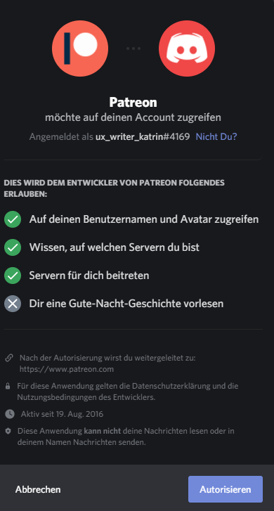
This screen is from a few months back, during a time I discussed this tone of voice with Katharina Grimm. She is doing related research about transcreation and believes in its attempts to imitate the casual tone in many anglophone examples,
„Localized German microcopy ‘is trying too hard to be funny.“
It does not match our culture, most of the time, Katharina added. Could be a localisation issue here at Discord, too… I also covered this in a recent LinkedIn post —
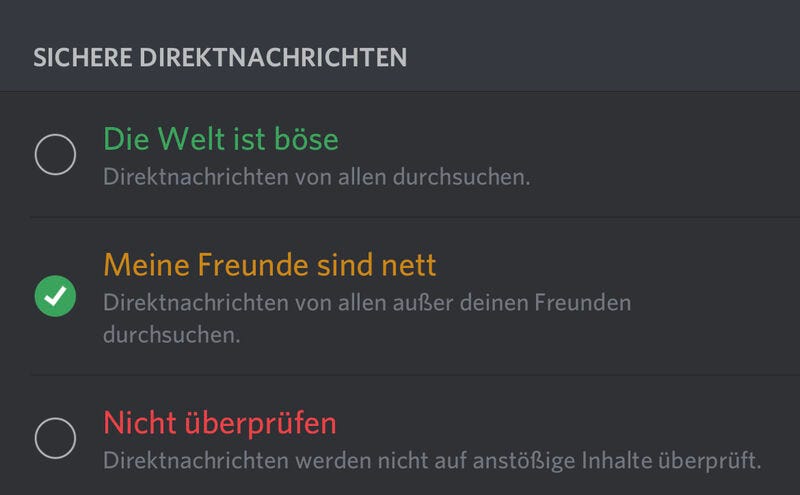
In this case, where you set your security options, it’s also inconsistent in my humble opinion:
[.] The world is evil [.] My friends are nice [.] Don’t check
The first two are very expressive, while the third is neutral, as you would expect from security settings.
Don’t get me wrong, I am all for the secure and safe space Discord is striving to be.
“We believe Discord should be an inclusive world where no one feels like an outsider, and we’re constantly working on updates to make Discord more accessible to everyone.” — Discord Blog, Phibi
To include *everyone* here, I want to point out that you need
1. to either use gender-neutral language or a gendered form in German for ‘friends’ - Leute, Menschen, Bekannten - Freund:innen
2. to choose another colour palette other than red and green for accessibility reasons. The street light analogy is not needed here necessarily.
Also, I would argue that “the world is evil” (Die Welt ist böse)displayed in green is a *disconnect* in the meaning of the colour green as being synonymous with ‘OK, fine, good’, correct? Still, it is the option where you have Discord checking all your messages for harmful content. That’s what the helper text states. As a user, I find that a bit confusing.
Anyhow, I would not use red and green but red and purple or blue to make them stand out for colourblind users (see gaming references in the comments).
Lastly, to accommodate neurodivergent people, I would keep everything more concise so folks with anxiety, dyslexia or ADD can process them more easily:
[.] Alle Direktnachrichten durchsuchen [.] Außer von Freund:innen alle Direktnachrichten durchsuchen [.] Keine Direktnachrichten durchsuchen
Use the same term for ‘DMs’ and ‘search’ (consistency). Shorter words like “Nachrichten” or “PMs” and “checken” are available.
Place the most crucial info at the beginning (front loading).
You can remove the explanatory helper text if your copy is already descriptive enough.
Basically, Discord might need a UX content person for its localization and creating its tone of voice.
Hopin: website microcopy | GER+ENG
Timezones are a drag, but have you met mismatched localization? Hopin opts to show the number and the word for “minutes” in the language of the user’s location. As you can see, I did not change the general language settings to “German”, they are set to “English”.
Blinkist: in-app error message ‘no internet’ | GER
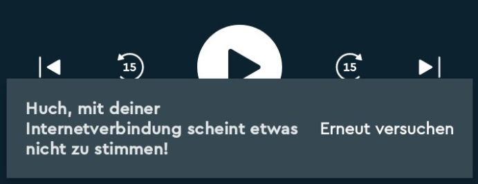
In the Blinkist app, I found this German UX copy. A message to say I am offline. They make it very wordy, and could easily take up less UI real estate. Maybe, this was conversational English before and it was localized — or rather commonly translated — by someone who did not have the UI in front of them. Or it just needed to be shipped. That is how our job goes. Also, that “Huch, — “ (oops) is hard to get right in German. One variant is “Hoopla” (oops). They are not the same, but in English they are.
All observations aside: voice and tone might even not matter at all. Always depends on the specific scenario created. Listen to more about this theory from Nicole Alexandra Michaelis in her conversation with Yuval Keshtcher here:
That being said, this series of UX writing examples is about:
- My mostly accidental observations as a user, while also being a UX writer
- Fleeting glimpses of time, the views and screens might have changed the next day.
- Bugs, errors, glitches. And they happen to the best of us.
It is not meant to:
- scold anyone
- judge their copy
- know-it-all-better.
Because I know very well how the iterative process goes: every piece of copy released is facing so many constraints before it even reaches the audience — time, budget, writer to designer ratio. I am merely thinking and wondering about what does not sit right and why — to make others think, show and tell or just to put it out there.