
Titles That Sell Versus Those That Don’t, a Quantitative Analysis
[When you] model the relationship of every word against all others, a strange and wonderful mathematical order emerges within our language.
Let’s see if we can find some interesting differences between top and bottom selling book titles; we will use the “Amazon Sales Rank” system along with word-embedded vectors to help us get there.
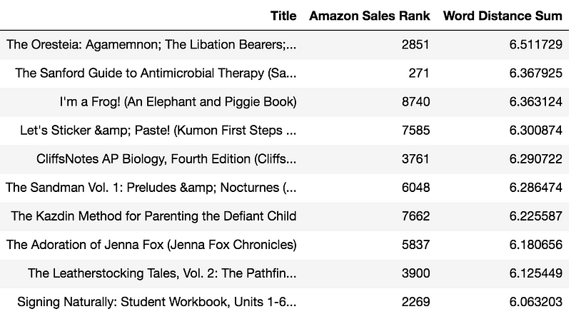
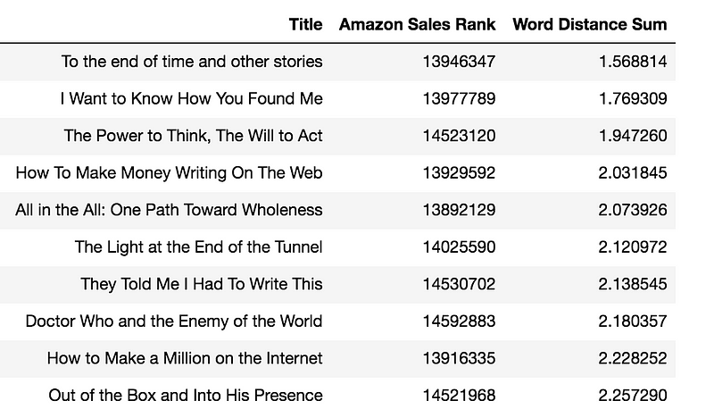
Take a look at the “Title” column in the following two tables. The first table shows eight-word titles that sold well on Amazon books and the second table shows those that didn’t. See any patterns?
If you didn’t catch any obvious differences, don’t worry, it’s a bit subtle. But before we go there, what’s with the eight-word titles?
The Eight-Word Title, the Ultimate Title Length for Success
Turns out, after taking a 10,000 sample of top-ranking titles and averaging the number of words, we get: 8.53 words. When we do the same with the bottom ones, we get 6.07 words. Thus, a title between 8 and 9 words is the perfect length for success.
Using Cosine Distances to Understand a Title’s Signature
Now here comes the interesting part. If you average the cosine distance between each embedded-word vector (a lot more about what that means below), you get a higher distance on top titles than on bottom ones.
4.1 average cosine distance for top titles
3.9 average cosine distance for bottom titles
In simple terms, it means that titles made up of words that are less synonymous with each other tend to do better. And when you consider that the top titles have an average of two extra words in them, you start seeing the pattern that people prefer titles that convey more meaning (really?).
The Amazon Sales Rank and the Word-Embedded-Vector-Distance Relationship
We know that the first table lists hot book titles, their small Amazon sales rankings in the second column confirms that. The opposite goes for the second table, those are laggards and it’s confirmed by their very large Amazon sales rankings.
The last column of both tables is the ‘Word Distance Sum’, which is the sum of the cosine distance of each word-embedded vector in the title. OK, what the heck is a word-embedded vector?
Word-embedded vectors have been one of the biggest boons in the natural language processing (NLP) world in the last decade. The word-vector distance is a linear substructure of the word-vector space. When you take a very large corpus (think all of Wikipedia) and model the relationship of every word against all others, a strange and wonderful mathematical order emerges within our language.
Here is the famous example from Tomas Milkov et al and word2vec modeling technique that has captured the imagination of every NLP amateur out there:
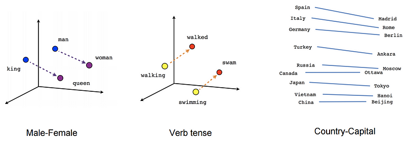
It shows that the distance relationship between gender, tenses, etc. can be captured quantitatively. For example, once you have captured the word-embedded vector distance for a country to its capital, you can unlock the country/capital for all other countries using that same distance key (for more, see Vector Representations of Words). It doesn’t end on standard idiomatic categories, made up ones work just as well. Trask modeled the Harry Potter series and extracted all sorts of cool information using word-embedded vectors:
the word “password”… revealed a list of passwords to the Gryffendor Common Room. (Trask: https://iamtrask.github.io/2014/11/23/harry-potter/)
Word-Vector Similarity and Cosine Distances
Another important yield from using word-embedded vectors is to use a distance metric to extract similarities within text. The closer the distance (i.e. the smaller the word-vector distance), the more similar the words. This, in turn, can be used as a powerful, context-sensitive thesaurus engine. Here, I used the cosine similarity distance metric to measure the space between each word in the title.
[If] a title is too short and uses too many synonymous words, it will be harder to know what the heck the book is about…
And that’s the differing pattern you may have noticed in both tables above. The first table is sorted by word-vector distances in descending order, so it will show the titles with the richest, most complex meanings, where each word isn’t very synonymous with its surrounding words. The second table is sorted by word-vector distances in ascending order, thus the ones made up of close synonyms. If you look closely, you’ll notice that the words are much longer in the first table than in the second one.
Conclusion
In the digital world, a title is the equivalent of a traditional book cover; it has to work a lot harder to convey meaning. This is even a bigger deal in the era of stock-art images; they don’t necessarily yield clues about a book’s content so the title has to work that much harder.
This does make intuitive sense, if your title is made up of close synonyms and is too short, it may not have the necessary information to attract potential readers. The key takeaway here is if a title is too short and uses too many synonymous words, it will be harder to know what the heck the book is about…
And if you want to see how your own titles and content stack up against the pros, test it out on the experimental Multi-Point Writing Analyzer on ViralML.com.
Please share and clap if you found this helpful — thanks for reading!
Manuel Amunategui
Get it and plenty more at amunategui.github.io and at ViralML.com.

OK — Sign up to my email group below and I’ll send you my free eBook on tips to becoming a (better) data scientist (and signup even if you aren’t interested in the eBook). Thanks for reading!!
Source
R. He, J. McAuley. Modeling the visual evolution of fashion trends with one-class collaborative filtering. WWW, 2016 J. McAuley, C. Targett, J. Shi, A. van den Hengel. Image-based recommendations on styles and substitutes. SIGIR, 2015

This story is published in The Startup, Medium’s largest entrepreneurship publication followed by 355,974+ people.
Subscribe to receive our top stories here.
