
Time series modeling with Facebook Prophet
A quick-start approach to analyzing and visualizing time series data
When trying to understand time series, there’s so much to think about. What’s the overall trend in the data? Is it affected by seasonality? What kind of model should I use, and how well will it perform?
All these questions can make time series modeling kind of intimidating, but it doesn’t have to be that bad. While working on a project for my data science bootcamp recently, I tried Facebook Prophet, an open-source package for time series modeling developed by … y’know, Facebook. I found it super quick and easy to get it running with my data, so in this post, I’ll show you how to do it and share a function I wrote to do modeling and validation with Prophet all-in-one. Read on!
Time series modeling: the basics
In a nutshell, time series modeling is about looking for the relationships between your dependent variable and time. Lots of real-world data can come in time series form: stock prices, temperatures, CO2 levels, number of treats I eat per hour on Halloween, etc. If you want to predict what will happen next in a time series, then you need to identify and remove the effects of time on your data so that you can focus your predictive energies on any underlying, non-time-based patterns.
In practice, this means you should:
- Identify any overarching trend in your data over time. Are the values generally on the rise or decline? Or are they hovering around a middle point?
- Identify any repetitive, seasonal patterns in your data. Do values spike every summer and hit a low every winter? Are values higher on weekdays or weekends? A “seasonal” trend can happen on any timescale (years, months, days, hours, etc.), as long it is repeating within your total time period.
- Test whether the data remaining after trend and seasonality are removed are stationary. If your time series is stationary, its mean, variance, and covariance from one term to the next will be constant, not variable over time. Most time series models assume that the data you supply them are stationary, so this is an important step if you want your model to work as expected.
What comes next is often some form of ARIMA (autoregressive integrated moving average) modeling. ARIMA is similar to linear regression, but our explanatory features are past points in time to which we compare each datapoint.
To run an ARIMA model in Statsmodels, you would need to figure out how many and which past points in time to use for comparison, and that can get tricky and time-consuming. To find the best combination, you would want to run your model many times, each with a different combination of terms (using a grid search or random search), then pick the one that yielded the best results. The time needed to do this can increase exponentially as you consider more options!
Facebook Prophet
Facebook Prophet automates some of these processes behind the scenes, so there’s less preprocessing and parameter selection for you to do (and fewer opportunities for you to mess up). As you can imagine, Facebook is very interested in time-based patterns in their users’ activity, so they built Prophet to be especially strong at handling seasonality on multiple scales. Prophet was also designed to be usable by developers and non-developers alike, meaning that it is easy and concise to code, and it can give you attractive plots and convenient tables of forecast data with little effort on your part. All Prophet really wants from you is data in a specific format, which I will cover in the next section.
Prep for Prophet
Keep in mind that I use Prophet in Python, so things may work a little differently if you’re using it in R. To get ready to run Prophet, you will need to format your data in a very specific way. When Prophet reads your DataFrame it looks for two specific columns. One must be called “ds” and contain your datetime objects, and the other must be called “y” and contain your dependent variable. Make sure that your data is in “long” format, i.e., each row represents a single point in time.
To make it easier to follow along, I’ll use a dataset from Statsmodels recording CO2 levels at the Mauna Loa Observatory from 1958 through 2001. As you’ll see, this data has both an upward trend and strong seasonal patterning.
# Load needed packages
import pandas as pd
import numpy as np
import matplotlib.pyplot as plt
import statsmodels.api as sm
from fbprophet import Prophet as proph

# Load the "co2" dataset from sm.datasets
data_set = sm.datasets.co2.load()

# load in the data_set into pandas data_frame
CO2 = pd.DataFrame(data=data_set["data"])
CO2.rename(columns={"index": "date"}, inplace=True)

# set index to date column
CO2.set_index('date', inplace=True)

CO2.head()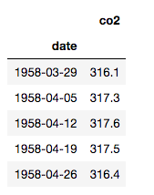
Note above that I’m not putting my DataFrame in the right format for Prophet right away; I want to do some things with it first.
The CO2 level was recorded once a week, but let’s say I’m more interested in monthly intervals. I’ll resample it to be monthly:
# Resample from weekly to monthly
co2_month = CO2.resample('MS').mean()

# Backfill any missing values
co2_month.fillna(method='bfill', inplace=True)

co2_month.head()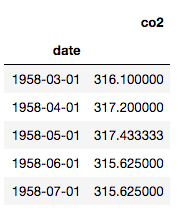
Have a look at the trend and seasonality:
# Plot co2_month
plt.plot(co2_month.index, co2_month.co2)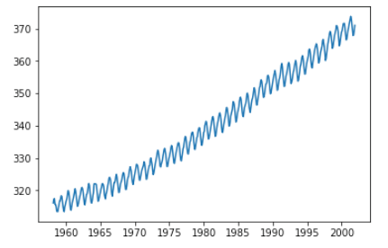
Ok, that’s a terrifying escalation of CO2 levels, but let’s move on. Before using Prophet, we need to create the “ds” and “y” columns.
# Reset the index to make the dates an ordinary column
co2_month.reset_index(inplace=True)

# Rename the columns
co2_month.columns = ['ds', 'y']
co2_month.tail()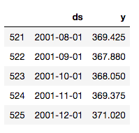
Now we’re ready for some prophecy!
Wrap that function
I want to predict how CO2 will rise over time, but I also want to know how well my model performs. I can do that with the data I have by splitting off some part of it, predicting values for that part, and then comparing the predictions to the actual values. In this case, I’ll shave off the last 10% of the data (53 months) to use for validation:
# Split the data 90:10
co2_train = co2_month[:473]
co2_test = co2_month[473:]
I wrote myself a function that can take in my training data, my validation data, and the whole dataset and return the following:
- a plot of my training data with predictions;
- a plot comparing my predictions to the actual values from the validation dataset;
- a plot showing long-range predictions based on the whole dataset;
- plots showing the overall trend and seasonality in the whole dataset.
My function prints these plots and also returns DataFrames containing the predictions to be compared to the validation data and the long-term predictions. These are useful if you want to analyze the exact values the model predicts.
Here’s my function:
# Define a function to do all the great stuff described above
def proph_it(train, test, whole, interval=0.95, forecast_periods1,
             forecast_periods2):
    '''Uses Facebook Prophet to fit model to train set, evaluate
    performance with test set, and forecast with whole dataset. The
    model has a 95% confidence interval by default.

       Remember: datasets need to have two columns, `ds` and `y`.
       Dependencies: fbprophet, matplotlib.pyplot as plt
       Parameters:
          train: training data
          test: testing/validation data
          whole: all available data for forecasting
          interval: confidence interval (percent)
          forecast_periods1: number of months for forecast on
              training data
          forecast_periods2: number of months for forecast on whole
              dataset'''

    # Fit model to training data and forecast
    model = proph(interval_width=interval)
    model.fit(train)
    future = model.make_future_dataframe(periods=forecast_periods1, freq='MS')
    forecast = model.predict(future)

    # Plot the model and forecast
    model.plot(forecast, uncertainty=True)
    plt.title('Training data with forecast')
    plt.legend();

    # Make predictions and compare to test data
    y_pred = model.predict(test)

    # Plot the model, forecast, and actual (test) data
    model.plot(y_pred, uncertainty=True)
    plt.plot(test['ds'], test['y'], color='r', label='actual')
    plt.title('Validation data v. forecast')
    plt.legend();

    # Fit a new model to the whole dataset and forecast
    model2 = proph(interval_width=0.95)
    model2.fit(whole)
    future2 = model2.make_future_dataframe(periods=forecast_periods2,
                                          freq='MS')
    forecast2 = model2.predict(future2)

    # Plot the model and forecast
    model2.plot(forecast2, uncertainty=True)
    plt.title('{}-month forecast'.format(forecast_periods2))
    plt.legend();

    # Plot the model components
    model2.plot_components(forecast);

    return y_pred, forecast2
Note that my function is set up to treat the data as monthly, and the plots will have titles that reflect that. You could refactor the function to handle data on different scales, but this suited my purposes.
Run, Prophet, run!
Let’s run this function on our three datasets (training, validation, and whole). Since I arbitrarily reserved the last 10% (53 months) of the data for validation, I’ll also arbitrarily forecast over 10 times that, or 530 months, which is a little over 44 years.
# Run the wrapper function, supplying numbers of months for forecasts
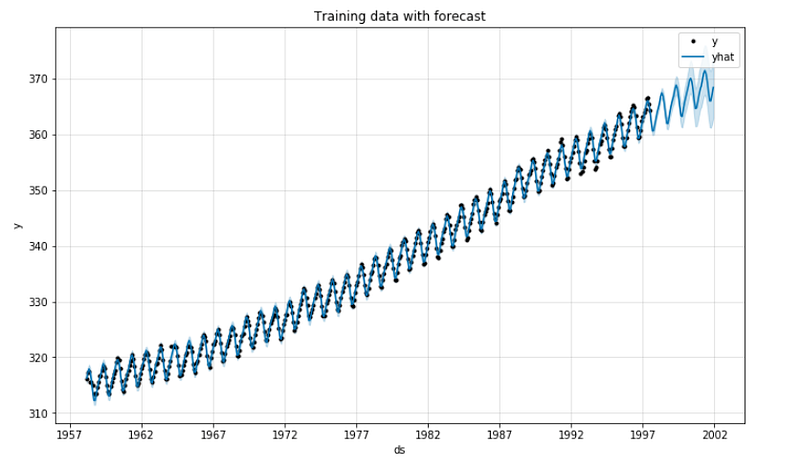
short_term_pred, long_term_pred = proph_it(co2_train, co2_test, co2_month, 53, 530)The function will now start printing out plots. Here’s the first 90% of the dataset with predictions for the last 10%:
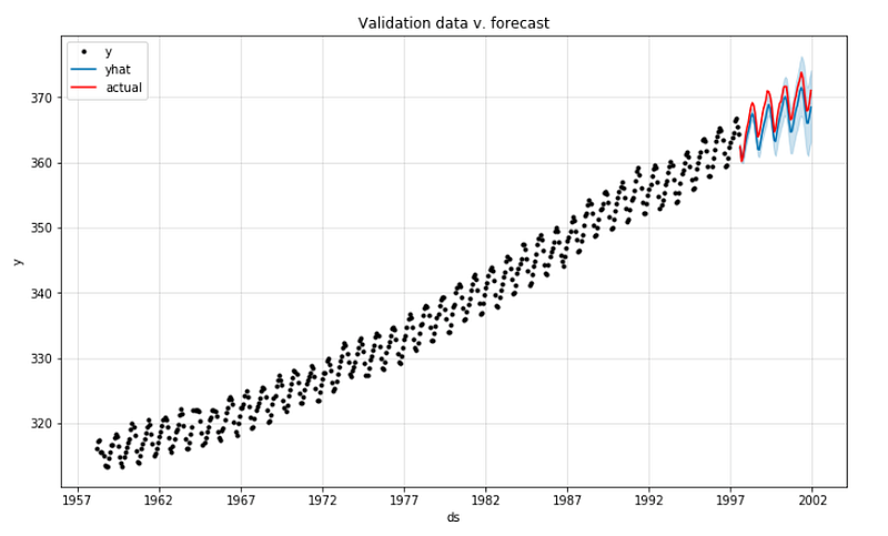
Now we can compare the predicted values with the actual values for the last 53 months:
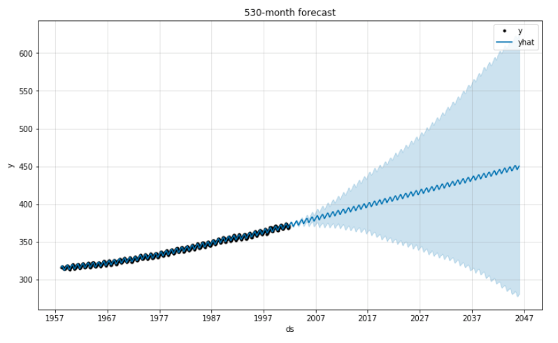
Now for the long-term prediction using all the available data. Naturally, the 95% confidence interval expands dramatically over time. CO2 levels could get lower … but they could also get waaaaay higher.
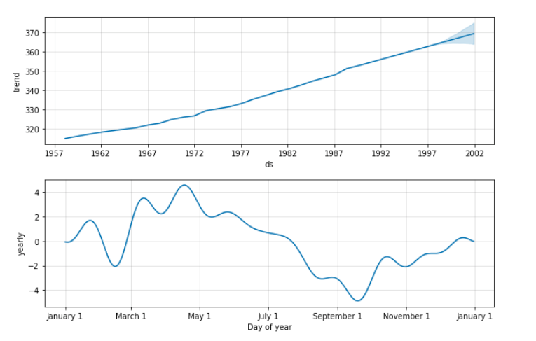
These are Prophet’s “component plots,” which break down trend and seasonality in the data. It looks like CO2 levels tend to hit their annual high in the spring and their low in the fall.
I can now visually analyze these pretty plots, and if I want to look at the predicted values themselves, I have those on hand, too.
That’s all there is to it! I used this function in a project about predicting how home prices will rise in Oregon over the next few years. You can check out the code on GitHub.
Thanks for reading!
Cross-posted from jrkreiger.net.


