

Time Series Analysis for Machine Learning
Trend, Outliers, Stationarity, Seasonality
Summary
In descriptive statistics, a time series is defined as a set of random variables ordered with respect to time. Time series are studied both to interpret a phenomenon, identifying the components of a trend, cyclicity, seasonality and to predict its future values. I think they are the best example of conjunction between the field of Economics and Data Science (stock prices, economic cycles, budgets and cash flows, …).
Through this article I will explain step by step the time series analysis standard approach and present some useful tools (python code) that can be easily used in other similar cases (just copy, paste and run). I will walk through every line of code with comments, so that you can easily replicate this example (link to the full code below).
We will use a dataset from the Kaggle competition “Predict Future Sales” (linked below) in which you are provided with daily historical sales data and the task is to forecast the total amount of products sold. The dataset presents an interesting time series as it is very similar to use cases that can be found in real world, as we know daily sales of any product are never stationary and are always heavily affected by seasonality.
Having said that, the main purpose of this tutorial is to understand the basic steps of time series analysis before working on design and testing models for forecasting (note that this article assumes a basic knowledge of the topic, so I won’t go much into definitions, but I will insert all the useful hyperlinks). In particular, we will go through:
- trend analysis to determine whether it is linear or not as most models require this information as input
- outliers detection to understand how to spot and handle them
- stationarity test to understand if we can assume that the time series is stationary or not
- seasonality analysis to determine what is the best seasonal parameter to use when modeling.
Full Code (Github):
Dataset (Kaggle):
Setup
First of all, we will import the following libraries
## For data
import pandas as pd
import numpy as np
## For plotting
import matplotlib.pyplot as plt## For outliers detection
from sklearn import preprocessing, svm## For stationarity test and decomposition
import statsmodels.tsa.api as smt
import statsmodels.api as smThen we will read the data into a pandas Dataframe
dtf = pd.read_csv('data.csv')dtf.head()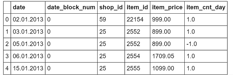
The original dataset has different columns, however for the purpose of this tutorial we only need the following column: date and the number of products sold (item_cnt_day). In other words, we’ll be creating a pandas Series (named “sales”) with a daily frequency datetime index using only the daily amount of sales
## format datetime column
dtf["date"] = pd.to_datetime(dtf['date'], format='%d.%m.%Y')
## create time series
ts = dtf.groupby("date")["item_cnt_day"].sum().rename("sales")ts.head()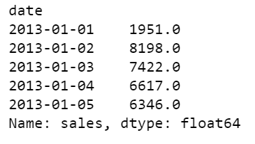
ts.tail()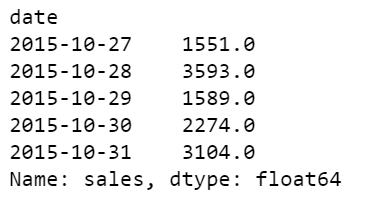
So the time series ranges from 2013–01–01 until 2015–10–31, it has 1034 observations, a mean of 3528, and a standard deviation of 1585. It looks like this:
ts.plot()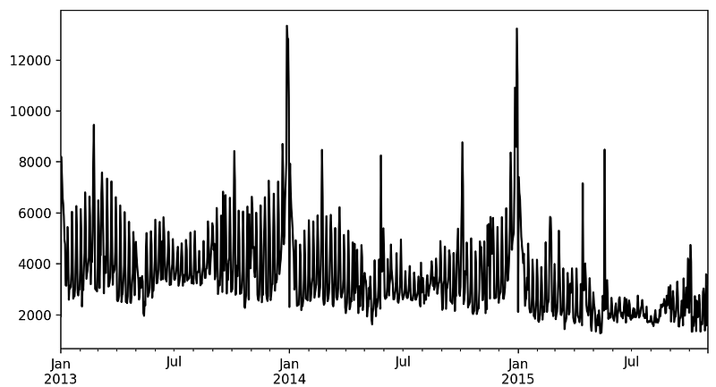
Let’s get started now, shall we?
Trend Analysis
The objective of this analysis is to understand if there is a trend in the data and whether this pattern is linear or not. The best tool for this job is visualization.
Let’s write a function that can help us to understand the trend and the movements of the time series. We want to see within the plot some rolling statistics such as:
- Moving Average: the unweighted mean of the previous n data (also called “rolling mean”)
- Bollinger Bands: an upper band at k times an n-period standard deviation above the moving average, and a lower band at k times an N-period standard deviation below the moving average.
'''
Plot ts with rolling mean and 95% confidence interval with rolling std.
:parameter
  :param ts: pandas Series
  :param window: num - for rolling stats
  :param plot_ma: bool - whether plot moving average
  :param plot_intervals: bool - whether plot upper and lower bounds
'''
def plot_ts(ts, plot_ma=True, plot_intervals=True, window=30,
            figsize=(15,5)):
   rolling_mean = ts.rolling(window=window).mean()
   rolling_std = ts.rolling(window=window).std()
   plt.figure(figsize=figsize)
   plt.title(ts.name)
   plt.plot(ts[window:], label='Actual values', color="black")
   if plot_ma:
      plt.plot(rolling_mean, 'g', label='MA'+str(window),
               color="red")
   if plot_intervals:
      lower_bound = rolling_mean - (1.96 * rolling_std)
      upper_bound = rolling_mean + (1.96 * rolling_std)
   plt.fill_between(x=ts.index, y1=lower_bound, y2=upper_bound,
                    color='lightskyblue', alpha=0.4)
   plt.legend(loc='best')
   plt.grid(True)
   plt.show()
When the dataset has at least a full year of observation, I always start with a rolling window of 30 days:
plot_ts(ts, window=30)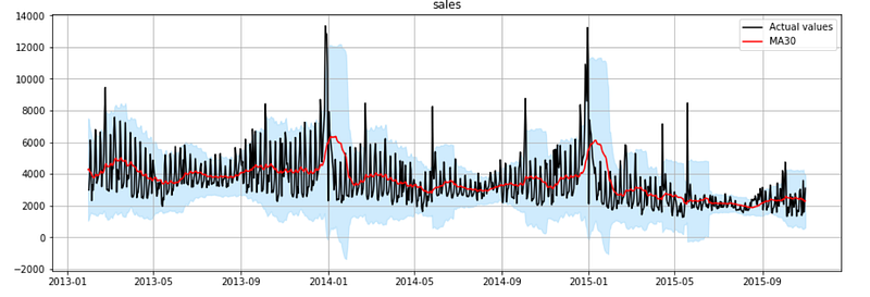
Looking at the red line in the plot, you can easily spot a pattern: the time series follows a linear downtrend with heavy seasonal peaks every January. The trend becomes obvious when a rolling window of at least 1 year is used
plot_ts(ts, window=365)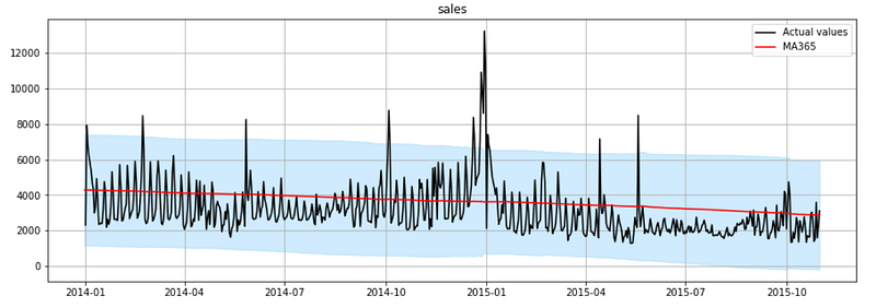
As you can see, It’s a clear linear downtrend. This is useful in model design as most of the models require that you specify whether the trend component exists and whether it is linear (also said “additive”) or non-linear (also said “multiplicative”).
Outliers Detection
The objective of this section is to spot outliers and decide how to handle them. In practice, traditional deterministic methods are often used, like plotting the distribution and label as an outlier every observations higher or lower than a chosen threshold. For example:
## Plot histogram
ts.hist(color="black", bins=100)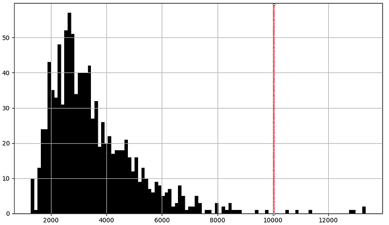
## Boxplot
ts.plot.box()
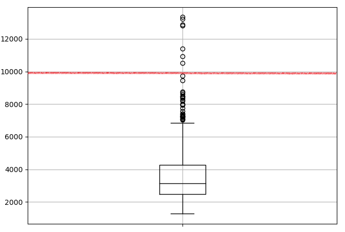
This kind of method work especially when you are very familiar with your data and you already know what kind of process and distribution it follows and therefore what threshold works better. However, I personally find easier to let a machine learning algorithm do this for me on any kind of time series dataset.
Let’s write a function to automatically detect outliers in a time series using a clustering algorithm from the scikit-learn library: one-class support vector machine, it learns the boundaries of the distribution (called “support”) and is therefore able to classify any points that lie outside the boundary as outliers.
'''
Find outliers using sklearn unsupervised support vetcor machine.
:parameter
    :param ts: pandas Series
    :param perc: float - percentage of outliers to look for
:return
    dtf with raw ts, outlier 1/0 (yes/no), numeric index
'''
def find_outliers(ts, perc=0.01, figsize=(15,5)):
    ## fit svm
    scaler = preprocessing.StandardScaler()
    ts_scaled = scaler.fit_transform(ts.values.reshape(-1,1))
    model = svm.OneClassSVM(nu=perc, kernel="rbf", gamma=0.01)
    model.fit(ts_scaled)
## dtf output
dtf_outliers = ts.to_frame(name="ts")
dtf_outliers["index"] = range(len(ts))
dtf_outliers["outlier"] = model.predict(ts_scaled)
dtf_outliers["outlier"] = dtf_outliers["outlier"].apply(lambda
x: 1 if x==-1 else 0)
## plot
fig, ax = plt.subplots(figsize=figsize)
ax.set(title="Outliers detection: found"
+str(sum(dtf_outliers["outlier"]==1)))
ax.plot(dtf_outliers["index"], dtf_outliers["ts"],
color="black")
ax.scatter(x=dtf_outliers[dtf_outliers["outlier"]==1]["index"],
y=dtf_outliers[dtf_outliers["outlier"]==1]['ts'],
color='red')
ax.grid(True)
plt.show()
return dtf_outliersWith this function we will be able to spot outliers, but what do we do with them once detected? There is no optimal strategy here: time series forecasting is easier without data points that differ significantly from other observations, but removing these points can deeply change the distribution of the data. If you have decided to exclude the outliers, the most convenient way to remove them is by interpolation.
Let’s write a function to remove outliers after they are detected by interpolating the values before and after the outlier.
'''
Interpolate outliers in a ts.
'''
def remove_outliers(ts, outliers_idx, figsize=(15,5)):
    ts_clean = ts.copy()
    ts_clean.loc[outliers_idx] = np.nan
    ts_clean = ts_clean.interpolate(method="linear")
    ax = ts.plot(figsize=figsize, color="red", alpha=0.5,
         title="Remove outliers", label="original", legend=True)
    ts_clean.plot(ax=ax, grid=True, color="black",
                  label="interpolated", legend=True)
    plt.show()
    return ts_clean
Now let’s use these functions. First we detect the outliers:
dtf_outliers = find_outliers(ts, perc=0.05)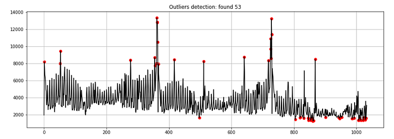
Then handle them:
## outliers index position
outliers_index_pos = dtf_outliers[dtf_outliers["outlier"]==1].index
## exclude outliers
ts_clean = remove_outliers(ts, outliers_idx=outliers_index_pos)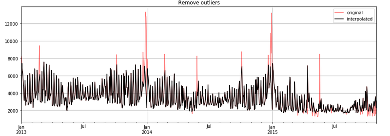
For the purpose of this tutorial, I shall continue with the raw time series (including outliers), but removing outliers and building a model on a clean time series (without outliers) is also a good strategy.
Stationarity Test
A stationary process is a stochastic process whose unconditional joint probability distribution does not change when shifted in time. Consequently, parameters such as mean and variance also do not change over time, therefore stationary time series are easier to forecast.
There are several ways to establish whether a time series is stationary or not, the most common are good old visualization, looking at the autocorrelation and running statistical tests.
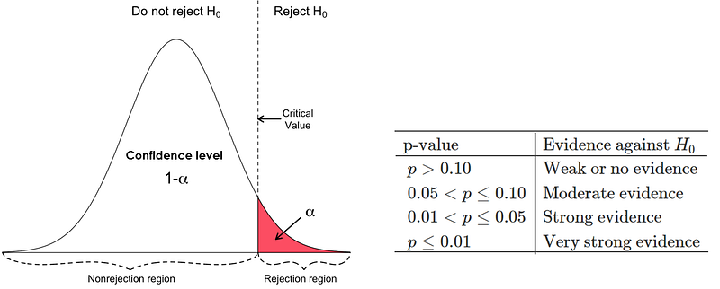
The most common test is the Dickey-Fuller test (also called “ADF test”) where the null hypothesis is that the time series has a unit root, in other words, that the time series is not stationary. We’ll test whether the null hypothesis can be rejected comparing the p-value to a chosen threshold (α), so that if the p-value is smaller we can reject the null hypothesis and assume that the time series is stationary with a confidence level of 1-α (technically we just can not say that it isn’t):
Let’s write a function that puts all those methods together and shows a figure composed of the following:
- The result of a 95% (α=0.05) ADF test (which will be printed in the title of the output figure).
- The first graph will plot the mean and the variance of the first x% of the data, this is a graphical test: if the properties of the time series are constant, we will see the 1-x% of the data hovering around the mean and within the range of variance of the first x% of observations
- The last 2 graphs plot the PACF and ACF
'''
Test stationarity by:
    - running Augmented Dickey-Fuller test wiht 95%
    - plotting mean and variance of a sample from data
    - plottig autocorrelation and partial autocorrelation
'''
def test_stationarity_acf_pacf(ts, sample=0.20, maxlag=30, figsize=
                              (15,10)):
    with plt.style.context(style='bmh'):
        ## set figure
        fig = plt.figure(figsize=figsize)
        ts_ax = plt.subplot2grid(shape=(2,2), loc=(0,0), colspan=2)
        pacf_ax = plt.subplot2grid(shape=(2,2), loc=(1,0))
        acf_ax = plt.subplot2grid(shape=(2,2), loc=(1,1))

        ## plot ts with mean/std of a sample from the first x%
        dtf_ts = ts.to_frame(name="ts")
        sample_size = int(len(ts)*sample)
        dtf_ts["mean"] = dtf_ts["ts"].head(sample_size).mean()
        dtf_ts["lower"] = dtf_ts["ts"].head(sample_size).mean()
                          + dtf_ts["ts"].head(sample_size).std()
        dtf_ts["upper"] = dtf_ts["ts"].head(sample_size).mean()
                          - dtf_ts["ts"].head(sample_size).std()
        dtf_ts["ts"].plot(ax=ts_ax, color="black", legend=False)
        dtf_ts["mean"].plot(ax=ts_ax, legend=False, color="red",
                            linestyle="--", linewidth=0.7)
        ts_ax.fill_between(x=dtf_ts.index, y1=dtf_ts['lower'],
                y2=dtf_ts['upper'], color='lightskyblue', alpha=0.4)
        dtf_ts["mean"].head(sample_size).plot(ax=ts_ax,
                legend=False, color="red", linewidth=0.9)
        ts_ax.fill_between(x=dtf_ts.head(sample_size).index,
                           y1=dtf_ts['lower'].head(sample_size),
                           y2=dtf_ts['upper'].head(sample_size),
                           color='lightskyblue')

        ## test stationarity (Augmented Dickey-Fuller)
        adfuller_test = sm.tsa.stattools.adfuller(ts, maxlag=maxlag,
                                                  autolag="AIC")
        adf, p, critical_value = adfuller_test[0], adfuller_test[1],
                                 adfuller_test[4]["5%"]
        p = round(p, 3)
        conclusion = "Stationary" if p < 0.05 else "Non-Stationary"
        ts_ax.set_title('Dickey-Fuller Test 95%: '+conclusion+
                        '(p value: '+str(p)+')')

        ## pacf (for AR) e acf (for MA)
        smt.graphics.plot_pacf(ts, lags=maxlag, ax=pacf_ax,
                 title="Partial Autocorrelation (for AR component)")
        smt.graphics.plot_acf(ts, lags=maxlag, ax=acf_ax,
                 title="Autocorrelation (for MA component)")
        plt.tight_layout()
Let’s run it:
test_stationarity_acf_pacf(ts, sample=0.20, maxlag=30)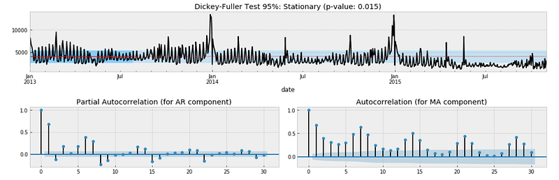
The result of the Dickey-Fuller test indicates that the time series might be stationary as we can reject the null hypothesis of non-stationarity with a confidence level of 95% (p-value of 0.015 < α of 0.05). However, this does not match with the “eye test” as we can see that the time series moves away from the mean after January 2015. Moreover, we couldn’t reject the null hypothesis of non-stationarity with a confidence level of 99% (p-value of 0.015 > α of 0.01) and the autocorrelation fails to converge to zero.
We will run the same tests after differencing the time series. Differencing can help stabilize the mean by removing changes in the level of observations, and therefore eliminating (or reducing) trend and seasonality. Basically we will apply the following transformation:
diff[t] = y[t] — y[t-lag]
Now let’s try with differencing the time series by 1 lag and run the previous function again
diff_ts = ts - ts.shift(1)
diff_ts = diff_ts[(pd.notnull(diff_ts))]
test_stationarity_acf_pacf(diff_ts, sample=0.20, maxlag=30)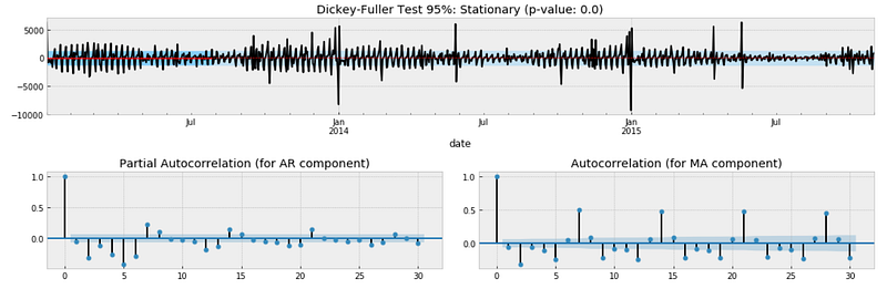
This time we can reject the null hypothesis of non-stationarity with a confidence level of 95% and 99% as well (p-value is 0.000). We can conclude that it is better to assume that the time series is not stationary.
In regard to the autocorrelation plot, clearly there is negative seasonality every 2 days meaning that at the beginning of the week there are less sales and positive seasonality every 7 days (more sales on the weekend).
Seasonality Analysis
The objective of this last section is to understand what kind of seasonality is affecting the data (weekly seasonality if it presents fluctuations every 7 days, monthly seasonality if it presents fluctuations every 30 days, and so on).
This is crucial for the model design part that comes after this analysis session. In particular, when working with seasonal autoregressive models you must specify the number of observations per season: I’m talking about the parameter “s” in SARIMA (p, d, q)x(P, D, Q, s).
There is a super useful function into the statsmodel library that allows us to decompose the time series. This function splits the data into 3 components: trend, seasonality and residuals.
Let’s plot the decomposition of the time series done with a seasonality of 7 days
decomposition = smt.seasonal_decompose(ts, freq=7)
trend = decomposition.trend
seasonal = decomposition.seasonal
residual = decomposition.resid
fig, ax = plt.subplots(nrows=4, ncols=1, sharex=True, sharey=False)
ax[0].plot(ts)
ax[0].set_title('Original')
ax[0].grid(True)
ax[1].plot(trend)
ax[1].set_title('Trend')
ax[1].grid(True)
ax[2].plot(seasonal)
ax[2].set_title('Seasonality')
ax[2].grid(True)
ax[3].plot(residual)
ax[3].set_title('Residuals')
ax[3].grid(True)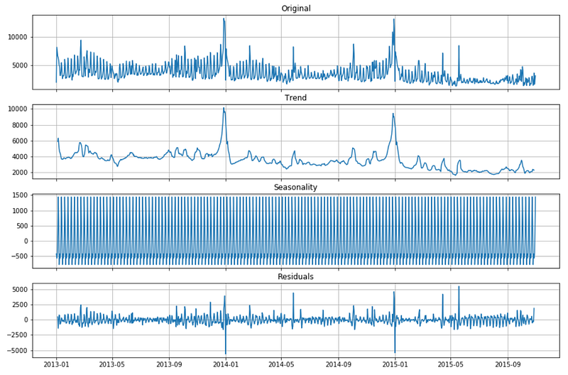
I usually choose the seasonal parameter that leads to smaller residuals. In this case trying with 2 days, 7 days and 30 days, the results are better with a weekly seasonality (s = 7).
Conclusion
This article has been a tutorial about how to analyze real-world time series with statistics and machine learning before jumping on building a forecasting model. The results of this analysis are useful in order to design a model that is able to fit well the time series (which is done in the next tutorials, links on top). In particular:
- we can include a linear trend component into out forecasting models
- we can train the model on the raw data including outliers and on the processed data without outliers and test which one performs better
- we know the time series is not stationary and therefore we should use an AR-I-MA model instead of an ARMA
- we can include a weekly seasonal component into out forecasting models.
I hope you enjoyed it! Feel free to contact me for questions and feedback or just to share your interesting projects.
👉 Let’s Connect 👈
This article is part of the series Time Series Forecasting with Python, see also:


