
Meet Dtale — A Python Library To Analyze Data Interactively Like Excel
Analyze in detail with Dtale

Python is a programming language that can be used for many cases, and one of them is to analyze data. Python is capable of analyzing data on a large scale, something that the spreadsheet software couldn’t have (i.e. Microsoft Excel and Google Sheets).
Although libraries like Pandas are already enough for analyzing the data, analyzing data interactively, like on the spreadsheet software, is still helpful in some cases. In this article, I will show you how to analyze data interactively using a library called Dtale. Without further ado, let’s get started!
Implementation
Install the library
Before we can use the library, the first step that we need to do is to install the library using pip. Here is the command for doing that:
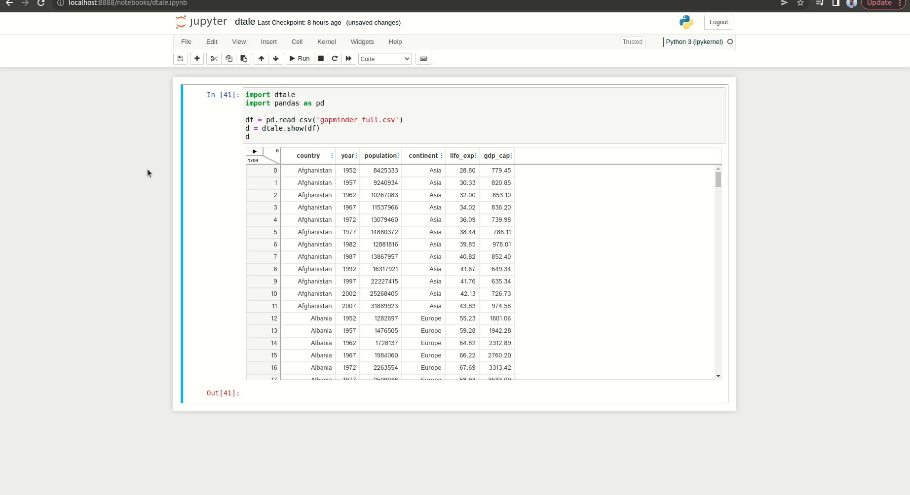
pip install dtaleThe data source
For the data source, we will use the gapminder data as an example. Gapminder provides data like population number, GDP per capita, and life expectancy for every nation worldwide. You can download the data from Kaggle, which I put the link here.
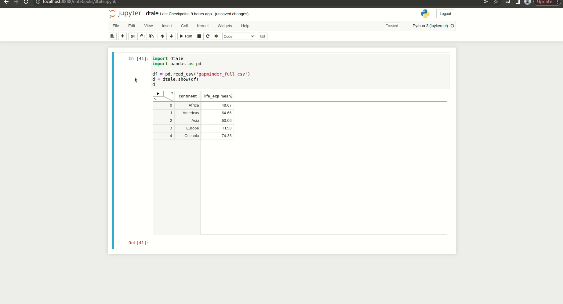
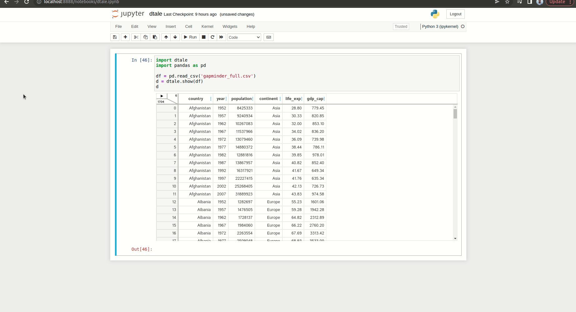
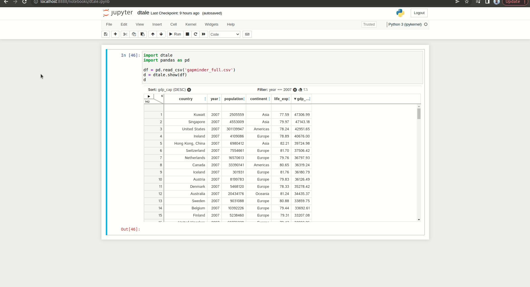
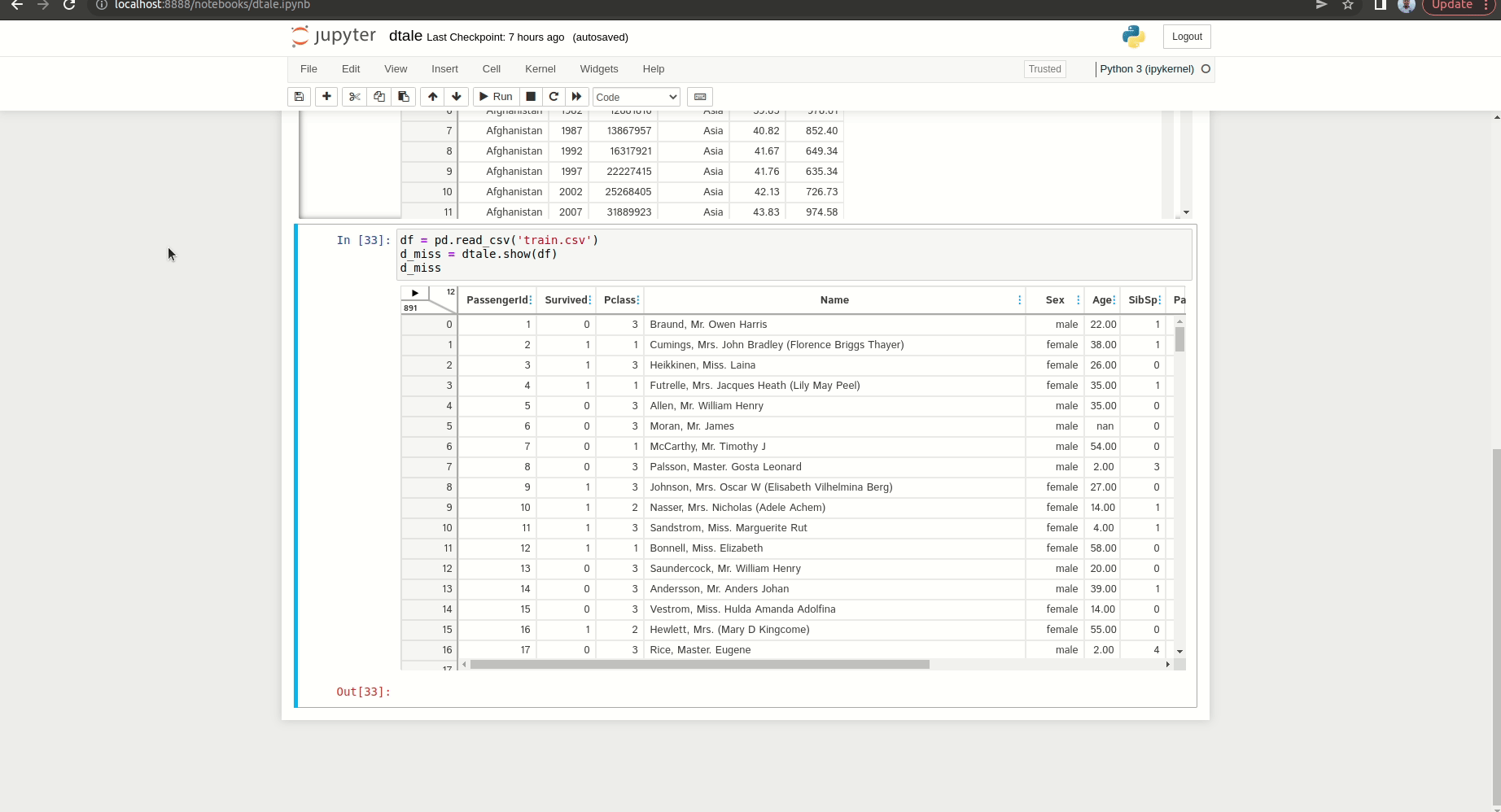
Let’s open the data. To access the data with dtale, you can write this below code:
import dtale
import pandas as pd
df = pd.read_csv('your_data_path')
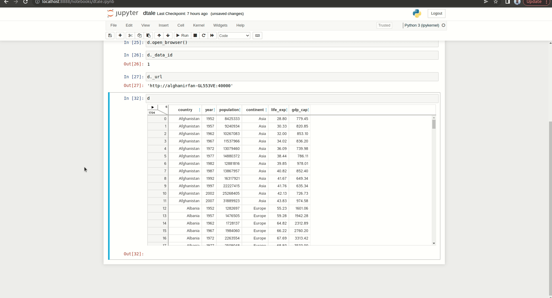
d = dtale.show(df)
dBy doing that, it will display an interface like this:
Data manipulation
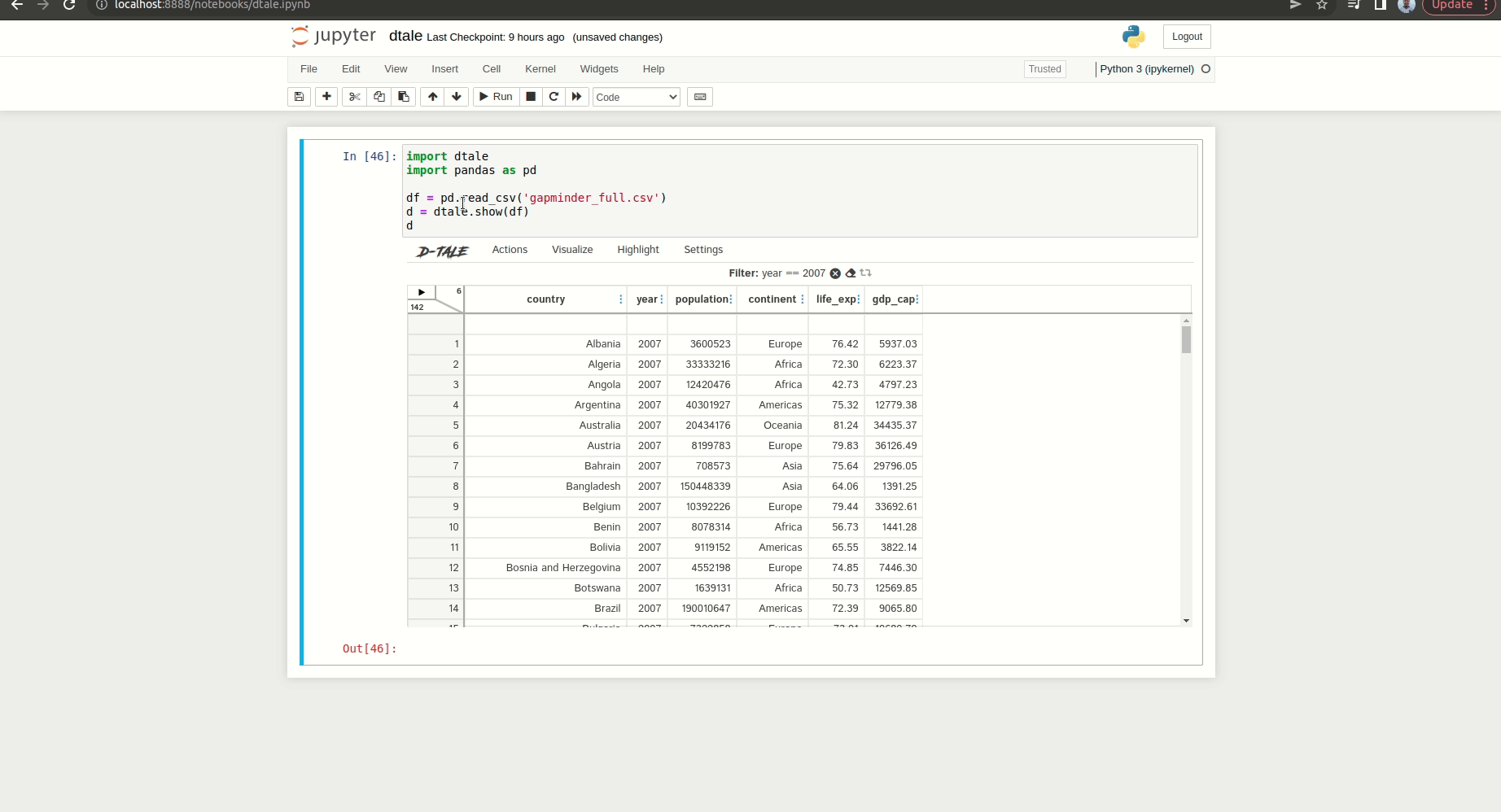
So you’ve opened the dataset, but what things you can do with it? With dtale, you can do data manipulation just like you have done with Pandas. Let’s do filtering first. Let’s say we want to filter the data that comes from the year 2007. For doing that, here is the GIF that shows the process:
We can also sort the data by clicking the specific column and setting the parameters to it. Let’s say we sort the data based on the GDP per capita from the highest to the lowest capita. Here is the GIF that shows the process:
Lastly, we can aggregate the data using the library. Let’s say we aggregate the life expectancy based on continents using the average. For doing that, you can see the process in the below GIF:
Exploratory data analysis
With dtale, you can do different kinds of visualizations. In case you want to analyze each column, you can use the ‘Describe’ feature from the library.
To access the feature, you can hover to the top part of the interface and then choose Visualize > Describe like this:
On the page, you can check and analyze each column. Let’s take a look at the life expectancy column. On the top side, you can see tabs that display different visualizations. On the below side, you can see information like unique values, outliers, and differences between values inside the column. Here is the preview of the Describe page:
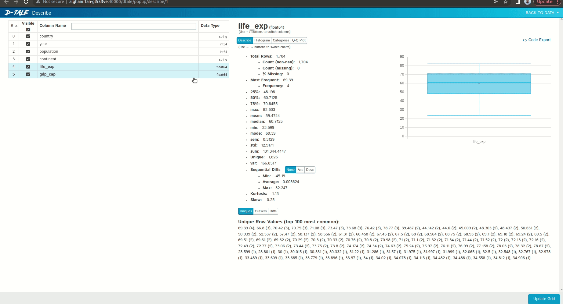
Now let me explain to you each tab from the top side. The first tab is the describe tab which contains statistical summaries of the chosen column. It also displays the box plot from the column.
The second tab is the histogram tab which visualizes a histogram of a column. You can tweak the histogram visualization by changing the number of bins or grouping the data based on a specific column.
The third tab is the grouping tab which visualizes a bar chart that aggregates the column values based on a categorical column. You can see that I aggregate the life expectancy values based on the continent. We can also change the aggregation method, whether using mean or median.
The last tab is the Q-Q plot. This plot basically tells us about the distribution of the column has. You can see a straight line along with data points inside of it. The closer the data points fit the line, the normal the distribution is.
Data visualization
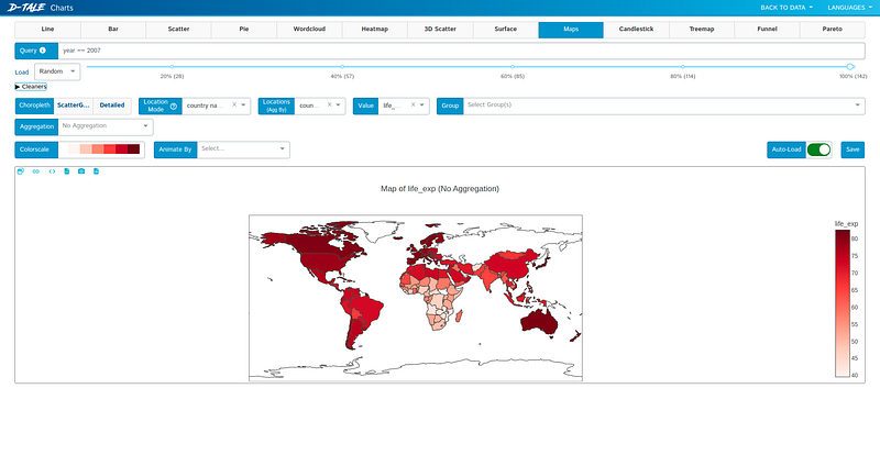
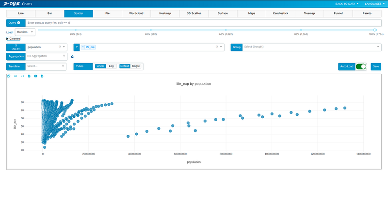
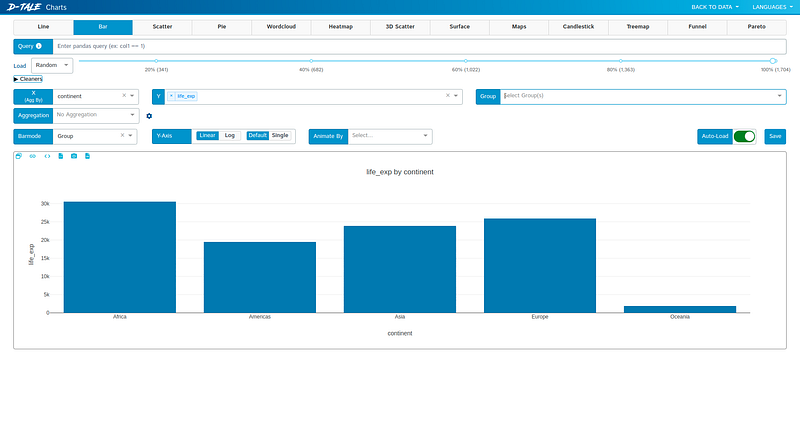
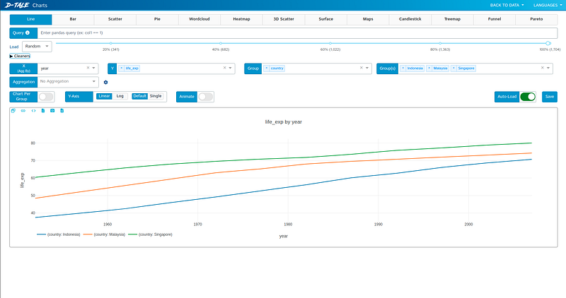
Besides analyzing the columns, we can do more visualizations using the library. All you need to do is hover the cursor to the top of the interface, and then click visualize > chart like this:
Using this feature, we can create a line chart, scatter plot, or even create visualizations using the map.
For creating the visualization process, you need to set parameters like the variables and the aggregation method. Here are the screenshots for creating the visualizations:
Missing data analysis
With the Dtale library, you can also analyze missing data by visualizing it. Unlike the previous part, let’s use the titanic dataset from Kaggle, which you can access here. Here is the GIF of the missing analysis feature:
There are several visualizations that we can make.
- Matrix is the first visualization where it displays the location of the missing data for each column.
- The correlation heat map displays the correlation if the presence of a value affects the other.
- The dendrogram displays the correlation of each variable further than the heat map.
- The bar chart displays the number of not missing data for each column. As the bar gets higher, it means less data that is missing.
Exporting Code
Because this is a Python library, we can convert our processing steps into code. Let’s take the example of aggregating life expectancy based on continents. We’ve done this before, but now let’s convert it into code. Here is the GIF of the process:
Well done! Now you have learned about the Dtale library. With that interactive user interface, I hope it helps you to analyze the data easier.
Thank you for reading my article.
References
[1] GitHub. https://github.com/man-group/dtale
Another related article you might enjoy:
Want to Connect?If you have any questions, you can contact me via LinkedIn.


