
This ad is so goddamn perfect it’s making me question my entire career

Luxury advertising pisses me off. Besides the products being outrageously expensive and intentionally exclusive, every campaign follows a similar format:
- Clinically clean
- Cold colors
- Featured model/celebrity
- Expensive car, jewelry, outfit
- Random animal props
- Melodramatic
- Ultra-airbrushed
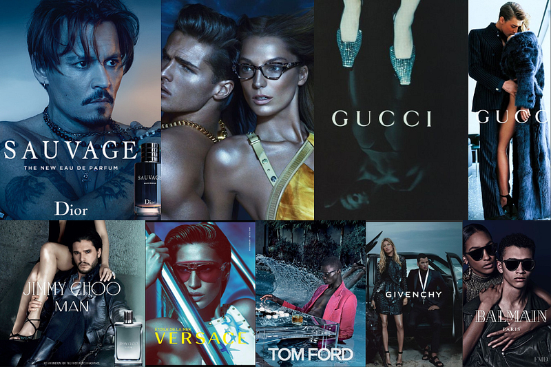
I get they’re trying to sell a specific lifestyle to a global audience. Flowing lines of copy may not translate well across markets. BUT this doesn’t mean you can’t have a pop of creativity somethere.
Every single brand copies each other. It’s exhausting to look at.
That’s why this Mother's Day ad from Chanel caught me off guard:
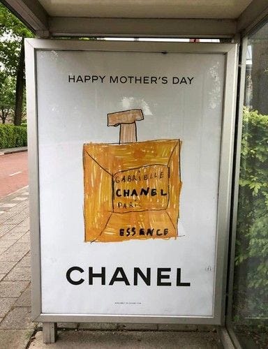
From what I’ve seen, it was inspired by a drawing from a Chanel employees’ daughter.
It’s personal and emotional. Warm and human. It doesn’t reek of a massive budget. It’s creative, new, interesting, and fun. This is how advertising should work.
I’m sitting here, grinding my teeth because Im didn’t think of the concept above. And I’m not alone.
That means it’s working.