Themes, Elements, and Structure in SwiftUI
Creating reusable elements and custom view modifiers

When I start programming an application, I often start with the main views and key components. As I go, I will add a couple of modifiers to elements to give an idea of the feel of the app (as well as a sense of progress).
The issue comes that before long, I have produced a SwiftUI file that is hundreds of lines long for a simple view, because I have individually declared modifiers for every element. One single Text label can have up to seven modifiers on it to make it look nice. Then comes the time that I want to streamline how my UI looks, play with spacing, colours, sizes. This involves going through every single modifier and changing the static value. There has to be a simpler way….
Centralise themes and View modifiers
Xcode has a good system for managing colours as assets, but it is not the most intuitive, and also is only accessible on Xcode.
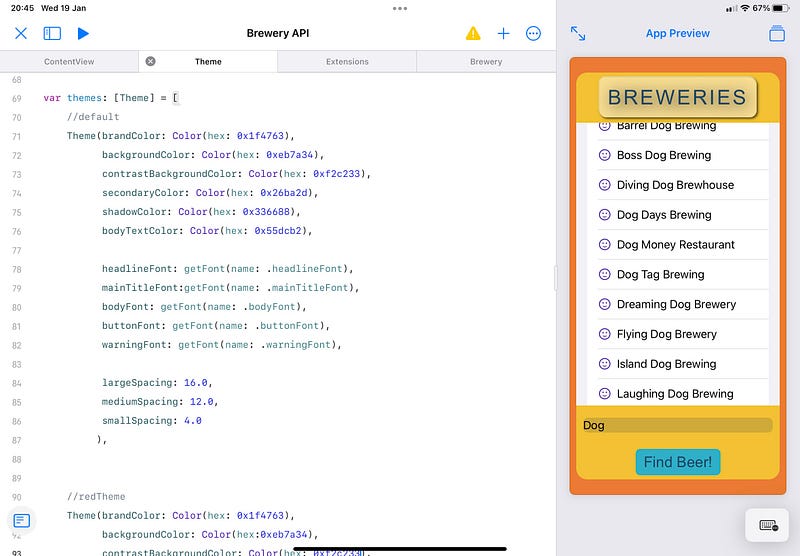
Using Playgrounds 4 on iPad you need to manually manage colours. Let’s expand on that a little bit more. A theme is not just colour. Yes, that is a decent entry into customisation, but actually a theme should also encapsulate sizes, fonts, shadows, corner radius, kerning and so much more.
When you change from light to dark mode on a device, you will see subtleties in the design that make an app visually more pleasing, and this is exactly what is needed in a theme. Kerning of the text is visually more pleasing when darker colours are used. So let’s look at accommodating this.
First of all, think about what you would like to declare in your app. Start with colours since that is the first thing we may want to provide differences for.
For the following, create a Theme.swift file to place the following code.
Start by declaring a class for our theme, and declaring all of the colours first:
To help with this, I use an extension to allow me to enter hex values. This really isn’t required, but I find it helps keep the code neat when working with several colours. You will see how this is used later on.
Ideally, this will be extensive, but for the most part, your app will not have more than 7 or 8 colours that will need defining.
Next up, think about the various fonts that you may want in your app. It could simply be 4 or 5 different fonts (including sizes that you want to reference: Title, header, body, button text, warning).
Now we could simply define each of these in our theme class, but it may be that we want to update the font or size across all of our themes from one place. So to do this we create an enum to define our fonts.
With this, we can add our fonts to the theme class:
To finish our class for this demonstration we will add some useful properties such as spacing values. This will be referenced when we want to define values for padding. I usually stick to the grid of 8. So small is 8, the medium is 16, superLarge is 24.
Add some initialisers to the class, and that gives the finished product:
Now we have a lot of our design parameters in one place. You will notice that we created a class and not a struct. This is because we want to be able to have the class conform to @ObservableObject. You will see why shortly.
So next up we need a place to store all of our various themes, and an enum to get the selectedTheme.
Still in the same Theme.swift file, create an array to hold the theme data:
Nothing special is done here, but it makes it very quick to reference parameters to update for the various themes. Make sure you comment the data here with the themeName for easy reference.
Then we want to add this to an enum so we can select the theme to use:
Every time we add a new theme to our themes array we must update the enum with the theme name. That’s everything in our Theme.Swift file declared. The full code looks like this:
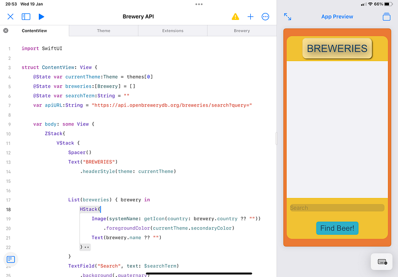
So how do we use this? Well, in our ContentView (or any other view) we have one variable to store our currentTheme and one function to change this. It is that simple. Again, any time a new theme is added, the changeTheme will also need the case added to it. This simply references the index of the theme in the themes array:
Because we defined our currentTheme with @State, whenever this is changed, the rest of our view is refreshed. As a bonus touch, we can also add withAnimation so that this fades into the new look, which is a bit easier on the eyes.
In reality, the user could select from a number of predefined themes from a drop-down menu, but I am making this simple for context.
With all of this together, we can look at our preview and start to refine the look of our app from one Swift file. If we want to change the headline font globally, we can do that.
The power here is that you may use a title for each page, so it is used across multiple views, yet here we can still modify it from one place. Or define a new font in the theme just for that purpose.
Below is an example of how easy it is to create a View and to modify everything from one place.
Reusable Elements and Custom modifiers
There’s another way you can take advantage of centralisation, and that is to identify key design elements that are reused throughout your app.
Instead of having multiple modifiers existing within the ContentView body, you can make custom modifiers for these views to apply multiple modifications.
The first thing we are doing is defining a ViewModifier and declaring all of the various modifiers we want to apply to the view. There could be quite a few here. To make this work with our theme we pass the currentTheme to it for reference. By doing this we can refer to the fonts and colours of the currentTheme, and these will refresh if the currentTheme changes.
Then we simply call this by adding a function as an extension of View. To use this, in content view we simply place one modifier: .headerStyle(theme: currentTheme)
The advantage of this is that we can modify multiple views from one place, and our ContentView is a lot cleaner and easier to read.
Spending the time to think about this now and design a good working system for themes will help speed up the refinement of the UI to produce a polished product. You can also use this to enable accessibility features in your app such as larger font sizes. Or to call different themes depending on the device or screen resolution.
The demonstrations above show how this could be used, but obviously, there are a lot more parameters that can be centralised and customised with themes such as shadows, corner radius, or even conditional formatting. The possibilities are endless.


