
The What, Why, and How of Sankey Diagrams
Showing resource flows intelligently
What to Know
Sankey diagrams show the flow of resources. They communicate sources and uses of the resources, materials, or costs represented.
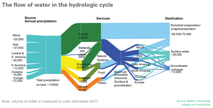
The key to reading and interpreting Sankey Diagrams is remembering that the width is proportional to the quantity represented. In the example below, the audience quickly sees that largest destination for water is terrestrial evaporation, among other features of the hydrologic cycle.
Red Flags
When presented with a Sankey diagram, remember that the only rule (ok, the main rule) is that the width of the lines and arrows represent amounts or volumes of resources. If the arrows don’t appear representative, it likely means the constructor made a mistake, does not understand the purpose of the tool, or is trying to hide an inconvenient truth. If something appears off, make sure to ask questions to make sure you are understanding the visualization.
Why/When They’re Great
- Sankey diagrams allow you to show complex processes visually, with a focus on a single aspect or resource that you want to highlight. If your team is making a decision about energy, time, or money, then that’s a great time to consider a Sankey diagram.
- Sankeys offer the added benefit of supporting multiple viewing levels. Viewers can get a high level view, see specific details, or generate interactive views. If you have a teammate that likes to drill down, many tools will let you share that functionality, without any extra work by the creator. You can also predetermine the level of depth that works best for your purpose.
- Sankey diagrams make dominant contributors or consumers stand out, and they help your audience see relative magnitudes and/or areas with the largest opportunities.
When They’re Not Great
Sometimes, Sankey diagrams aren’t the right tool for your situation:
- They can appear overly complex and hard for your audience to digest.
- Poorly made Sankey diagrams and hide instead of highlight the actionable insight.
- Since not everyone is familiar with this visualization type, complex Sankey diagrams may require explanation that takes more time and energy than they are worth
- Sankey diagrams can make it difficult to differentiate and compare flows with similar values (widths). If these comparisons are essential for your purpose, consider a (stacked) bar graph.
How to Make Sankey Diagrams
Step One: Design
First, solidify your purpose and the most important take-away for your audience. To avoid wasting time rebuilding your diagram or building an ineffective Sankey diagram, here are some questions I would recommend asking yourself before you start:
- Are you using this Sankey for exploratory data analysis?
- Are you using it to tell a story, promote a particular action, change minds?
- Who is your audience?
- What is your audience’s experience level with data visualizations?
- What will your audience be looking for and convinced by — ROI, efficiency, effectiveness, profitability, comparisons by region or by city?
From here, it’s a good idea to start with an outline of how you want your visualization to look before you start coding. As you sketch, consider the following:
- Alternative ways to communicate your point
- Group related inputs or outputs in space and/or with color
- Using color to indicate transition from one state to another
- Emphasizing the main takeaway for your audience using color saturation or intensity, position, length, angle, direction, shape. (Anything but width!)
- Cutting minuscule flows or grouping them into an “other” category to reduce clutter
Step Two: Code
from matplotlib.sankey import Sankey
from matplotlib import pyplot as plt
fig = plt.figure(figsize=(15,10))
ax = fig.add_subplot(1, 1, 1, xticks=[], yticks=[],
title="Flow Refugees from the Syrian Civil War")
sankey = Sankey(ax=ax,
scale=0.0000001,
offset= 0.1,
format = '%d')
sankey.add(flows=[6918000, -3600000, -950000, -670000, -250000,
-130000, -1300000, -18000],
labels = ['Syria', 'Turkey', 'Lebanon', 'Jordan', 'Iraq',
'Egypt', 'Europe', 'USA'],
orientations=[0, 0, 1, 1, 1, 1, -1, -1],#arrow directions
edgecolor = '#027368',
facecolor = '#027368')
sankey.finish();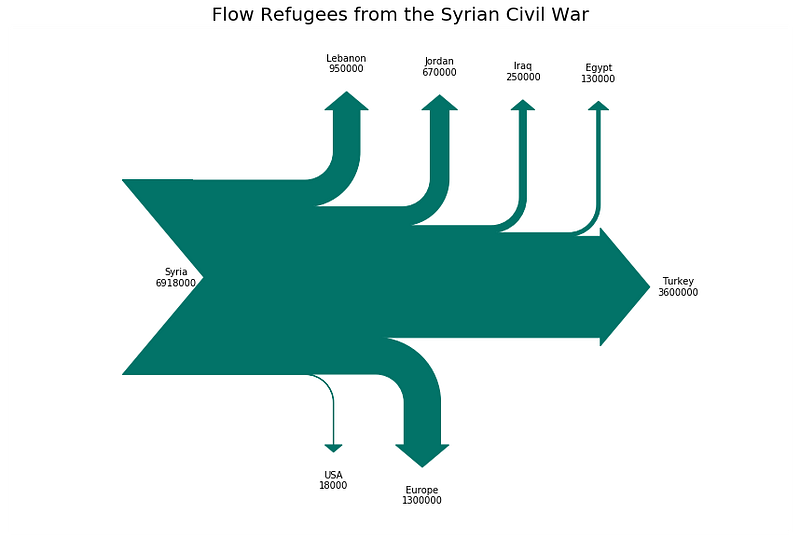
Other useful arguments
- Pathlength — use this argument to adjust the lengths of the arrows once they separate from the main flow with a list of floats.
- Trunklength — use this argument to adjust the length of the space between the inputs and outputs
A word of warning
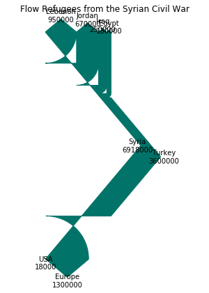
Originally, I got this not very Sankey-like visualization. I was completely confused as to what was going wrong — I see some numbers and labels and widths, but definitely not what I expected.
Digging into the documentation, I decided to adjust the trunk length, which helped my Sankey begin to emerge from its geometric artwork cocoon. As my husband pointed out, it went from Pollock to Dali.
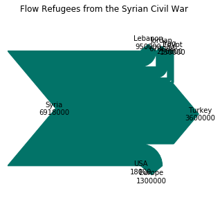
Then I found it — scale factor. It turns out that the scale factor is key for working with large values! After a little experimentation, I got the Sankey looking much better.
It seems like the defaults work great for percent values, but be prepared to scale for any other data magnitudes.
Add Intermediate or Additional Steps
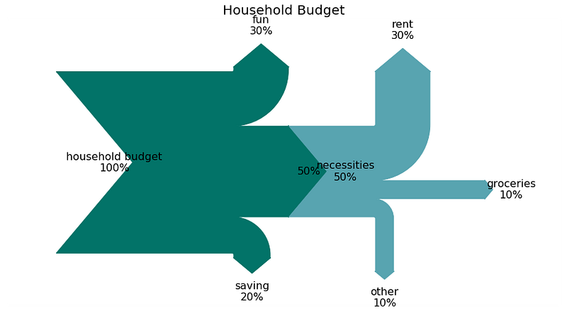
fig = plt.figure(figsize = (15,8))
ax = fig.add_subplot(1, 1, 1, xticks=[], yticks=[],
                     title="Household Budget")
sankey = Sankey(ax=ax, scale=.1, offset=1, unit='%')sankey.add(flows=[100, -50, -30, -20],
labels=['household budget', 'necessities', 'fun',
'saving'],
orientations=[0, 0, 1, -1],
trunklength = 10,
edgecolor = '#027368',
facecolor = '#027368')sankey.add(flows=[50, -30, -10, -10],
labels=['','rent', 'groceries', 'other'],
trunklength = 2,
pathlengths = [3,3,3,3],
orientations=[0, 1, 0, -1],
prior=0, #which sankey are you connecting to (0-indexed)
connect=(1, 0), #flow number to connect: (prior, this)
edgecolor = '#58A4B0',
facecolor = '#58A4B0')diagrams = sankey.finish()
for diagram in diagrams:
for text in diagram.texts:
text.set_fontsize(16);Matplotlib’s sankey package doesn’t seem to do everything you might hope to do with Sankey diagrams. For example, it does not seem to track flows across nodes using color to indicate the origin or a third property. If you want to make more complex Sankey diagrams, especially with color functionality, I recommend using other tools such as floweaver [how to use post here].
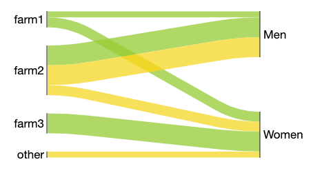
Their choice of subject — the movement of apples and bananas from farms to gendered consumers — feels a little contrived. I find it hard to believe that no women consume apples from farm2, and only women consume apples from farm3. At the same time, I see how this tool could be a good choice, depending on your needs and style preference.
Sankey diagrams aren’t the perfect tool for every situation. They are definitely not the quickest and simplest visualization to create or digest. But when they are done well, they work as a powerful conversation starter. Just make sure that you are using them because they are the best way to communicate your message, not only to show off your visualization skills.


