The Ultimate Medium Image Guide
Bonus tip: how to set a focal point on any image
Articles with images get 94% more views than those without. On Medium specifically, images are also used to grab the attention of your potential reader when they’re scrolling through their feed. Images are super important, whether as a preview of an article or as inline content.
There is an official Medium Image Guide that explains handling images in Medium, but it is not really comprehensive, and it doesn’t cover important subjects like compression and the optimisation of GIF files.
So I thought I’d come up with my own Ultimate Medium Image Guide, which should help you take care of images in your articles like a pro.
Let’s get straight to it.
Optimise Your Images
Something fundamental to understand about images is this: If you do not optimise your images, they will take longer to load in your article. You’ve probably seen those before:
Medium shows a blurry preview while it loads the image. That’s not optimal, because people don’t like to wait.
Let’s look at a few tips to make this faster.
You don’t need anything above 1060 pixels wide
A lot of authors download pictures from free photo websites and import them straight into Medium. This is not best practice, because the images from these websites are usually huge, high definition pictures. It’s totally unnecessary and it highly impacts load time.
Here are the four different placement types available for images in Medium:
From left to right: floating, full column-wide, out-set, and screen-width. Here are medium’s recommended sizes for each placement type:
- Floating: no requirements mentioned
- Full column-width images: 1400px wide
- Out-set images: 2040px wide
- Screen-width images: 2500px wide
From these guidelines, we can see that anything above 2500px is unnecessary. I never use anything above 1200px. Medium does have this note in their image guide:
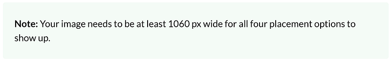
However, when I try uploading an image that is 1060px wide, I do not have access to all the placement options. I do with 1200px though. Something to investigate?
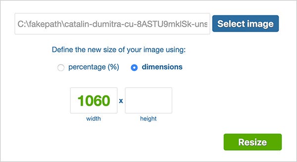
How to resize images
- Use simpleimageresizer.com
- Choose a new size using dimensions, not percentages
- Enter 1060px in width, and nothing in height. Everything else is automatic.
- Click on “resize” and download your image
Compress Your Images
On top of making your image smaller, you will want to make it lighter.
This is Medium’s note from their official image guide, regarding image sizes:

25MB is absolutely gigantic, enormous, unnecessary. Here is my rule of thumb when compressing images. They should be:
- Definitely under 1MB
- Preferably under 500KB
- Ideally under 100KB
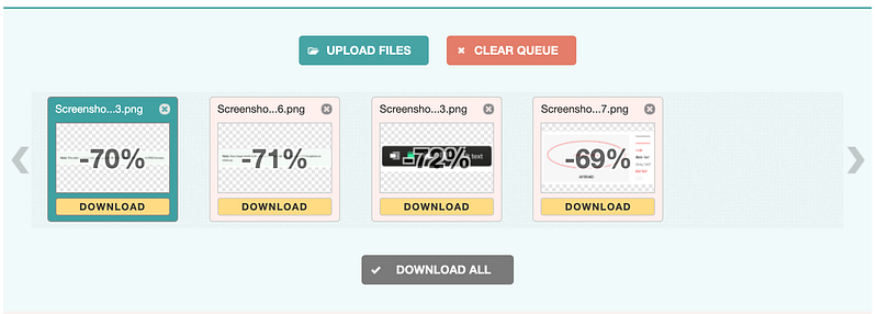
How to compress images
- Use optimzilla.com
- Upload your file, wait for it to compress
- Download
Tip: You can batch-compress by drag-and-dropping multiple files to the area that says “Drop your files here.” Then, click on “Download all”, and you will get all your files at once in a ZIP folder.
Compress Your GIFs Too
GIFs are actually images, but you can’t use the same technique to compress them. The problem with GIFs is that they can get heavy very easily. Here are the main factors that will impact your GIF size:
- Frame rate (images per second)
- Dimensions (in pixels)
- Number of colours (256 is the maximum)
If you get your GIF from an existing source, it will probably be already optimised for web use. But if you make your own, here is how to compress the final result.
How to compress GIFs
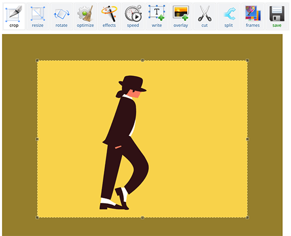
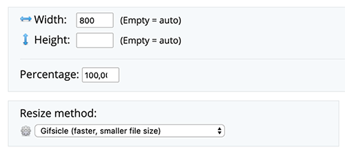
- Resize the gif. Don’t go above 800px. Leave height value empty.
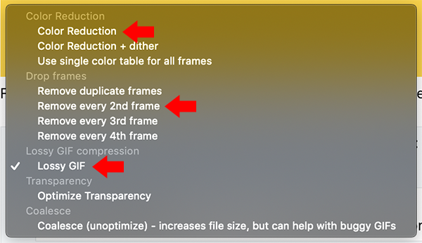
- Optimise the GIF. If needed, you can compress it more. You can also remove some frames to reduce the frame rate, which does wonders at reducing the size. You have tons of options available, but I recommend you only stick to those three: color reduction, remove every second frame, and lossy GIF.
Think Mobile
Over 50% of internet traffic comes from mobile phones. When you import images in your article, think of your mobile readers, which make up most of your audience.
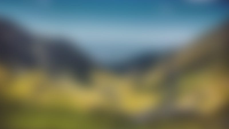
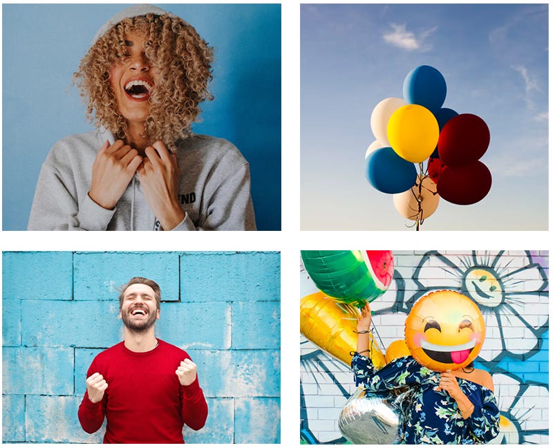
Your images need to be easy to understand. What does that mean? Look at this example:
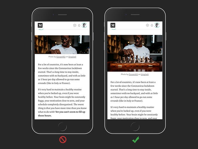
The second image looks much better. There’s more space to quickly understand the picture, more context, and the aspect ratio is more aesthetic.
Aspect ratios
In general, don’t go for wide and low aspect ratios. Go for these:
- 16:9
- 4:3
- 1:1
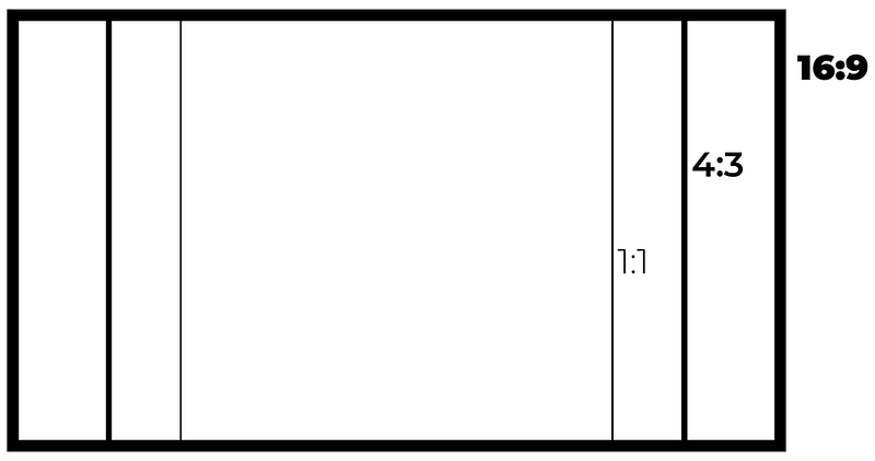
They’re the most used, and also generate better previews when your article gets shared on social networks. Facebook, Linkedin, Instagram, Twitter — all of them use the three most common size ratios, or ratios really close to them. The only reason they don’t go for the exact ratios is to have “proprietary” formats, to be different.

Link to Your Sources
Linking to your sources gives credit to the author of the picture (which is always nice to do) and adds more credibility to your article. Especially when using images from websites that are not free image providers, it is really important to link back to where you got the content, as you could get in trouble if you don’t. You’d be surprised how easy it is to commit copyright infringement.
On a practical level, publications prefer articles that link to their sources.
How to link to your sources
Simply add a link to the URL where you got the picture from. In image captions, you can add links like you would in a regular paragraph.
If you want to link the whole image to an external source, select your image and hit ⌘+K on Mac, or Ctrl+K on Windows. The editing bubble will appear and you just have to paste your link inside.
Try to Have a Theme
Don’t make your article a collage of pictures that don’t go together. Especially in UX and design publications, the authors are really good at making content that looks good from head to toe.
You can use a theme across the images in your blogpost with colors, subjects, framing, or people. It’s always better to try and create an identity for your content, even if you didn’t design the images in the first place.
Learn the Basics of Photo Editing
Learning the basics of photo editing or image creation can go a long way to creating your own identity. You don’t need a lot to be able to make cool visuals that people will instantly recognise are from you, and only you.
Adobe Photoshop is widely used and has definitely become more affordable over the years. It will cost you around $20 per month depending on where you live (offers vary).
Adobe Illustrator is also used a lot, for vector illustrations. It costs around the same as Photoshop.
If you want to go the free way, there are a lot of tools for you to try out there, the most popular being Canva. It wants to be like Photoshop, but it will never be as good. However, it’s definitely enough to get you started. You don’t need a powerful laptop to run it, because it’s cloud-based. If you ever decide to switch to Photoshop, you won’t find it hard, because the two interfaces are really similar.
Where to Get Images
Here is a list of some websites that offer free images to use in blog posts:
- Unsplash — the most popular
- Gratisography
- Morguefile
- Pixabay
- Stockvault
- Pexels
- Picjumbo
- Pikwizard
- Rawpixel
- Reshot
Original list from foleon.com
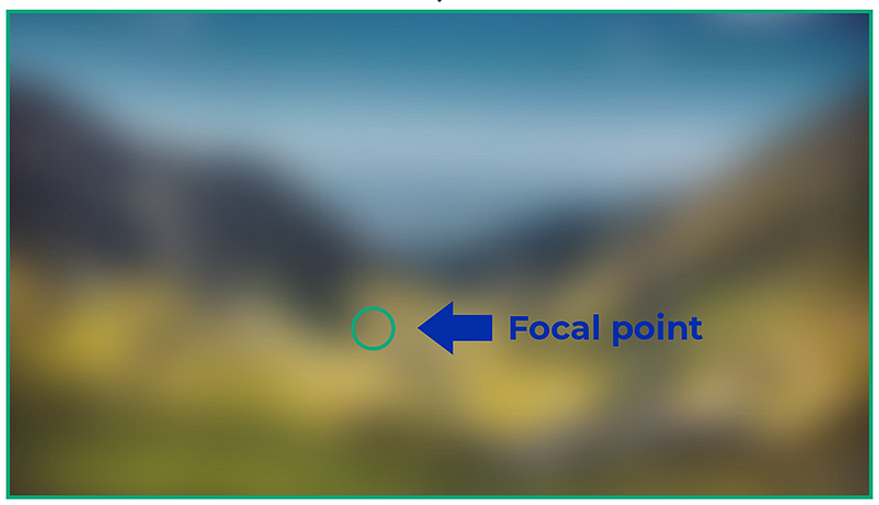
Bonus Tip: Focal Point
Not a lot of people know this, but you can set a focal point on your images to crop them better for social media thumbnails and preview content on Medium.
By default, all focal points are set to the exact centre of images. This can make some pictures lose their context when cropped for preview.
Here is how to set a different focal point, from the official Medium Featured Image guide:
- Hold Opt on Mac, Alt on Windows
- Click on the image in the place where you want your focal point to be
- The resulting green circle will serve as a focal point for automatic image cropping that appears in post listings and previews around the site