
The Two Best Tools for Plotting Interactive Network Graphs
A guide on how to use them, when to use them, and who should use them.

Introduction
For this article, I have selected the two BEST python packages for plotting network graphs, fit for data-scientists who are in need of a decent visualisation package for quick prototyping, visualising their analytics, or debugging their models that are under development.
Our packages for discussion today are pyvis and Ipysigma.
Criteria
I have selected these two packages based on the following criteria:
- Moderately good scalability to number of edges and nodes (hundreds to thousands of nodes)
- An interactive GUI.
- Convenient to implement.
Some solutions I considered…
included well known packages like networkx, dash, plotly, but they didn’t make the cut because they didn’t satisfy all criterions listed above.
For example,
Networkxis convenient to plot, but it is non-trivial to introduce interactivity.- With
plotlywe can, but implementation can get quite involved and scalability quickly becomes an issue. dashis very powerful, but has a steep learning curve and requires a lot of boilerplate code.
We will be…
Going through some example code for visualising networks, specifically looking at
- Homogenous and Undirected Networks
- Heterogenous and Directed Networks
to showcase the visualisation packages and compare their functionalities.
You can find all the code referred to in this article here:
A Brief Introduction
Homogenous undirected networks are the simplest form where we deal with single node types and edge types. For example, we could model LinkedIn accounts as nodes, and ‘connections’ between accounts as edges.
The ‘connections’ are inherently undirected in nature as you cannot have a case where account A connects to account B, but account B connects to account A.
In comparison, Instagram accounts and their ‘follows’ are directed, as account A can follow account B, but not necessarily vice versa. If we were to model this, we would be dealing with a homogenous, directed network.

The term heterogeneous indicates that we are dealing with multiple node and edge types.
For example, if you were working on a recommendation problem for Amazon, your node types could include ‘users’ and ‘products’.
‘Users’ can interact with ‘products’ by ‘buying’ them, while also being able to leave a ‘review’. This means that there are two different relationships between a ‘user’ and a ‘product’:
- ‘user — buys — product’
- ‘user — reviews — product’
For such a task, we would be dealing with a heterogeneous graph with two node types and edge types respectively.
Now, enough with the boring explanations. Let’s get started with some coding.
Installation
We will be running our code in a Jupyter notebook.
pyvis
pyvis installation is pretty straight forward.
pip install pyvis
Ipysigma
Same for Ipysigma. Ipysigma is a Jupyter Extension and in my case,
pip install ipysigma
I had to execute the below commands to get it to activate as an extension, as advised by the docs.
jupyter nbextension enable --py --sys-prefix ipysigma

# You might need one of those other commands
jupyter nbextension enable --py --user ipysigma
jupyter nbextension enable --py --system ipysigma
We also need networkx to build our example networks.
pip install networkx
You can also use the conda environments file in my Github repo to replicate the environment I used.
Homogenous Undirected Network Example
We firstly need to write some code to generate an example network which we can use to test our two visualisation packages.
Graph Generator
We will use a random graph generator, for which I have selected the networkx.dual_barabasi_albert_graph method as I want to simulate a scale-free network so that it is close to something you might find in a real network.
import networkx as nx
import numpy as np
import uuid

def get_new_test_graph():
    # hard code parameters and use seed to replicate same network each time
    NUM_NODES = 50
    p = 0.5
    seed = 1
    test_graph = nx.dual_barabasi_albert_graph(n=NUM_NODES, p=p, seed=1, m1=2, m2=1)

    ### append node properties

    # 1. Compute Node Degree
    nx.set_node_attributes(test_graph, dict(test_graph.degree()), name='degree')
    # 2. Compute betweenness centrality
    nx.set_node_attributes(test_graph, nx.betweenness_centrality(test_graph), name='betweenness_centrality')

    for node, data in test_graph.nodes(data=True):
        # 3. Simulate node level features
        data['feature1'] = np.random.random()
        data['feature2'] = np.random.randint(0, high=100)
        data['feature3'] = 1 if np.random.random() > 0.5 else 0

        # 4. Simulate UIDs as node identifiers
        data['node_identifier'] = str(uuid.uuid4())

    ### append edge properties
    for u, v, data in test_graph.edges(data=True):

        # Simulate edge level features
        data['feature1'] = np.random.random()
        data['feature2'] = np.random.randint(0, high=100)

    return test_graph
We add node level and edge level features to the network to simulate data you might find in real life.
We compute node degree and betweenness centrality values, while adding some additional random features to emulate more complex information someone might want to hold in their graph object.
We finally label each node with a uuid (Universally Unique IDentifier) to make things look more like real data.
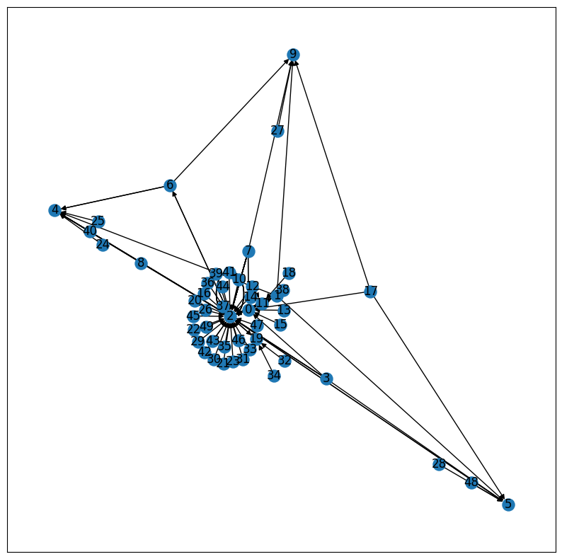
The resulting graph that we have is shown below, drawn using the default plotting functionality in networkx:
import networkx as nx

nx.draw(test_graph)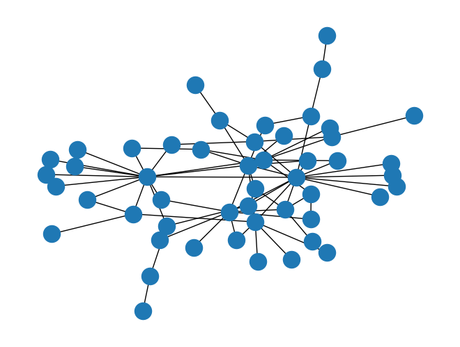
Now that we have a graph to work with, let’s start plotting them.
Ipysigma
It is very simple to get going with Ipysigma.
The node and edge attributes you want to use for configuring your plot, such as node size, edge size and colour, can all be done through the Sigma constructor by simply passing the name of the attribute you wish to use.
test_graph = get_new_test_graph()
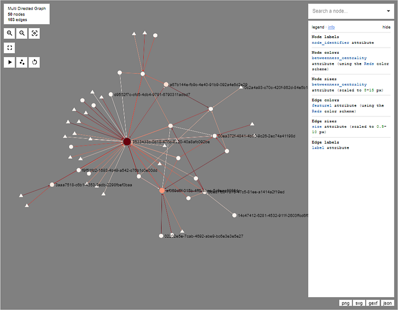
Sigma(
graph=test_graph,
# node config
node_color='betweenness_centrality',
node_color_gradient="Reds",
node_size='betweenness_centrality',
node_label='node_identifier',
#edge config
edge_color="feature1",
edge_color_gradient="Reds",
edge_size="feature1",
# general config
background_color="grey"
)The constructor arguments are well documented here.
In our example, we set the node colour to be scaled according to the betweenness_centrality values, using a Reds colormap referenced from d3-scale-chromatic. The higher the centrality value, the more red the nodes will be. The lower the value, the node colour becomes closer to white.
...
    # node config
    node_color='betweenness_centrality',
    node_color_gradient="Reds",
    node_size='betweenness_centrality',
    node_label='node_identifier',

    #edge config
    edge_color="feature1",
    edge_color_gradient="Reds",
    edge_size="feature1",
...
Similarly, we use the arbitrary values of feature1 to colour edges, again using Reds as our colormap.
Node and edge sizes are scaled according to betweenness_centrality and feature1 respectively.
...
  # general config
  background_color="grey"
):
Finally, we set the background of our plot to grey as the Reds colormap scales from white to red, such that we can better see nodes and edges mapped close to white.

And voilà!
Very easy and simple. Done and dusted with essentially 2 lines of code!
What I like most about Ipysigma is the information side-bar on the right hand side of the plot.
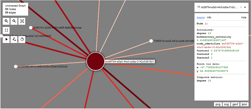
When I click on a node, it displays all of its node attributes, which comes in very handy when you have many of them. The same can be done for edges as well.
In addition, Ipysigma reduces clutter from the plot by only displaying a few node labels at once.

Only when you zoom in do you see all the labels.
This feature may sound trivial, but when your graph sizes start to grow, this becomes very important as it helps to reduce clutter in your graph.

Pyvis
Now, we move on to pyvis.
There is a bit more work that needs to be done with pyvis compared to Ipysigma. There are two ways we can construct the graph, and we will go for the most convenient: we will use its from_nx function to automatically convert a networkx object into a graph.
In order to use this function correctly, we need to assign our node/edge attributes to specific keys if we want to configure elements such as node colour or size.
For example, node size is dictated by the attribute value, so we need to assign betweenness_centrality to this key if we want to replicate what we did with ipysigma. The same goes for edges.
# set node size to be scaled according to betweenness centrality
for node, data in test_graph.nodes(data=True):
    data['value'] = data['betweenness_centrality']

# set edge size to be scaled according to feature1.
for u, v, data in test_graph.edges(data=True):
    data['value'] = data['feature1']
Setting Node Colour
For colour, we need to do some manual work to translate the feature value to an rgb string. We define a MplColorHelper class to facilitate this, with the help from this article:
class MplColorHelper:

    def __init__(self, cmap_name, start_val, stop_val):
        self.cmap_name = cmap_name
        self.cmap = plt.get_cmap(cmap_name)
        self.norm = mpl.colors.Normalize(vmin=start_val, vmax=stop_val)
        self.scalarMap = cm.ScalarMappable(norm=self.norm, cmap=self.cmap)

    def get_rgba(self, val):
        return self.scalarMap.to_rgba(val, bytes=True)

    def get_rgb_str(self, val):
        r, g, b, a = self.get_rgba(val)
        return f"rgb({r},{g},{b})"
We instantiate the colour generator, and initialise it with the min-max values of betweenness_centrality in our graph.
# prep node color generator
vals = nx.get_node_attributes(test_graph, 'betweenness_centrality').values()
betweenness_min, betweenness_max = min(vals), max(vals)
node_colors = MplColorHelper("Reds", betweenness_min, betweenness_max)

# prep edge color generator
vals = nx.get_edge_attributes(test_graph, 'feature1').values()
val_min, val_max = min(vals), max(vals)
edge_colors = MplColorHelper("Reds", val_min, val_max)
This allows us to mimic the behaviour in ipysigma. We use the same Reds colormap, but this time this is taken from matplotlib.
We then set the colour values by iterating through each node and setting the rgb string to attribute color.
for node, data in test_graph.nodes(data=True):
    data['color'] = node_colors.get_rgb_str(data['betweenness_centrality'])

for u, v, data in test_graph.edges(data=True):
    data['color'] = edge_colors.get_rgb_str(data['feature1'])
Displaying Feature Values
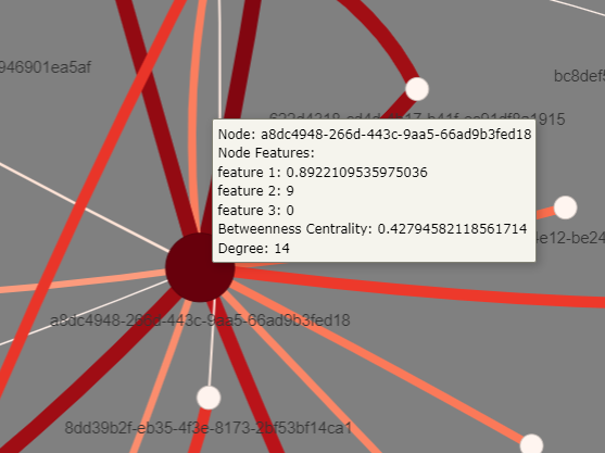
Finally, pyvis does not have the information sidebar that Ipysigma does, so we need to find an alternative way to display node and edge features.
Conveniently, pyvis offers a pop-up that becomes visible when you hover your mouse over a node or edge, which displays the contents of the node attribute keyed on title.
for node, data in test_graph.nodes(data=True):

    data['title'] = (
        f"Node: {data['node_identifier']}"
        "\nNode Features:" +
        f"\nfeature 1: {data['feature1']}" +
        f"\nfeature 2: {data['feature2']}" +
        f"\nfeature 3: {data['feature3']}" +
        f"\nBetweenness Centrality: {data['betweenness_centrality']}" +
        f"\nDegree: {data['degree']}"
    )


for u, v, data in test_graph.edges(data=True):

    data['title'] = (
        f"Edge: {test_graph.nodes[u]['node_identifier']} -> {test_graph.nodes[v]['node_identifier']}" +
        f"\nEdge Features:" +
        f"\nfeature 1: {data['feature1']}" +
        f"\nfeature 2: {data['feature2']}"
    )
The Resulting Plot…
We then pass the networkx object to the from_nx method and generate the plot.
net = Network(height=900, width="100%", bgcolor="grey", filter_menu=True)
net.show_buttons()
net.from_nx(test_graph)
net.save_graph('pyvis_example.html')
The pop-up that displays feature values looks like this:
pyvis offers a filter_menu at the top which allows the user to filter based on node and edge IDs and feature values, and select one or more nodes to display while removing all others.
Furthermore, in contrast to Ipysigma, pyvis supports dragging and dropping nodes. This is useful for complicated networks as it allows one to manually rearrange nodes to suit the user.
This interactivity, however, comes at a cost — pyvis scales worse than Ipysigma owing to the additional computation required to provide this interactivity.
However, there are some tricks the user can use to improve scalability.
The show_buttons method provides an interactive settings panel at the bottom of plots where one can turn off the physics engine, or prevent edges from being rendered while drag-and-dropping nodes.
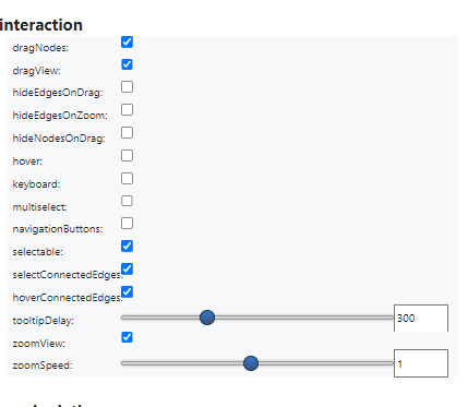
It also provides a whole host of options for configuring your plot in an interactive manner, such as the physics engine parameters, graph layout, edge curvature, edge scaling, highlighting, and borders.
Verdict for Undirected Homogenous Graphs
So far, Ipysigma is the clear winner here:
- It is convenient, achieving what took over 50 lines of code in
pyviswith an astonishing 2. - It scales better if you do not need the interactiveness.
- It displays node and edge features better using an interactive side-bar.
You might be thinking why I am even bothering with pyvis given the extra complexity involved to achieve on-par functionality with Ipysigma. This will become clearer in the next section, but here are the things that pyvis offers that Ipysigma does not:
- It offers a better filtering functionality, allowing the user to isolate whatever node or edges the user wants.
Ipysigmaonly allows selection, but not hiding nodes. This becomes exceptionally valuable for the user for very complicated networks. - It allows searching for nodes or edges based on their attribute values, while
Ipysigmaonly allows for searching on the node identifier value. pyvisallows drag-and-dropping of nodes, which is also a valuable functionality for the user for complicated networks.- It offers a better customisation experience compared to
Ipysigmathrough its interactive dashboard. Being able to configure the physics engine while having the plot displayed live makes it much easier for the developer to fine tune parameters.
Let us now move on to directed, heterogeneous graphs.

Heterogenous Directed
Graph Generator
Like we did for the homogenous case, we need a function to generate our test graph.
It is the same function, but with a different graph generator.
We use networkx.scale_free_graph to generate our graph. Strictly speaking, this function gives us a MultiDiGraph, where two nodes can have multiple directed edges between them as opposed to a DiGraph that can only have one.
We introduce the node_type attribute to make our graph heterogeneous, and set nodes with ids in the range [0, 24] to be node_type = 0 and [25, 50] to be node_type = 1.
def get_new_test_digraph():
    NUM_NODES = 50
    SEED = 0
    test_graph = nx.scale_free_graph(n=NUM_NODES, seed=SEED)

    ### append node properties
    nx.set_node_attributes(
        test_graph,
        dict(test_graph.degree()),
        name='degree'
    )
    nx.set_node_attributes(
        test_graph,
        nx.betweenness_centrality(test_graph),
        name='betweenness_centrality'
    )

    for node, data in test_graph.nodes(data=True):

        # Assign a node_type attribute to make our graph heterogeneous
        data['node_type'] = 0 if node < 25 else 1

        data['node_identifier'] = str(uuid.uuid4())
        data['feature1'] = np.random.random()
        data['feature2'] = np.random.randint(0, high=100)
        data['feature3'] = 1 if np.random.random() > 0.5 else 0

    ### append node properties
    for u, v, data in test_graph.edges(data=True):
        data['feature1'] = np.random.random()
        data['feature2'] = np.random.randint(0, high=100)

    return test_graph
We plot our graph with networkx.draw to see what we are dealing with. I haven’t bothered with colouring them or shaping them, as we will do that properly with pyvis and Ipysigma, but they are numbered with node_id values so we know which ones belong to which node_type.
Let’s now see what this looks like on Ipysigma and pyvis.
Ipysigma
Again, it is very simple to generate the plot. It is much the same as before, except that we now add the node_shape and node_shap_mapping parameters to specify that node_type = 0should be drawn with circles, while node_type = 1 should be drawn as triangles.
test_graph = get_new_test_digraph()
Sigma(
    test_graph,

    # Node config
    node_color='betweenness_centrality',
    node_color_gradient="Reds",
    node_size='betweenness_centrality',
    node_label='node_identifier',
    node_shape='node_type',
    node_shape_mapping={0 : 'circle', 1 : 'triangle'},
    node_size_range=(8, 15),

    # edge config
    clickable_edges=True,
    edge_color="feature1",
    edge_color_gradient="Reds",

    # graph config
    background_color="grey",
    height=900
)
The plot is shown below.
We will reserve evaluating this plot for now, as I want to make some comparisons with the pyvis plot.
Pyvis
Again, much of the same as before.
The only difference is that we now set an attribute called shape to be dot for node_type = 0 and triangle for node_type = 1.
# prep node color generator
vals = nx.get_node_attributes(test_graph, 'betweenness_centrality').values()
betweenness_min, betweenness_max = min(vals), max(vals)
node_colors = MplColorHelper("Reds", betweenness_min, betweenness_max)

# Add Node Attributes
for node, data in test_graph.nodes(data=True):
    data['value'] = data['betweenness_centrality'] # node size
    data['label'] = data['node_identifier']
    data['title'] = (
        f"Node: {data['node_identifier']}"
        "\nNode Features:" +
        f"\nfeature 1: {data['feature1']}" +
        f"\nfeature 2: {data['feature2']}" +
        f"\nfeature 3: {data['feature3']}" +
        f"\nBetweenness Centrality: {data['betweenness_centrality']}" +
        f"\nDegree: {data['degree']}"
    )
    data['color'] = node_colors.get_rgb_str(data['betweenness_centrality'])

    # Add node shape according to node type
    data['shape'] = 'dot' if data['node_type'] == 0 else 'triangle'

# Set Edge Attributes
for u, v, data in test_graph.edges(data=True):
    data['value'] = data['feature1']
    data['color'] = edge_colors.get_rgb_str(data['feature1'])
    data['title'] = (
        f"Edge: {test_graph.nodes[u]['node_identifier']} -> {test_graph.nodes[v]['node_identifier']}" +
        f"\nEdge Features:" +
        f"\nfeature 1: {data['feature1']}" +
        f"\nfeature 2: {data['feature2']}"
    )

# Generate the plot
net = Network(
    directed=True,
    height=900,
    width="100%",
    bgcolor="grey"
)
net.show_buttons()
net.from_nx(test_graph)
net.save_graph('pyvis_example_directed.html')
And we get the below graph.

Here, I want to make an important comparison between pyvis and Ipysigma.
Look at the two plots below. I have filtered out the pyvis plot to include two nodes that have multiple, directed edges between them.

The below shows the equivalent nodes in Ipysigma. We see that Ipysigma is only showing a single edge. This is misleading, as it is actually displaying all edges, but they are plotted on top of each other so that they overlap.
This is problematic for ANY directed graphs (excluding acyclic directed graphs where you would never have multiple edges between two nodes) — you can’t see edges in either direction apart from the one at the top!
I have looked through the docs and it doesn’t seem possible to configure the edges to behave like pyvis.

One workaround for this could be to use the z-index to prioritise which edges are plotted at the top, but it does not solve the inconvenience of not being able to see all edges at once.
Therefore, though Ipysigma retains all the benefits mentioned for the homogenous graph case, it is most likely unusable in the directed or multi-directed case.
Verdict for Directed Heterogeneous Graphs
Though this will depend on the specific application, for directed graphs in general (apart from acyclic), pyvis seems to be the clear winner. We can replicate most of the features that Ipysigma has to offer (albeit requiring more boilerplate code, but I have done the heavy lifting for you!), and we are also able to handle directed and multi-directed edges very well.
Ipysigma still offers the same benefits that I have already outlined in the previous section. However, I struggle to think of an example where a plot of a directed graph can get away with all but one of the edges being visible and interactable.
So if the user wants to draw directed graphs, it seems pyvis will serve them best.
Summary
So, we have looked at how Ipysigma and pyvis can be used to generate interactive visualisations for homogenous undirected and heterogeneous directed graphs.
Having compared the necessary code implementations, their functionalities and limitations, we can draw the following conclusions:
- If you are dealing with undirected graphs, it is a no-brainer, go for
Ipysigma. It involves much less code, and provides a better display for node and edge attributes. - If you are dealing with directed graphs,
pyvisis most likely your best option (unless you can get away with displaying only one edge or are dealing with acyclic directed graphs). With a bit more coding, it (1) provides the same features, (2) a better node and edge filtering functionality, and (3) better interactivity and an easier parameter optimisation experience. - While both provide an interactive GUI where the user can select nodes and edges to highlight neighbours and view related information,
Ipysigmadoes not allow for drag and dropping nodes that can be convenient for more complex networks.pyvizprovides this useful functionality at the cost of scalability —Ipysigmascales better thanpyviz.


