
The Three Best React Icon Libraries
And why you should use icons in your next application

Take a look at the websites and applications you use most frequently. You might notice they have something in common. That’s right, they all make use of icons. Like the proverb, “a picture is worth a thousand words”. As web developers, we can use icons to spice up our websites and grab our users’ attention.
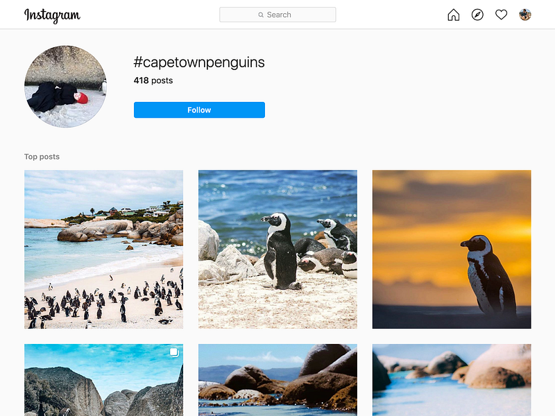
Take a look at Instagram. They use icons for their navigation. A heart for your likes, a compass to discover, and a house to return home. These icons are used instead of text and require global recognition to be useful.
Icons can be especially useful for navigation on websites that are translated into many different languages. For example, if we had a design that relied on our “home” navigation text being relatively short (four characters), how will it look in French, where we use the word “acceuil” (seven characters) instead?
However, we should use icons to replace text when they have one clear, recognizable meaning. Like bathroom. When I’m visiting a new country, I might not know the word for the bathroom, but I can sure recognize the symbol.

So now that we have established the widespread use, and usefulness of icons in web design, let’s take look at how we can easily incorporate into our next React application.
Let’s start with our acceptance criteria. We want a library that
- Can be imported one by one (without unused icons)
- The icons should be SVG-based, not font-based.
- Works out of the box without changes to our build setup.
Why SVG?
In the past, uses font based icons was all the rage. You might remember using font awesome in previous projects. However, using font-based icons has the following drawbacks:
- Font sets contain icons that you (probably) won’t use, so they bloat your bundle size.
- They require performing another HTTP request to fetch the font set.
- They lead to invisible text flashing (when the font loads), leading to a poor user experience.
- They have bad accessibility, as we can’t provide meaning to users with screen readers
- They are hard to position, and you need to play around with line-height to get them vertically centred.
Whereas, using SVG based icons gives us the following benefits:
- Accessibility. They are treated like images instead of text, so you can use attributes like
titleanddescriptionfor users with screen readers. - Easily customizable with CSS, and can even be animated.
- Inline SVGs are included in the HTML document, so they require no further HTTP requests and don’t suffer from the flash of invisible text like font based icons.
So without further ado, let’s take a look at the best SVG icon sets to use for a React application 2020.
1. React Icons
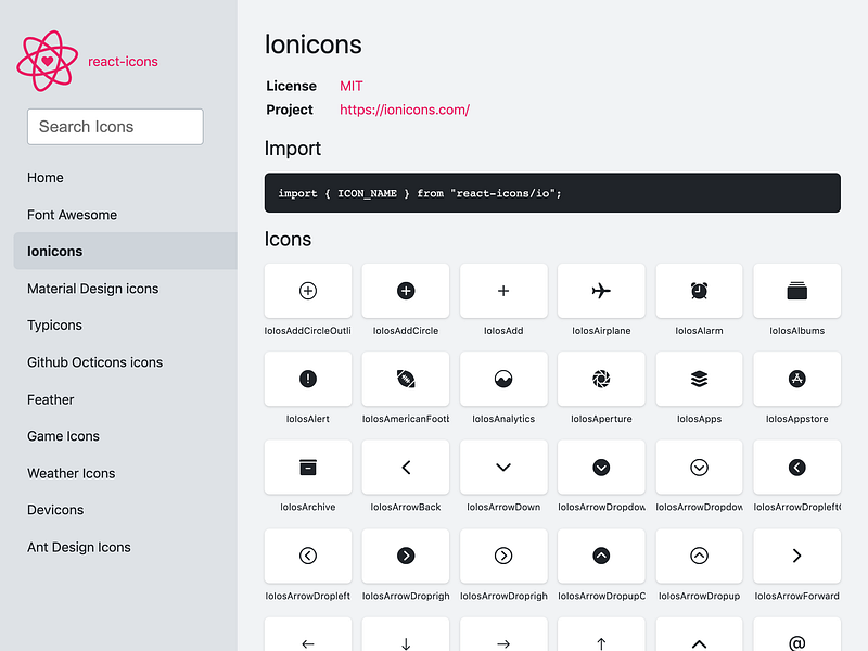
React Icons offers popular sets of icons, including FontAwesome, Ant Design, Material Design and more. They can be imported one by one using ES6 syntax.
import { FaHeart } from 'react-icons/fa';const Home = () => (
<a href="/"><FaHeart /></a>
);You can even use the React Context API to configure global configurations for your react-icons.
<IconContext.Provider value={{ className: "my-icon-classname" }}>
  <App />
</IconContext.Provider>;
2. Styled Icons 💅
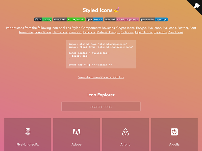
Styled-Icons offers over 13,500 icons from popular icon packs as styled-components. It also offers TypeScript support and ES6 style imports. If your project is already using styled-components, then styled-icons is a great choice.
import React from 'react'
import { Lock } from '@styled-icons/material'
const Lock = () => <Lock size="48" title="Unlock account" />3. React Feather
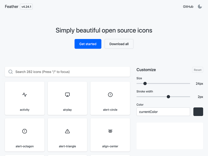
As you might have guessed from the name, react-feather offers the feather icons as a set of React components. Feather bill itself as “simply beautiful open source icons”, and they aren’t kidding. What they lack in numbers, they more than makeup for in quality.
import React from 'react';
import { Camera } from 'react-feather';
const App = () => {
return <Camera />
};export default App;Feather icons are a great choice to make your app stand out, as many applications use popular icon sets like Material Design and Font Awesome.
These are my favourite icon libraries to use when I start a new React application. What about you? Let us know what your favourite library is, and how you incorporate icons into your web applications.