
Design in Business
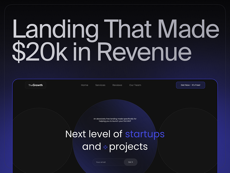
The Secret of a Landing Page That Got My Client Over $20K in Less Than a Month
3 Simple Secrets That Made All The Difference
Landings are an essential part of every business.
Whether you want to get emails, get more calls, sell your product, or literally get any action from the users.
I’ve been creating landings my whole life, but this story is unique.
The story of how my client got over $20k in less than a month by just getting his landing page live (That’s a slightly redesigned template, so you can get it for free and use it)
The best part — I haven’t reinvented the wheel at all.
I just used some of the insights that I learned throughout my career and implemented them at the right moment, at the right time.
So, let’s get to them.
It Works, Not Just Looks
That’s the main problem I see among the juniors.
The only reason why the design sphere even exists is because that’s an additional way to make more money for the business and make customers more loyal to you.
In other words, 90% of the time, we see websites that are just beautiful. But they’re not functional at all.
You can come to this page and be impressed, but the overall conversion rate might be pretty low.
Designer always needs to strike a balance between functionality and aesthetics.
And that was pretty much the main reason why this landing boomed.
Every section, every block of text, and every button are specifically tailored to make the overall navigation easier.
It doesn’t have some outstanding design, no.
I would even say that from the point of UI, it’s a little bit above average and you can find thousands of other landings on Behance on Dribble that would be 10x better.
But it keeps this balance that is so crucial in the entrepreneurship world.
This functionality resonates in literally every section.
- The right-placed CTAs
- Just enough information to not get overwhelmed
- Easy navigation & usability
- Perfect responsiveness
And trust me, it’s much easier to get similar results than it seems.
All you need to do is make sure not to push things too far and combine entrepreneurial and designer points of view at the same time.
Little Interactions
While building a website, you’re creating a story for a user.
You try to make him believe in what you’re saying and showing.
And the most crucial part here is to pay attention to the details, especially to little interactions everywhere on your page.
I’m talking about beautiful hover animations, tickers, custom cursors, effects while clicking, and so on.
It’s a never-ending list of all of these interactions that you can implement on your website.
And the landing that I’ve made has a decent amount of them.
Everything that you see on this landing makes you forget about reality and just hover, click, and interact with everything that you see.
That’s pretty much the place where you can unleash all of your creativity as a designer.
Here, you shouldn’t limit yourself to usability. You just need to make sure that these interactions are interesting.
A potential customer wants to see how much you care about him.
How much time you spend on these little interactions shows how much time users would spend on your page.
The more interesting it gets to stay on your website, the higher your chances of getting a user to buy something.
But don’t overdo it.
It’s essential to keep the right amount of small details and not just put everything that you’ve seen on the internet.
Loading Speed & Performance
I think we all know that if a user waits more than 3 seconds he’s more likely to close the tab.
We don’t want that, right?
So, the solution is simple — just optimize everything.
Make sure that:
- Your images aren’t too large
- You don’t have any background blur (I faced this issue many times)
- You don’t have some really complex animations, and so on
Again, the list of all the optimizations is endless, and you can make all the minor and major adjustments until your page performance gets to 80+ on PageSpeed Insights.
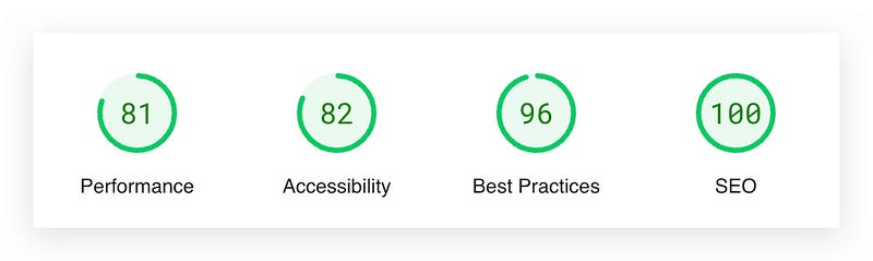
As you can see, the performance of this landing page is fabulous. All the metrics are green and close to one hundred.
It’s not only crucial for us as users, but it’s even more crucial for Google algorithms and how it sees our website.
So, make sure that everything is running fast on your website and nobody needs to wait several seconds for it to load.
Conclusion
Designing landings isn’t hard at all. You just need to follow some guidelines, limit yourself, and express your full design spirit.
It’s a question of balance and how well you can think from the perspective of a business.
If you’ll focus more on making money for your clients, then clients will come to you themselves, and you’ll be able to make better and better websites over and over again.
If you’re willing to take a closer look at the landing that I’ve designed and try to make something on your own, then you can easily download it on my Gumroad.
I’ve made a little redesigned version and changed all the text so you can easily use it whenever you want!
Subscribe to my Twitter and always get updated on new giveaways and stories like this one!


