
The real difference between iPhone and Android apps.
The year is 2023.
The current flagship iPhone is the 14 Pro.
The current flagship Samsung (slab) is the S23 Ultra.
The vast majority of the apps you love will be in both the Apple App Store and Google Play store. Yes there will be some exclusives, as there are with XBOX and PlayStation, but the mainstream apps will be available in both stores.
Yet these apps are not entirely the same. They will take advantage of the ecosystem within which they live, such as incorporating multitasking capability on Android, but even with these nuances, there remains a fundamental difference.
Let’s look at some examples.
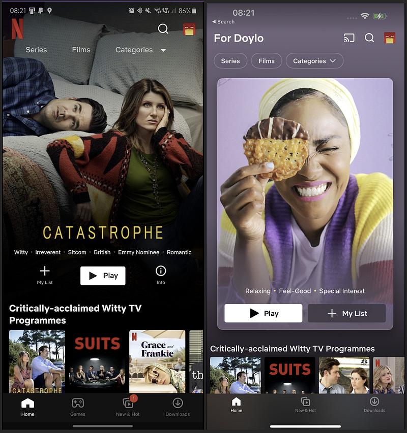
NETFLIX
There are a few things that stand out to me:
- The Android version, on the left, has a plain black background. Compare that to the blurred and use of colour on the iPhone. Subtle, yet enough to be aesthetically superior.
- The presentation of the feature recommendation. The Android version is nice, with a full-screen blended photo, the iPhone version has been specifically designed and is compelling the viewer to select it and hit play. Its colour theme is also the dominant colour on the full screen. Another design choice.
There’s nothing fundamentally wrong with the Android version, but it just lacks that attention to design that the iPhone benefits from.
TODOIST
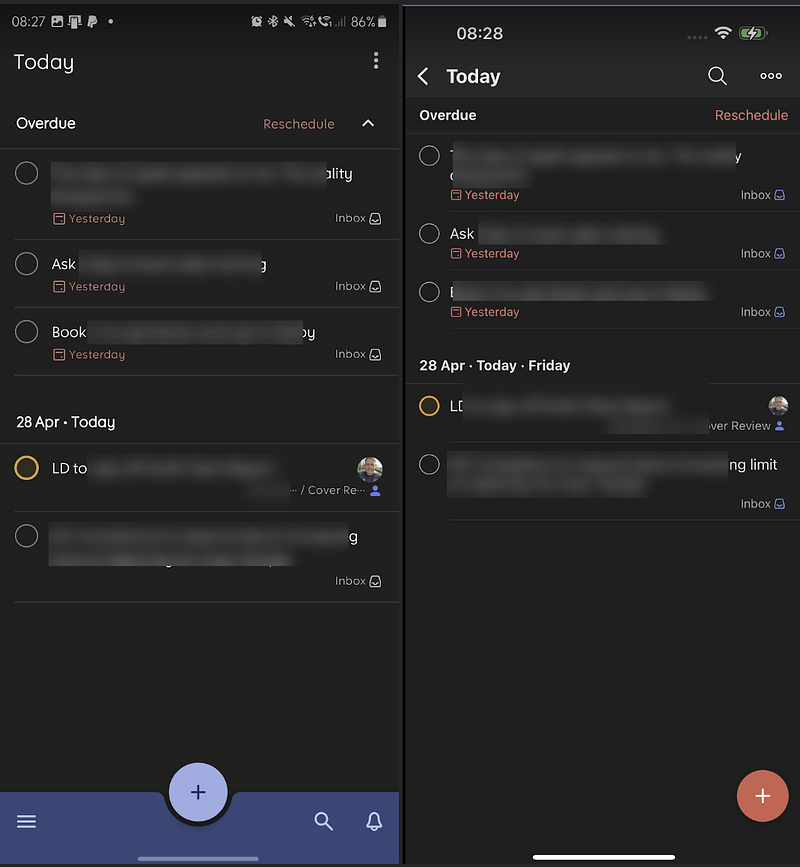
Once again, Android is on the left.
There are a few stylistic differences here. The execution of the task list is pretty similar, but if we look at the bottom of the app, it’s where the differences occur. Of course this is subjective, and there are a few things I prefer about the Android version which I’ll come on to. But my first question, is why is the bottom panel on the Android version a bluey-purple? Todoist colour language is red. I’ve not selected a theme to include this colour choice, so to me it feels out of place. I’m sure there was a design decision made, but it doesn’t feel on-brand.
What I do prefer is the choice to place the menu and search options in proximity to the add button. That makes it easier for navigation. But does this tell us that function was more important than design with Android?
STRAVA
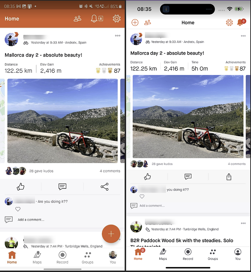
Strava is a fitness app that will be familiar to many of you. This is my feed, with Android left and Apple right.
This is another subjective one, but the Android execution feels like its from 2015, with a big bold line of colour at the top of the screen. I totally get that others will prefer this, but for me, the iPhone version just feels cleaner.
The placement of the ‘plus’ button as well on the Android interrupts the feed. Sure its convenient and perhaps easier to find compared to the iPhones which is small and out of the way at the top left, but aesthetically it makes the iPhone’s display cleaner.
MEDIUM
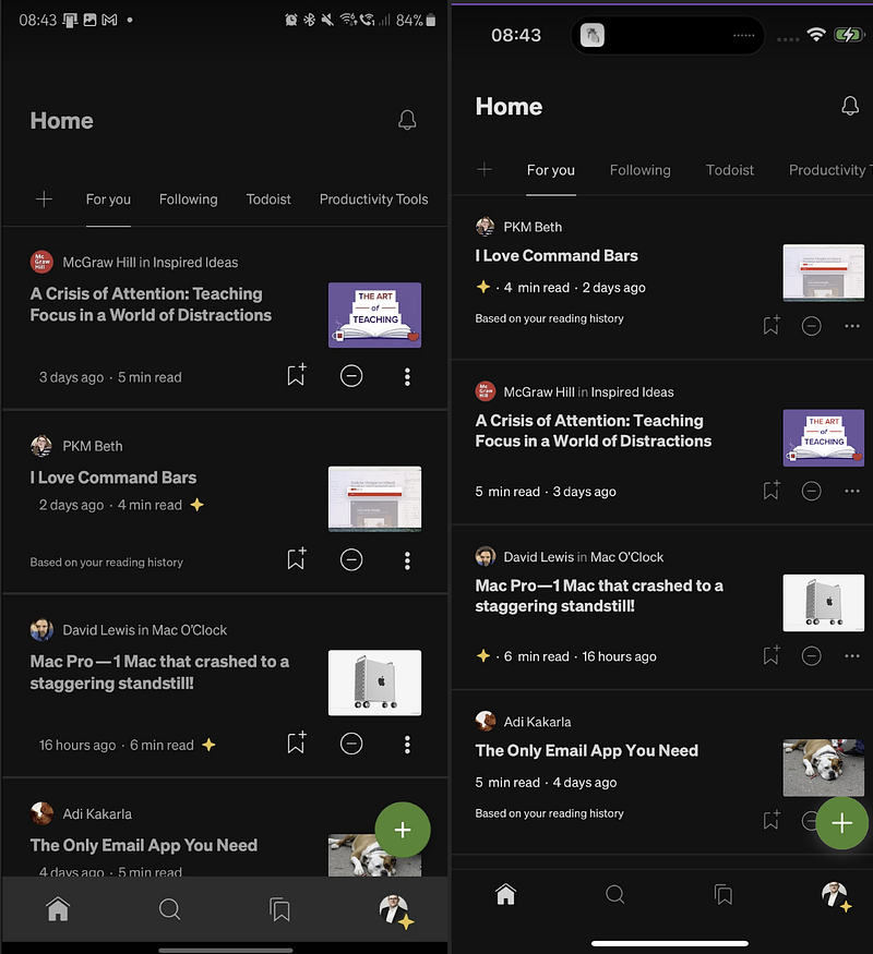
There isn’t a huge difference the two versions of Medium here, once again in the same order. But there are a few differences that pop out to me.
- Why is the navigation bar on Android grey? It’s the only part of the app that is.
- Android’s swipe bar is below this grey bar and it means there is now a gap with black in there. It’s small but it’s enough to make it poor design.
- I think both are poor when it comes to the inconsistent placement of the length of the read and how long ago it was published. Look at the PKM Beth article compared to the placement of the read time on the David Lewis article. One is immediately below the headline, the other a few lines below.
- And to be fair to the Samsung, I prefer the fact I can read the entire ‘Productivity Tools’ header which is half off the screen on the iPhone.
So the difference, is aesthetic design. In my experience, apps launched on the iPhone are crafted. Aesthetic is important in its design, both consistency, and individuality. Yes there is an equivalent in the Google Play store, but it seems that the objective for the Android version is just to get it published, not to make it beautiful. Google has less rigorous design guidelines for its apps, and while they are pleasant apps, they suffer from design inferiority compared to their Apple counter part. It’s a subtle difference and perhaps only noticeable when the two phones are in juxtaposition, but this sort of thing matters, especially when folk are considering swapping from one platform to the other.
Can you think of any other examples?
Do these design features bother you?
Do you or would you pick one platform over another due to this?
Leave me a comment to join the conversation.


