
The Quickest Guide to Data Visualization in Python using Matplotlib

Data Visualization is very important in data analysis and machine learning, it allows us to have a better understanding about the pattern of some variables in our data, conclude some correlation between multiple variables, and eventually we can take the right decision based on that.
In this story, I will present how to create basic diagrams in Python. I will use the Matplotlib package, which is a 2D graphical library in Python language, it supports plotting graphics and images of the data in an attractive way.
If you want to know more about interesting packages in python, including matplotlib itself, check my previous story on medium:
Getting Started
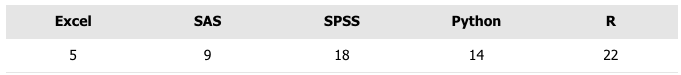
In order to plot something, we need data, let’s start with the following data for demonstration:
Plot a 3D Pie Chart using matplotlib
import matplotlib.pyplot as plt

labels = 'R','Python', 'SPSS', 'SAS', 'Excel'
sizes = [22, 14, 18,9,5]
colors = ['gold', 'yellowgreen', 'lightcoral', 'lightskyblue','orange']
explode = (0.1, 0, 0, 0,0)

plt.pie(sizes, explode=explode, labels=labels, colors=colors,
        autopct='%1.1f%%', shadow=True)

plt.axis('equal')
plt.show()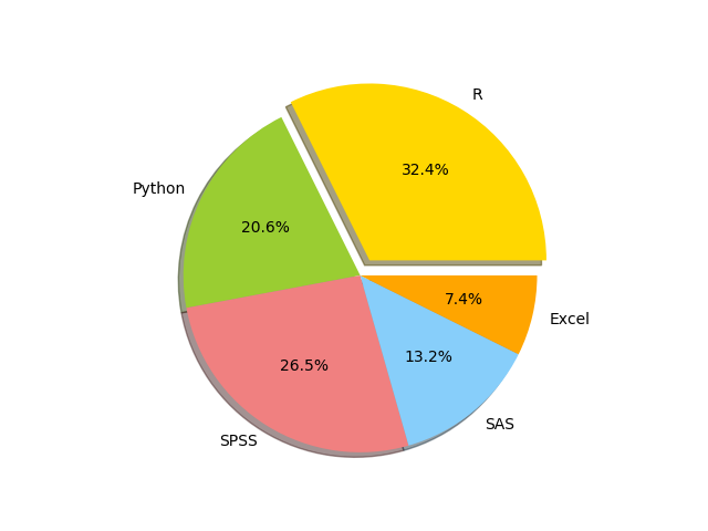
Plot Bar Charts in Python using matplotlib
This data can also be represented using bar charts as follows:
import matplotlib.pyplot as plt

x = [-4,0,4,8,12]
heigh = [22, 14, 18,9,5]
width=3
colors = ['gold', 'yellowgreen', 'lightcoral', 'lightskyblue','orange']
labels = 'R','Python', 'SPSS', 'SAS', 'Excel'

plt.bar(x,heigh,width,align='center',color=colors)
plt.xticks(x,labels)
plt.ylabel('The number of users')
plt.axis('equal')
plt.show()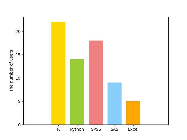
Also, the bars can be drawn horizontally using the following code:
import matplotlib.pyplot as plt

y = [-4,0,4,8,12]
heigh = [22, 14, 18,9,5]
width=3
colors = ['gold', 'yellowgreen', 'lightcoral', 'lightskyblue','orange']
labels = 'R','Python', 'SPSS', 'SAS', 'Excel'

plt.barh(y,heigh,width,align='center',color=colors)
plt.yticks(y,labels)
plt.xlabel('The number of users')
plt.axis('equal')
plt.show()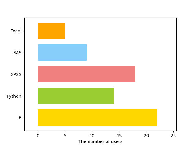
Line Plot in Python using matplotlib
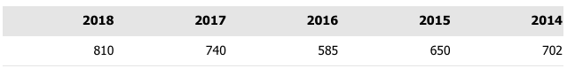
Let us assume the number of students admitted to a college during 5 years is shown in this Table:
We can use the function plot to plot a line plot as follows:
import matplotlib.pyplot as plt

years=[2014,2015,2016,2017,2018]
Numbers=[702,650,585,740,810]

plt.plot(years,Numbers, linestyle='solid', color='blue')
plt.xticks(years,years)
plt.ylabel('The number of students')
plt.xlabel('Year')
plt.show()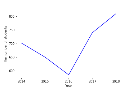
If we do not like the line, you can apply some styling by replacing the following line:
linestyle=’solid’, color=’blue’with multiple options for formatting and coloring as follows:
plt.plot(years,Numbers, '--b')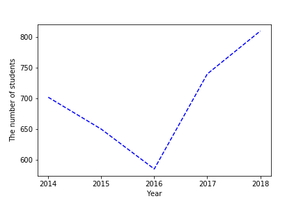
plt.plot(years,Numbers, '-.g')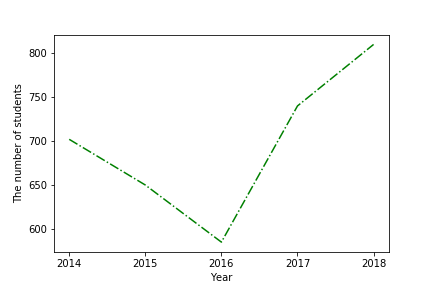
plt.plot(years,Numbers, ':r')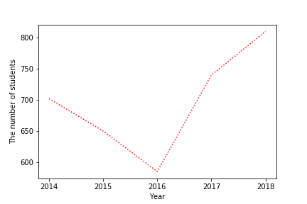
Plot Data from CSV in Python using Matplotlib and Pandas
Now we will draw some advanced plots, where we will use mydata data, which can be obtained from the following link:
https://github.com/zahrasyria/data/blob/main/mydata.csv
Then you can load it to a data frame in pandas as follows:
import pandas as pd
mydata = pd.read_csv('mydata.csv',sep=',')
The data contains four variables: y, x1, x2, x3.
To facilitate accessing those features (or variables) from the data, the following code can be used:
def attach(df):
    for col in df.columns:
        globals()[col] = df[col]

attach(mydata)
To represent the probability distribution of the variable y we can use the function:
import seaborn as sns
import matplotlib.pyplot as plt
sns.distplot(y,kde_kws={"color": "black"},hist_kws={"color": "skyblue"})
plt.ylabel('Probability Density')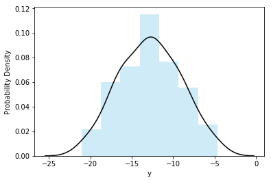
Or using different style:
sns.kdeplot(y, color="r", shade=True,legend=False)
plt.xlabel('y')
plt.ylabel('Probability Density')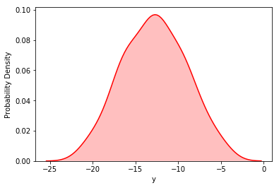
Also we can use boxplot
sns.boxplot(y, orient='v',color='skyblue')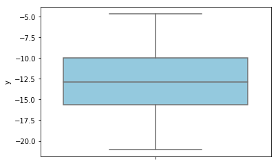
To compare more than one distribution:
sns.kdeplot(x1, label="x1")
sns.kdeplot(x2, label="x2")
sns.kdeplot(x3, label="x3")
plt.xlabel('features')
plt.ylabel('Probability Density')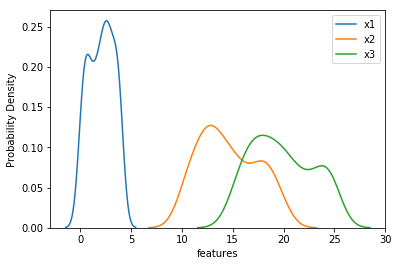
Plot the Correlation Between Multiple Variables in Python Using Scatter
To plot the correlation between two variables (if it exists),
sns.scatterplot(x1,y)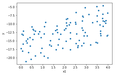
Conclusion
I have presented in this article a quick overview of almost everything I have been using in matplotlib to plot awesome figures in my recent 2 years career as a Data Scientist.
Of course there are more advanced plots, but mastering what I have presented in this article will secure you a nice and representatives plots for your data exploration task.
If you liked my article, applauding it will encourage me to contribute and share more :)
And as usual, your questions and comments help me to provide better content.