
The Power of Data Visualization with D3: A Practical Guide
Today, I’m going to share my experience with D3.js in creating multiple charts within a Next.js project

One of the best parts of being a web developer for all these years is the exposure I’ve had to a multitude of libraries and frameworks. Each of them comes with their unique strengths, and often a few drawbacks, but one library that has consistently amazed me with its capability is D3.js.
D3.js, or Data-Driven Documents, is a JavaScript library for producing dynamic, interactive data visualizations in web browsers.
Today, I’m going to share my experience with D3.js in creating multiple charts within a Next.js project.
The joy of programming comes from problem-solving, right? So let’s dive right in.
Summary
This tutorial provides a step-by-step guide to creating various types of charts using the D3.js library within a Next.js project.
The goal of this guide is to aid in the creation of a financial management system.
Here’s a brief overview:
- Step 1: Next.js project setup: You’ll learn how to create a new Next.js project and set up a basic page structure.
- Step 2: Importing D3.js: Here we cover how to install and import the D3.js library into your Next.js project.
- Step 3: Importing financial data: This step explains how to import financial data from a JSON file into the project.
- Step 4: Basic Bar Chart: We start visualizing our financial data by creating a simple bar chart.
- Step 5: Stacked Bar Chart: Expanding on the bar chart, we build a more complex stacked bar chart.
- Step 6: Pie Chart: This step explains how to represent financial data using a pie chart.
- Step 7: Line Chart: Here, we learn how to display our data over time with a line chart.
- Step 8: Scatter Plot: This part details the creation of a scatter plot to visualize correlations in our data.
- Step 9: Force-Directed Graph: This segment focuses on creating a force-directed graph to display the interconnections between data points.
- Step 10: Treemap: We then delve into hierarchical data visualization with a treemap.
- Step 11: Circular Barplot: This step explores a unique style of data presentation with a circular barplot.
- Step 12: Add More Charts
- Conclusion: We wrap up the tutorial with a note on the limitless potential of D3.js and Next.js for data visualization.
This summary provides a roadmap of the tutorial’s contents and should make it easier to find specific information within the text.
Step 1: Create a New Next.js Project
Let’s kick things off by setting up a new Next.js project.
Make sure you have Node.js and npm/yarn installed on your system. If you haven’t, you can download it from here.
Navigate to your desired directory and open the terminal. Run the following command to create a new Next.js app:
npx create-next-app@latest d3-financial-app
Step 2: Install D3.js
Inside the newly created project, we need to install D3.js.
You can do so by running the following command:
npm install d3

// OR

yarn add d3
Step 3: Set Up Your Financial Data
For simplicity, I will use a static dataset.
Let’s assume you have a file named financialData.js under a data folder in your root directory.
The data could look something like this:
export const financialData = [
  {
    "month": "January",
    "revenue": 1000,
    "revenue1": 300,
    "revenue2": 400,
    "revenue3": 300,
    "expenses": 500,
    "profit": 500,
    "numberOfClients": 50
  },
  {
    "month": "February",
    "revenue": 1500,
    "revenue1": 500,
    "revenue2": 500,
    "revenue3": 500,
    "expenses": 600,
    "profit": 900,
    "numberOfClients": 70
  },
  // ... Repeat this for each month
];
Remember, in a real-world project, you might fetch this data from an API or a database.
Step 4: Create a Bar Chart
Next, let’s create a bar chart using this financial data.
Create a new pageBarChart.
If you don’t know how to proceed, check this. We’ll create a new page for each chart, be sure to be comfortable with this process.
Then, import necessary modules:
"use client";

import { useEffect, useRef } from "react";
import * as d3 from "d3";
import { financialData } from "../../data/financialData";
Next, define your BarChart component in your page:
const BarChart = () => {
  const ref = useRef();

  useEffect(() => {
    const svg = d3.select(ref.current)
      .attr("width", 500)
      .attr("height", 500);

    const x = d3.scaleBand()
      .range([0, 500])
      .domain(financialData.map((d) => d.month))
      .padding(0.2);

    const y = d3.scaleLinear()
      .range([500, 0])
      .domain([0, d3.max(financialData, (d) => d.profit)]);

    svg.append("g")
      .attr("transform", "translate(0,500)")
      .call(d3.axisBottom(x));

    svg.append("g")
      .call(d3.axisLeft(y));

    svg.selectAll("rect")
      .data(financialData)
      .enter().append("rect")
        .attr("x", (d) => x(d.month))
        .attr("width", x.bandwidth())
        .attr("fill", "#69b3a2")
        .attr("height", (d) => 500 - y(d.profit))
        .attr("y", (d) => y(d.profit));

  }, []);

  return (
    <main style={{ display: 'flex', justifyContent: 'center', marginTop: '10em' }}>
      <svg ref={ref}></svg>
    </main>
  );
};

export default BarChart;
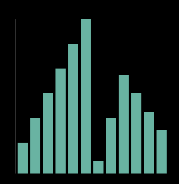
In this step, we use D3 to bind data to the ‘rect’ elements of our SVG, creating new ones where necessary. We then define their attributes based on the provided data.
This will render a simple bar chart.
Step 5: Stacked Bar Chart
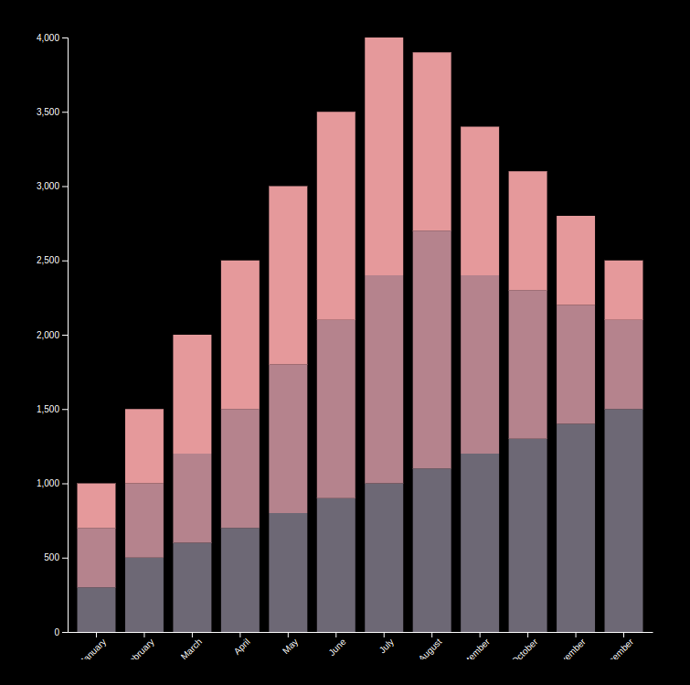
Stacked bar charts are an extension of the regular bar chart where segments are piled on top of each other to show their combined contribution.
In D3, this can be achieved using the d3.stack() method.
Let's assume you have multiple profit metrics for each month in your financialData like 'profit1', 'profit2', and 'profit3'.
Here is how to create a stacked bar chart:
"use client";

import { useEffect, useRef } from "react";
import * as d3 from "d3";
import { financialData } from "../../data/financialData";

const StackedBarChart = () => {
  const ref = useRef();

  useEffect(() => {
    const margin = { top: 20, right: 20, bottom: 30, left: 40 },
      width = 700 - margin.left - margin.right,
      height = 700 - margin.top - margin.bottom;

    const svg = d3
      .select(ref.current)
      .attr("width", width + margin.left + margin.right)
      .attr("height", height + margin.top + margin.bottom)
      .append("g")
      .attr("transform", `translate(${margin.left},${margin.top})`);

    const subgroups = ["revenue1", "revenue2", "revenue3"];
    const groups = [...new Set(financialData.map((d) => d.month))];

    const x = d3.scaleBand().domain(groups).range([0, width]).padding(0.2);

    svg
      .append("g")
      .attr("transform", `translate(0,${height})`)
      .call(d3.axisBottom(x).tickSizeOuter(0))
      .selectAll("text")
      .attr("transform", "rotate(-45)")
      .style("text-anchor", "end");

    const y = d3
      .scaleLinear()
      .domain([
        0,
        d3.max(financialData, (d) => d.revenue1 + d.revenue2 + d.revenue3),
      ])
      .range([height, 0]);

    svg.append("g").call(d3.axisLeft(y));

    const color = d3
      .scaleOrdinal()
      .domain(subgroups)
      .range(["#6d6875", "#b5838d", "#e5989b"]);

    const stackedData = d3.stack().keys(subgroups)(financialData);

    svg
      .append("g")
      .selectAll("g")
      .data(stackedData)
      .enter()
      .append("g")
      .attr("fill", (d) => color(d.key))
      .selectAll("rect")
      .data((d) => d)
      .enter()
      .append("rect")
      .attr("x", (d) => x(d.data.month))
      .attr("y", (d) => y(d[1]))
      .attr("height", (d) => y(d[0]) - y(d[1]))
      .attr("width", x.bandwidth())
      ;
  }, []);

  return (
    <main
      style={{ display: "flex", justifyContent: "center", marginTop: "10em" }}
    >
      <svg ref={ref}></svg>
    </main>
  );
};

export default StackedBarChart;
In this example, first, we set the domain of the x-scale to all the months. The y-scale’s domain is set from 0 to the maximum total profit for each month.
Next, we define a color scale using d3.scaleOrdinal(). This will give a different color to each segment of our stacked bar.
The magic happens with d3.stack().
This method takes an array of keys, which are the names of the properties in our data to stack.
It transforms our flat data into an array of arrays, where each inner array represents all the data for a particular key (in our case, each type of profit), and each data point in the inner array has been transformed into a pair of values representing the top and bottom y-values for that segment of the bar.
Then we add a group (<g>) element for each key and fill it with the color for that key.
Inside each group, we add a rectangle (<rect>) for each data point, setting the y-value to the top of the bar segment, the height to the total height of the segment, and the width to the band width.
This creates a stacked bar chart where each type of profit is represented by a different color.
With a stacked bar chart, you can compare total profits across months while still seeing the breakdown of profits within each month.
Step 6: Create a Pie Chart
A pie chart can help us visualize proportions. Let’s create a pie chart to show the profit distribution by month.
"use client";

import { useEffect, useRef } from "react";
import * as d3 from "d3";
import { financialData } from "../../data/financialData";

const PieChart = () => {
  const ref = useRef();

  useEffect(() => {
    const svg = d3.select(ref.current).attr("width", 500).attr("height", 500);

    const radius = Math.min(500, 500) / 2;
    const color = d3.scaleOrdinal(d3.schemeCategory10);

    const pie = d3
      .pie()
      .value((d) => d.revenue)
      .sort(null);

    const path = d3
      .arc()
      .outerRadius(radius - 10)
      .innerRadius(0);

    const label = d3
      .arc()
      .outerRadius(radius - 40)
      .innerRadius(radius - 40);

    const g = svg
      .append("g")
      .attr("transform", "translate(" + 500 / 2 + "," + 500 / 2 + ")");

    const data = pie(financialData);

    const arcs = g
      .selectAll(".arc")
      .data(data)
      .enter()
      .append("g")
      .attr("class", "arc");

    arcs
      .append("path")
      .attr("d", path)
      .attr("fill", (d, i) => color(i));

    arcs
      .append("text")
      .attr("transform", (d) => "translate(" + label.centroid(d) + ")")
      .attr("dy", ".35em")
      .text((d) => d.data.month.substr(0, 3));
  }, []);

  return (
    <main
      style={{ display: "flex", justifyContent: "center", marginTop: "10em" }}
    >
      <svg ref={ref}></svg>
    </main>
  );
};

export default PieChart;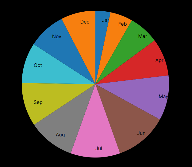
Step 7: Create a Line Chart
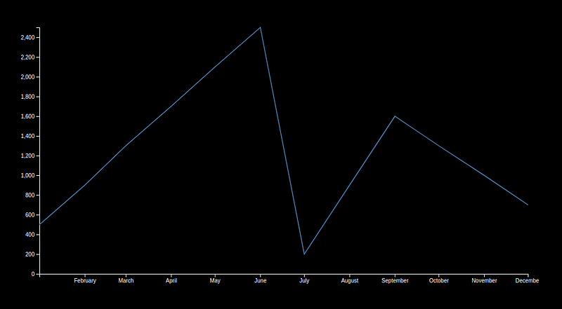
Line charts are great for displaying data trends over time.
In this case, we’ll visualize the profit changes over the months.
"use client";

import { useEffect, useRef } from "react";
import * as d3 from "d3";
import { financialData } from "../../data/financialData";

const LineChart = () => {
  const ref = useRef();

  // An object mapping month names to month numbers
  const monthNamesToNumbers = {
    January: "01",
    February: "02",
    March: "03",
    April: "04",
    May: "05",
    June: "06",
    July: "07",
    August: "08",
    September: "09",
    October: "10",
    November: "11",
    December: "12",
  };

  // Convert the month name in each datum to a Date object
  financialData.forEach((d) => {
    const monthNumber = monthNamesToNumbers[d.month];
    d.month = new Date(`2023-${monthNumber}-01`);
  });

  useEffect(() => {
    const margin = { top: 20, right: 20, bottom: 30, left: 50 },
      width = 960 - margin.left - margin.right,
      height = 500 - margin.top - margin.bottom;

    const x = d3.scaleTime().range([0, width]);
    const y = d3.scaleLinear().range([height, 0]);

    const line = d3
      .line()
      .x((d) => x(d.month))
      .y((d) => y(d.profit));

    const svg = d3
      .select(ref.current)
      .attr("width", width + margin.left + margin.right)
      .attr("height", height + margin.top + margin.bottom)
      .append("g")
      .attr("transform", "translate(" + margin.left + "," + margin.top + ")");

    x.domain(d3.extent(financialData, (d) => d.month));
    y.domain([0, d3.max(financialData, (d) => d.profit)]);

    svg
      .append("g")
      .attr("transform", "translate(0," + height + ")")
      .call(d3.axisBottom(x));

    svg.append("g").call(d3.axisLeft(y));

    svg
      .append("path")
      .data([financialData])
      .attr("class", "line")
      .attr("d", line)
      .attr("stroke", "steelblue") // stroke color
      .attr("stroke-width", 1.5) // stroke width
      .attr("fill", "none");
  }, []);

  return (
    <main
      style={{ display: "flex", justifyContent: "center", marginTop: "10em" }}
    >
      <svg ref={ref}></svg>
    </main>
  );
};

export default LineChart;
Please note that D3 works best when the data being visualized is already in the correct format.
In the above example, we assume that the month property of each data point is a Date object. You may need to preprocess your data to ensure this is the case.
Step 8: Create a Scatter Plot
Scatter plots can be useful for showing relationships between two numerical variables.
For this example, we’ll show the relationship between profit and loss per month.
"use client";

import { useEffect, useRef } from "react";
import * as d3 from "d3";
import { financialData } from "../../data/financialData";

const ScatterPlot = () => {
  const ref = useRef();

  useEffect(() => {
    const margin = { top: 20, right: 20, bottom: 30, left: 50 },
      width = 960 - margin.left - margin.right,
      height = 500 - margin.top - margin.bottom;

    const x = d3.scaleLinear().range([0, width]);
    const y = d3.scaleLinear().range([height, 0]);

    const svg = d3
      .select(ref.current)
      .attr("width", width + margin.left + margin.right)
      .attr("height", height + margin.top + margin.bottom)
      .append("g")
      .attr("transform", "translate(" + margin.left + "," + margin.top + ")");

    x.domain([0, d3.max(financialData, (d) => d.numberOfClients)]);
    y.domain([0, d3.max(financialData, (d) => d.profit)]);

    svg
      .append("g")
      .attr("transform", "translate(0," + height + ")")
      .call(d3.axisBottom(x));

    svg.append("g").call(d3.axisLeft(y));

    svg
      .selectAll(".dot")
      .data(financialData)
      .enter()
      .append("circle")
      .attr("r", 5)
      .attr("cx", (d) => x(d.numberOfClients))
      .attr("cy", (d) => y(d.profit))
      .attr("stroke", "steelblue") // stroke color
      .attr("stroke-width", 1.5) // stroke width
      .attr("fill", "steelblue"); // fill color;
  }, []);

  return (
    <main
      style={{ display: "flex", justifyContent: "center", marginTop: "10em" }}
    >
      <svg ref={ref}></svg>
    </main>
  );
};

export default ScatterPlot;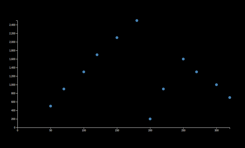
Step 9: Create a Force-Directed Graph
Force-directed graphs are great for visualizing complex interconnections between data points.
In the context of financial management, this type of graph could be used to represent relationships between different financial entities.
First, you’ll have to create a new data object. In your financialData.js file, add the following:
export const graphData = {
  nodes: financialData.map((d) => ({ id: d.month, group: 1 })),
  links: financialData
    .slice(1)
    .map((d, i) => ({
      source: financialData[i].month,
      target: d.month,
      value: 1,
    })),
};
Then, in your page:
"use client";

import { useEffect, useRef } from "react";
import * as d3 from "d3";
import { graphData } from "../../data/financialData";

const ForceGraph = () => {
  const ref = useRef();

  useEffect(() => {
    const svg = d3.select(ref.current).attr("width", 500).attr("height", 500);

    const simulation = d3
      .forceSimulation(graphData.nodes) // Use graphData.nodes instead of graphData
      .force(
        "link",
        d3
          .forceLink(graphData.links)
          .id((d) => d.id)
          .distance(100)
      )
      .force("charge", d3.forceManyBody())
      .force("center", d3.forceCenter(250, 250));

      const link = svg
      .append("g")
      .attr("class", "links")
      .selectAll("line")
      .data(graphData.links)
      .enter()
      .append("line")
      .attr("stroke", "#999") // Add stroke color here
      .attr("stroke-opacity", 0.6);

    const node = svg
      .append("g")
      .attr("class", "nodes")
      .selectAll("circle")
      .data(graphData.nodes)
      .enter()
      .append("circle")
      .attr("r", 5)
      .attr("fill", "#69b3a2"); // Add fill color here

    simulation.nodes(graphData.nodes).on("tick", ticked);

    function ticked() {
      link
        .attr("x1", (d) => d.source.x)
        .attr("y1", (d) => d.source.y)
        .attr("x2", (d) => d.target.x)
        .attr("y2", (d) => d.target.y);

      node.attr("cx", (d) => d.x).attr("cy", (d) => d.y);
    }
  }, []);

  return (
    <main
      style={{ display: "flex", justifyContent: "center", marginTop: "10em" }}
    >
      <svg ref={ref}></svg>
    </main>
  );
};

export default ForceGraph;
Step 10: Create a Treemap
Treemaps are excellent for displaying hierarchical data, or data that can be broken down into nested categories.
Once again, we need a new object for our data.
In your financialData.js file, add the following:
export const treeData = {
  name: "Expenses",
  children: [
    {
      name: "Housing",
      children: [
        { name: "Rent/Mortgage", value: 1200 },
        { name: "Utilities", value: 200 },
        { name: "Maintenance", value: 100 },
      ],
    },
    {
      name: "Food",
      children: [
        { name: "Groceries", value: 300 },
        { name: "Dining Out", value: 200 },
      ],
    },
    {
      name: "Transportation",
      children: [
        { name: "Car Payment", value: 250 },
        { name: "Gas", value: 100 },
        { name: "Public Transit", value: 75 },
      ],
    },
    {
      name: "Healthcare",
      children: [
        { name: "Insurance", value: 200 },
        { name: "Medications", value: 50 },
      ],
    },
    {
      name: "Entertainment",
      children: [
        { name: "Streaming Services", value: 30 },
        { name: "Events", value: 100 },
      ],
    },
    {
      name: "Savings & Investments",
      children: [
        { name: "Retirement", value: 500 },
        { name: "Other Investments", value: 300 },
      ],
    },
  ],
};
This data structure defines a series of “expense categories” (Housing, Food, etc.) and within each category there are more specific types of expenses (Rent/Mortgage, Groceries, etc.).
Then, in your page:
"use client";

import { useEffect, useRef } from "react";
import * as d3 from "d3";
import { treeData } from "../../data/financialData";

const TreeMap = () => {
  const ref = useRef();

  useEffect(() => {
    const svg = d3.select(ref.current).attr("width", 500).attr("height", 500);

    const root = d3
      .hierarchy(treeData)
      .sum((d) => d.value)
      .sort((a, b) => b.height - a.height || b.value - a.value);

    const color = d3.scaleOrdinal(d3.schemeCategory10); // Add color scale

    d3
      .treemap()
      .tile(d3.treemapResquarify)
      .size([500, 500])
      .round(true)
      .paddingInner(1)(root);

    const cell = svg
      .selectAll(".node")
      .data(root.leaves())
      .enter()
      .append("g")
      .attr("class", "node")
      .attr("transform", (d) => "translate(" + d.x0 + "," + d.y0 + ")");

    cell
      .append("rect")
      .attr("id", (d) => d.data.name)
      .attr("width", (d) => d.x1 - d.x0)
      .attr("height", (d) => d.y1 - d.y0)
      .attr("fill", (d) => color(d.data.name)); // Use color scale to set fill color

    cell
      .append("text")
      .attr("class", "label")
      .attr("x", 5)
      .attr("y", 20)
      .text((d) => d.data.name);
  }, []);

  return (
    <main
      style={{ display: "flex", justifyContent: "center", marginTop: "10em" }}
    >
      <svg ref={ref}></svg>
    </main>
  );
};

export default TreeMap;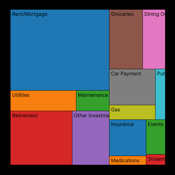
Step 11: Create a Circular Barplot
Circular barplots, or radial barplots, can add aesthetic appeal and novelty to your data presentation, though they may not always be as intuitive to read as standard, cartesian barplots.
"use client";

import { useEffect, useRef } from "react";
import * as d3 from "d3";
import { financialData } from "../../data/financialData";

const CircularBarplot = () => {
  const ref = useRef();

  useEffect(() => {
    const svg = d3.select(ref.current).attr("width", 500).attr("height", 500);

    const g = svg.append("g").attr("transform", "translate(250,250)");

    const x = d3
      .scaleBand()
      .range([0, 2 * Math.PI])
      .align(0)
      .domain(financialData.map((d) => d.month));

    const y = d3
      .scaleRadial()
      .range([100, 200])
      .domain([0, d3.max(financialData, (d) => d.profit)]);

    g.append("g")
      .selectAll("path")
      .data(financialData)
      .enter()
      .append("path")
      .attr("fill", "#69b3a2")
      .attr(
        "d",
        d3
          .arc()
          .innerRadius(100)
          .outerRadius((d) => y(d.profit))
          .startAngle((d) => x(d.month))
          .endAngle((d) => x(d.month) + x.bandwidth())
          .padAngle(0.01)
          .padRadius(100)
      );
  }, []);

  return (
    <main
      style={{ display: "flex", justifyContent: "center", marginTop: "10em" }}
    >
      <svg ref={ref}></svg>
    </main>
  );
};

export default CircularBarplot;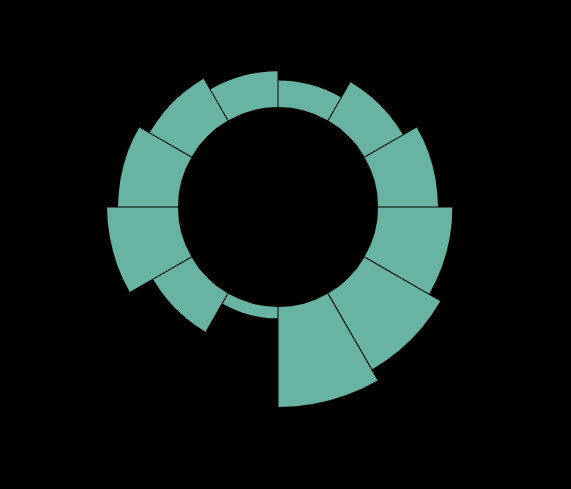
Step 12: Add More Charts
You can follow the same process to add more charts. D3.js offers numerous types of charts for different use cases.
The possibilities are endless:
Conclusion
D3.js and Next.js make a powerful combination for handling dynamic, data-driven visualizations in web applications.
This step-by-step guide aimed to provide a practical introduction to this toolset in a financial context, but the principles here are widely applicable.
Always remember, D3 might look complicated at first, but the more you use it, the more you will appreciate its flexibility and depth. The ability to create such bespoke visualizations that are interactive, dynamic and completely in your control is a powerful feature in any developer’s toolkit.
- D3.js Documentation: The official D3.js documentation is an essential resource to understand its various methods and features.
- Observable’s D3.js Tutorials: Observable’s collection of D3.js tutorials is a great resource to learn D3.js through practical examples.
- D3 Graph Gallery: This site provides a lot of examples that you can use directly or tweak for your purposes.
- FreeCodeCamp’s Data Visualization Course: This course includes a section on D3.js, and FreeCodeCamp’s hands-on approach is very helpful for learning new technologies.
- Udemy’s D3.js Courses: There are also several paid courses on Udemy if you prefer a structured course format.
Enjoyed the read? For more on Web Development, JavaScript, Next.js, Cybersecurity, and Blockchain, check out my other articles here:
If you have questions or feedback, don’t hesitate to reach out at [email protected] or in the comments section.
[Disclosure: Every article I pen is a fusion of my ideas and the supportive capabilities of artificial intelligence. While AI assists in refining and elaborating, the core thoughts and concepts stem from my perspective and knowledge. To know more about my creative process, read this article.]
In Plain English 🚀
Thank you for being a part of the In Plain English community! Before you go:
- Be sure to clap and follow the writer ️👏️️
- Follow us: X | LinkedIn | YouTube | Discord | Newsletter
- Visit our other platforms: Stackademic | CoFeed | Venture
- More content at PlainEnglish.io


