
The New Medium Dashboard
Have you been upgraded yet?
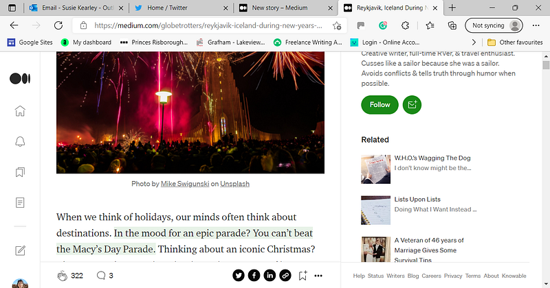
I hear that not everyone has been upgraded to the new Medium dashboard. So let me enlighten you. Here is the new look — and it means that 50% of the screen is taken up with white space and ‘related articles’, while the stories themselves have to squeeze into a narrow band left of centre.
It’s annoying because I prefer the stories to take up the whole screen. And also, the inability to avoid those shitty clickbait ‘Recommendations’ every time I login is quite poor.
I want to support people whose stories have not gone viral, and I want to read outside of the topic of Medium itself. The Recommendations are crap, so I chose a travel story to feature above.
I’ve asked Medium, “Can I turn the new interface off and revert to the original?”
They replied: “Thanks for taking your time to share your thoughts about the recent product changes on Medium. We’re in the process of collecting feedback from our users, and we have now and passed your message on to the product team.”
I guess that’s a ‘no’ then.
Have you been upgraded yet?
More from me…


